Tycho Sunrise DJ Set on The Dusty Rhino at Burning Man
Thursday, September 1, 2016
Thanks to everyone who made this morning so special. Thanks to Clarke and the Dusty Rhino crew for having me. Special thanks to my brother Dane for all the help.
Enjoy!
Track Listing
Tycho – Spectre (Bibio Remix)
Boards of Canada – Dayvan Cowboy
Tycho – Montana (Christopher Willits Remix)
Maribou State – Natural Fools
Krankbrother – When You’re Watching Me
Cubenx – Blazing
Rival Consoles – Ghosting
Hammer & Ludd – Controller
Tourist – Run
Tycho – Epoch 48:58
Com Truise – Silicon Tare
Jonathan Wilson – Desert Raven
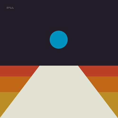
“Epoch” is the latest single from Scott Hansen’s continually expanding project Tycho and the keystone of the forthcoming album. The new album is at once a departure and an evolution for Tycho; honing the sonic aesthetic of Dive while drawing on the kinetic energy of Awake, it explores darker themes and new musical territory.
Mark Pritchard just released the video for his collaborative song with Thom Yorke, Beautiful People. The song came out in May and has been on repeat, definitely a top 5 song of the year in my book.
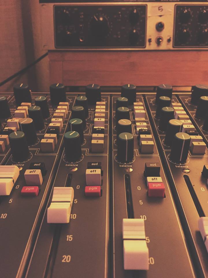
We are living in a golden age of sound technology. The tools we have at our disposal today were only a dream just a decade ago. The industry has found the balance between the power and flexibility of digital and the character and nuance of analog. People generally focus on the end result, but for most musicians, producers and engineers, the process is the product and the tools are the enablers.
The following is an off-the-top-of-my-head gear list for this record, my favorite tools, created by the brilliant engineers who make what we do as recording artists possible.
I used a bunch of other things but these are the standouts, stuff I couldn’t do without. “Best” means “in my opinion this is the best I’ve used, personally” and “new” means “new to me, like I got it less than 18 months ago”. Feel free to ask questions about specific applications and I’ll do my best to answer. Would love to hear your favorites as well.
**DISCLAIMER: In this post I’m mentioning some high end (read: expensive) gear. But I want any of you who are just starting out to know that you should never think that expensive equipment is an answer to anything. All it does it add, incrementally, to your sound. A good engineer / producer should be able to produce quality recordings without the use of boutique or prohibitively expensive gear. I used inexpensive equipment for many, many years before saving up for and spending the time to understand higher level recording equipment. Of course, with the right tools a job can become easier, but it’s not impossible without them (but do invest in a good preamp before anything, that’s really the most important thing). That being said, after 18 years as a recording engineer and musician, these ended up being my go-to tools for this record.
Best New gear overall
Kemper Profiling Amp
Best New FX Unit overall: Strymon Blue Sky
Best New Synth: Korg Minilogue
Best New Old Synth: Moog New Minimoog Model D (can’t believe they actually did it. Just got it a week ago, somehow even better than my original 1972 Model D)
Dangerous 2-Bus+ (if you’re looking for analog summing, this is it)
Rupert Neve Designs Portico II Channel (the perfect balance of color and clarity, a modern classic)
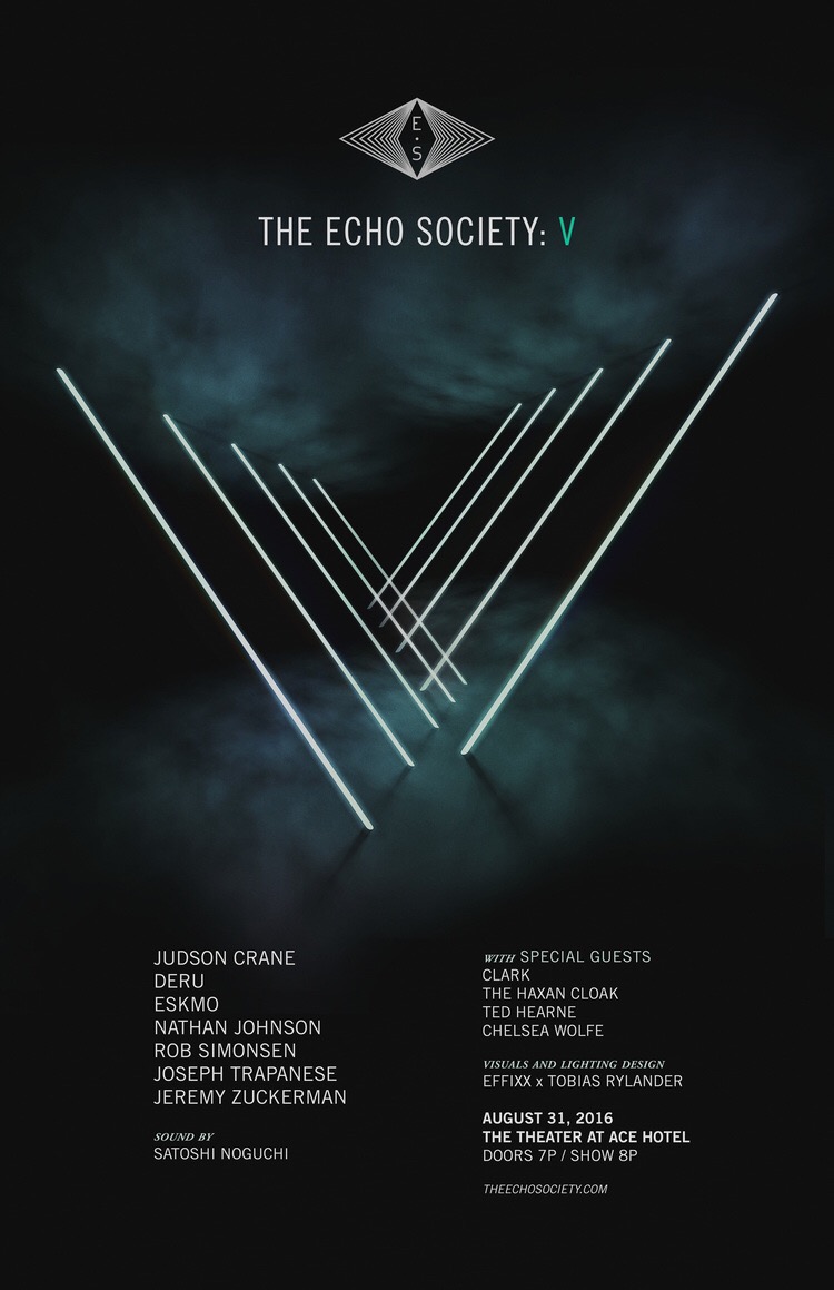
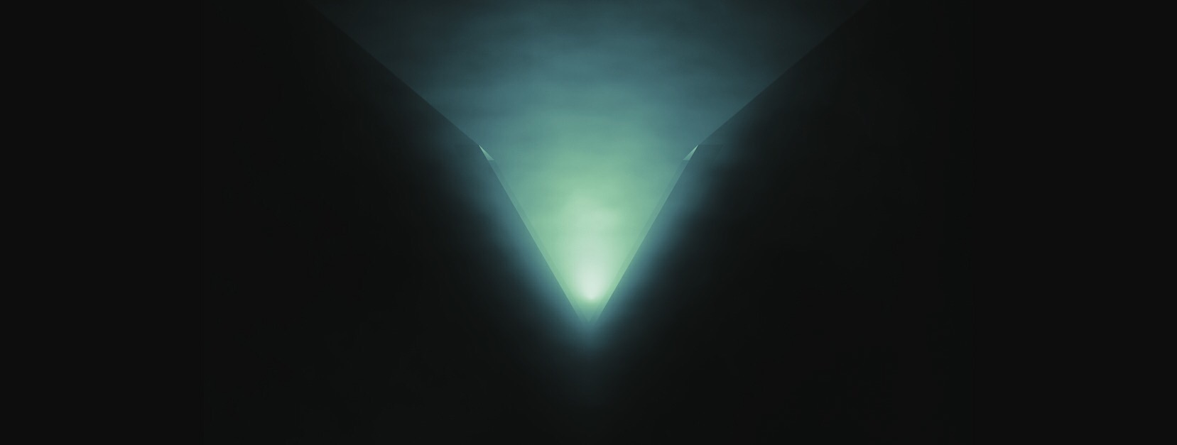
The Echo Society’s fifth event, V, will take place in the historic The Theatre at Ace Hotel in Downtown LA on Wednesday, August 31, 2016. The show will feature new works by the The Echo Society collective alongside guest collaborators Clark, The Haxan Cloak, Ted Hearne, and Chelsea Wolfe.
V, or five, evokes freedom and symbolizes matter with the subtle addition of spirit. It moves beyond restrictions.
In addition, V will feature video projections by EFFIXX and lighting by visual designer Tobias Rylander of Seven Design, who has worked with such acts as Miike Snow, The XX, Phoenix, Explosions In The Sky, to name a few.
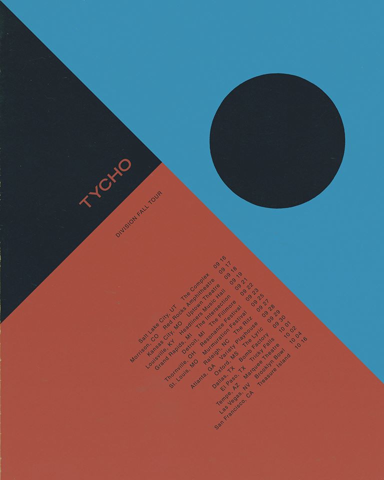
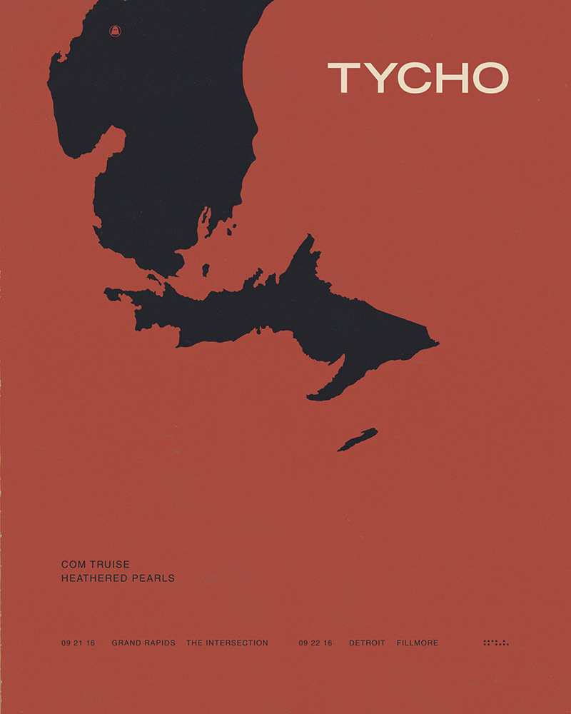
Tycho’s new track “Division” – the first new material since the release of Awake.
TYCHO 2016 TOUR DATES
JUL 02 – Chicago, IL – Mamby on the Beach
SEP 17 – Morrison, CO – Red Rocks Amphitheatre (w/ Lotus, El Ten Eleven)
SEP 22-24 – Thornville, OH – Resonance Music & Arts Festival
SEP 24-25 – St. Louis, MO – Murmuration Festival
OCT 15-16 – San Francisco, CA – Treasure Island Music Festival