Brené Brown asks – “What would you try if you knew people would never say ‘this’ about you?”
One of the biggest struggles for any creative is how to handle fear. The fear of criticism, comparison and scarcity. Some may think it’s best to ignore the chatter and just shut those people out. Instead Brené takes a different approach…
Step inside the arena and find out how she handles the critics.
Now onto the brighter side of the NHL logos and branding. The worst logos list was easy compared to the best. I fit in a few into the top just based on necessity ala a well crafted unique font and a aesthetics that the general public would lean towards.
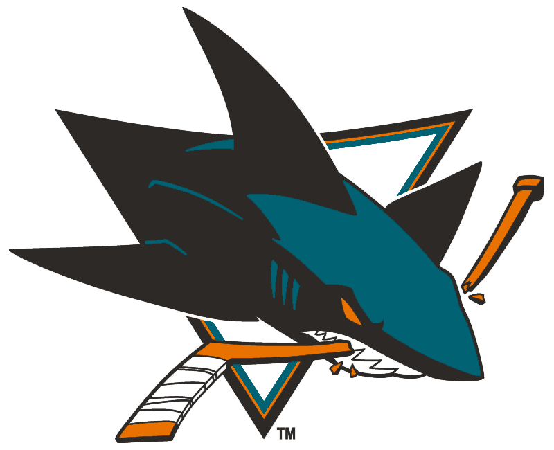
#5 San Jose Sharks
Starting off with the Sharks logo, it has appeal right away to a younger crowd, its fitting for the area the team lives in and it has a modern take which i’m not against. The reason I put it in the top 5 was because it might have that modern speedy look that I might complain about BUT there is reason here, its a shark breaking through a hockey stick, its a fast creature unlike lets say the Blue Jackets logo there was no reason. Also, it looks like someone took the time with the details and pulled it back a bit to find balance and I can appreciate that.
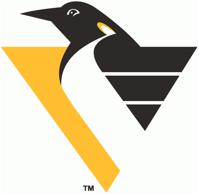
#4 Pittsburgh Penguins
This one might be a hard one to have people agree with me on. I personally thought it was iconic and it simplified the penguins image for the better. The problem I have with the current Pittsburgh Penguins logo are the old school equipment he’s wearing, if it was more timeless i’d probably like it more. I love the wings here and the bit of yellow on the neck, it shows off that detail is doable in a simple logo.
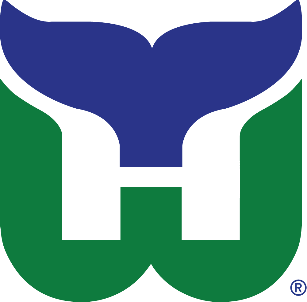
#3 Hartford Whalers
Classic. Hands down maybe the best executed sports logo for a designer that has to work under the these circumstances: a whale mascot and a team called the Whalers. Do you see the H for Hartford? And we thought the FedEx arrow was special. What a fluid effort, too bad they are now the Carolina Hurricanes, who have a horrid brand.
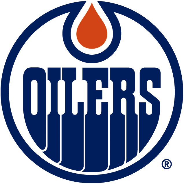
#2 Edmonton Oilers
So you’re getting paid to do a logo for a sports team, probably a dream job for many designers. You’ll probably want to make it your own and be remembered for your best effort, right? so probably on the top of your list would be a custom font and this designer knocked it out of the park.
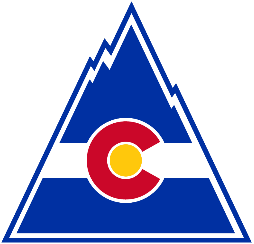
#1 Colorado Rockies
When you can take the States flag and transplant it into a team logo and hand in something literal but also create something that can look great on any piece of merch then i’m all in. The designer that created the MLB Colorado Rockies probably will always feel 2nd best. This is bold, grabs your eyes, its for all ages, a city can be proud of it, the uniforms looked out there but one of a kind.
This is a pretty passionate subject for me, probably one that I could argue over for the rest of my life so I decided to finally make a series of posts. Lets start with the NHL aka the National Hockey League. Who has the best and worst logo and why is the question, if you want to join the argument, here is a list of logos.
I will be doing the best NHL logos in a different post and we will go through a few other sports as well.
TOP 5 WORST NHL LOGOS
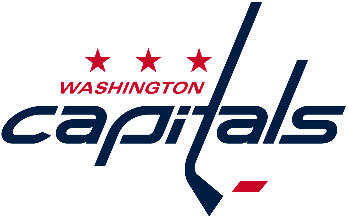
#5 Washington Capitals
Let me point out a few things before I start explaining the problems I have with it. First off, not a boring font, not a great font but hey i’m actually alright with the ITA situation with the stick and connections its making. Now step away from it and stare, what is it? I want to sell merchandise for my hockey team and make something special for the city that will support it. What is this though? a love for a font and i’m adding a hockey stick because hey its hockey?? It honestly looks like a rushed college graphic designers homework assignment that was turned in without a passion or connection with the sport. An agency maybe doesn’t even care for the sport? could that be what happened here? I’m not going to question the 3 stars or the color scheme but seriously if I was from DC i’d just sort of feel bummed out by this.
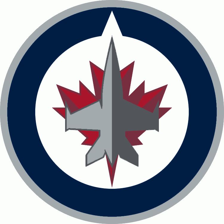
#4 Winnipeg Jets
I’ll start off with 2 nice things to say, first off nice work on fitting in the Canadian maple leaf and second i’m happier with this than their old logo which isn’t saying something that nice.
Okay now, i’m into an icon that represents an organization but that has to be a pretty low effort in the jet icon world. Also, why so literal with the leaf and the jet? I also have a problem with its something hard to get excited over, as a fan i’m already excited about the team why not add some cherries on the top for the people of Winnipeg? its like a vague statement without any effort for surprise. I mean this city JUST got their hockey team back and they revealed that…the city was in tears announcing they got their team back and a designer turned in a C- / D+ effort, you give a graduate design class this project and 2 to 3 students in each school across the continent would turn in hands down better executions for a team in 2015 that has the word jet in its name.
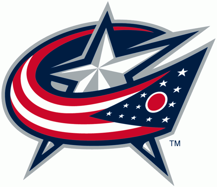
#3 Columbus Blue Jackets
Ooooooooooh boy, now we get into the portion of the list where the pros column gets a little thin. We have a star with a flag whizzing across the front like a Miss America ID ribbon strap. You want generic? here is something pretty generic. You already made the average sports fan happy by using colors that most people would wear and I guess the patriotic angle works BUT who made this rule on why things need to look 3D and more importantly angled and tilted?? I completely understand its better than their old logo which is a ribbon cutting disaster but if you’re building a city from scratch to fall in love with hockey then this 2nd step forward on the logo front is full of hesitation and conservative ideas, someone with an imagination needs to step in and start working with them, they aren’t a lost cause.
#2 Vancouver Canucks
My beloved Canucks, my first sports team that I completely adored. I never was a fan when this logo came around in the past and in the present because I was pretty much a fan only in the 90s during the Pavel Bure era. Some people might argue with me that I just like a simple logo, this…I don’t know… who let this out in the public? I’m sure more than one person is in the decision making of a logo out in public, I don’t think there was much thinking going on. Again with the fascination with the hockey stick, we understand one is used to play them sport but putting over a hockey rink and saying thats your cities logo…no, no you can’t turn that in. Its almost frightening that adults were in charge and approved this.
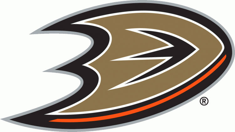
#1 Anaheim Ducks
Well well well, look how far you’ve read into this rant, i’m surprised you stuck around.
Look at this logo… maybe blow it up full screen i’ll wait… and gaze at the glory of it and imagine the confused faces across the country when they saw this the first time.
Its a D for Duck THAT. IS. MAYBE? A BACKWARDS DUCK FOOT?? or a chubby boomerang that would never work because of the surface area and die-cuts. Maybe a shield!?..no, no its not, its just a copper D that was abused in illustrator by a Mountain Dew loving bro. I can’t wrap my head around it and I don’t expect anyone else too either especially anyone in California that showed up to the unveiling of this logo. You go from team colors of teal and purple with a duck mask into this batman weapon made of Taco Bell ingredients.
Tanlines have announced their new album Highlights. They also have shared the album’s first single, “Slipping Away“. Highlights is out May 19 in the US on True Panther.
Tracklist
01 Pieces
02 Slipping Away
03 Palace
04 Two Thousand Miles
05 Invisible Ways
06 Bad Situations
07 Running Still
08 Thinking
09 If You Stay
10 Darling Dreamer
More from Chaz! we are finally realizing what he’s going for and its a stunning fusion of psych rock / am gold / funk. Its a bold vintage statement but who is else going to do it?
Indian Wells is back with a new album on Bad Panda, this time its slightly more detailed and upfront, maybe more confidence after playing in front of people and tweaking in favor of the live show but without compensating his sound at all. That seems to always be the sophomore album move that is the right move, its nice to get live shows under your belt and be asked to come back and I hope thats what happens here for Indian Wells.