1976 Reprinted
Posted by Scott

It’s hot as hell but luckily the summer-friendly tri-blend edition 1976 Heather Blue shirt by ISO50 is back in stock! Get them while they last this time, it’s going to be a long summer… Link
It’s hot as hell but luckily the summer-friendly tri-blend edition 1976 Heather Blue shirt by ISO50 is back in stock! Get them while they last this time, it’s going to be a long summer… Link


With spring all but here (at least in San Francisco) I thought it would be a good time to whip up some new tees using American Apparel’s summer-friendly Tri-Blend Heather shirts (50% Polyester / 25% Cotton / 25% Rayon). The result is this new 1976 on American Apparel Tri-Blend Heather Blue. When I first designed the original version of the 1976 tee, I had this sort of vintage track tee vibe in mind. At the time, AA didn’t offer a Tri-Blend shirt in blue so I ended up going with the cotton baby blue — which I think has it’s own thing going on — but once I saw the new tri-blend blue I knew it would be perfect for a subtle remix.
Shirts have always been a fun design challenge for me. Unless you’re a pretty big company, you’re pretty limited in your color choices when it comes to blank shirts. Sure, American Apparel (one of the blank shirt manufacturers with the best cuts and colors) has a great selection of colors, but most are pretty straight-forward, bright colors. For most of my designs I envision washed out, faded colors and there really aren’t that many companies offering that kind of blank these days. AA’s tri-blends come very close and the fit and feel are incredible, so I usually end up going with that combo. But it can be a rather daunting task to balance your Pantone ink choices with the dye colors to try and reproduce the style and look you’re going for. You can always mock it up in Photoshop, but you really never know what it’s going to look like until you print one up and see the real thing.
After all that comes the task of trying to get photos of the shirts that accurately reproduce the color and texture, which can be even harder than designing the shirts in the first place. This time around I had a Gretag card and some color-correct CF lights so it went a little more smoothly. I shot in NEF format RAW on the Nikon and got some pretty usable output this time. The process of brining the RAW shots in is always a bit tedious, but it definitely yields more accurate and flexible results. I usually try to get one shot that’s as color accurate as possible (first shot above) for the storefront, and then another, more effected version (second image above) to give another perspective on the shirt. I’m still planning to rent a better lens for a day or so and see if that helps any, although after this most recent session I am feeling a little more confident with my D80. Also, a quick thanks to my little brother Kirk for modeling the shirt! I usually have to hold the remote while taking the shots of myself and it’s a lot harder to frame up shots and get the settings down that way.
At any rate, the ISO50 1976 Tri-Blend Heather Blue is now available for your enjoyment, get them while they last!


As you may already know, this Friday and Sunday Ghostly International will be celebrating their 10 year anniversary and have a select few artists (Tycho among them) playing in San Francisco and Los Angeles live. We’re giving away a set of two tickets for both shows which will include two t-shirts each (see above) for the winners. The first two people to correctly answer this question win:
Which Ghostly International catalog numbers are currently missing between their first release and their latest release? (Note: Catalog numbers are the numbers that are put on each release to show what number release this album is.)
Please email the answer to: jakub [at] iso50 [dot] com (please specify which show you will be going to). The winners must be able to go to the Los Angeles or San Francisco shows, sorry to the friends that just want the shirts, we will run a few more giveaways soon to make up for it.
More info on the shows is here and advanced tickets can be purchased here (SF) and here (LA).


Eley Kishimoto make some very well designed fabrics and wallpapers. Self-described “surface decorators”, the London based firm has been designing textiles since the early ’90’s. More info at their site and their blog.
The top two are meant to be wallpapers and while they’re incredible to look at, I’m not sure I could handle that pattern going on all day. Maybe one small wall in the studio?

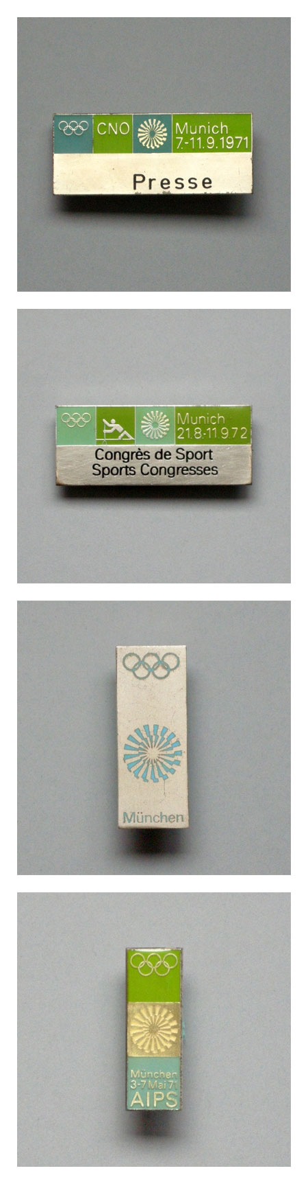
Some Otl Aicher 1972 Munich Olympics pins. There is nothing better than green with that deep aqua-marine (top pin in particular). If I had these I would wear a different one every day on a short sleeved white button up shirt with horn rim glasses. Speaking of the ’72 Olympics, Spitz is still the champ in my book based on style alone.
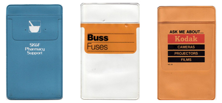 Go ahead and laugh but these dress shirt saving vinyl badges at one time we’re great because advertising designers could have that extra chance to put their logo somewhere in a creative way. I love the layout on these, there is a whole huge collection here.
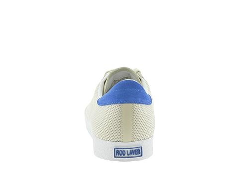
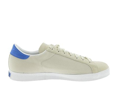
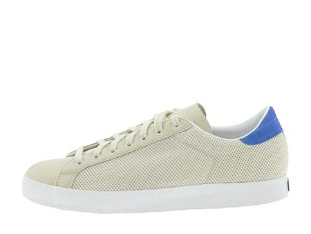
I don’t pretend to understand sneaker culture, and rarely indulge in buying shoes for any other reason than that they look and fit good. But there are a few designs I hold dear, shoes I used to wear a lot or that just remind me of growing up. One shoe in particular is Adidas’ Rod Laver, I used to wear the white/greens all the time. Sort of burnt out on them (if that’s possible) so I don’t currently own a pair. I came across these new "Laver Classics" on Zappos today, but of course, they are out of stock. Guess I’ll have to actually venture out of the house to find them, perhaps one of the billion boutique shoe stores up on Haight Street will have them. Anyways, these are amazing, can’t wait to score a pair.