Air Canada
Posted by Scott

The Canadian goodness just keeps coming.
Update via Joe Kral:
“This was designed by Dan Reisinger. Featured in an old issue of Graphis magazine.”
The Canadian goodness just keeps coming.
Update via Joe Kral:
“This was designed by Dan Reisinger. Featured in an old issue of Graphis magazine.”
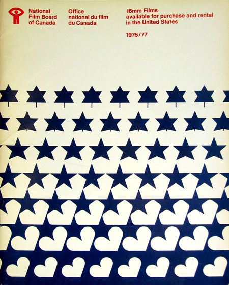
Sent via Jason Bustin:
“I’m in the process of moving and I came across an old National Film Board of Canada catalogue that was made available for American residents wishing to order 16mm films from the NFB in 1976/77.”
These evolving, MC Escher style designs are great. Especially love the motion metaphor tie in with the NFB. The bowed text at the top is an artifact of correcting for the angle at which the photo of this piece was taken.
I never realized it until I started posting all this stuff, but Canada seems to have a very strong legacy of graphic design, something for which I am not quite sure they are getting their due credit. I didn’t study design in school, is Canadian design a part of the curriculum of most design programs? If not, it should be. Just scroll through the recent entries here and you’ll see lot’s of great examples. I have a lot more coming too.
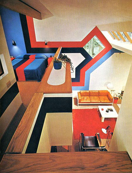
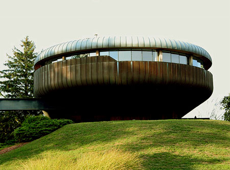
Love vaulted ceilings, love skylights, love plenty of angles. Is this a home or a cabin? Not sure of the details on this, if anyone has any info let me know in the comments. Obviously a few things could have been handled with a bit more restraint (never been a huge fan of oak), but overall it’s a great feel. If some crazy design comes off the wall and turns into a bed, you really can’t complain much. $20 says there’s a matching Porsche parked out front with perforated leather driving gloves in the console. Seems to be some variant of the Marcel Breuer Wassily Chair in the foreground, name that couch.
Whenever I see setups like this I always wonder who lived in them, did they actually get much use out of the place? Wonder what it looks like now….probably totally gutted and replaced with stock art fake paintings and plastic floral arrangements everywhere.
Update: Via Fisker in the comments “The picture is from the book ‘Decorative Art 70s’ published by Taschen
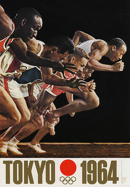
One of the original posters from the 64 Tokyo olympics. Simple and effective, the gold/red color scheme is perfect. Love the grain of the photo, yet another beautifully organic phenomena we have lost to the digital revolution.

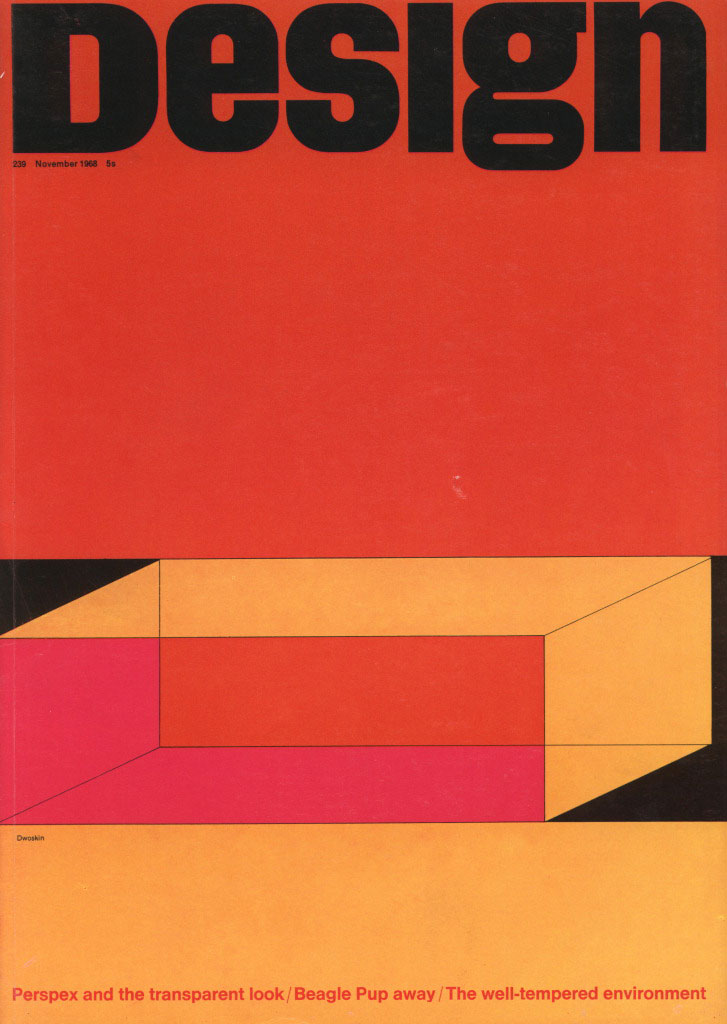
Design magazine Issue 239. Very nice color combo, similar to the Mexico Olympics cover. The cover story reads “Perspex and the transparent look”. Perspex is a transparent glass alternative heavily used in 1970’s interior design. They utilized fluorescent colored Perspex for all sorts of furniture and installations. My neighbor had a lot in his old SF Victorian until they remodeled. Should have snagged a picture before they tore it out. The colors featured in the illustration on the cover of this magazine must have been the common choices, as I recall his were all in these tones as well.
J went and took some photos of the Wil Armster designed Condo. Still looking pretty nice, thanks J. More Pics at his Flickr.
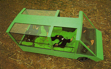
A collaboration with car makers Citroen and Pirelli Mario Bellini built what amounts to a minimalist mobile home. This would make a great car for an impromptu camp out.
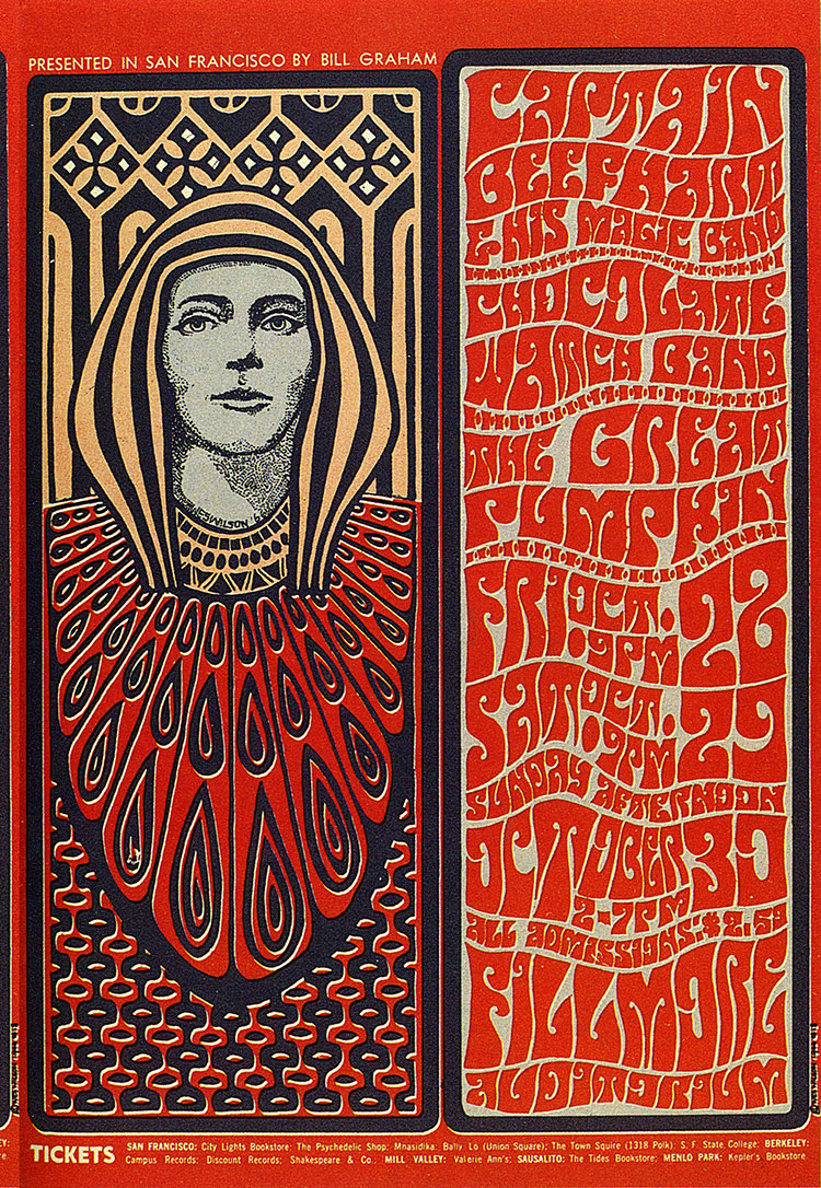
Here’s a nice example of the Fillmore West style by Wes Wilson. This style is a conglomeration of many of the early 20th century design themes. While a bit less than legible, the illustrative lettering indicative of this style is a work of art in itself. The psychedelic and Art Nouveau themes associated with the Fillmore movement have always been a great inspiration to me but I have always felt them to be a little overstated. When I do explore these themes in my own work I tend to temper them with a more minimalist slant.