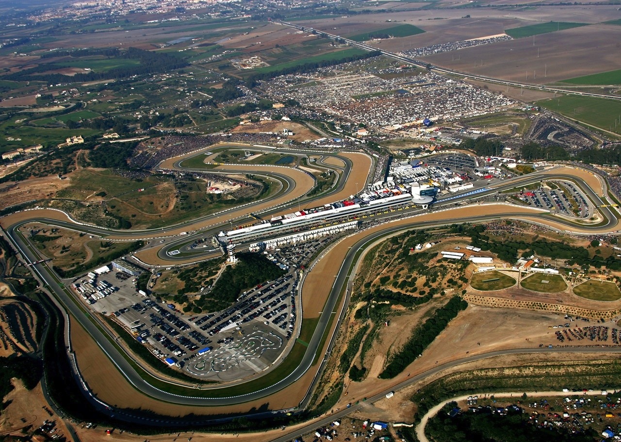
Testing for the 2013 Formula 1 season began earlier this morning at the Circuito de Jerez in Spain. This is a stable year in terms of regulations, not much has changed since 2012. This [should] mean a closer field and some desperate development avenues for the Big 5. Red Bull is [still] clearly the team to beat coming of of their 3rd straight Constructors Championship & WDC after a down-to-the-wire finish at Interlagos in Brazil.
The offseason proved to be the biggest driver shakeup in recent memory, the most sizable of which was Lewis Hamilton making a shock exit at McLaren and forcing Michael Schumacher at Mercedes into his 2nd [and hopefully final] retirement. This inevitably caused a ripple effect to many of the teams and drivers below scrambling to fill – and find – seats, and left one of my favorite drivers on the grid, Kamui Kobayashi, hung out to dry sadly. How all the big money in Japan let this happen, I don’t know. Hope to see him back next year, maybe with a Honda sticker on his helmet.
With some interesting packaging choices and a new Pirelli tire, I’m personally hugely anxious to see how everyone’s form fares over the next few weeks. All teams will be in attendance, the only caveat being that Williams will be running their 2012 spec car in order to finish preseason preperations in time for the next test in Barcelona. Missing from the grid this year is perennial backmarker HRT who folded at the conclusion of last season. Rumour has it that some idiots here stateside are looking to buy in, however, and if that’s truly the case I’ve got a bridge to sell them as well…
Check out all the 2013 challengers after the jump.
Here’s another destructive photographic technique that’ll give you super shallow focus, lovely bokeh and light leaks – take your lens off and shoot while holding it to the camera body.
Commonly referred to as freelensing, it’s essentially a poorman’s tilt-shift, letting you manually adjust the angle of the focal plane by tilting the lens slightly in every direction. It’s also a great way to get dirt and dust on your sensor, so please try this at your own risk. For the unwilling / faint of heart, the safer alternative is to pick up a trusty Lensbaby.
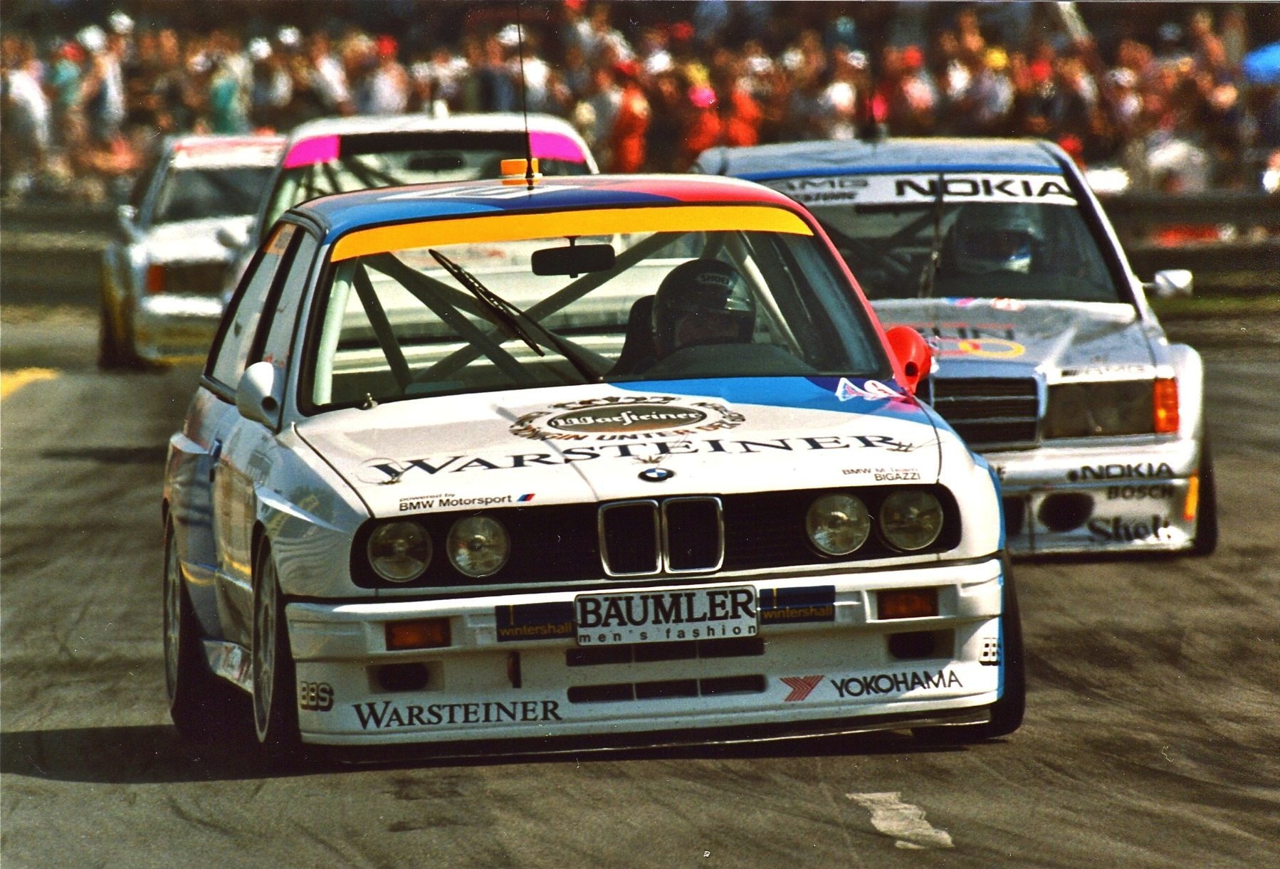
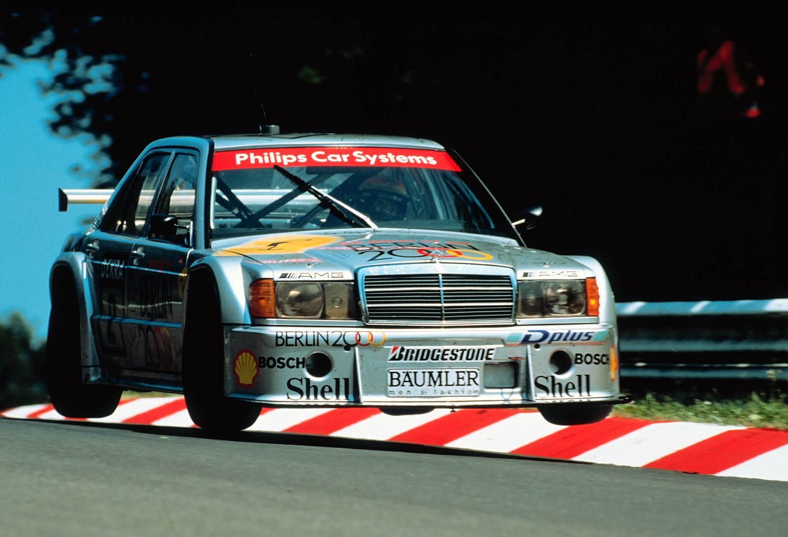
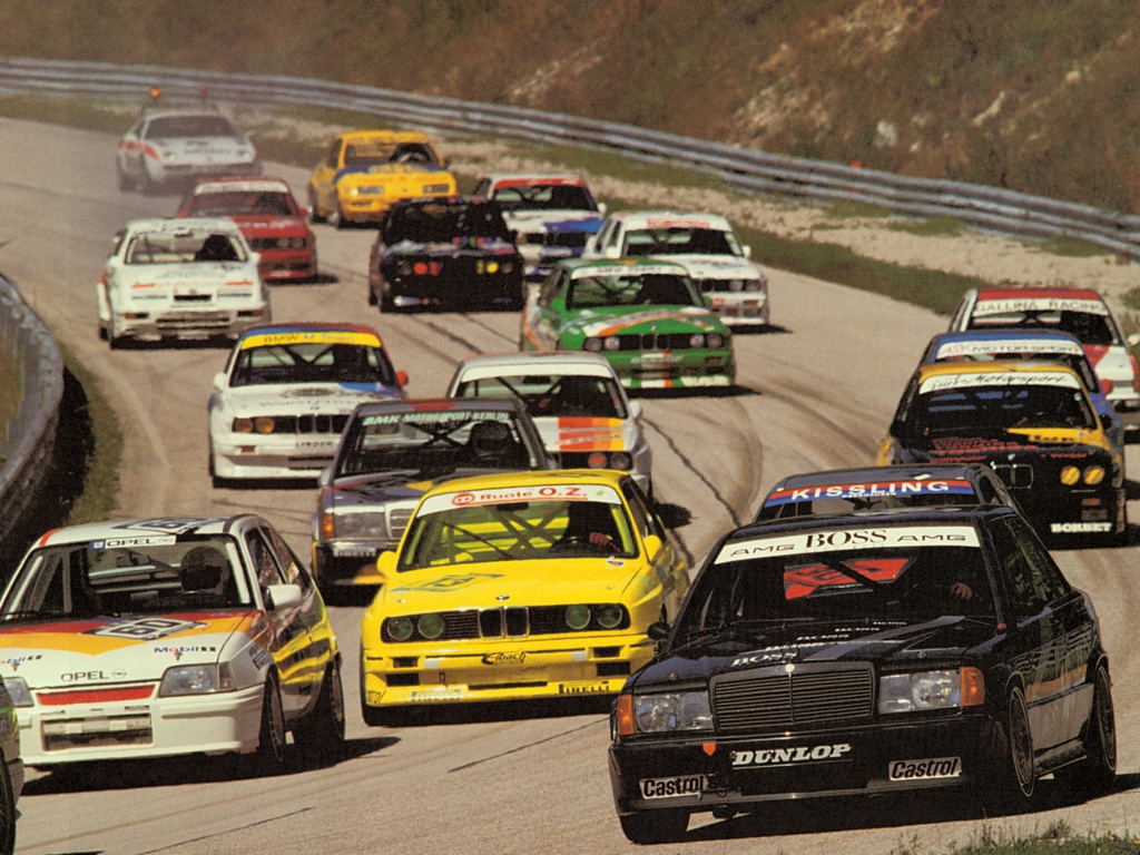
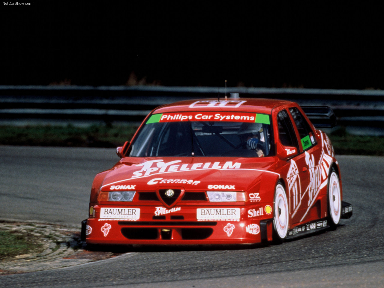
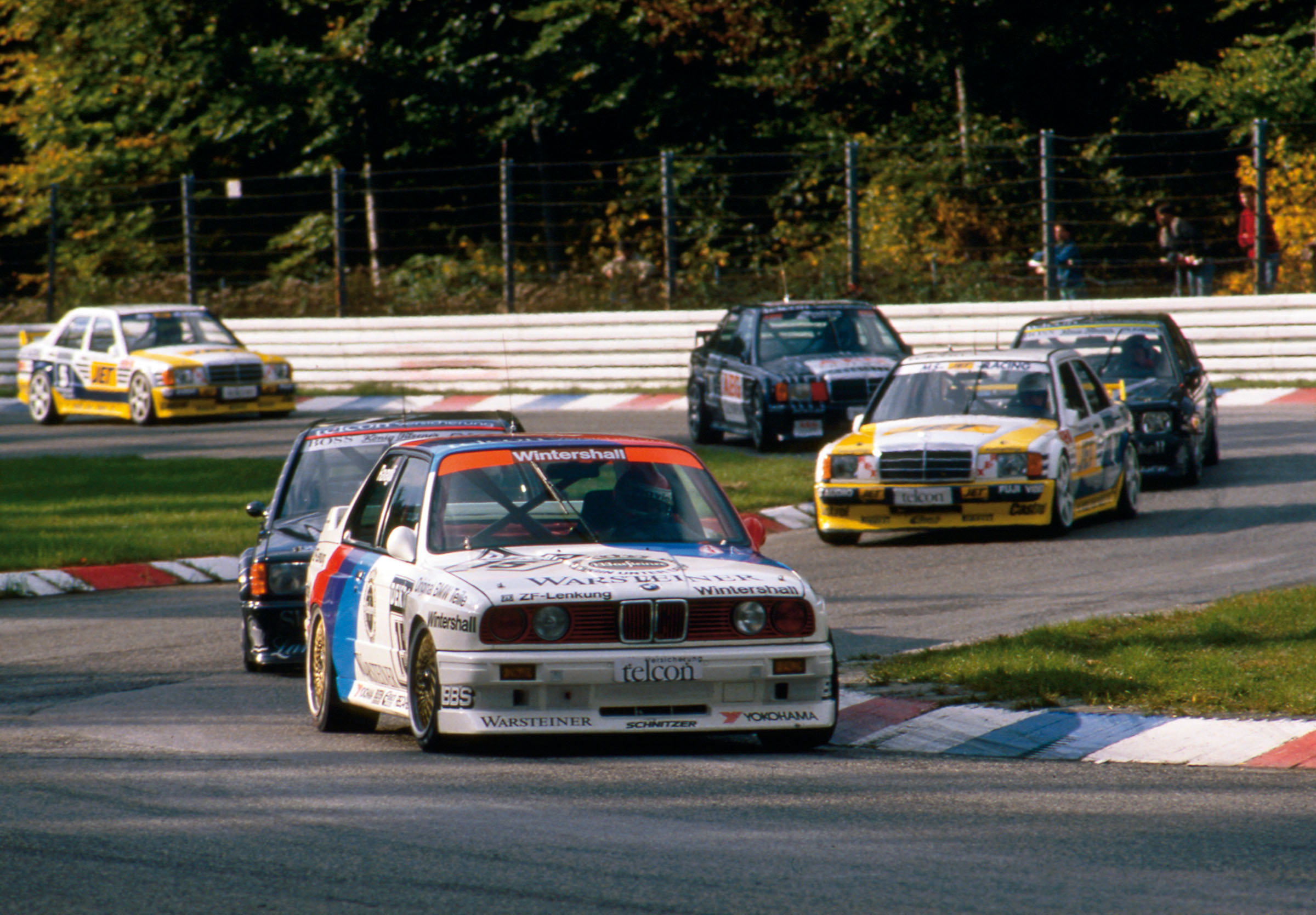
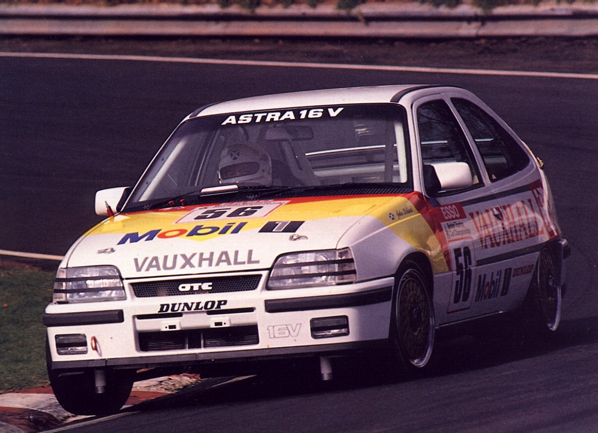
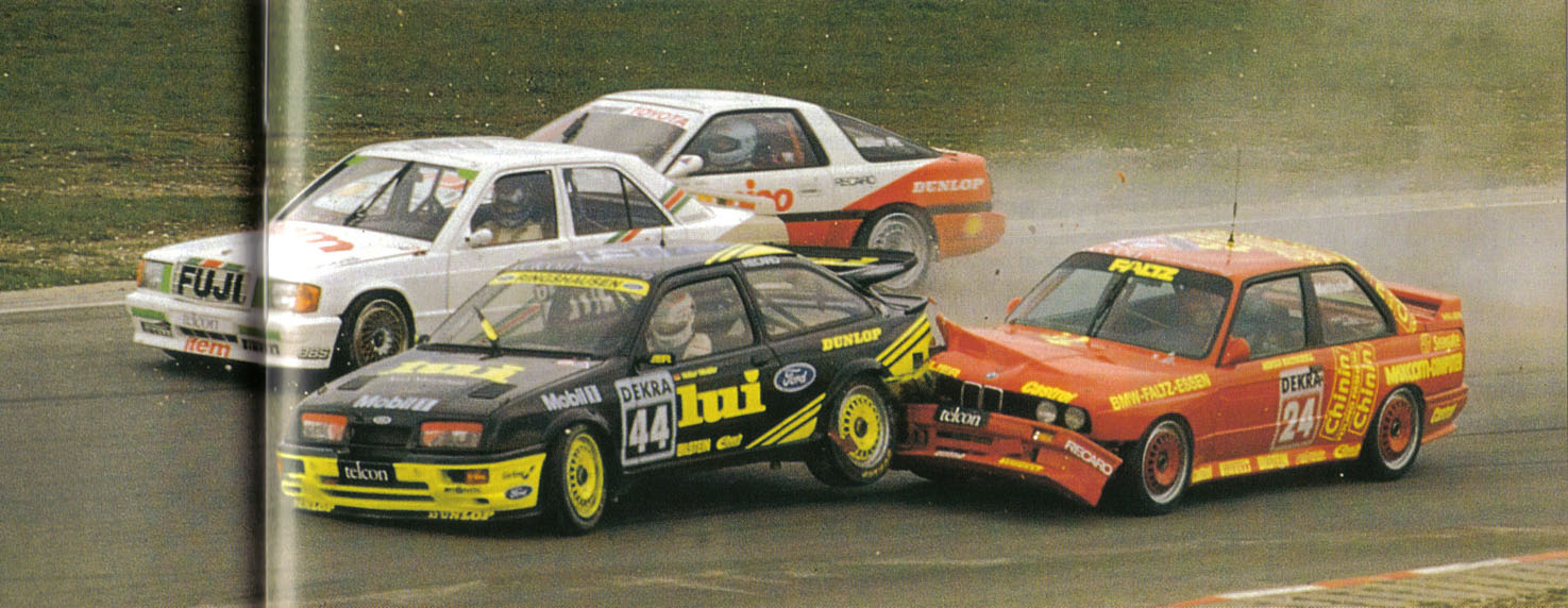
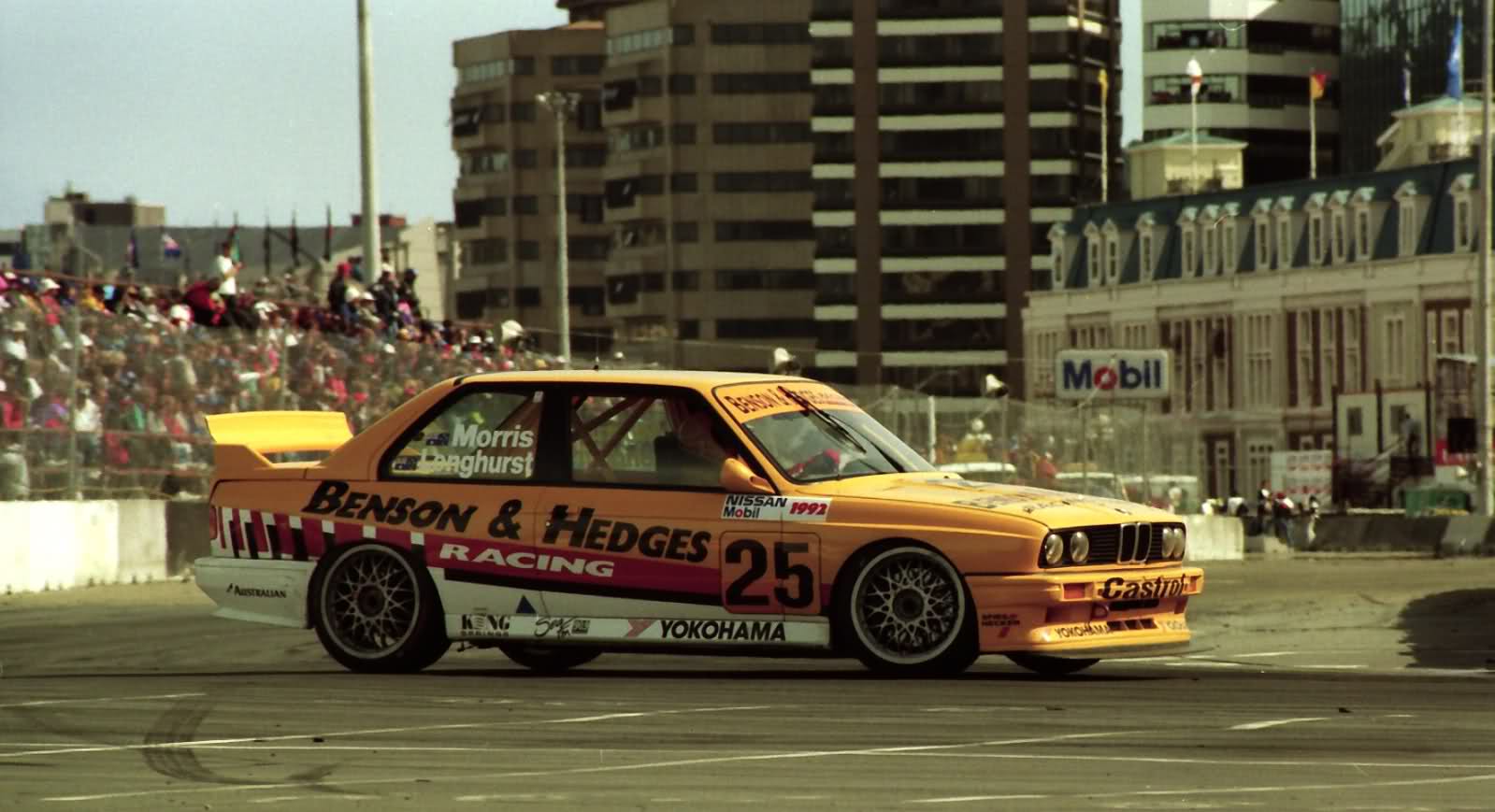
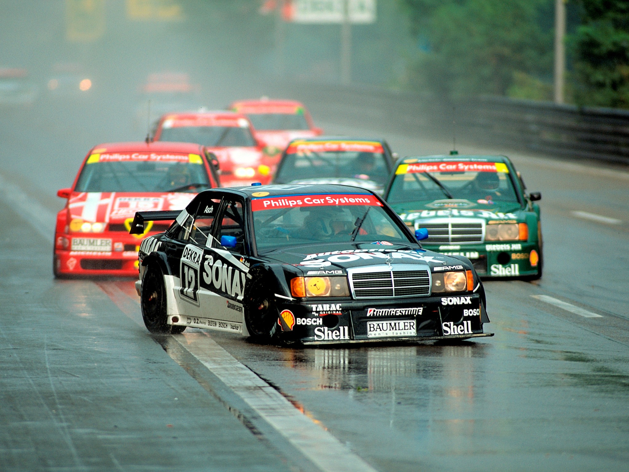
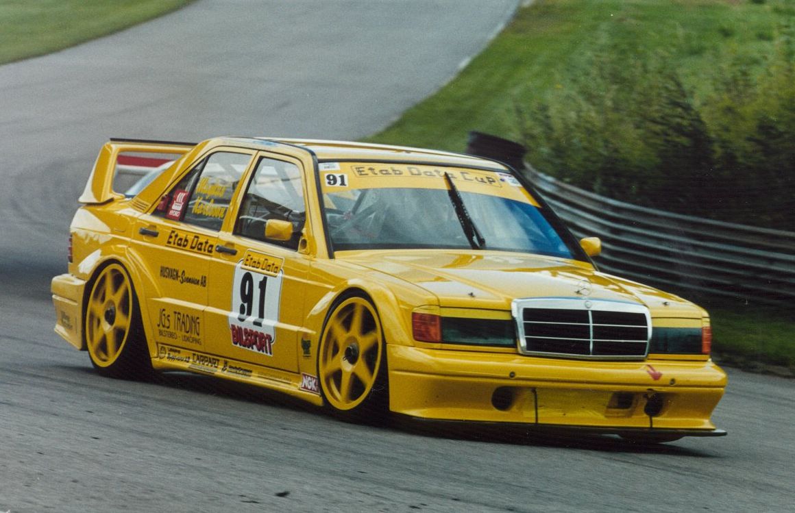
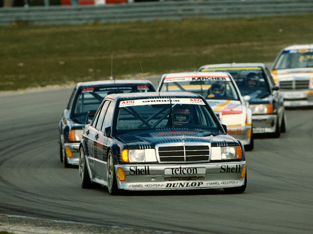
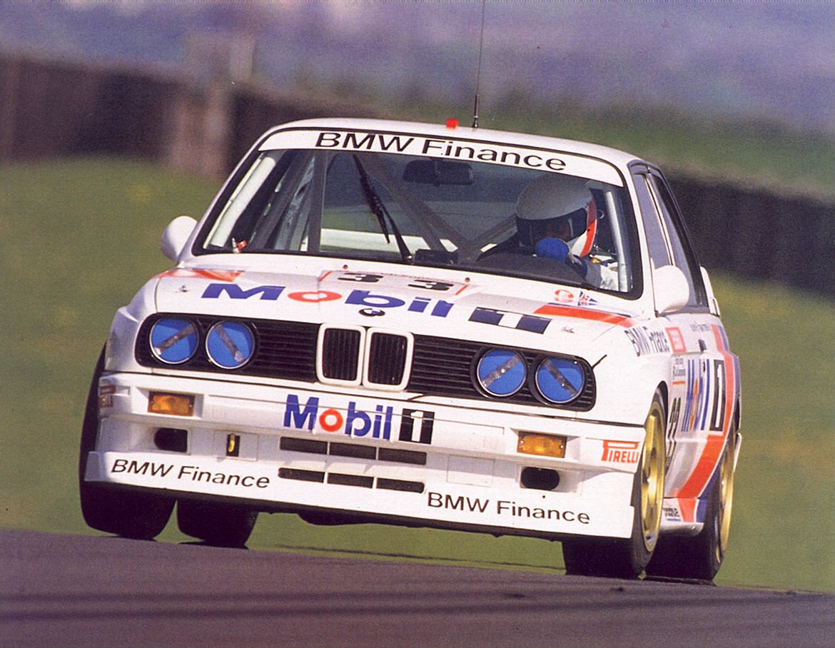
I usually like to present these posts in a factual tone, but it’s hard for me to be impartial when talking about [the original] DTM. Nowadays they run silhouette cars – merely skinned to resemble production vehicles [ie NASCAR]. Back then, the M3 you bought at the dealer was basically what these guys ran, and the series spawned a lot of my favorite cars. Seeing pictures of the 190e with all four wheels off the tarmac really rustles my jimmies. Enjoy!
Starting in 1966, Can-Am was an idealistic series conceived by the SCCA and its Canadian counterpart, CASC. Running under FIA Group 7 rules, it was as open as a series could get, essentially a formula libre format with the chassis weight and horsepower being, for all intents and purposes, unlimited. If the the tires weren’t exposed and it had 2 seats, you could race it. It was popular among drivers and enthusiasts, the likes of Keke Rosberg, Gilles Villeneuve, and even Paul Newman being regulars at the meets.
While this format led to some interesting technological developments and some truly oddball designs, it also opened the door to the inevitable: 1,000+HP engines bolted to cars that proved to be as unsafe as they were powerful. Lola & McLaren dominated the front 9 of the first era, the latter half saw the introduction and subsequent perfection of the Porsche 917, which nearly spelled the end of the series as they were unbeatable by non-works sponsored teams.
Some notable offspring of the early Can-Am years included heavy experimentation with aerodynamics and downforce, particularly Jim Hall’s Chaparral cars. The 2J, or “sucker car” [seen above in b&w bearing the number 66] used a series of skirts and a small 2 stroke engine which powered 2 fans aft of the vehicle. This combination of parts cobbled together [on what I feel is one of the ugliest race cars ever produced] created a unique type of ground effect, one which didn’t require moving air over the car, meaning that downforce in excess of 1.5g could be accomplished at any speed. When it was actually working, it qualified 2 seconds faster than the closest car, and was quickly banned.
The late 1970’s saw the waning series combined with then thriving Formula 5000 category, allowing teams to convert single-seat, open wheeled tubs into closed-wheel sports cars. While less popular in the long run, it encouraged many more teams to compete and led to a truly unique chapter of motorsport, as well as some really good looking cars. This modest resurgence continued until the dominance IMSA/Camel & CART took over as the format of choice in the 80’s.
My old buddy Nick Felton spends a lot of time tracking his every move. After years of hanging with him knowing at the end of the year my stats would also in some way be immortalized in that years annual report, I decided to make use of one of the tools he created to track all that data: Daytum. It might be old news now, considering he’s moved on from Daytum, but it’s taken a while for the type of data I’ve been tracking to reveal something, hence the late-to-the party post.
I started obsessively keeping track of all of my music purchases via Daytum mostly just to keep tabs on myself – to make sure I was in fact supporting artists like I claimed I was.
But most telling to me is how the formats break down. Having moved a few times recently with a pretty hefty record collection – and a slow shift to “digital djing” (cue the purists), my buying habits have have clearly shifted towards downloads.
It may be a hold over from the vinyl and cd days, but no matter how hard I try, I can’t commit to the Rdio’s and the Spotify’s out there. I need to have the thing, be it physical or digital. I need to know it’s with me here, preferably in lossless format, taking up space somewhere – even if it’s just bits on an external hard drive. Loads of them.
I’m excited to see the label roster over at Drip.fm grow – it’s the perfect subscription based, lossless downloads model in my opinion.
For the last month and a half I’ve been posting a series of found “shapes” on Instagram. The objects in the images are various places, signs, or vintage objects. Each image expresses my affection for simple, clean and effective design. It’s also about connecting with those lines; It’s about the feeling you get when viewing it.
It’s a challenge finding new compositions that really give off that spark, but it’s also fun. It’s also really interesting to see how others react to certain shapes and colors. Hope you enjoy!
Caleb Owen Everitt is one of those designers who has such a dialed in style, you can almost instantly recognize his work when you see it. Not to mention, he has some of the coolest clients in the game from Hufnagel to Deus Ex Machina and many more. His work is always a great source of inspiration for me.
The 2012 Land Rover Defender XTech. In the United States, we can’t get our hands on these and that’s a tragedy. In my opinion it’s one of the best designed off-roader / SUVs ever and now there’s an XTech version which is much more rugged and has a new engine. I’m not sure if I like the original or the XTech version more, but it definitely brought me around to posting about the Defender.
The thing that I truly admire about the design of this car, it’s simple and done right. There’s no weird pattern in the seats, the instrument panels are symmetrical and the exterior colorways are that of a machine. Sure there are a lot of technological enhancements and the glaring safety features missing. No airbags keep it from coming stateside. However, it has a timeless appeal to it. Of course, it’s diesel and weighs A LOT and with what we’re all paying for gas right now it’s not really an option. However, I’d ride my bike to the studio during the week and take this out on the weekends to offset my carbon footprint.