I had the great fortune to study under Jennifer Sterling at the Academy of Art, a couple of years ago now. She taught two of my typography classes (one of which I completed the Pantone Poster for). I’ve always been a big fan of her work, and as Fabien points out, her long disconnected site, has recently popped back up. No new work that I can see, but it was exciting to see the archive back online.
Jennifer was definitely one of my favorite instructors at school. She was intensely critical, which I loved, and I feel like her exacting evaluations drove me to do some of my best work at the time. I can’t stand it when people hold back during critiques or are luke-warm on giving feedback. If something I’ve done is bad I want to know. Maybe I’ll disagree and we can argue about it, but it is in no way helpful for students/teachers to hedge around giving honest feedback. I always appreciated Jennifer’s classes for her honest and precise critique.
Eye Magazine has great piece on typographic posters and were kind enough to supply some very high resolution scans of these beautiful prints (click any image above for full resolution or visit the original Flickr page). There’s more info and analysis over at the original post.
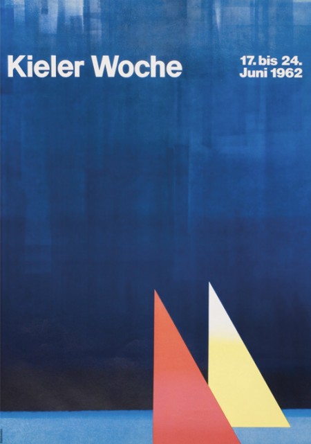
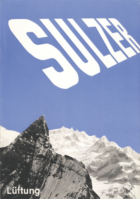
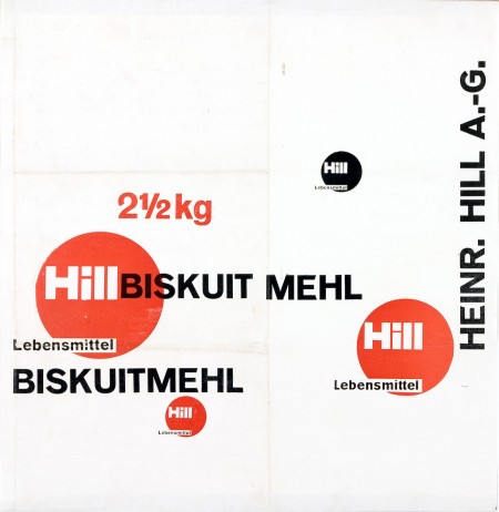
First off let me just say that it’s awesome to have come across this beautiful archive of work by German graphic designer, Anton Stankowski. The images in the archive are fairly large so the detail of the design becomes evident. In the first image of this post it looks to me like the background of the poster was painted with a brush then overlaid by the type. The process of how this was done would be refreshing to see.
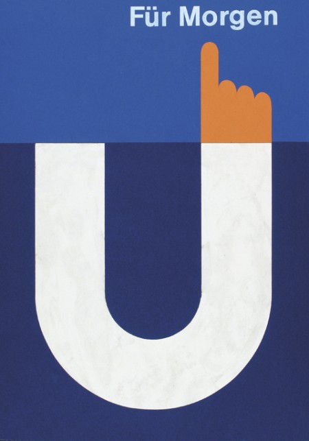
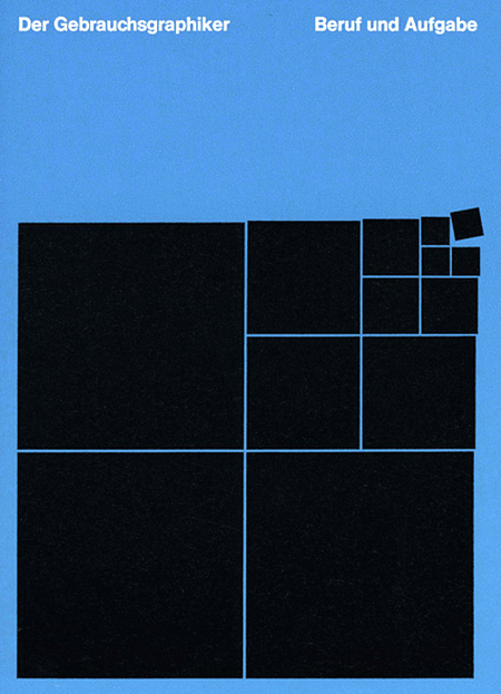
The first thing about Stankowski’s work that pulled me in was the amount movement. Nearly every one of these pieces utilizes a visual system that controls your eyes across the graphic elements and to the typography. The system is very effective considering that I keep looking at these pieces every couple of minutes to see how my eyes move around.
The Sulzer poster and the Hill Briskuit Mehl packaging are undoubtedly my favorites. Even though both are very simple they still have a lot of motion in them. Also in the Sulzer piece, the transition of the mountain peak to the type sings composition to me and in the Briskuit packaging I really admire the grid and typography.
One of the very first articles I ever wrote for this blog lamented the careless proliferation of Archer, the slab serif from H&FJ. At the time, I was specifically reacting to the unfortunate redesign of the San Francisco Chronicle. That was in February of last year. Since then, the typeface has spread itself ever further, and continues to pop up just about everywhere.
Lauren Adams wrote a article about this very topic over on the AIGA blog. She states, “Archer’s instant stardom raises questions about its appropriateness. Can a font with such a defined character properly suit so many purposes?” She goes on to point out numerous recent examples of Archer’s continued domination of the ‘friendly’ typeface sphere. I was excited to see her article, as this issue continues to bug me the more I spot those little ball terminals. (Be sure to check out the blog she mentions, Archer Alert, for recent examples of Archer in the wild.)
At the end of my article back then, I asked if “Archer was the next Papyrus” — a polarizing contention to be sure — but maybe now my question doesn’t seem so far fetched. Before you get all crazy on me, let me say again that I am a *fan* of Archer. It looks good. I have nothing against the way it is drawn and actually think that it is quite amazing (like all of H&FJ’s work). Though as Lauren states, “an elegant typeface doesn’t simply translate to universal functionality.” I would add that such a distinctive typeface shouldn’t translate to ubiquity.
Like Papyrus, Archer shares a unique personality and the aforementioned “defined character”. Just as Papyrus became the go-to font for “exotic” or “earthy”, Archer has become the easy choice for “friendly” and “approachable”, which makes its misuse all the more prevalent. The more Archer is used in scenarios where it’s vaguely appropriate, the less effective it becomes in situations where it actually makes sense. As Christopher Simmons points out in the comments over there, “In unskilled hands even a Stradivarious will only make noise”. With Archer being clumsily wielded as frequently as it is, it’s this “noise” that has rendered unbiased viewings of the typeface impossible.
H&FJ just put out a really cool article on combining fonts. They break it up into four lessons and provide visual examples and typeface options. All the examples use their fonts, but the lessons carry over to usage with other typefaces easily.
I found the article to be especially inspiring, or at least liberating. I have a weird mental block when it comes to combining typefaces. I’ll often use two different ones, but never three without a huge mental commotion. I don’t know what it is, but I get really stressed out trying to finagle more than two typefaces into a design. Of course it depends what type of design it is. I guess I always felt like there was this mystical over-arching design rule that prevented exciting combinations of type (I know that sounds ridiculous). Anyway, something about their examples opened things up for me. It’s nice to hear it from the high authorities that this sort of thing can be this effective.
I’m also consistently amazed how good they are about talking about type; the adjectives they use are always way out of left field but completely spot on. Calling Gotham Rounded ‘cheeky’, for example, wouldn’t have come to me right away but makes complete sense once I hear it. If you recall their scene in Helvetica where they rattle off some rather satisfying descriptions of type — that was awesome.
Helvetica and the New York City Subway System by Paul Shaw — which examines the Helvetica’s role and history in the New York City Subway system — looks like a must have for any design collector. It’s currently sold out of it’s initial limited edition but Shaw’s site says they are looking for a publisher. Let’s hope that works out.
I’m embarrassed to say I cannot draw an ampersand from memory; when I do it always looks like an unfortunate treble clef. Regardless I think the ampersand is easily the coolest symbol in any character set (or ever…). There are many reasons for this assessment.
First, it’s a complex symbol. Often times an ampersand would look more at home amidst a group of kanji characters rather than a cluster of geometric letters. This makes it very interesting to look at and you end up perceiving the overall shape, rather than the distinct path of the lines. Second, it can exist in many different forms and still be understood as an ampersand. I suppose this is the same for most letters, but the ampersand varies the most substantially between typefaces (thus allowing for the most potential random awesomeness). The creativity of the typographer is best (or at least more freely) expressed through the ampersand. Lastly, it stands for the word “and”, which if I were a symbol and I had to stand for something, would be a pretty damn good choice. Very optimistic and inclusive. I suppose the only sad thing about the ampersand is its relative absence from written English. (Though Wikipedia tells me it’s making a comeback via text messaging. I’ll have to get on that…)
I can’t write a post about ampersands and not mention the best blog ever: Ampersand. And another one! 300&65 Ampersands. Above I’ve collected just a few of my favorite ampersands; not a definitive list by any means. Links are below: