Book & Periodical Covers
Posted by Scott


Some great covers archived by Oliver Thomas on his Flickr. Some are pretty high res scans so get your printers warmed up…
Source:
Book & Periodical Covers Set by Oliver.Thomas
Some great covers archived by Oliver Thomas on his Flickr. Some are pretty high res scans so get your printers warmed up…
Source:
Book & Periodical Covers Set by Oliver.Thomas


The Ghostly Store just released an exclusive interview and series of prints from Andy Gilmore, below is the beginning of the interview and here’s a link to check out the rest of the designs.
GI: Tell us about your first memory.
AG: Drawing is at the center of a lot of my childhood memories, the most profound of which is watching my father draw. I remember being astonished in watching his lines take form into realistic depictions of horses
GI: So you were into skateboarding, how did that affect you?
AG: Yes, I starting skateboarding in 1987 or so, in the era of H-street. Skateboarding has introduced me to a lot of great and talented people that have guided me on my personal and professional path.
In 2002, an old friend from skateboarding offered me a job resizing print ads for C1rca footwear and Forum snowboards in Southern California. Fourstar was the beginning of working with the computer for me and I will always be indebted to the wildly talented creative staff that I learned so much from.
GI: How do you feel about music, in regards to your artistic life?
AG: Music is at the center of my artistic life. As a musician I have always been fascinated by the harmony and the physics of sound in a sense defining music as waveforms, waveforms whose properties and proportions define our scales, from which we write our melodies, in which we weave our emotions and memories into songs.
In addition to music as an experience I have been very interested in the theories, methods and language of music ”serialism, minimalism, spectralism, indeterminacy, improvisation, tonality/atonality, silence/noise, raga and rhythm these have always informed the language that I applied to design and ultimately shaped my work.
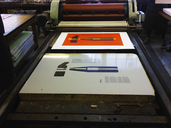
Beautiful color prints by Tom Hingston Studio for Danish mobile phone brand Æsir. Working at Edition Copenhagen during a two week residency, Hingston produced 100 copies each of these lithographic prints for potential customers. Creative Review has a detailed write-up of the entire process:
Lithographic printing dates back to 1796 when Alois Senefelder discovered a way of printing from stone. Lithographic ink is applied directly to polished stone from where it is transferred to the paper. Each colour requires a new stone, so the process is both slow and very expensive but does produce incredibly vibrant colours.
I really wish I could see these in person. I’ve done some screen printing and letterpress for my projects and have been pretty happy with the results, but I’ve never tried lithography. Anybody with lithographic experience care to share their thoughts?
via Creative Review


Just about as good as it gets.


The second issue of Eureka — a new science supplement to The Times — is out and it’s looking like a design classic in the making. Matt Curtis (art direction), Matt Swift (information graphics), and David Loewe (design) comprise the design team for the new publication. Going to have to track down a copy for myself.
Browse the full issue here


As many times as I’ve listened to Tame Impala’s Innerspeaker and thought how perfectly the cover suited the music, for some reason it never occurred to me to fin out who designed it. Luckily today I stumbled across the answer. Leif Podhajsky, the artist behind the Tame Impala packaging, is a Melbourne based artist and creative director. Really beautiful, psychedelic stuff in there. Loving how he blurs the lines between the found art and the post work, all very fluid. I believe he also works with And Melbourne who have some equally stellar work in their portfolio.


Work by Rolf Harder; this may be some of the most inspiring stuff I’ve seen in a while. More info from Harder’s bio at Roch and Harder:
Rolf Harder was born in Hamburg, Germany in 1929 and studied design at the Hamburg Academy of Fine Arts. In 1959 he moved to Montreal and established Rolf Harder Design. In 1965 he founded Design Collaborative—a graphic design and industrial company with offices in Toronto and Montreal—with Ernst Roch, Anthony Mann and Al Faux. Together they produced catalogues and booklets, trade marks and symbols, bearing “visual clarity and direct, effective communication”. The style of their design work “combines constructivism with a leaning to playful experiment”.
More of Harder’s work can be found at the MOMA archive. Interesting to see the progression of his work all the way up through the ’90s. It seems like right around end of the 1980’s the style of his work (at least what is represented at the MOMA site) sort of got watered down. No doubt a reaction to the times and the needs of the client. I wonder if, looking back, a designer like Harder would prefer any era of their work over another. I guess for me it’s obvious what I like most, but I wonder if Harder himself would say those Esprit covers, for instance, were better than his earlier work.


Really refreshing illustration work from Kilian Eng. I’m really getting an Avant Garde Magazine / 70’s-80’s illustration vibe from all this. Love the use of texture, it all feels so authentic.
More of Eng’s work and inspiration can be found at His Tumblr. (thanks Francisco)
Kilian Eng via BDIF