Saw this on FFFFOUND and thought it was interesting. It was just an image named "Pythagorean Tree" so I looked that up on wiki and found this. I recently saw some pictures of plates with these super detailed illustrations of owls on them, all done in that fractal style. The tree reminded me of them, does anyone remember the plates I am talking about? They’ve been making the rounds on design blogs for a while now.
Found this one at NAGO (Nederlands Archief Grafisch Ontwerpers). Some other very nice images there.
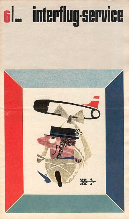
Not sure what this is exactly… In flight brochure? Not too keen on the illustration but the header/type is spot on.
Image via Anthony Mark

Interesting Cretive Review piece about Olympic Logos:
"With the enormous barrel of nastines currently being dumped all over the London 2012 logo, we wondered what the reception might have been for some of its predecessors had they been released today. What comments, for example, might the Herr in the strasse have come out with when confronted with design’s holiest of holies, the Munich 1972 logo?"
Read the rest of this article >
If you read down to the bottom you’ll find this surprising bit of info:
"As we revealed here, the final 72 logo is not solely Otl Aicher’s design. Aicher had wanted to use a radiating sun (which was later put to good use by the German lottery) but it was deemed impossible to copyright. His design was put out to competition, the winning entry, as judged by a panel including Aicher, being Coordt von Mannstein’s (literal) twist on the original."
And on a side note the type is set in Univers, so nice.
Image via FFFFOUND!
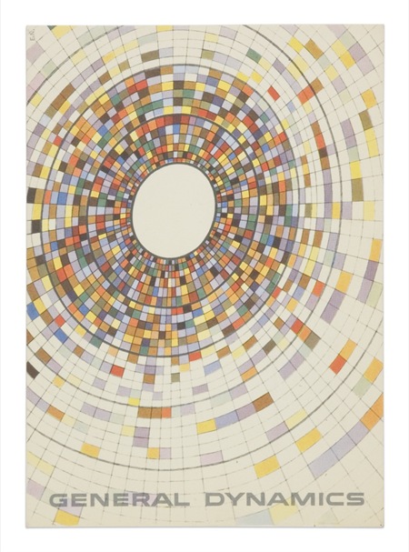
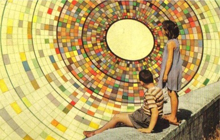
The top image is a General Dynamics postcard by Erik Nitsche. The lower is from Joel Johnson’s flickr page. The background illustrations in each appear to be essentially identical save for some rotation. If you look closely at the children in the lower one you can see they are superimposed rather poorly (note the black outline from the sloppy clipping path). I wonder if this was someone appropriating the artwork or if this was some General Dynamics-sanctioned variation of the original (doubt it). Interesting either way; I think I like the yellowed, saturated version on the bottom best. The composition of the top example, of course, is superb.
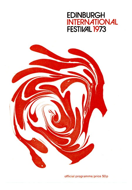
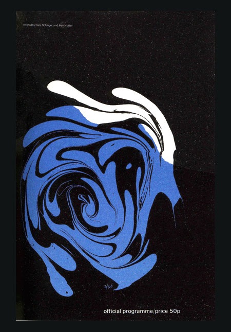
Couple nice programs from the Edinburgh International Festival 1973. Some good Avant Garde action going on in the top one.
Via FFFFOUND via ALKI1

Illustrator Jimmy Turrell has updated his portfolio, really like his style. You may remember the lower image from this post, Jimmy was kind enough to send in the illustration by itself.
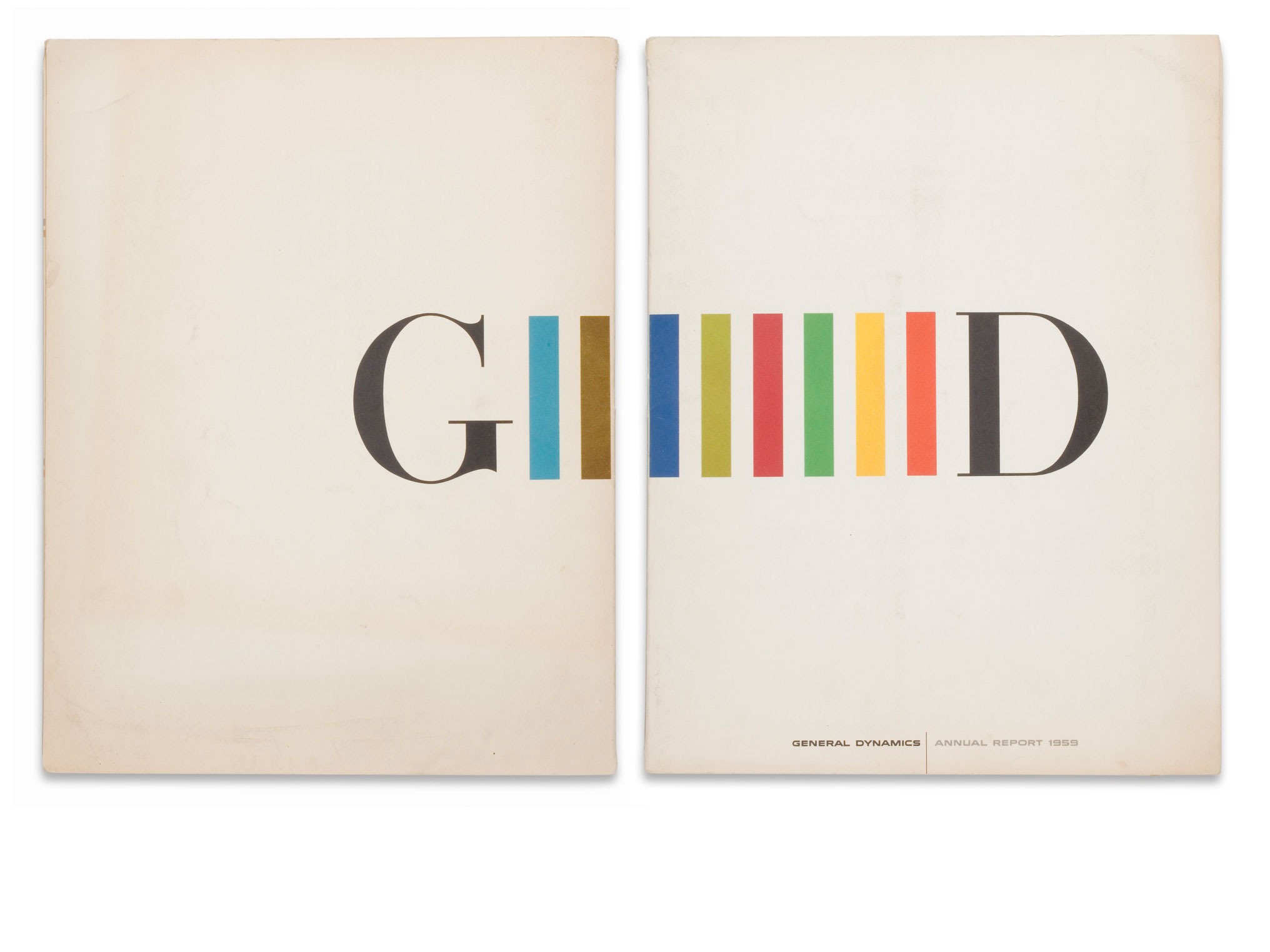
 Erik Nitsche’s cover for General Dyanmic’s 1959 Annual Report. (Back and Front)