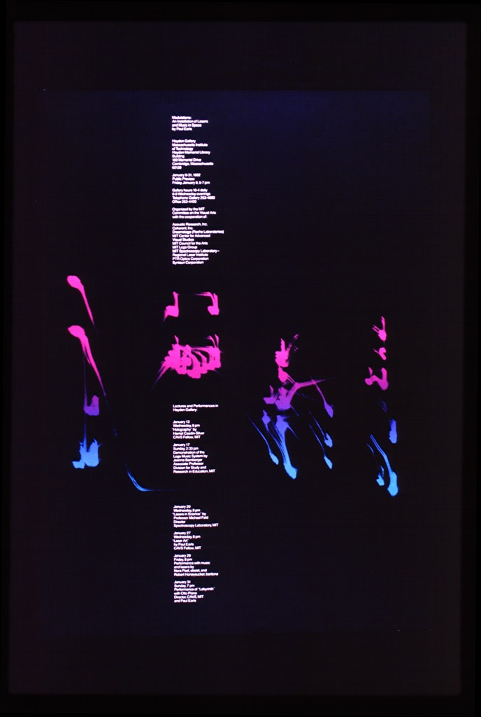
Matt Maust is the Bassist for Cold War Kids and a great designer as well. Their album Robbers & Cowards has really been a sleeper hit for me. I first became aware of them a while back but sort of thought Hospital Beds was cool and left it at that. But lately I’ve been working to the record and really enjoying it as a whole.
Today I checked on their site to see what they were all about and was greeted by the lovely image you see above. Once inside it just gets better. I’m always a sucker for the big-gothic-type-on-photographs motif, and here it’s done very well. Even with the most talented designers, a lot of the time you can see through to the fact that the artwork for a band was project / money driven. In the case of an outfit like Cold War Kids, I think the (literally) DIY design ethic shines through to great effect. But at the end of the day, it’s not how you look as a band, it’s how you sound.
Cold War Kids – Hang Me Out To Dry
[audio:dry.mp3]

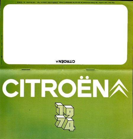
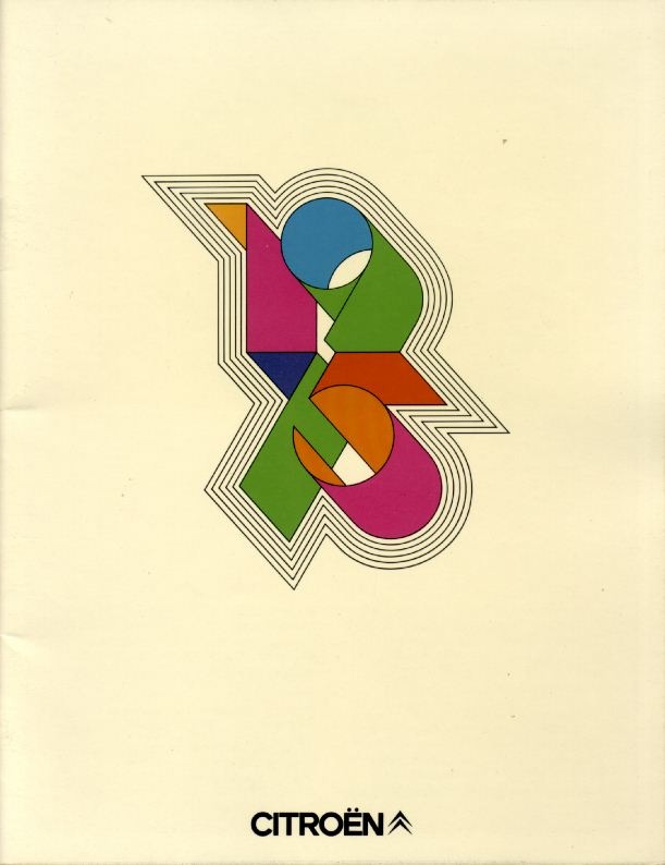
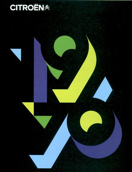 Some more Citroen Brochure covers from the Citroen 2cv Pages.
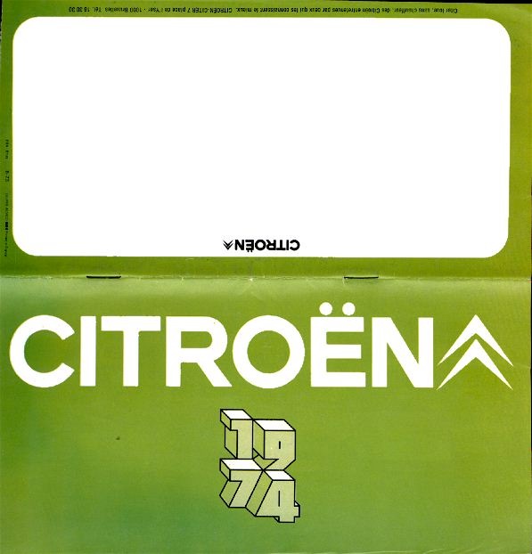
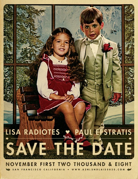
After reading Jefta’s comment in the J.Casey piece I realized I hadn’t been posting much of my own work lately so I decided to put up this wedding announcement I did for my friends Paul and Lisa. I normally wouldn’t post personal work of this nature but I was happy with the result and thought it would make a good exception. To tell you the truth, these are usually my favorite projects; there’s no money involved, no client to compromise for, and no concerns over whether it will be well received by the public. Sadly, it seems this sort of project is the exception not the rule which is unfortunate given that most of us started out in this business purely out of love and enjoyment of art and the process. The other good part of these projects is the timeline, or lack thereof. But as usual, I put this project off until the last minute so I only had a night to complete it, which ended up making it a bit more enjoyable as I knew there wouldn’t be the inevitably endless revision process to attend to after completion. As this was intended to look like a retouch or a painted piece, I was a bit more free to be heavy handed with the lighting effects. This would have been far more difficult if I was going for a photo-realistic look.
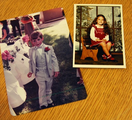
So when my friends approached me about creating this we threw around various ideas. In the end they came up with the idea of combining photos of them as kids. Unfortunately all the photos I had to choose from were very different in terms of lighting and color. I’ve never considered myself much of an expert at photo manipulation but this project made me realize just how little I really knew about the process; I definitely struggled trying to get the two photos (pictured below) to look right together. The shot of Lisa was an artificially lit, indoor studio portrait, the other an outdoor snapshot, so it was tough to get the lighting right. I decided to use Lisa as the reference point since she was well lit and then bring Paul closer to that tonal range / lighting condition. The original shot of Paul was taken at dusk as the sun was pretty low in the sky behind him so I ended up doing a lot of gradient masking of color balance and curves transition layers to compensate for the overly dynamic lighting that resulted from the conditions of the original shot. The background imagery had to be scaled up a bit, I cloned one of the windows and did some tweaking to the contents to make room for the added subject. Finally, I added some shadows to Paul’s right side to account for the new position of the lighting and Lisa’s position relative to his.
As for the art direction, I wanted this to feel a lot like an illustration or painting so I did a lot of dynamic lighting, unsharp mask, and some artistic filters to shift it in that direction. The imagery of the existing studio shot of Lisa had a distinctly European thing going on so I tried to push further in that direction to evoke a sort of vintage Swiss-era poster vibe. For that reason, and because this was just the announcement and not the wedding invitation itself, I chose the Futura typeface to give it a fresher feel (than a typical wedding invitation) while at the same time maintaining a sort of classic design sensibility. And of course I went with some loose kerning to give it that Anderson-esque vibe.
Finally I applied some paper effects (blending mode stuff etc.) to give it a real world feel. I have a bunch of vintage poster reproductions hanging around my house and always enjoyed that copy-camera style they give off. While I was overseas a couple years ago I went to a gallery that had a lot of the originals of the stuff I have at home and I got to see them in person. I realized I actually enjoyed the reproductions more, they have a nice grain and vingetting that didn’t show up in the originals (which were typically painted and so also didn’t show the yellowing of aged paper and ink.) This is the kind of aesthetic I am usually trying to achieve in most of my poster work, I want it to feel like a reproduction of an original printed piece.
All in all this was a fun project, I think we as designers should take on more work like this. Free work for friends always helps reacquaint me with the aspects of design that drew me to it in the first place; it gets me excited about the process again, an emotion that I think easily spills over into the jobs that come after it.


The darker side of Jacqueline Caset. Via RIT
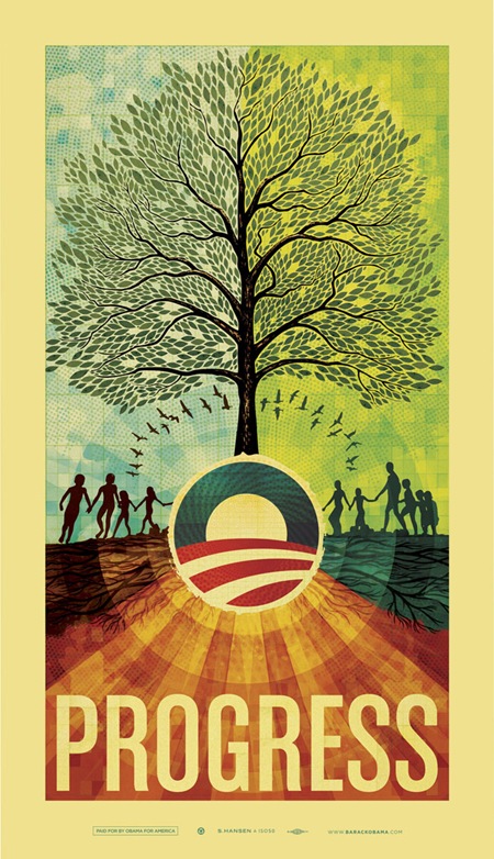
The Obama print sold out over the weekend, 4300 of a limited edition of 5000 (the final 700 were previously reserved). Thanks to everyone who picked one up, I am sure the Obama campaign is very thankful for your support. Sorry to anyone who missed out, I will definitely be doing what I can to make these available in a different form soon.
This was one of the largest format prints I’ve ever done and it got me excited to start converting some of the old designs to larger formats. Be on the lookout for the big stuff soon. For those of you waiting on the case study I was going to write for this piece, I’m sorry for the delay. This past month has been nothing short of insane so I’ve been playing catch-up on a lot of front. I am shooting for having that out this week.
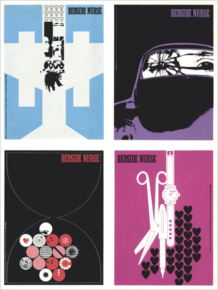

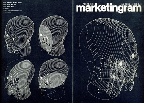
Some random beauty from Graphis 71/72 via The Nonist. These are from the same issue as that Dietmar Winkler piece I posted a while back (one of my all time faves). The Bedside Nurse stuff sort of reminds me of Air’s Virgin Suicides OST cover.
1. Charles Goslin / David Barnett. Covers for the magazinebedside Nurse. (Look very modern don’t they? But the bigger question “Bedside Nurse magazine?!")
2. By: Kohei Sugiura. Front and back covers of Marketingram, the Shiseido house organ, here dealing with the morphology of the human head.
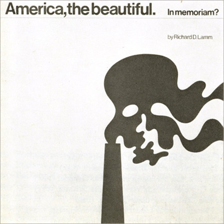
3. By: Ron Hughes. Cover for a record about ecology. (Gore could have used this for An Inconvenient Truth 35 years later.)

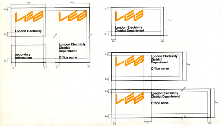

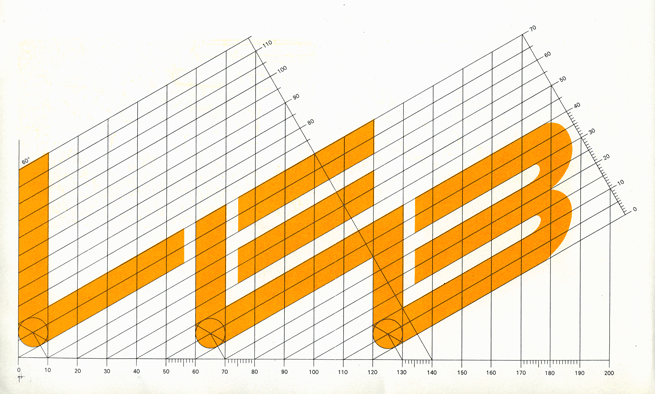
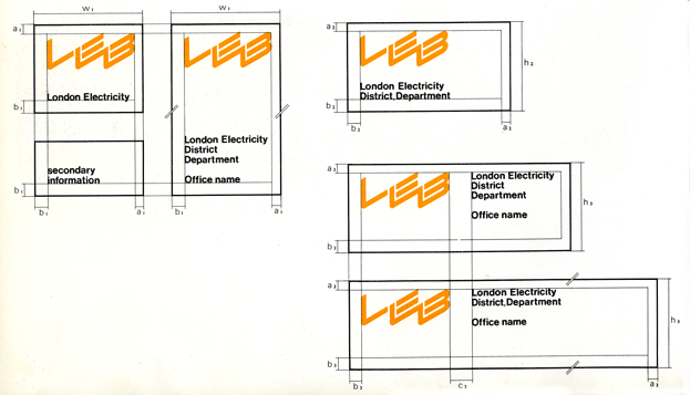
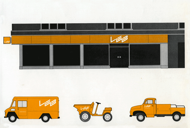
Some British logo design and great grid action via Alki1.

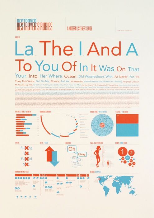
Jez Burrows’ expression of ‘Destroyer’s Rubies’ by Destroyer. They’re sold out but you can at least read a bit more about the idea behind them at Jez’s site. Great typography and color. Via FFFFOUND