Just a small collection of oil company maps I’ve found around the web; I wasn’t aware of this fascinating sub-genre of design. This is the sort of throw-away stuff that for some reason is the coolest thing to find in the garage drawer it’s been sitting in for 30 years. I think that Hawaii one is actually just a Casino Versus Japan 12″ cover. That German one is ridiculous; leave it to them to design a map that they give out free at the gas station that betters the collective output of United State graphic designers for the entire calendar year in which it was produced. Way to go guys.
These images are by New York City based artist Robert Longo. Props to but does it float for spotting these, truly a great find. I have always been fascinated with anything and everything to do with aviation, so these are of obvious appeal. The coolest thing is the process behind them; though they look like photographs at first, they are actually graphite and charcoal drawings, based off projected photographs. The background disappears and all that is left is the strikingly detailed subject. These pilot renderings are my favorite, but much of his other work is up on his site for your enjoyment.
I had seen Aron Jancso’s “g” poster on Buamai earlier but just recently saw more of his work. Very impressive mastery of typography. Check out his Flickr for more.
It’s always great to learn about new artists and Paul Tebbott is no exception. Alex sent me Paul’s site today and I was really moved by his color choices and restrained use of texture and distressing. Paul seems to be just getting started — as evidenced by his relatively small body of work — which is all the more reason to believe we’ll be seeing lots of great things from him in the future. If that’s not enough for you, Paul also has a music project that Boards of Canada fans will surely find enjoyable.
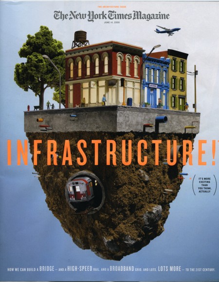
The New York Times Magazine is the reason I wake up early on Sunday morning. Excellent photography, fascinating articles, and sophisticated design fill its pages week to week. It was recommended to me when I started graduate school and I haven’t missed an issue since.
This week the Times rolled out a new, svelte version of the Magazine. Like everyone, they are cutting costs where they can, and it was determined that reducing the size of the magazine by 9% would save them millions in paper costs. To accommodate the smaller page real estate and squeeze in more words, they enlisted Lyon Text, a more condensed typeface than they were using before. It’s a very subtle switch, and as they say, “Perhaps if we hadn’t mentioned it, you would hardly know the difference.” Where the change is most obvious is with the two new display faces: Knockout (H&FJ) and Nyte (Dino dos Santos). Both work really well in the new layout; definitely my favorite part of the redesign. They have also reworked the table of contents, changed the section order a touch, and sprinkled a multitude of new design elements throughout.
I think Arem Duplessis and his team have done an incredible job. I loved the Magazine before, and was initially concerned they might mess with a winning formula, but I think they succeeded in turning budget induced page shrinkage into a successful and well-executed redesign. Intact is the nuanced and ultra refined look and feel that first caught my eye. The smaller size is actually more manageable (a la Rolling Stone), and afforded them the opportunity to make the exciting upgrades. I don’t think anyone will miss the extra millimeters.
note: There were two covers that came out with the redesign. The one above, with a model by Thomas Doyle, was my favorite, but be sure to check out IC4Design’s version on the NYT website if you’re interested.
If you’re graduating in the middle of a recession, it’s likely that an arc of despair trumps the impending thrill of your newly-liberated station in life. Conversely, though, I can’t imagine a better time to get out of school. Nobody’s hiring, but why let that stop you? While the mechanics of, say, having a roof over your head suggest that a little modest income might be a good thing, the actual economics of making work no longer depend on an actual employer. The portfolio no longer means a big black suitcase schlepped around from studio to studio. Get your work online, put your videos on YouTube, and get busy.
I am about 1-2 years out from graduating myself and I already feel the jitters of the “what next…” syndrome. The world of design is changing so fast, every day, and it can be quite an intimidating place to look out upon from within the graduate school bubble. Sometimes I feel like being a student is like being a star college basketball player; floating along no problem in this league—making threes, hitting jumpers, dominating the *paint*—only to be in for a big surprise when you graduate to the Pros and get dunked on by guys double your height and ability that got recruited straight out of high school.
The cries of “nobody’s hiring!” that sound throughout the design world can be periodically distressing, but also inspiring in a backward kind of way. As Ms.Helfand alludes to above, the traditional model of graduate/interview/work for studio is not what is necessary anymore (and thankfully!). New opportunities exist, and as long as you have that hyper-awareness and ready ability to adapt, you can take advantage of them just like before. At least that’s the way it seems from inside the bubble.
It does seem like a scary time to graduate now (and probably will again in a couple years), but the optimist in me agrees with her letter and isn’t concerned. Everything is going crazy and I’ll just try to stay crazy right along with it. Read the full letter on Design Observer.
I posted on Andy Gilmore last year and I stumbled across his site again today. Looks as though Andy’s been busy, there’s a lot of great new work up at his site. This stuff would be great large format.