Some classics via Helloairecords. It always amazes me to see such forward thinking design from this period. It’s 1955 and design this evolved already exists, it’s incredible. Of course, this is Europe. Unfortunately, most of us in the states were too concerned with Elvis and Marilyn Monroe to appreciate the finer points of the grid system or minimalist design theory. There is something very pleasing about such simple shapes and colors modulated by the quirks and imperfections of the analog printing process, it really brings life to the composition.
Adolphe Jean Édouard-Marie Mouron is one of my favorite commercial poster artists. Unfortunately, he went from running a successful advertising agency (Alliance Graphique who’s work includes the Yves St. Laurent logo), to losing it all and serving in the French army in World War II, to doing set design to get by, and finally suffering from depression and committing suicide in 1968. It’s very sad to think this was the fate of a man who contributed so much to design. You can find more information on Cassandre here and here.
Perhaps his most recognizable work, the Dubonet Wine poster is all but ubiquitous in vintage poster collections these days. This style of poster art is sort of a bittersweet thing for me. I really do love it, but once you start seeing something sold at Target it’s hard to take it seriously as art. I have a few old advertisement posters from this period around the house (all reproductions), but I really want to start focusing on later modernist stuff.
Apparently the Manifest Hope DC show was a big success with a great turnout. Theodor3 posted the pic above on flickr and Piecemaker has some up as well. Unfortunately, I don’t have any personal shots of the print as I didn’t get a chance to grab any before the framed version went out. The print sold so maybe the purchaser or someone else with shots from the show could send a full size head on of it. Notcot also has a lot of great shots from the show here and here. Thanks to everyone who came out and supported, wish I could have been there to see it for myself!
My “Progress” print will be featured in the upcoming Manifest Hope:DC Gallery as part of the lead up to the inauguration ceremony on Tuesday. The gallery runs Saturday, Jan. 17 through Monday, Jan. 19 in DC. I had #112 of the original 200 I signed at press framed and shipped it out last week. Unfortunately, I won’t be able to attend, hopefully somebody can check it out and let me know how it went. Here’s the details:
The MANIFESTHOPE: DC Gallery will be open to the public in Washington, DC for the days preceding the Presidential Inauguration, Saturday, January 17th, 2009 through Monday, January 19th, 2009 between the hours of 10:00 AM – 6:00 PM. Art exhibition management will be provided by our Washington, DC gallery partner, Irvine Contemporary.
MANIFESTHOPE: DC
January 17th-19th, 2009
10:00am – 6:00pm
3333 M Street NW, Washington DC 20007 http://www.manifesthope.com
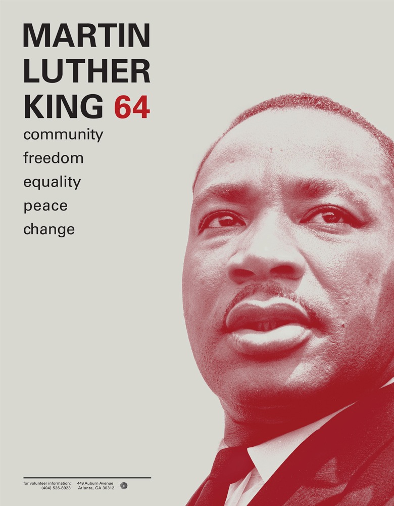
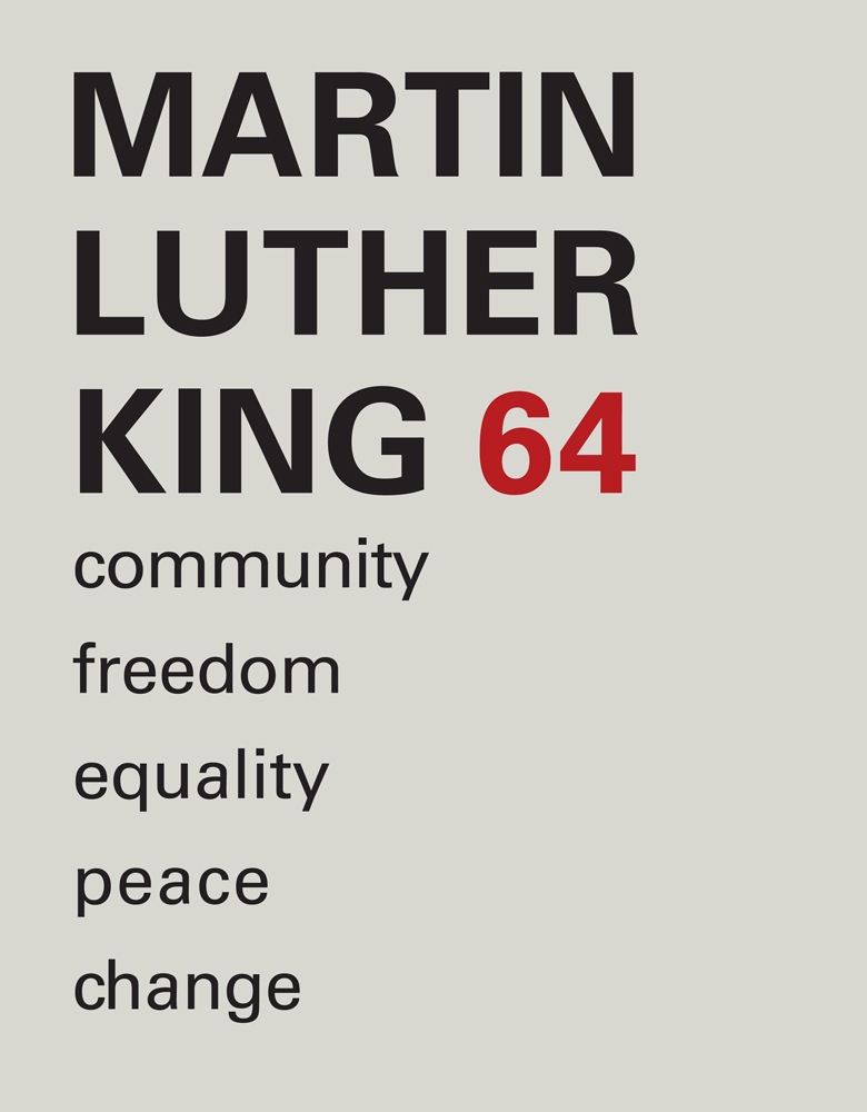
This student project by Ryan Hageman caught my eye today. Very nice color / typo interaction and a clean, direct style. There’s more over at his site notfreelance.com
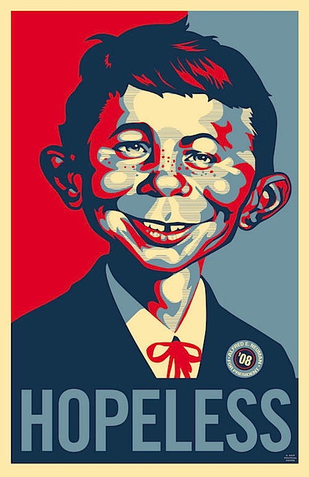
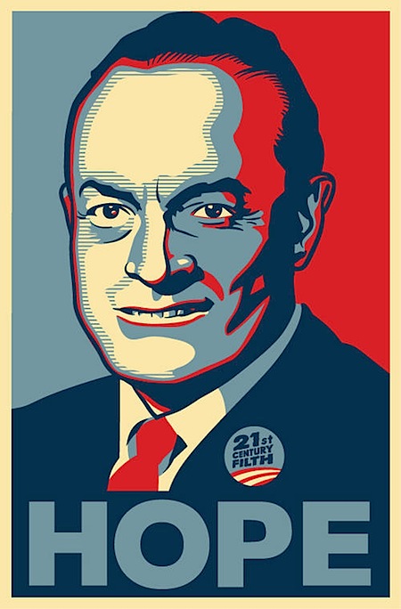
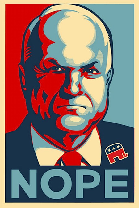
One testament to the success of Shepard Fairey’s iconic (and nearly ubiquitous) Obama poster is the sheer number of spoofs that have turned up since he created the now famous image. The Village Voice has compiled a rather comprehensive collection of them; some are good natured jabs while others come off a bit more incendiary. Either way, it’s an interesting look at the flip side of the veritable phenomena and centerpiece of a revolution in the visual communication and branding of election campaigns. I particularly like the Mad Magazine take pictured above; as a kid I obsessively collected every issue I could get my hands on and it’s great to see them still at it. Link