Plastolux posted up these wonderful shots by Matthew Donaldson of various Dieter Rams artifacts in their natural habitats. Unfortunately though, if placed in my house — being the cluttered mess that it is — most of these poor creatures would wither and die in a matter of days. There just aren’t enough clean lines and pristine spaces to support their minimalist German sensibilities. Someday… Although seriously, can anyone get anything done in an environment like this? I’d love to see Jonathan Ive’s work space, I would bet it doesn’t exactly mirror his design aesthetics.
One of the most important non musical to do’s for a musician/designer is getting a proper press photo in my opinion. This is your chance to show a ton of your personality and a big step in getting writers on board for a feature or helping them to understand your musical direction at that time. This doesn’t mean you have to show your face, take for example the fact that we never saw Burial’s face for more than a year — we just had that drawing of him — but it set the mood I thought. If you’re a musician or even graphic designer, I think brainstorming out some ideas first is well worth your time when doing a press shot. We’ve all worn out the standing in a urban landscape, the blurry shot at a live show, or standing still like a mannequin with a white background. So from 2009 and on i’d love to see photographers really grabbing the personality out of their subjects (Timothy Saccenti’s excellent work comes to mind). This kind of effort in a press photo could make or break you chances with bloggers or writers many times prompting them to use your photo above a couple other things they’re writing about that day. At any rate, a good shot definitely increases your chances of being written about.
Above are a few of my favorites [from top to bottom: Kraftwerk, Boys Noize, Erlend Oye, Jimmy Edgar, Jarvis Cocker]
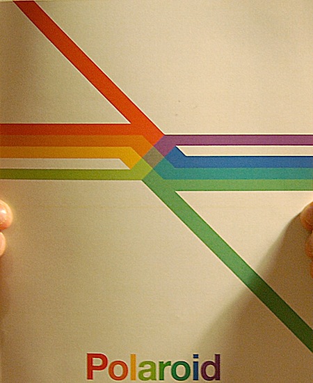
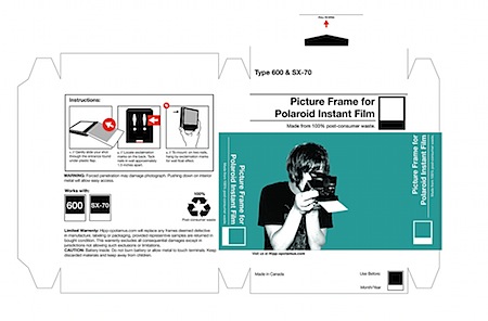
Blog reader Christopher Edwards has some interesting Polaroid-related projects over at his flickr page. There’s a mock Polaroid annual report with a very nice cover graphic (above) and some packaging concepts too. Be sure to check out his other photography, he’s got some great time zero film examples in there.
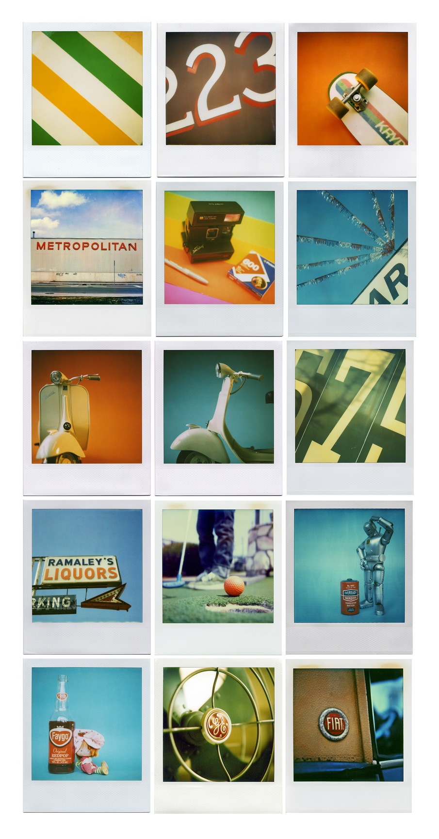
In case you missed it, Polaroid has ceased production of it’s iconic , eponymous film. The company says there’s enough to last through 2009, but after that it’s all over. Shaun Tubridy set up the Save Polaroid site to raise awareness and CNN ran a piece on the whole situation and Tubridy’s efforts. Turbidy, a graphic designer, is also an avid Polaroid photographer with a very nice flickr portfolio, the source of all the images in the collage above. Pretty sad to see such a wonderful piece of pop culture be pushed into extinction by digital, but I suppose it was inevitable. Let’s hope Lomo or some other third party picks up the torch and finds a way to reproduce Polaroid film. How man of you use Polaroid film? Has the production shutdown effected you yet?
Update: As Jones pointed out in the comments, Polapremium.com is still selling Polaroid film but, as the name implies, they’re selling it at a premium: $15–$130 per pack. At prices like these, just buy a medium format Rolleiflex with the money you would have spent on film.
I wasn’t sure if this new shirt and thermal were going to get printed before the new year, but we were able to get them out this week. The new Black on Black 50/50 American Apparel Tee (pictured above) and cotton AA Thermal are now available at The ISO50 Shop. These are going to drop in the ad on Monday so get them while they’re still around (as always, I’m posting them here on the blog a little early).
On a somewhat related note, I’ve always found it difficult to photograph black objects and this shirt was no different. The contrast between the paint and the shirt is a lot more subtle in real life (and the paint isn’t grey, it’s black), some more accurate pictures are here (taken by the guys at Merchline who have been shooting all the recent model shots for the ISO50 storefront). Apparently I need a gray card because I’m using the same lights as them: The Calumet Quattro (more on that later) and a tungsten Smith/Victor photo flood. The picture above was overexposed for effect, but even when I’m trying to be as color accurate as possible I’m still running into trouble. I was definitely happier with how these shots came out and it’s getting frustrating because I was using the same lighting setup, same exposure settings, and same room to shoot them. Does anybody out there know much about this phenomenon or how to correct it? Any advice would really be appreciated in the comments.
In other news, Alex brought by his Wacom Intuos 6×8 today. I really enjoyed working with it, I’ll be posting on that more tomorrow. Thanks again to everyone who took the time to respond to the Wacom: Which Size? post. It really helped a lot.
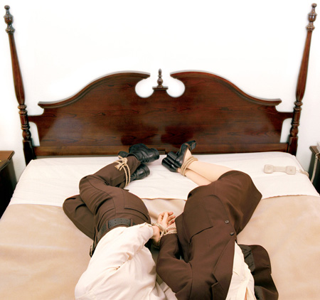
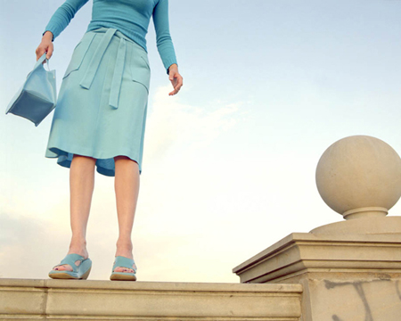
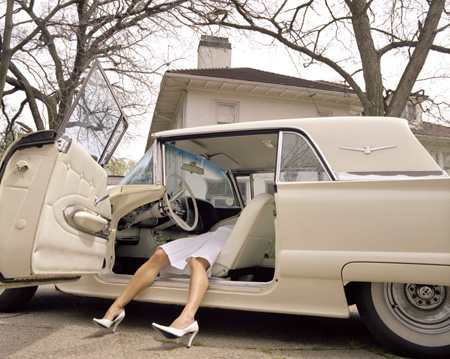
I’ve always been a fan of Nicola Kuperus photography so I had to share a few of my favorites. If you recognize her name it’s probably because of her band Adult.
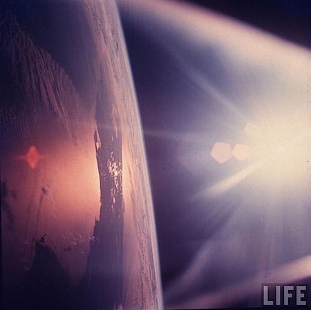
Life Magazine and Google have partnered to make over 10 million photos from the Time/Life archive available online. The images are searchable and all available at pretty good resolutions. (Athough probably not quite big enough for print) You could have some fun lifting textures and elements for web stuff I’d bet, the quality is more than enough for the screen. What’s even crazier than scanning 10 million photos is that apparently 95% of the them have never been seen before. The few I posted above were just from a couple minutes of random searching, I can’t imagine what you could turn up with a little effort. Check it all out over at Google Images’ Life Archive page.


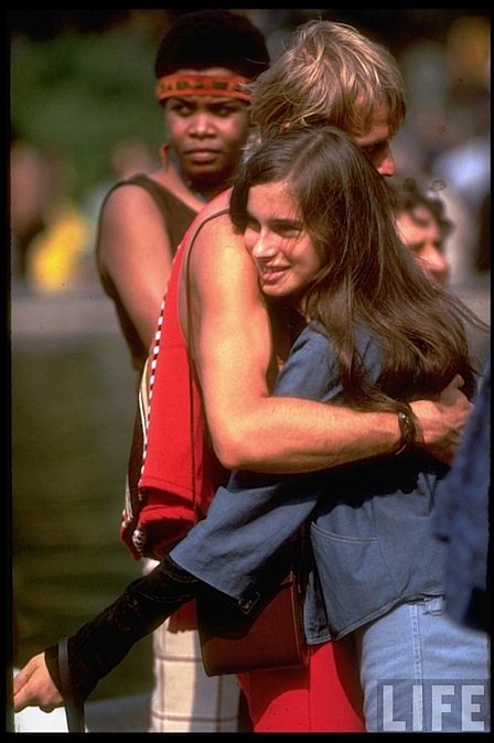
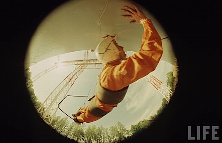
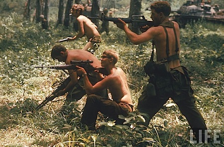 Life Magazine and Google have partnered to make over