While digging up facts for the recent Saul Bass branding post, I came across an interesting analysis of the AT&T logo redesign on Speak Up today. As you probably know, a few years back AT&T axed their original, Bass-designed mark in favor of a new, more modern version. Check out the comments of the article for an earful of various opinions on the transition.
James White has posted a very nice collection of Saul Bass logos at his site, Signalnoise.com (also very nice). Going through this list, I am pretty amazed. I knew Bass did a few of them, but some of those are big surprises. Link
So the much anticipated / extremely controversial Beijing Olympics are in full swing and despite the issues surrounding the host country, the games themselves have been incredibly entertaining. From a visual perspective the whole production is off the charts. If you didn’t see the opening ceremonies, do yourself a favor and watch the replay. I can’t even begin to describe it so I’ll just say there was a roll-up LCD screen about the size of a football field and a mass-scale drum display that looked like some sort of giant human Tenori-On.
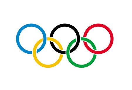
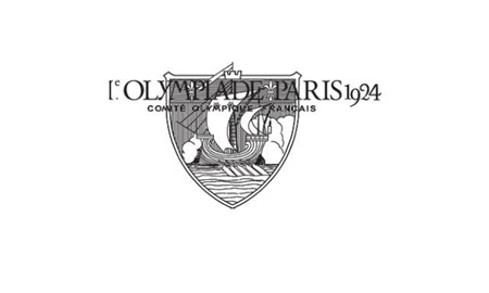
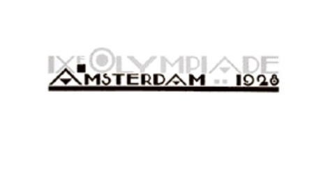
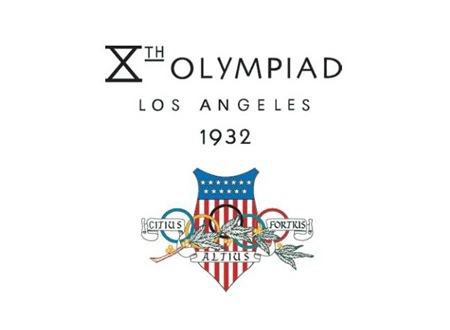
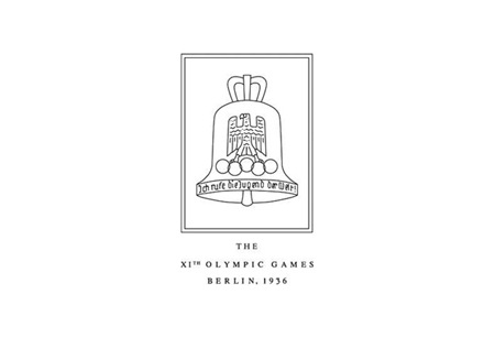
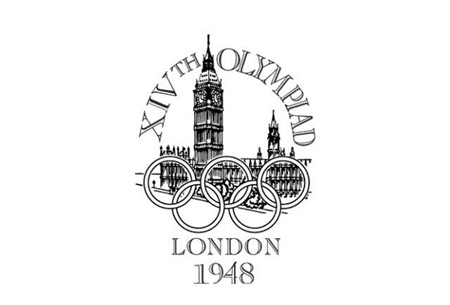
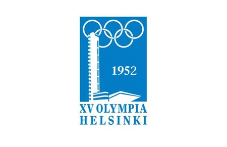
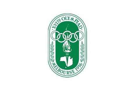
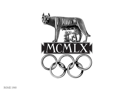
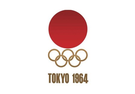
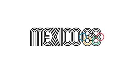
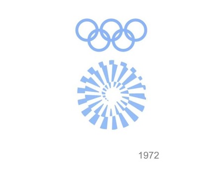
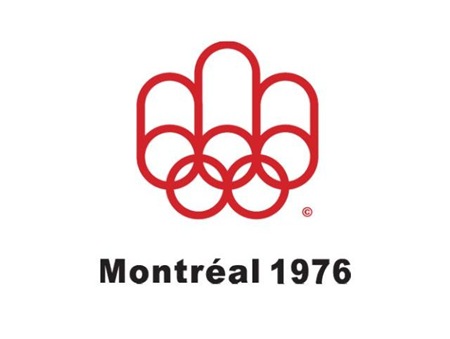
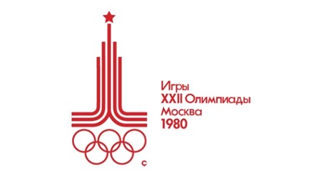
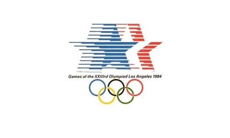
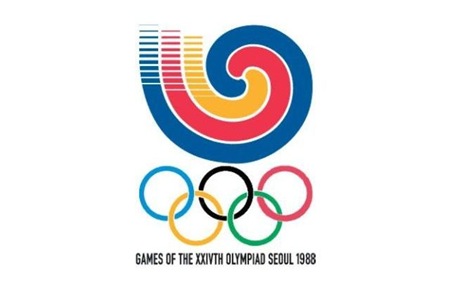
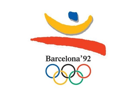
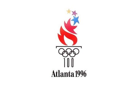
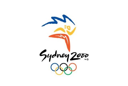
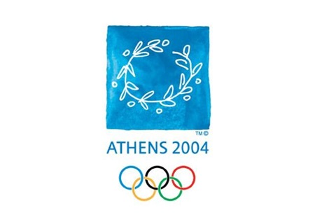
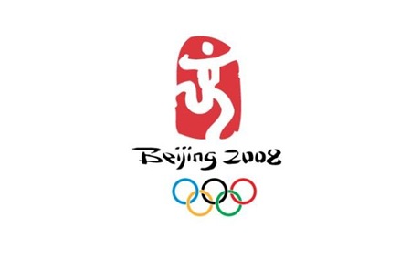
Obviously branding and information design are central to each Olympic experience and while I’ve posted a lot on past Olympics, I thought it would be good to get all of the logos together in one post. It’s very interesting to scan through these; the stylistic transitions say a lot about the country and historic era of origin. Helsinki kicked off the modern approach, but then Melbourne and Rome had to go and screw everything up for 8 years. Tokyo ’64 started what turned out to be a 24 year winning streak of incredibly well thought out, masterful logo designs which continued unabated until Seoul decided to kill the party with something that can only be described as inexplicably bad. From then on out it was a lowest common denominator free for all of middle of the road mediocrity. This, of course, coincided with the dawn of cheap, accessible desktop publishing where everyone all at once decided to forget everything they had ever learned about typography and color theory. I think this was also around the time that the Olympics was maturing into the massive corporate money machine it is today, so the shift in style makes a lot of sense given the new set of imperatives driving the branding (i.e. MAKE AS MUCH MONEY AS HUMANLY POSSIBLE).
Although there were 8 games prior 1924, I’ve started with Paris as it seemed to be the first of the modern games that had a specific logo mark associated with it. Most of the earlier games had posters but nothing you would consider a logo. Also missing are 1940 (Tokyo > Helsinki) and 1944 (London) which were both canceled due to World War II.
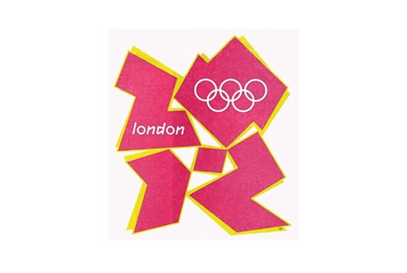
And it wouldn’t be completely without a peek into not-so-distant, yet oh-so-hideous future (London 2012). To tell the truth, something about this is starting to appeal to me. At the very least I can say I prefer the 2012 logo to some of it’s more boring ancestors (i.e. 1988-2008).
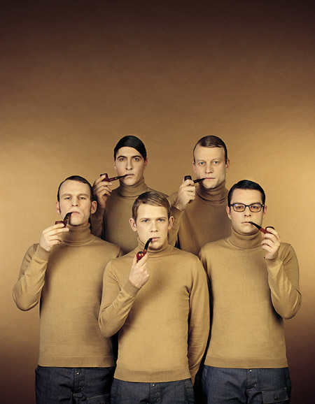
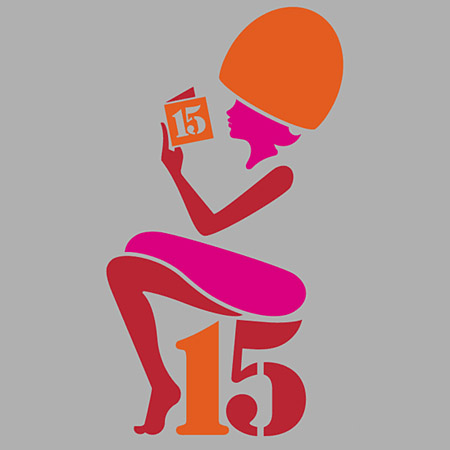
Buro Destruct was one of the design bureau’s i found after finding Scott’s ISO50’s work that i really enjoyed. I was mostly drawn to the bearded guy icon and their poster’s they did for artists on Warp Records 5-10 years ago. I love their well thought out press photo though and books they’ve put out over the years.
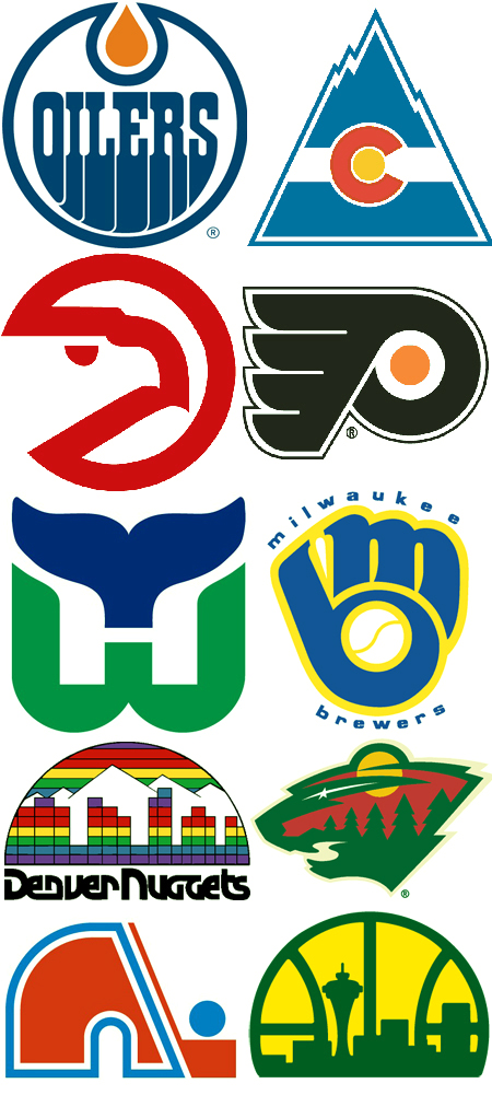
These are just some of the major league(NHL, NBA, MLB) sport logos that i’ve enjoyed over the years. Most of them i like for different reasons some simply just the color scheme, clever layout, or unique shape. Some of these I thought could’ve be done a tad bit better like the Minnesota Wild logo one where the trees really struggle but the forest elements are all there in pretty creative way like the path for a mouth is pretty genius i thought. I also was missing good versions of the Philadelphia Phillies logo that was bold light blue and maroon or the old Houston Astros uniforms that a lot of people rip on but they’re abit of a guilty pleasure for me.
Logo identity from left to right and top to bottom: Edmonton Oilers, Colorado Rockies(the hockey one), Atlanta Hawks, Philadelphia Flyers, Hartford Whalers, Milwaukee Brewers, Denver Nuggets, Minnesota Wild, Quebec Nordiques, Seattle Supersonics
A small collection of Network Identifications from the 60’s-80’s. I always loved the synthesizer work on these and the mechanical video effects are something you just can’t fake. The second one down is the OEPBS (Oregon PBS) sign off from the 80’s. The beginning is just the standard PBS ident, but watch until 0:35 and you’ll seen their own amazing logo animation complete with warbling analog synth melody.
This has me feeling a bit dated, I remember vividly each of these (with the exception of the Oregon PBS Ident).
This So-Me directed video for Justice’s DVNO features a somewhat similar style to the Oscilliscopy Catalog from a couple days ago. Justin posted this in the comments and also included a link to a high res MOV version here.
The video is basically a remix of a bunch of old logos, some interesting stuff. I personally think the whole thing is a bit clean, would have been nicer if they did it with authentic techniques or just put a little more effort into grunging it up a bit. But perhaps they were going for this style, or perhaps they didn’t have the 2 years it would surely take to make this with mechanical video effects. At any rate, a fun clip, and below it is an interesting French spot featuring more of the same oscilloscope-styled graphics.
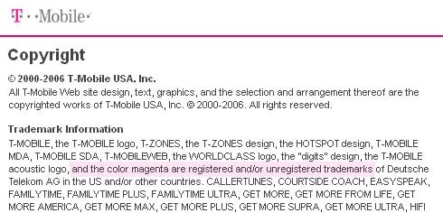
So I just learned today that my ex-wireless provider, the German T-Mobile, is attempting to own magenta. Yes, they want to own a color. Here’s a discussion on Engadget that does a bit to downplay the whole thing and a site dedicated to reclaiming magenta. Let’s just hope they don’t change their logo to a rainbow, we’ll have to start designing in grayscale again.