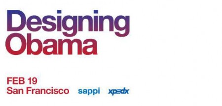
Sol Sender and Scott Thomas, the minds behind the Obama logo, will be in San Francisco in a couple weeks to talk about the process and development of the campaign. (Recall the Obama Logo Design videos that circulated a while back) I love hearing designers talk about their work, and even though I’ve heard just about everything possible regarding this logo, it should be interesting to hear them explain and answer questions about their process, in a live setting. The event is free. Register here.
Designing Obama
February 19th / 6-8:30pm
Morgan Auditorium
491 Post St at Mason
San Francisco, CA
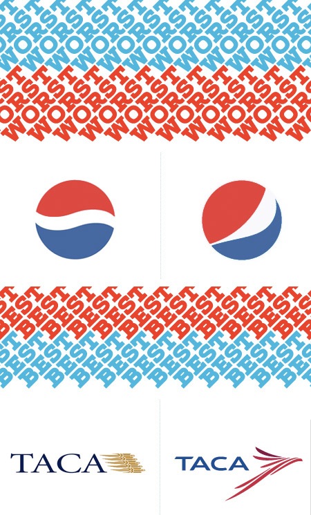
With all this talk of brandinglately it was interesting to see Under Consideration’s Brand New blog’s picks for Best & Worst Brands for 2008. The ever-controversial Pepsi re-brand predictably made the worst list while 826 Valencia and Taca headed up the Best-of column. There were some surprising omissions as well as a few controversial picks–as the 126 comments and counting thread will attest to. Check out both full lists here.
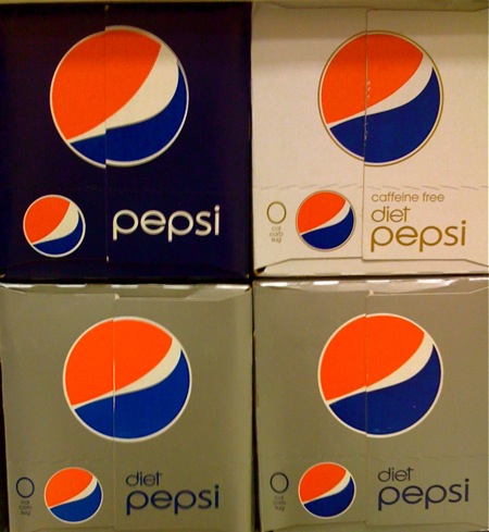
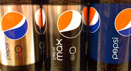
Pepsi stepped up it’s game in my opinon and simplified their brand really nicely (Please excuse the iPhone camera photos but I didn’t bring my camera to the grocery store like usual). Not only did they change the logo, but they’ve changed the swoosh slightly a bit for each variety of (i.e. Diet, Caffeine-Free, and Max). I was pretty impressed mainly because they had the new logos sitting next to the old ones which has these blue pixel explosions in the background and so much unwanted text. Stepping back and seeing a wall of the simple new blue pepsi 2 liters all aligned was pretty beautiful even though i’m a Coca-Cola fan. One other good layout addition was the abbreviation of the 0 calorie, carbohydrates, and sugar text aligned nicely under the logo. Don’t get me wrong though, i’m not a complete fan of the Microsoft gamer X in the font. Do you think this means Mountain Dew will get a new logo? Oh my there is a graphic design god and he cares.
Sol Sender walks us through how he and his team created the now iconic Obama 2008 campaign logo in this two part video (above). However you feel about the finished product, this video is a great window into the inner workings of branding at high levels. Logos are so deceivingly simple that we often don’t realize the amount of thought and effort that goes into creating them. In a similar way, we often don’t realize how the subtle nuances of a design can effect us as viewers.
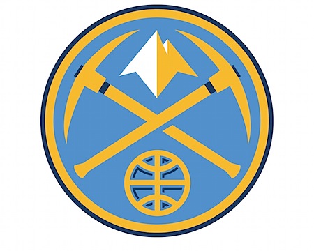
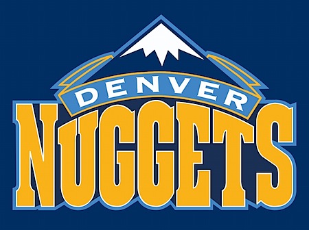
After all the talklately about logo redesign failures I thought I’d post something about a potential success. I happened across Aaron Draplin’s post on the new Denver Nuggets logo and thought it came out pretty good. At first glance the pick axes seem a bit over the top (we get it, people mined for gold in ye olde times Colorado), but it grew on me. As Draplin pointed out in his post, the mountains are the best part of the whole deal. Below the new logo are the two preceding versions. The most recent was pretty much gross in every possible way. The old school one is of course awesome in that nostalgic way, very cool for throwback jerseys and all that (or if you really, really like Tetris), but it just wouldn’t cut it in today’s game. The typo is heavy-handed and the logo is too busy and detailed to be useful in small formats.
This new version is clean and strong; even if you don’t really like it you’d have to give them points for steering clear of, as Jakub puts it, the “Mountain Dew logo style”. I’d have to imagine fans are going to be pretty happy with the new look, can you imagine wearing that last one on a shirt? It looks like the logo for a pizza place up in the hills somewhere, I half expect it to say “Uncle Mike’s Pizza” or whatever. So what do you think, did they nail it?
P.S. While the logo may be nice, I’m not sure how I feel about the typography for the new jerseys. Something about it reminds me of an off the strip South Lake casino.
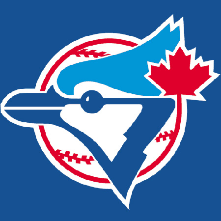
I hope you don’t mind if I go on a tangent here? I know the baseball season is over but enough is enough on these redesigns that look like the Mountain Dew logo. Who are the graphic designers that are doing these? The new logo looks like its going 80 miles per hour. The old classic Toronto logo had such strong pieces holding it together especially the color scheme, separated shapes and the leaf. The new one strips away the only Canadian element about it the maple leaf and even the color red, what on earth was the designer thinking?