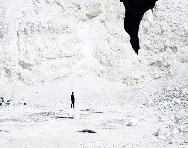
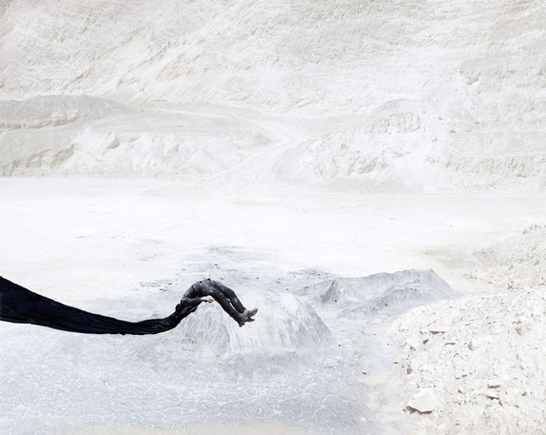
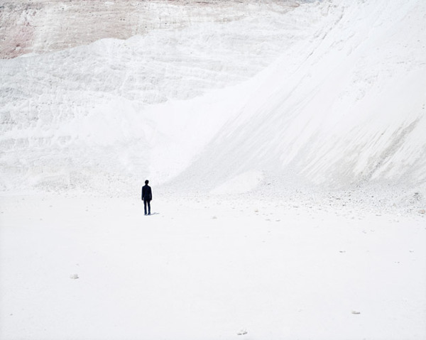
With such stark contrast between the subtleties of the salt and the void created by cloth, at first blush, you’d think these were illustrations or oil paintings. Meet Shanghai artist / photographer Bence Bakonyi. There’s something so clever in how he twists your sense of medium & scale. Find more of his work on Behance.
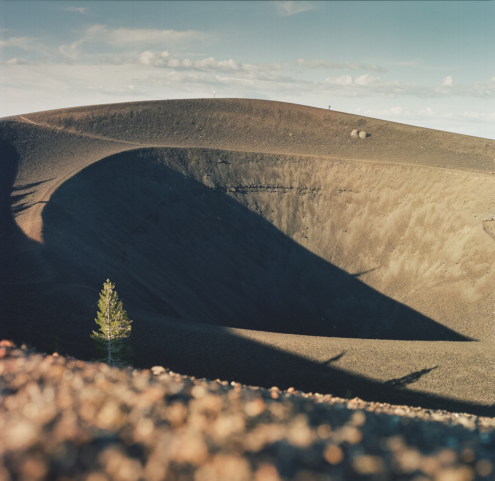
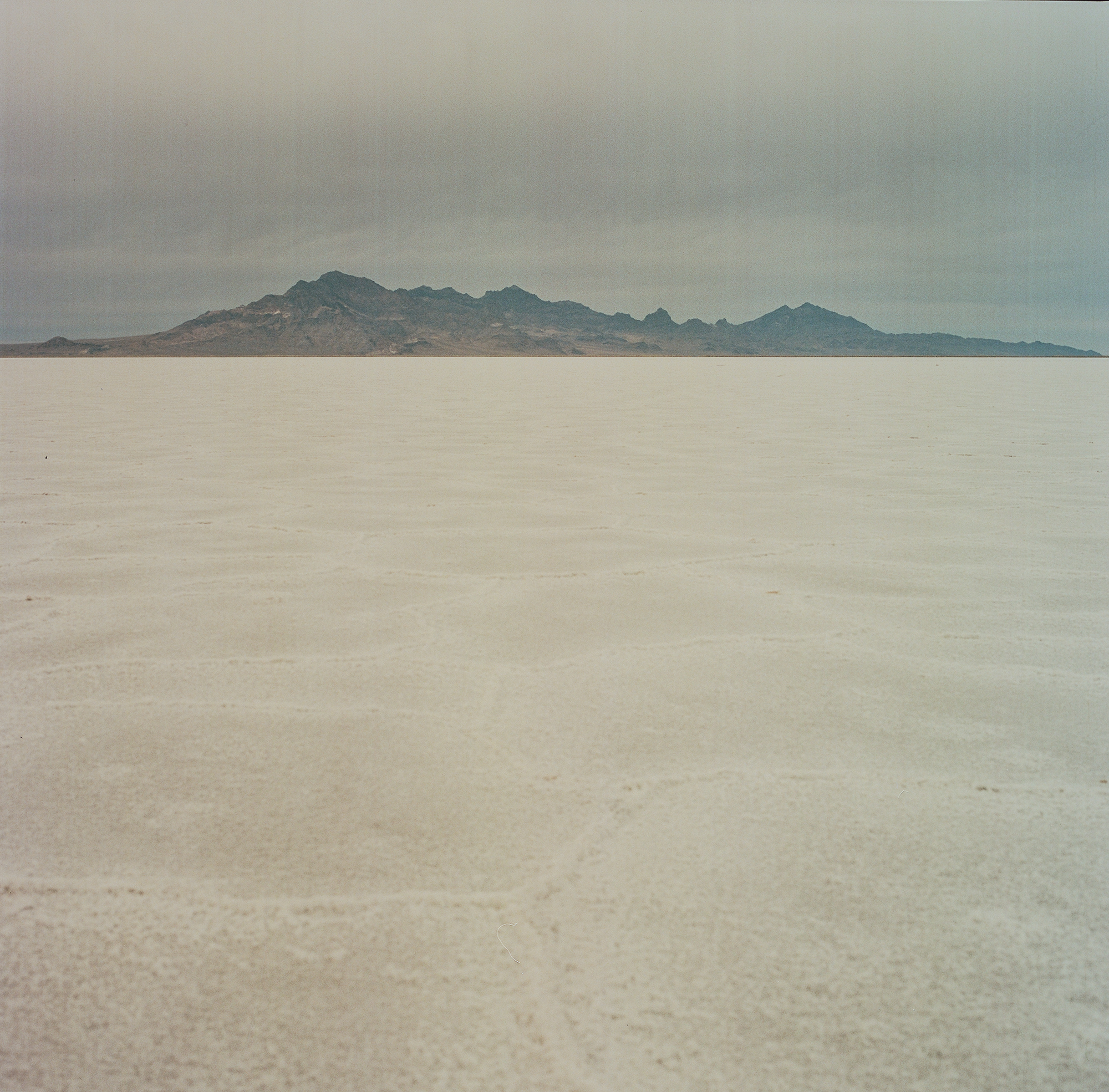
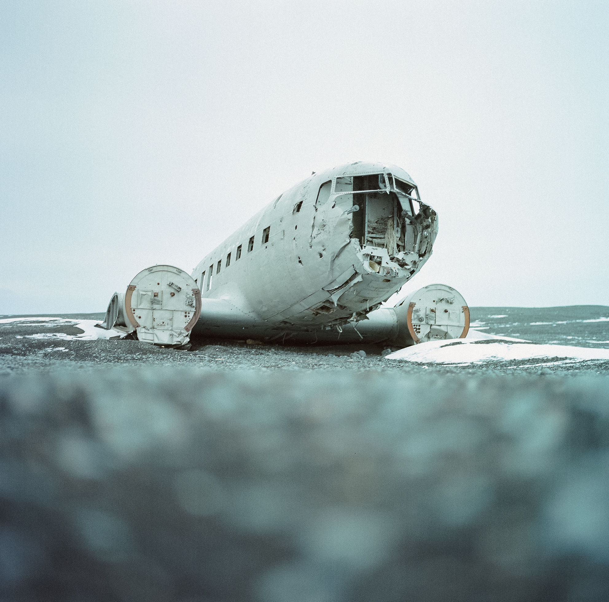
In honor of this week’s discovery of a moon-sized planet smaller than mercury, here’s a selection of work from 2012 of our own tiny sphere, featuring hills, craters, flats, fields, and broken flying machines. Shot with the Hasselblad 500 C/M on Kodak Portra. See more here.
My friend Cameron Ballensky has been in town visiting for a few days, so we’ve been out and about shooting loads of film. Me, mostly 35mm, him Polaroid. After seeing some of the unpredictable results yielded by certain films he uses, I was really turned on by the idea of exploring this format myself (also two of my favorite photographers, Reuben Wu and Neil Krug, have inspired this in me as well). Cameron mostly get’s all of his film through The Impossible Project, a company that now produces Polaroid film, and as I was exploring their site, I came across the beautiful work of Chloe Aftel, a Los Angeles based photographer and film director.
Browse through her beautiful body of work on Flickr.
Chloe is also part of The Impossible Project’s launch of a new instant film material for 8×10 cameras (image below). More info can be found here.
Blog and personal favorite visual artist Leif Podhajsky just updated his site recently, and as usual, mind blown!. Most notably: Dan Croll’s‘From Nowhere’ 7″ artwork (first and second images).
Japanese artist Yamamoto Motoi was born in Hiroshima, Japan in 1966 and worked in a dockyard until he was 22, when he decided to focus on art full-time. Six years later, in 1994, his younger sister died from complications due to brain cancer and Yamamoto immediately began to memorialize her in his labyrinthine installations of poured salt. The patterns formed from the salt are actually quite literal in that Yamamoto first created a three-dimensional brain as an exploration of his sister’s condition and subsequently wondered what would happen if the patterns and channels of the brain were then flattened.
Although he creates basic guidelines and conditions for each piece, the works are almost entirely improvised with mistakes and imperfections often left intact during hundreds of hours of meticulous pouring. After each piece has been on view for several weeks, the public is invited to communally destroy each work and help package the salt into bags and jars, after which it is thrown back into the ocean.
Mr. Div is Tumblr I find myself (and apparently 30,000 other followers) visiting quite often, due to the amazing world of Animated GIF’s and Motion Graphics that inhabit within, designed by Matthew DiVito.
I intend to one day hire this man for my show visuals. Above are a few of my personal favorites.
As a kid, a lot of my time was spent either drawing or rummaging through my parents vast music collection. The latter becoming more of bed time ritual, as every night I would listen to an album(s) until I fell asleep, literally, until I fell asleep, which meant that the next morning my Dad gave me his usual: “Jonathan, you’re going to go deaf if you continue to fall asleep with those headphones on…” speech. This ritual turned to obsession when in 4th grade I received my first Sony Walkman. Night to night I would pick out a new tape to listen to. At first, I started listening to albums that I had heard my parents play on one of many weekend camping trips or long drives to our lake house, but when I started running out of familiar names, I would choose solely on a what the album’s cover looked like (unbeknownst to me at the time, this would be one of the main reasons I would become a Graphic Designer). As I got older and became more familiar with certain artists, photographers and designers, I came to realize that 90% of the album covers I had fallen in love with as a kid, were designed by a group by the name of Hipgnosis.
Hipgnosis was a British design group responsible for creating some of the most iconic and recognizable album covers of all times. Most notably for bands and artists such as Pink Floyd, T-Rex, Led Zeppelin, AC/DC, Scorpions, Yes, The Alan Parsons Project, Genesis, Peter Gabriel, ELO, just to name a few. The group consisted primarily of Storm Thorgerson and Aubrey Powell, and later, Peter Christopherson. The group would dissolve in 1983, though Thorgerson still works on album designs, and Powell works in video.
Pink Floyd - "Ummagumma" (1969)
Pink Floyd - "Wish You Were Here" (1975)
Pink Floyd - "Animals" (1977)
Peter Gabriel - "I" (1977)
Peter Gabriel - "II" (1978)
Peter Gabriel - "III" (1980)
The groups approach to album design was strongly photography-oriented, and they pioneered the use of many innovative visual and packaging techniques. In particular, Thorgerson & Powell’s surreal, elaborately manipulated photos (utilizing darkroom tricks, multiple exposures, airbrush retouching, and mechanical cut-and-paste techniques) were a film-based forerunner of what, much later, can be called “Photoshopping”. Hipgnosis used primarily Hasselblad medium format cameras for their work, the square film format being especially suited to album cover imagery.
The Alan Parsons Project - " I Robot" (1977)
The Alan Parsons Project - "Pyramid" (1978)
Led Zeppelin - "Houses Of The Holly" (1973)
Led Zeppelin - "Presence" (1976)
Led Zeppelin - "In Through The Out Door" (1979)
Genesis - "The Lamb Lies Down On Broadway" (1974)
Genesis - "And Then There Were Three" (1978)
Black Sabbath - "Technical Ecstasy" (1976)
Black Sabbath - "Never Say Die" (1978)
Another trademark was that many of their cover photos told “stories” directly related to the album’s lyrics, often based on puns or double meanings of words in the album title. Since both Powell and Thorgerson were film students, they often used models as “actors” and staged the photos in a highly theatrical manner. Many of Hipgnosis’ covers also featured distinctively “high tech” pen and ink logos and illustrations (often by graphic designer George Hardie), stickers, fancy inner sleeves, and other packaging bonuses. One of the unique extras created by Hipgnosis was the specially printed inner sleeve for Led Zeppelin’s“In Through the Out Door LP”, a “black and white” affair that magically turned to color when dampened with water (tying in with the main cover’s photographic theme).
The groups contribution to album cover designs and packaging can best be described as more of a legacy than anything. A legacy that definitely shaped a generation and set the bar for future album design for years to come.


")
")
")
")
")
")
")
")
")
")
")
")
")
")
")


")
")
")
")
")
")
")
")
")
")
")
")
")
")
")
")
")
")
")
")
")
")
")
")
")
")
")
")
")
")
")
")
")
")
")
")
")
")
")
")
")
")
")
")
")
")
")
")