Jelle Martens

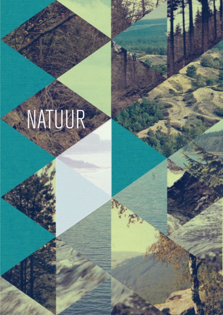
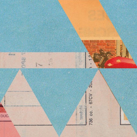
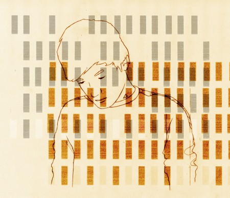
Absolutely loving Jelle Martens’ work. Raw and inspired, I want a print. More work can be found at his flickr.
Via Matthew Lyons’ incredibly excellent Inspiration Tumblr


Absolutely loving Jelle Martens’ work. Raw and inspired, I want a print. More work can be found at his flickr.
Via Matthew Lyons’ incredibly excellent Inspiration Tumblr
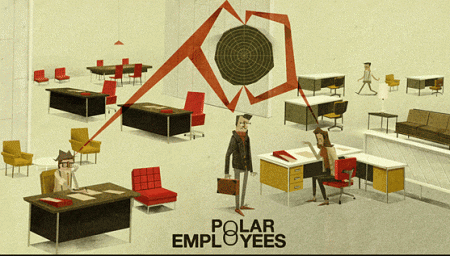
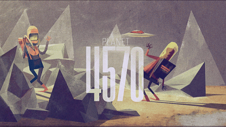
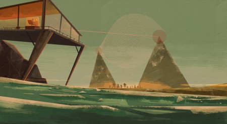
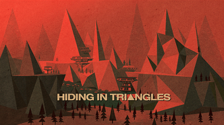
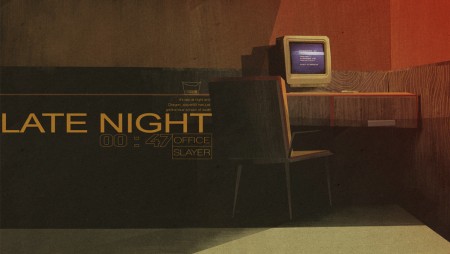
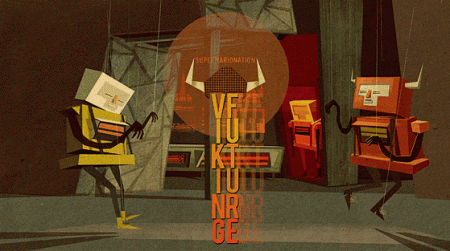
Absolutely killer illustrations by Matthew Lyons. My first assumption was that these pieces were very old, and the work of a grizzled old artist, who had developed exceptional skill and craft over years and years of animation grunt work. I was incorrect. Matthew is actually a 21 year old student at his final year at the Loughborough University in England. He’s clearly a natural. Not only is his eye for color and composition spot on, he also clearly has a vast imagination. I want to get in my spaceship and explore each of the scenes he has presented.
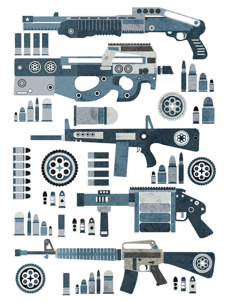
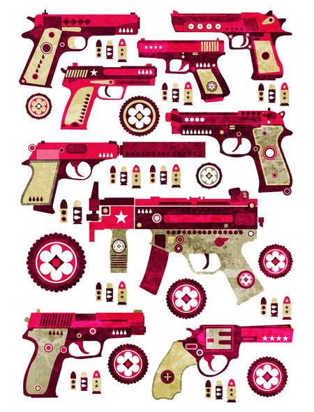
Combining a polished illustration style with the beautiful mechanics of small arms weaponry, Jonny Wan has created these terrific pieces. I like how he’s reduced the weapons to their most basic parts, while simultaneously adding gorgeous little details here and there. I feel like they would shoot creativity bullets instead of metal ones. His style reminds me of what might happen if you mixed Leandro Castelao and Sanna Annuka in a twisted pot of liquid talent. 2010 is sure to be a great year for Mr. Wan.


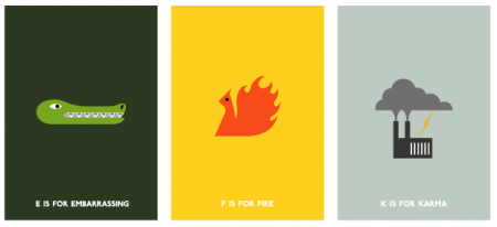
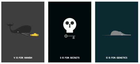

You may have seen the work of Robert Samuel Hanson here and there, Monocle and elsewhere. I’ve seen some of his wonderful illustrations before, but a few of the works above are still getting a good laugh out of me. The “I love you and I know where you live” piece especially cracks me up. I would totally send that around as a Valentines Day card if I thought the recipients had enough of a sense of humor to not get me arrested.
Not only is Robert’s work beautifully rendered and realized, but it’s just the right amount of clever without being too cute. Aren’t we lucky he works for so many terrific publications! It’s always a nice surprise to stumble on one of his delightful illustrations. His logo is amazing too, check it out on his front page.

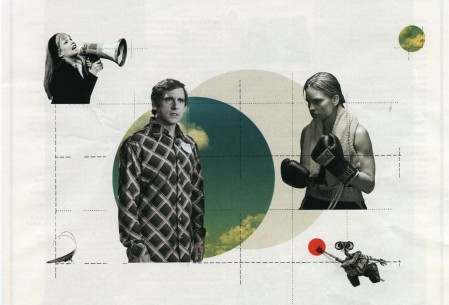
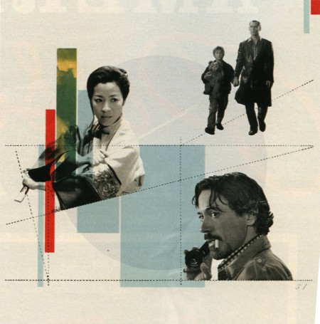
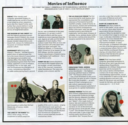
I was reading the New York Times this weekend and was pleasantly surprised to see the work of Cristina Couceiro as part of one of the magazine articles. I recognized her distinctive style from when Scott posted her work a little while back. In the capacity of the magazine article, it was interesting to see how the use contemporary imagery changed the overall impression of her work. I think it was successful — it brings context, and an slight twinge of humor to the work that wasn’t present in some of the earlier ‘found imagery’ pieces. Something about Steve Carrel especially just works for me…maybe it’s that ridiculous shirt he’s wearing.
This is probably the third time recently I’ve randomly stumbled upon the work of an artist I recognize in a magazine; I saw Leandro Castelao in a recent issue of GOOD, Mark Weaver in Wired, and someone else I’m forgetting now. It’s great to see how their work translates into an editorial environment. And great to see that magazines are supporting the amazing talent of all these artists!
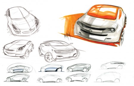
Spencer Nugent posted an interesting article on the Levels of Sketching over on IDSketching (that’s his image above). I don’t know a lot about industrial design, or the complex role sketching appears to have in the field, but I was really interested to read a little more about it. What came to mind immediately was the sketching process we are constantly encouraged to go through at graphic design school. I am always terrified of this part and try my best to avoid it (which is impossible). Of course, though the role of the sketch is different in this case — as it serves as a rough internal mock up rather than a deliverable for a client — it’s importance remains of a high level (for a number of reasons, many of which Milton Glaser explains in this video that’s been floating around the last couple weeks).
The sketching process for the project I mentioned a while back has been pretty intense. Recently I’ve been working through countless concepts and designs, sketching my hands off. I was lucky to figure out my direction/concept early on, but it’s taken me forever to figure out the right way to render it. This has meant ENDLESS amounts of sketches and crappy little mock ups. I guess I lack the patience to sketch well, and my process book looks like I was drawing blindfolded, drunk, and with my off hand.
Seeing the way industrial designers sketch, I am truly envious. To be able to render something that detailed and precise, without a computer sometimes, I can’t imagine. Of course, I am reacting this way because I grew up designing with the computer. “Process” to me has always meant keyboard and mouse, not pencil and paper. I recognize this as a potential weakness in my workflow, and have been trying really hard to incorporate sketching into this project. Results have been here and there so far, and I wonder if I will ever be able to develop my sketching ability to where it’s consistently worthwhile.
I know David Airey for one is a big proponent of sketching, and has written many interesting articles on the subject. How do the rest of you feel about sketching when it comes to the graphic design process? When starting a project (especially a logo design for example), do you start with pencil or mouse (or the hybrid, Wacom Tablet)?
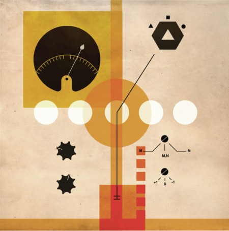
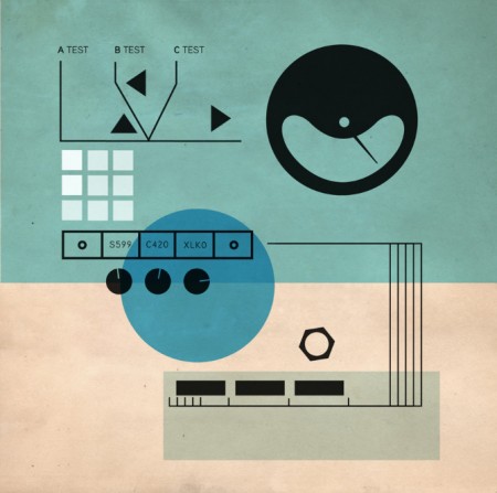
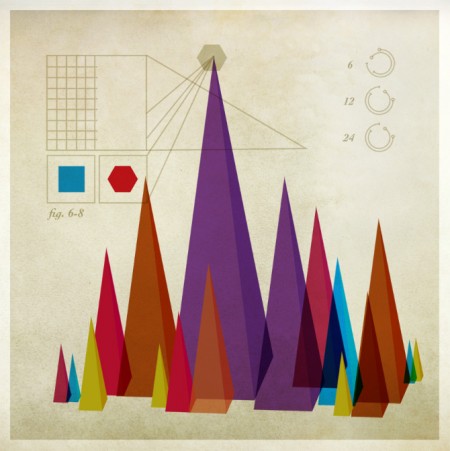
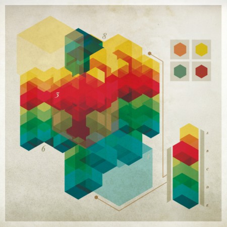

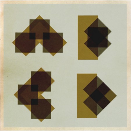
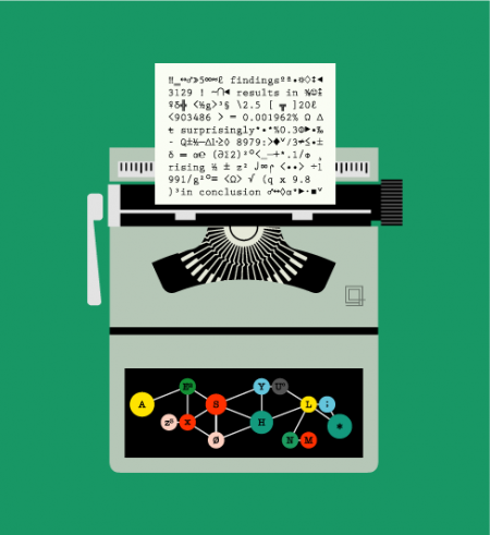
I found a number of cool sites as I explored the Cargo network this last weekend. One such site was the portfolio of Chad Hagen. I love how each of his projects unfolds as a series; within every section there are a number of interesting images tied together by similar visual stylings. I enjoyed clicking through the slideshows and determining my favorites of each, some of which are above.
His beautifully designed illustrations look like they could be out of an instruction manual for some amazing (albeit nonexistent) product or device. As his title “Nonsense Infographics” indicates, there is actually no “information” being conveyed per se — but when the graphics look this good, I don’t really care.
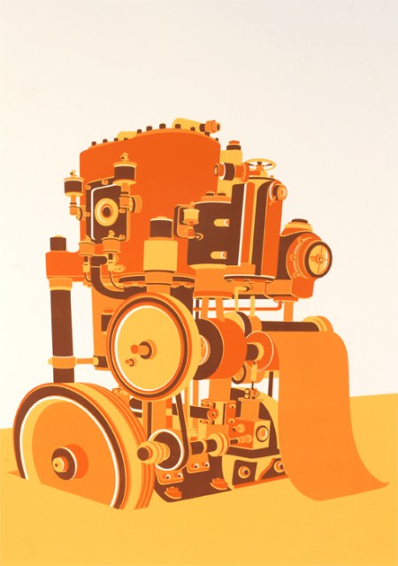
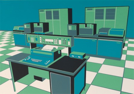
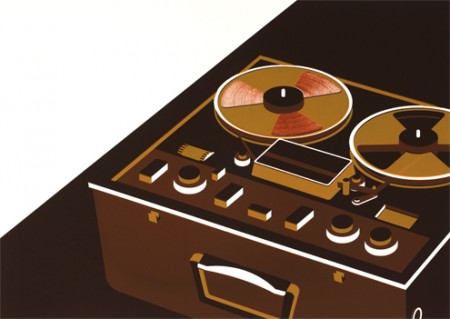
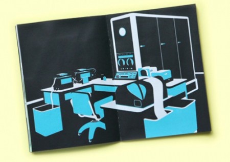
Said the Computer to the Specialist is a new book by Tom Rowe. It’s a collection of illustrations of analog recording equipment and long extinct super computers. Very stylish if you ask me. I would love to see some typography going on though — could really make some of these pieces. Nothing crazy, just some interesting titling to introduce some variety and that extra level of visual interest. Either way, some terrific illustrations.
Production is limited to 50 signed/numbered copies, so better act fast if you’re interested. Availible for purchase through Nobrow press.