Cartells
Posted by Scott
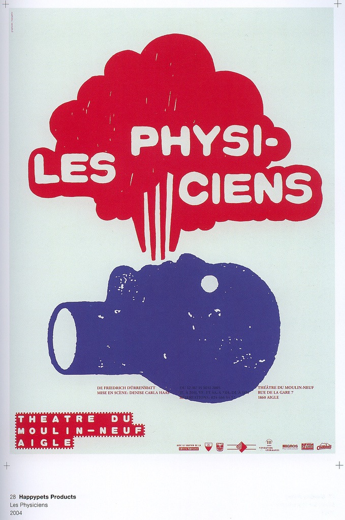
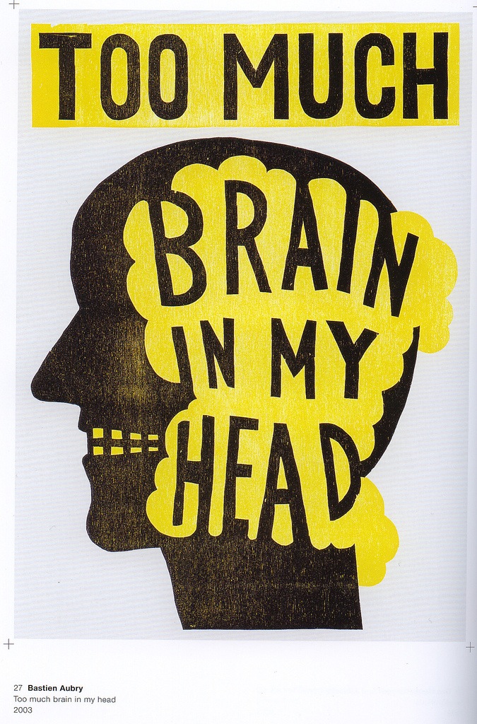 Foncercolor has a very nice collection of book scans at their Flickr page featuring some quality disembodied-head-action by the likes of Happypets Products and Bastien Aubry.
Foncercolor has a very nice collection of book scans at their Flickr page featuring some quality disembodied-head-action by the likes of Happypets Products and Bastien Aubry.
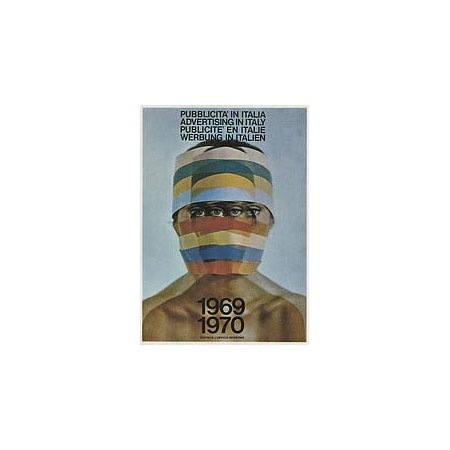
I usually stick to the rule of only posting images that are at least 450px wide, but this was such an amazing cover I thought I’d break that rule. I searched all over for it but couldn’t find a full size, perhaps someone has a scan? Dave from Grain Edit had the 71/72 edition, it was amazing. I’ve never seen this one in person though.


Afiler’s Flickr has some excerpts from a book by Ladislav Sutnar aptly entitled How To Show Telephone Numbers On Letterheads. As you may have guessed, the book features various examples of type placement in letterheads. It’s a very nice set of classic examples of a dying art form and is designed by one of the key architects of information design. I’ve always seen letterheads as a great opportunity to get away with being a minimalist in an otherwise standard design scenario. It’s pretty easy to convince a client that clean, efficient design is the answer in the case of a letterhead as most of the page is required to be blank by default. Of course they will probably still ask you to make the logo bigger. View the entire set on Flickr
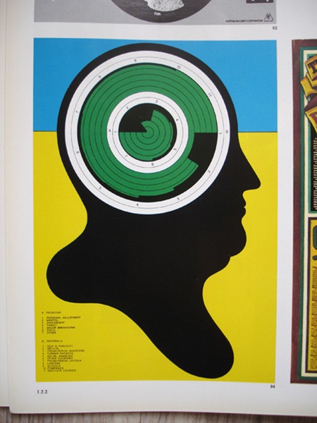
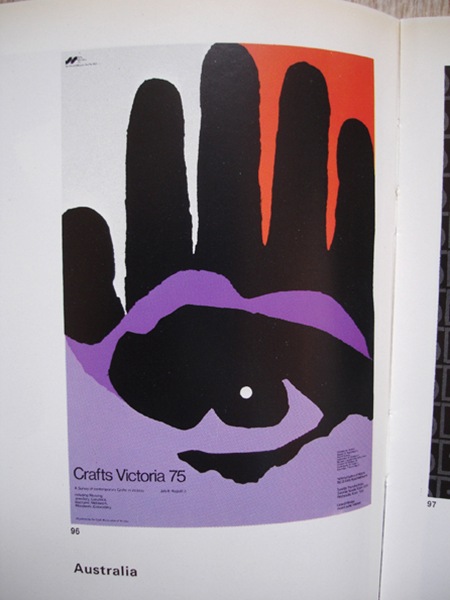
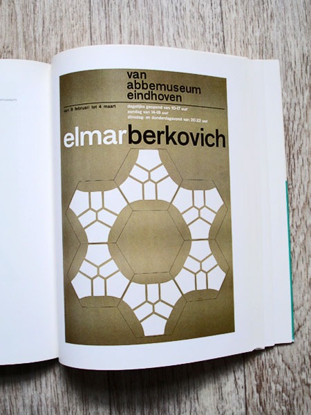
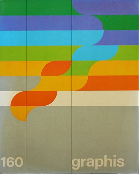
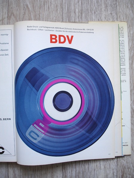
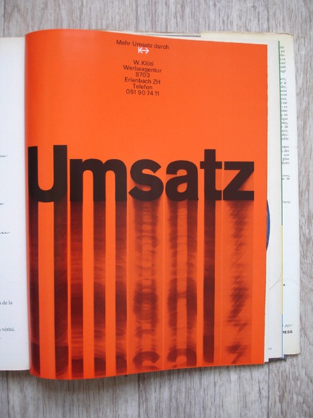
Some more pages from Graphis 190 (1977/78) via insect54

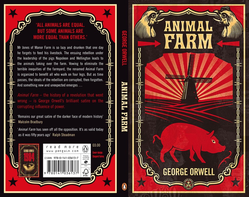
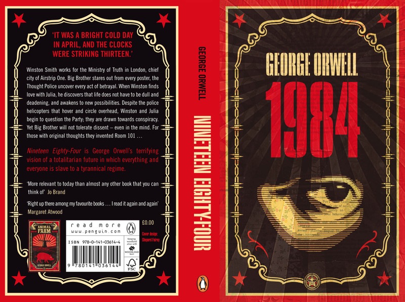
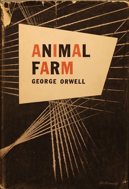 Shepard Fairey has re-designed the covers for two of George Orwell’s classic novels: his dystopian masterpiece, 1984 and his totalitarian allegory, Animal Farm. I can’t think of a better artist to tap for such a task, these two concepts fit nicely with the decidedly cynical slant of Shepard’s work. I really like his take on the covers, but must admit that the minimalist / modernist in me is still partial to Art Brenner’s original for Animal Farm (above).
More greatness from Mr. Aicher Via rallovallo
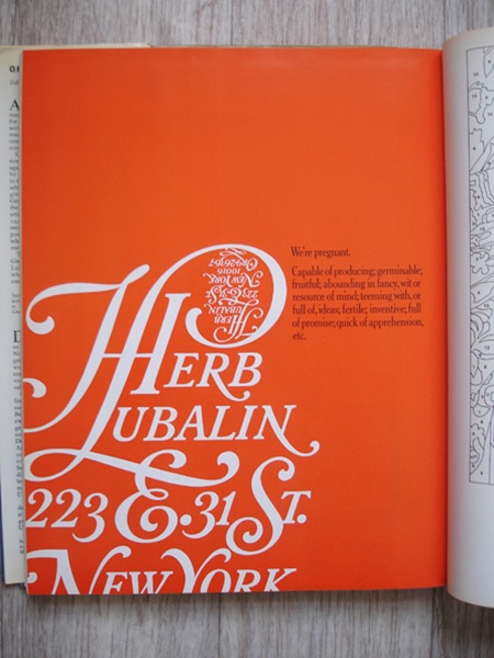
It’s all about the orange: Graphis Annual 1965/66. Via insect54.