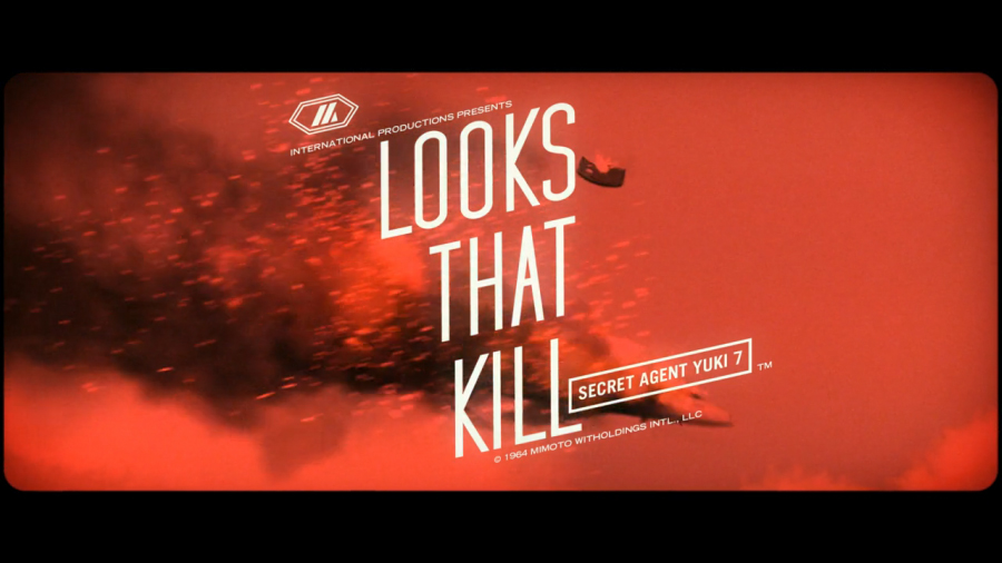
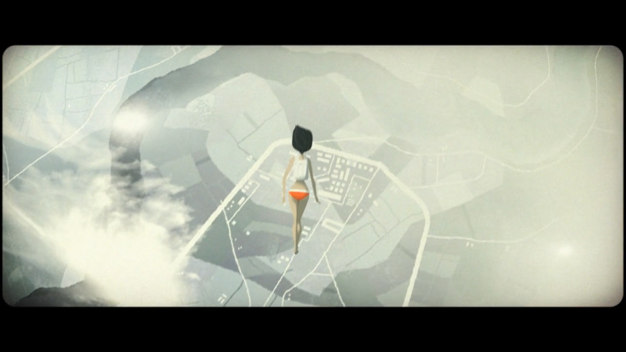
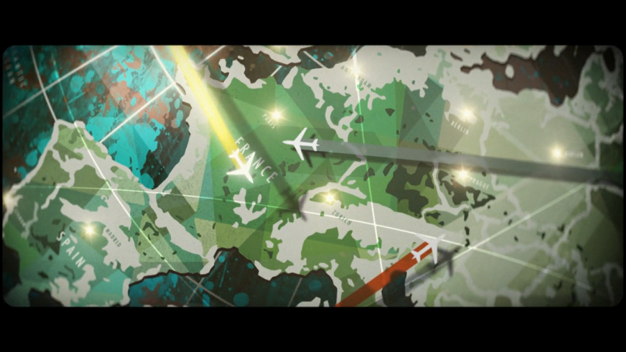
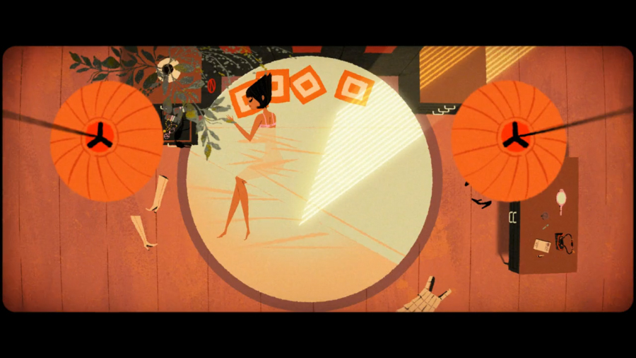
The amazing Kevin Dart has a new Yuki 7 book coming out titled “Looks That Kill.” To celebrate its release he has teamed up with animator Stephane Coedel to produce a trailer for the second hypothetical film in the Yuki 7 universe, and the result is even more impressive than their previous collaboration.
Mr. Dart has been influential in my development as a designer, and his ability to create a fully realized world with Yuki 7 is truly inspiring. Enjoy.
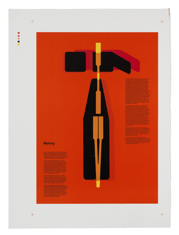
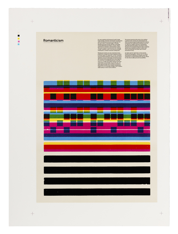
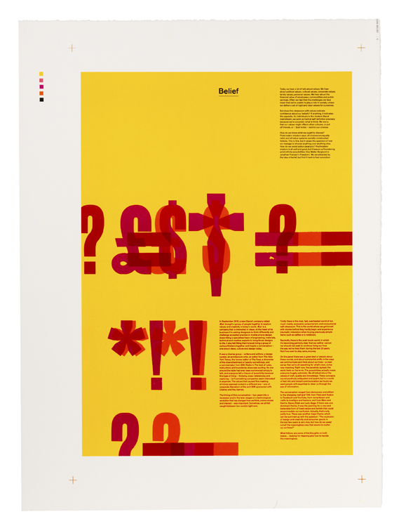
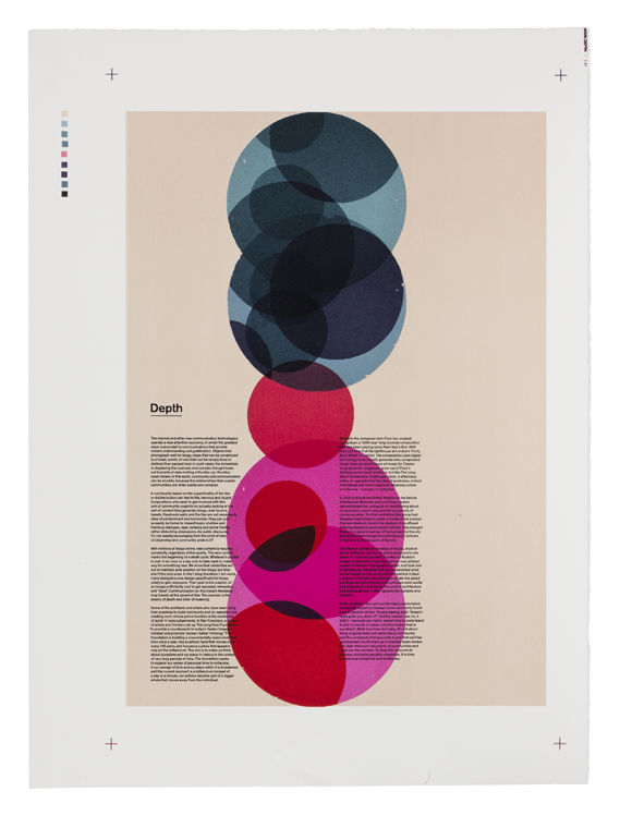
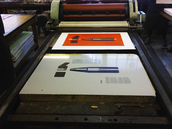
Beautiful color prints by Tom Hingston Studio for Danish mobile phone brand Æsir. Working at Edition Copenhagen during a two week residency, Hingston produced 100 copies each of these lithographic prints for potential customers. Creative Review has a detailed write-up of the entire process:
Lithographic printing dates back to 1796 when Alois Senefelder discovered a way of printing from stone. Lithographic ink is applied directly to polished stone from where it is transferred to the paper. Each colour requires a new stone, so the process is both slow and very expensive but does produce incredibly vibrant colours.
I really wish I could see these in person. I’ve done some screen printing and letterpress for my projects and have been pretty happy with the results, but I’ve never tried lithography. Anybody with lithographic experience care to share their thoughts?
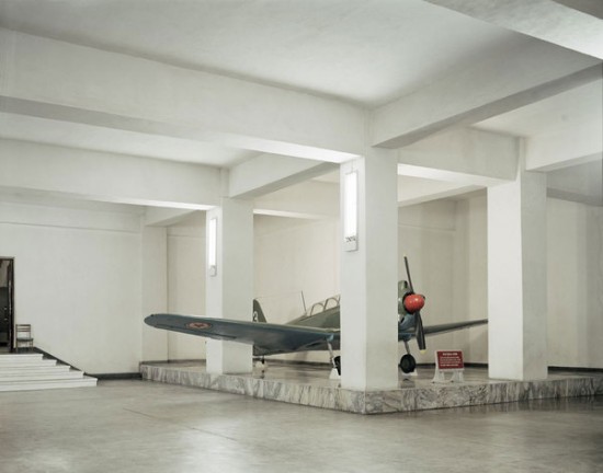
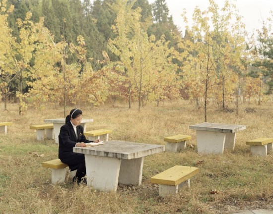
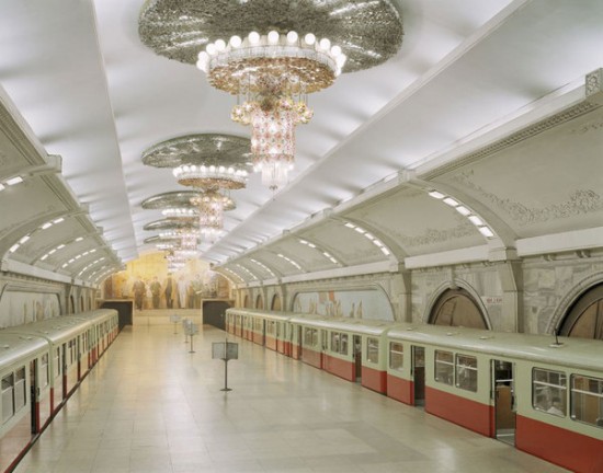
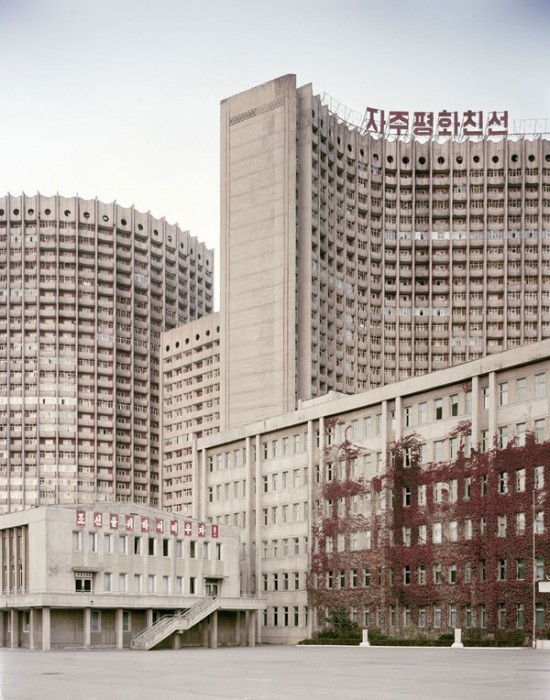
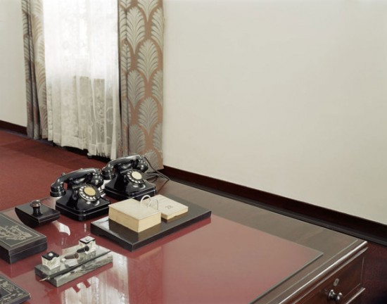
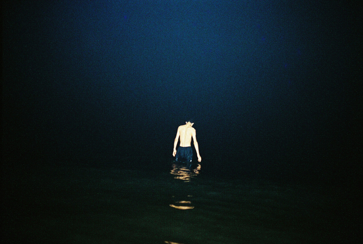
This series is taken from a larger body of work in Pyongyang, the capital city of North Korea.
Although not commonly thought of as a holiday destination all these photographs have been taken at tourist sites throughout the city.
It took over a year to get permission to go in with my camera and nothing quite prepares you for what awaits. I was not allowed to take my mobile phone past customs and was met by two guides who were to accompany me at all times throughout my trip.
It’s a fascinating glimpse into a place unknown to much of the world, and the series makes for an interesting counterpart to the previous post on North Korean propaganda posters.
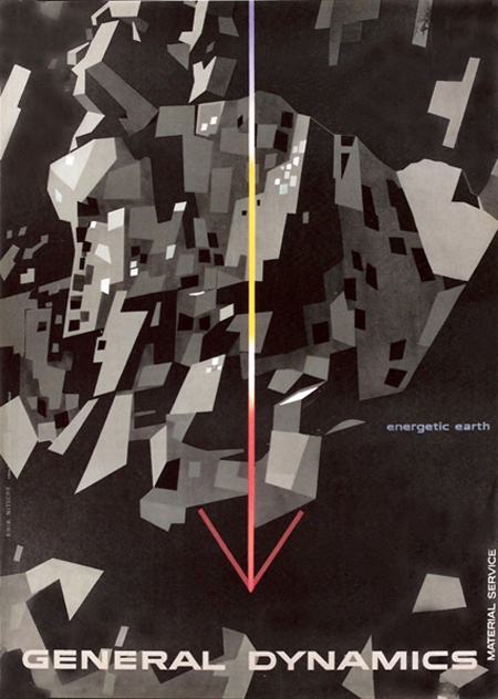
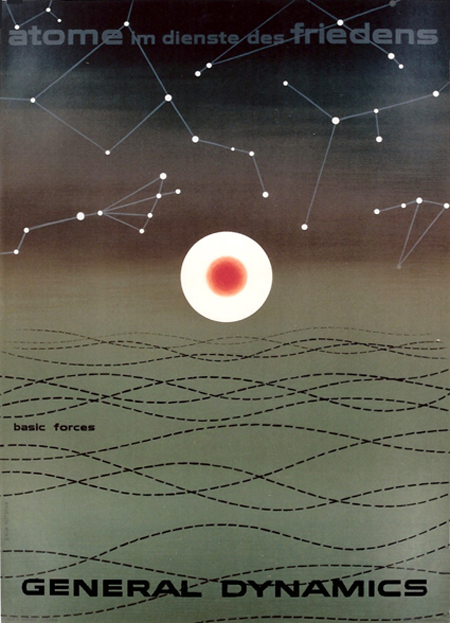
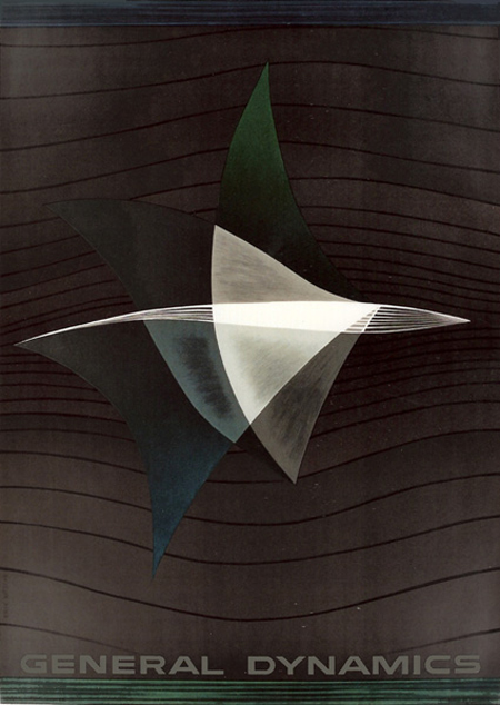
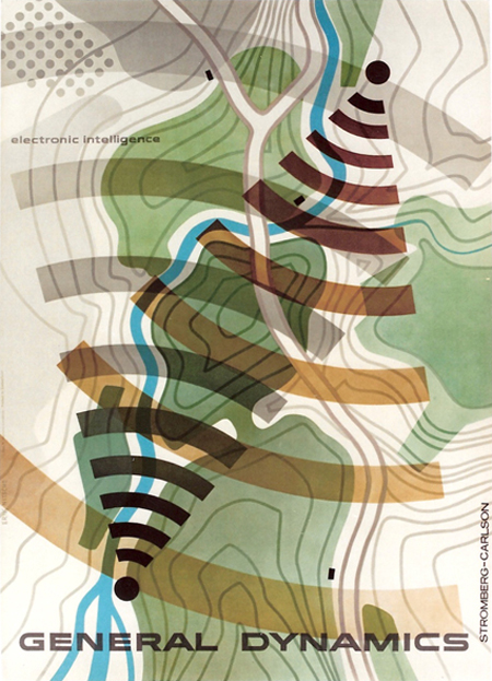
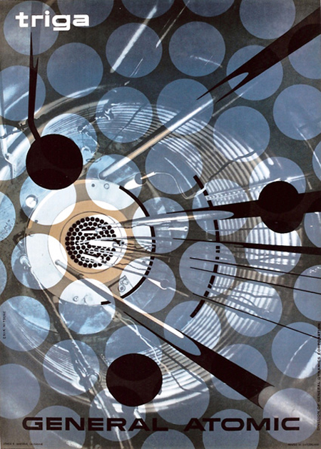
Erik Nitsche is a favorite at ISO50 (see posts here, here, and here), and I was disappointed when the Flickr stream compiling his work went down (mainly because I missed the chance to check it out). Luckily, Matthew Lyons and Galerie 123 (where you can purchase some of his original prints) are here to lend a helping hand.
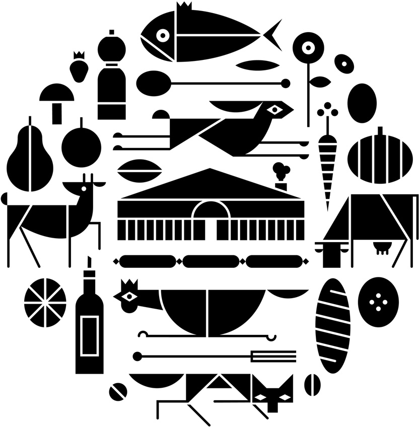
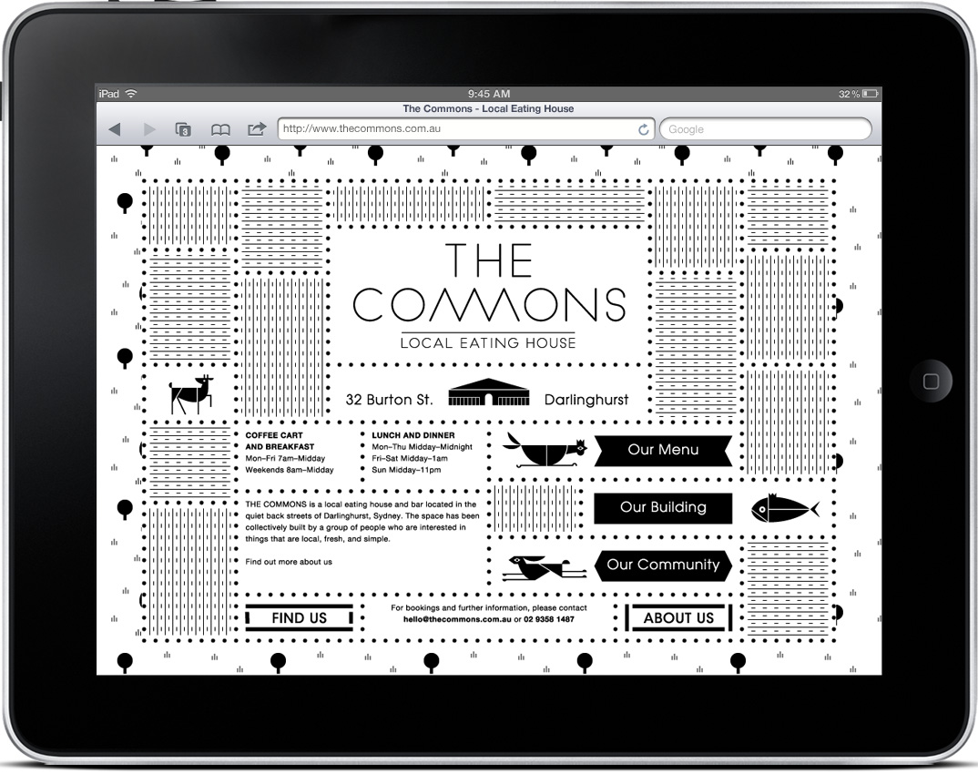
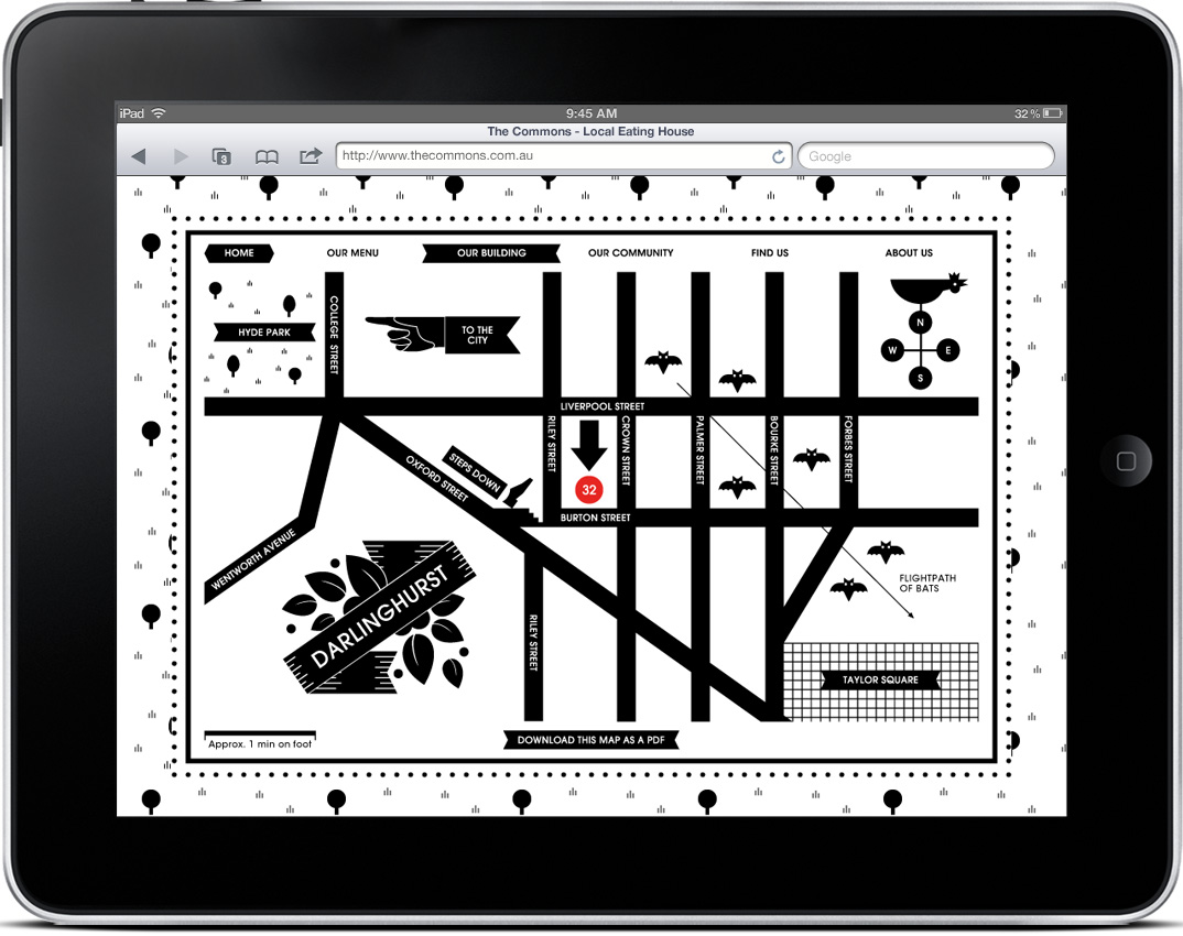
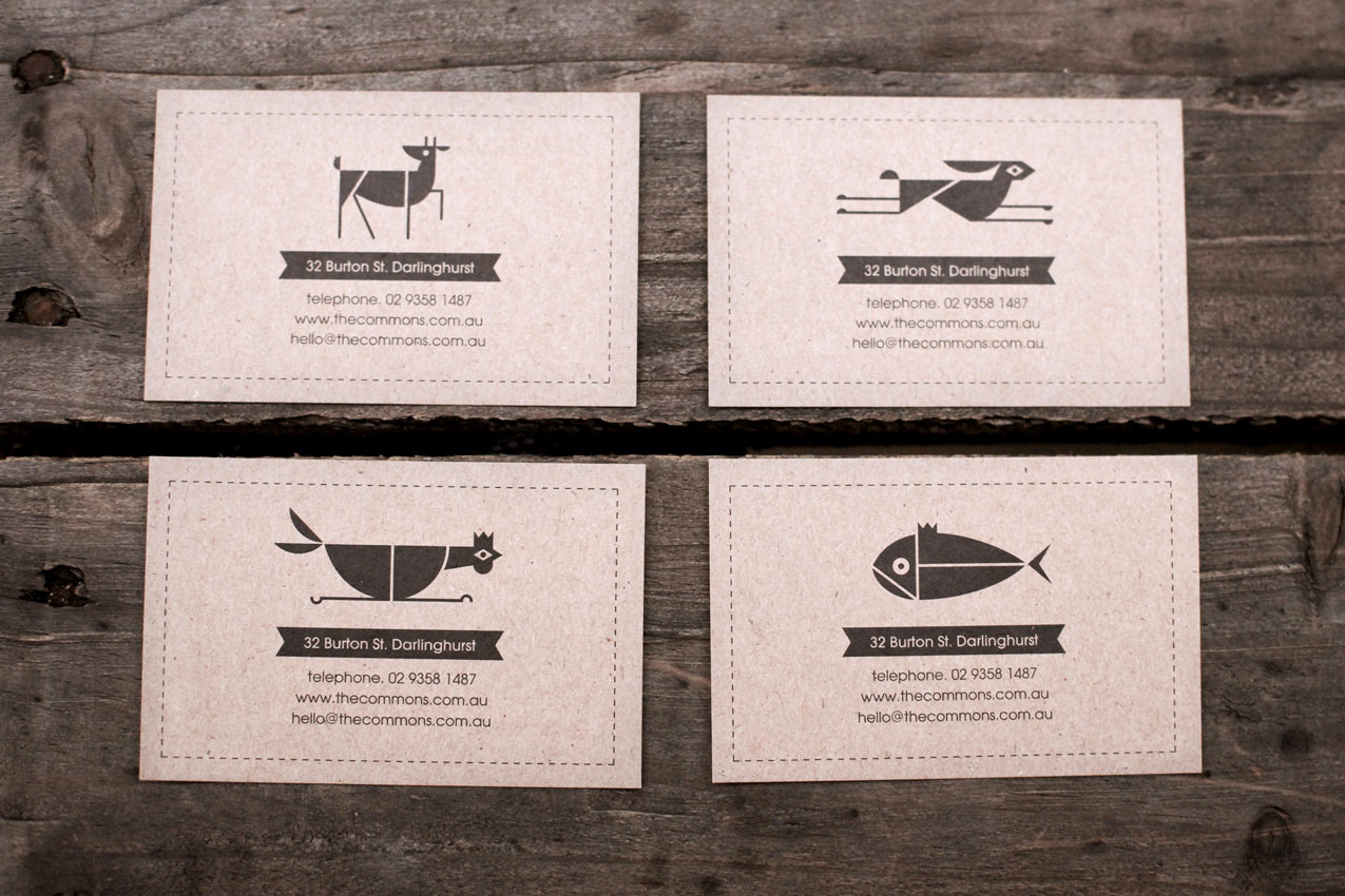
I typically start my designs in black & white, but eventually I reach a point where I feel like the work is missing something, and at this time I begin to incorporate some color. That’s why I’m impressed by design that succeeds in B&W, and Craig & Karl’s work for The Commons is some of my favorite yet. The fact that it is successful across an entire system is even better. Check out more pictures here.
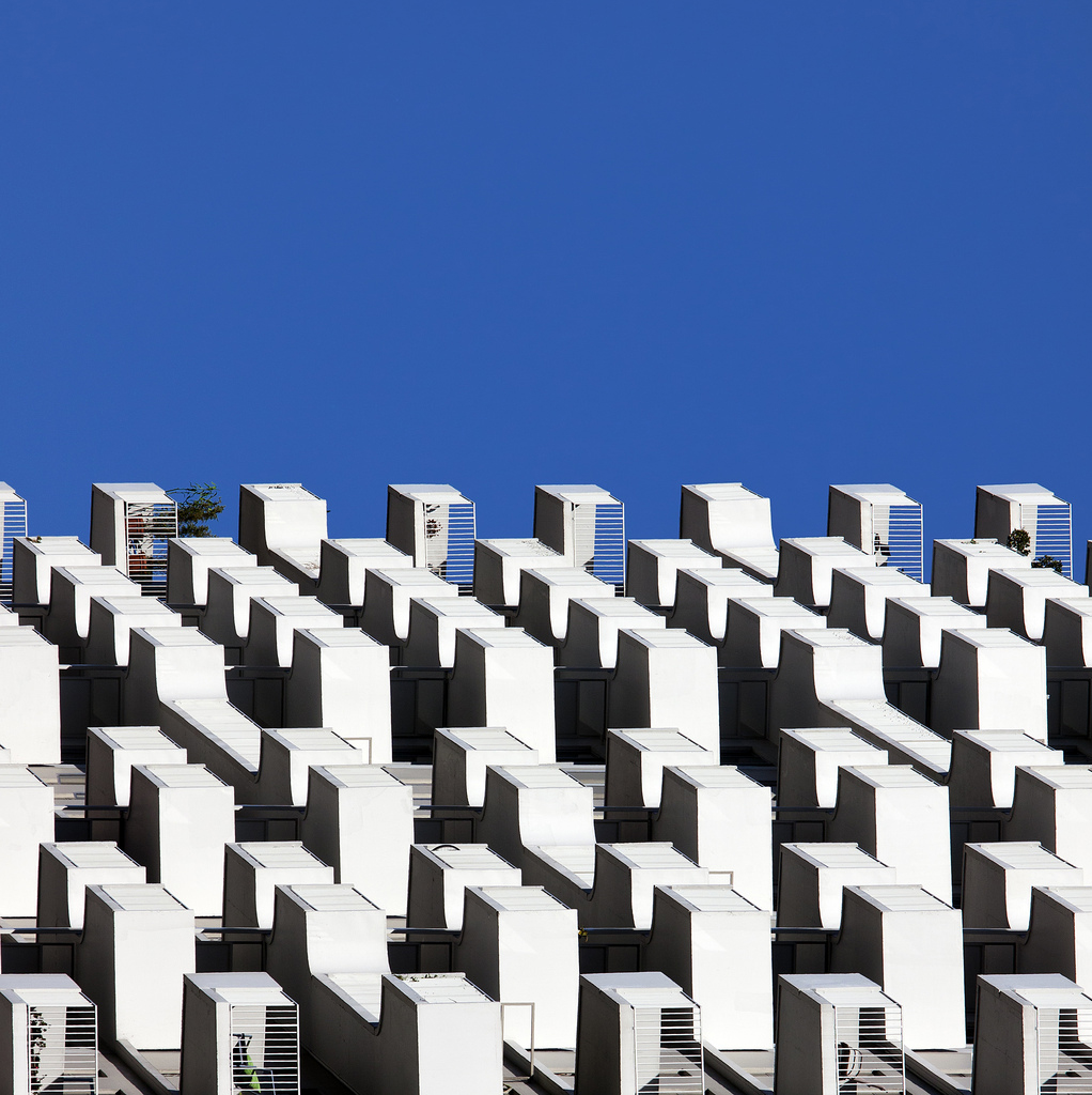
I was looking for texture inspiration for a new project when I came across the Flickr set of barbera*. I love the flat colors and geometric shapes of her photos; they remind me of Matthias Heiderich’sColor Berlin series.
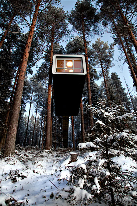
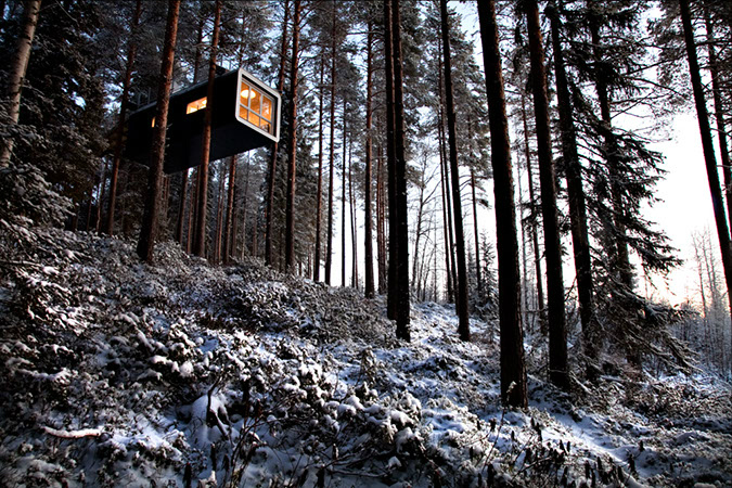
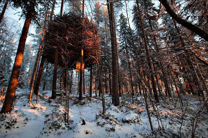
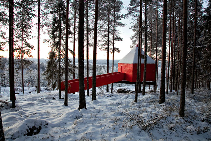
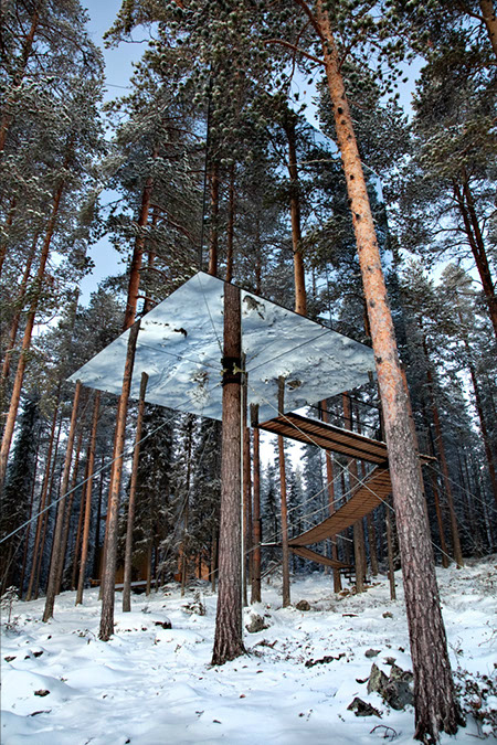
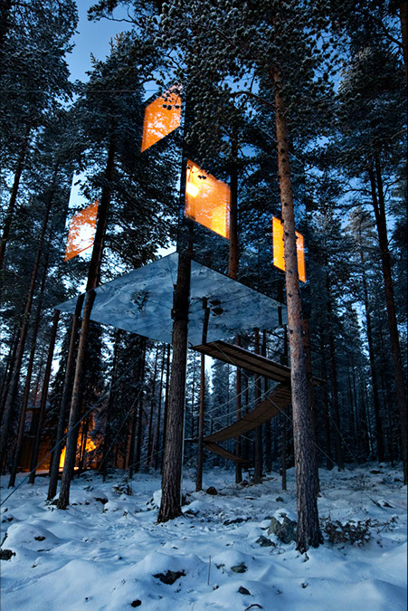
One of these days I’d like to visit Sweden, and when I do I’m staying at the Treehotel.
Captured here by Mauro Puccini, the hotel has six rooms accessible through wooden ladders and ropes, and each features a unique name like the Blue Cone, UFO, Bird’s Nest, and their most famous room, the Mirrorcube.
Check out more beautiful images of the hotel here. Also see previous post on Linda Aldredge’s home for more treehouse goodness.