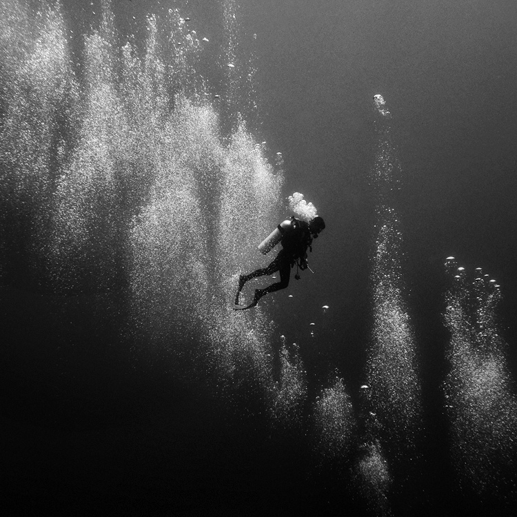
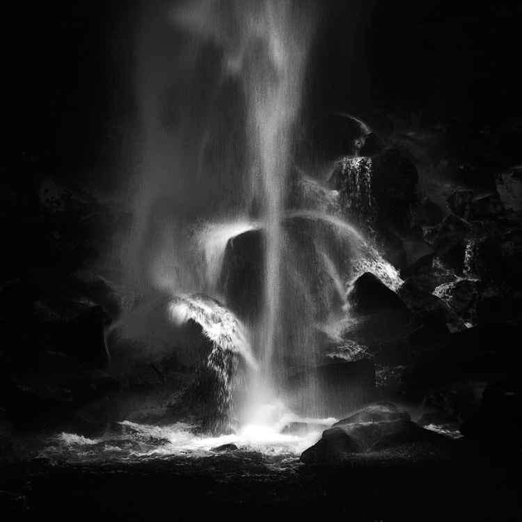
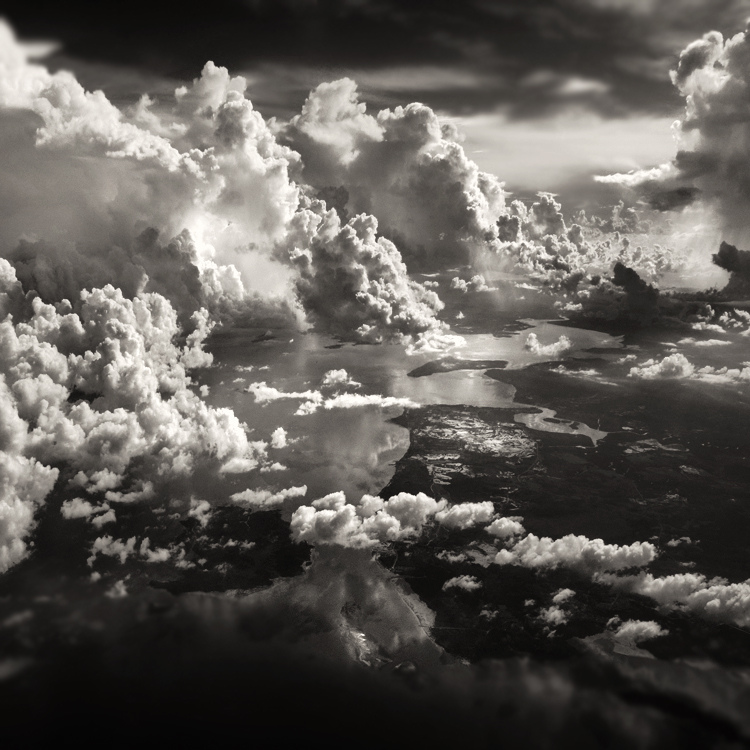
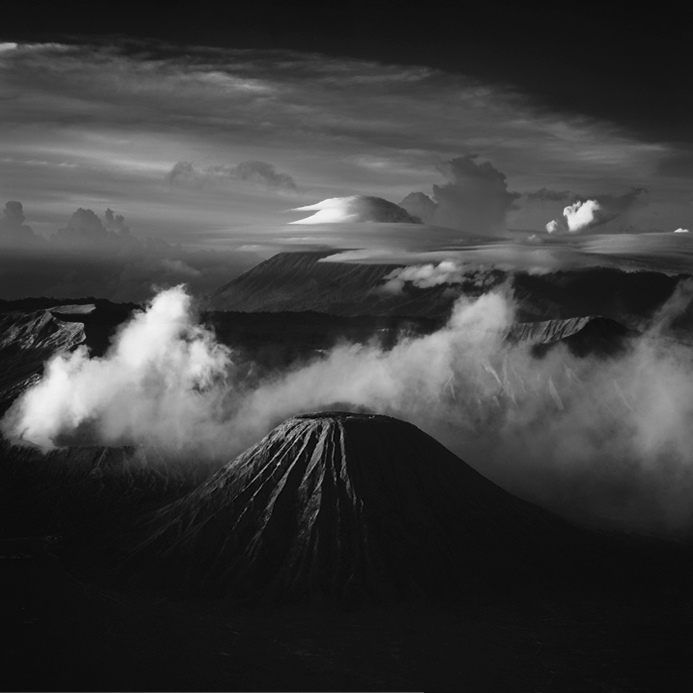
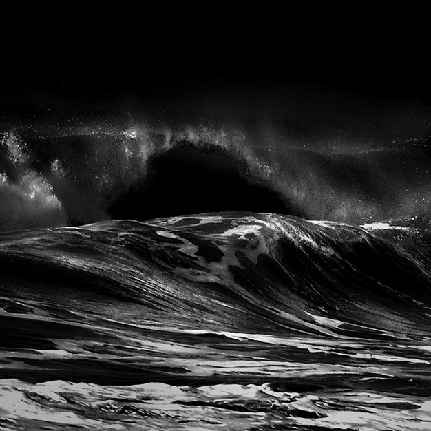
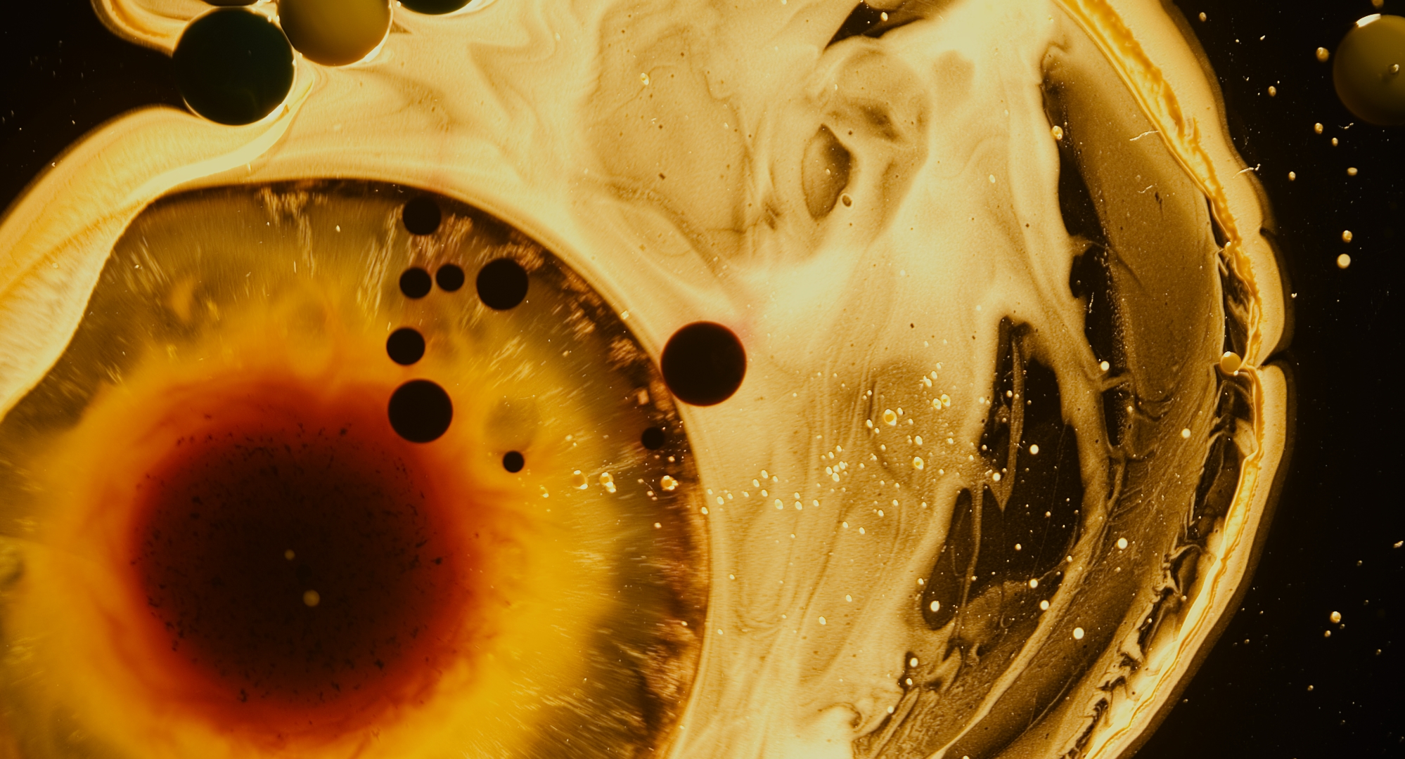
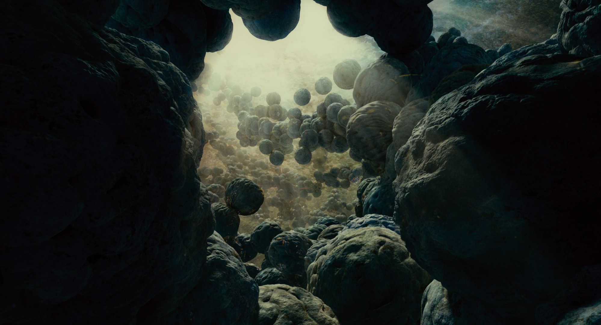
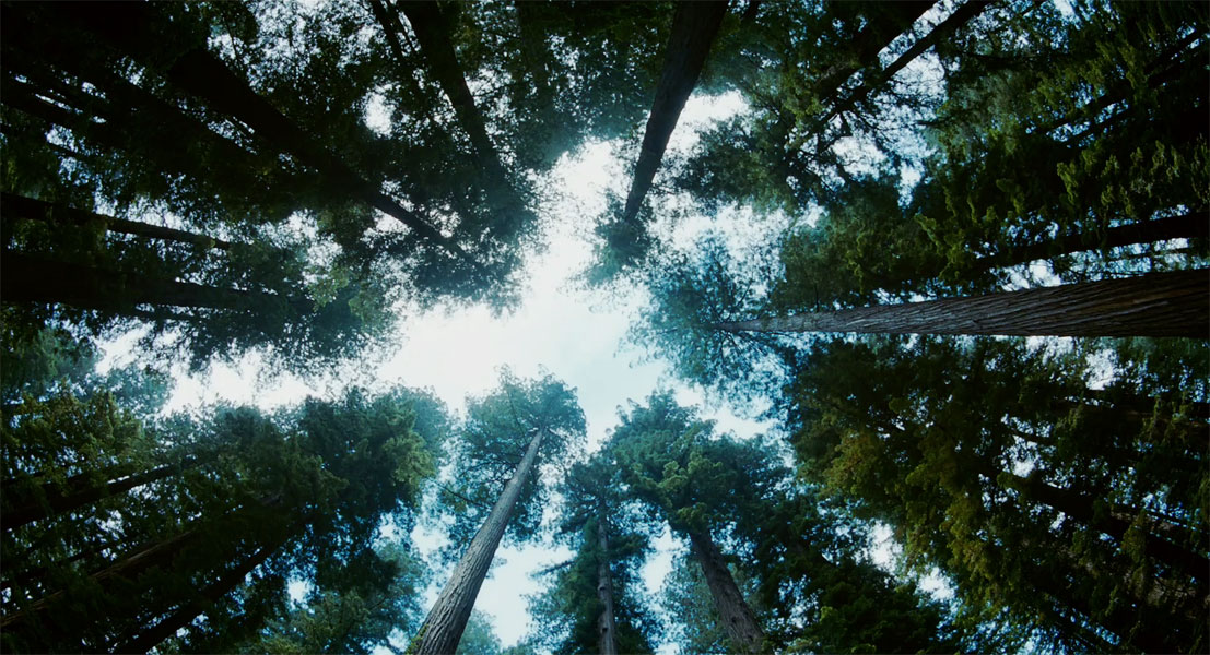
Hengki Koentjoro is a photographer from Indonesia, where most of these shots were taken. You can see more of his jaw-dropping work on his flickr. Any idea what kind of camera was used for these?
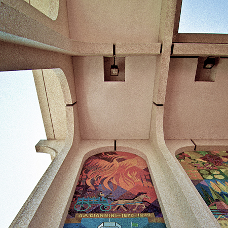
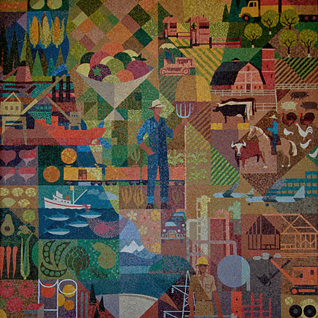
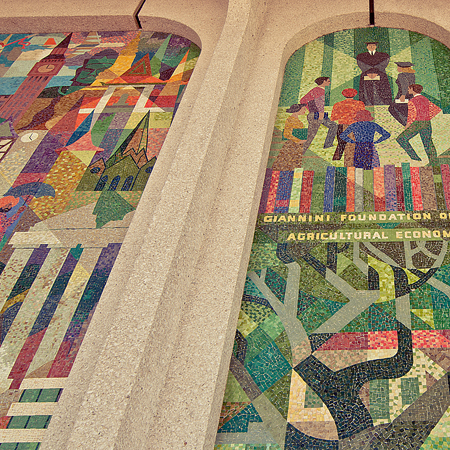
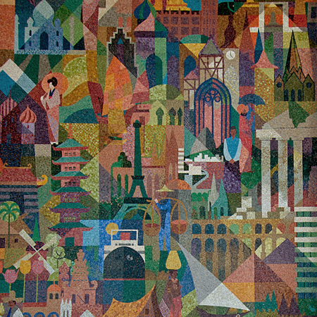
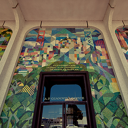
Scott’s trip to Graz for the recent Springfestival inspired me to take a walk through my hometown of San Mateo to see what visual inspiration I could find. One thing that’s always fascinated me is the beautiful mural decorating the front of the local Bank of America.
Consisting of 5 panels, 25′ high and approximately 90′ across, the mural was designed by Louis Macouillard and set by Alphonso Pardinas in glass tile. The panels tell the story of A. P. Giannini, the founder of the Bank of Italy (what would later become the Bank of America) who moved the bank’s records and cash to San Mateo after the 1906 San Francisco earthquake.
These pictures don’t really do it justice, so for the two of you who happen to pass through San Mateo it’s worth checking out. Anyone else have any cool hometown design gems to share?
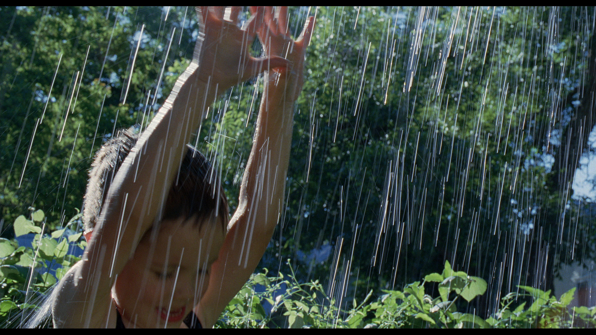
Terrence Malick’s The Tree of Life opens across the US tomorrow, and these stills for the film look amazing. I’ve purposely been avoiding any news on it so I wouldn’t build up any expectations, but I couldn’t help but look at these images. I rarely go out to watch movies anymore thanks to Netflix, but this looks like something that would really benefit from a trip to the theater.
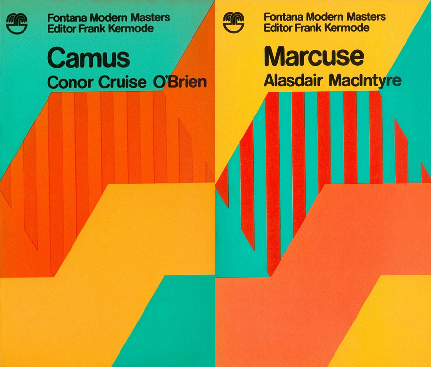
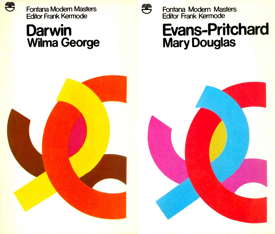
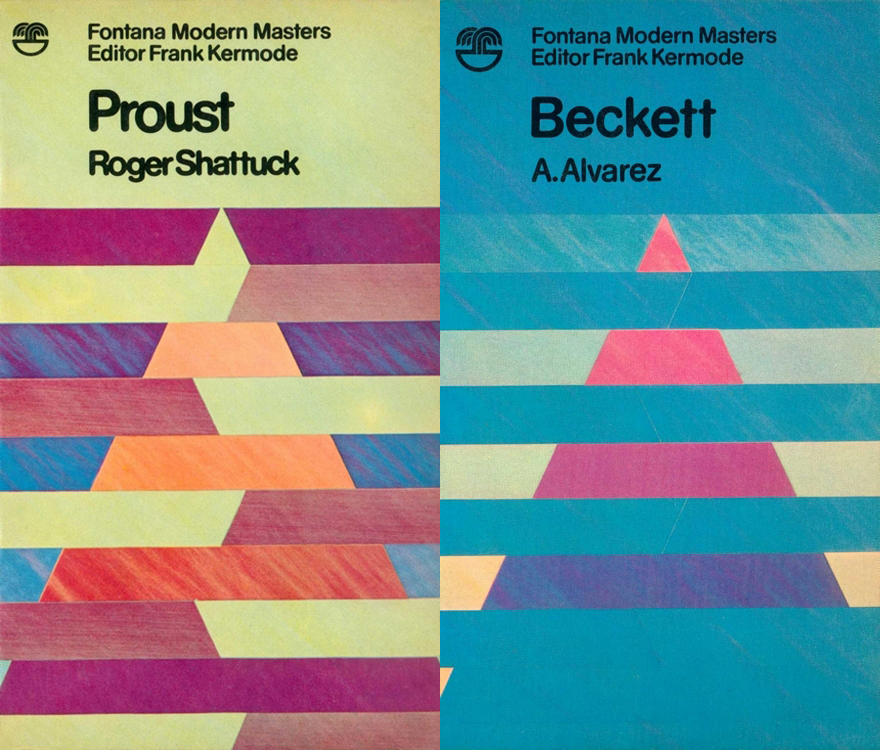
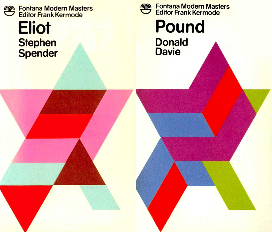
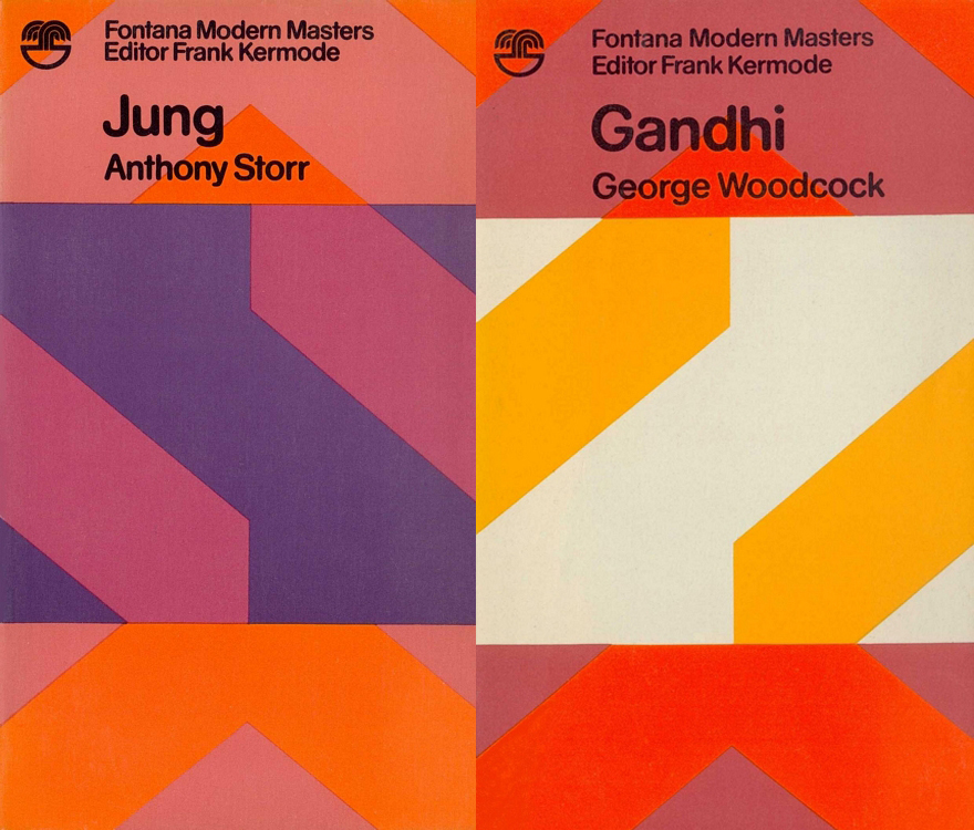
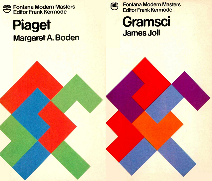
It’s a beautiful day outside but seeing these covers for Fontana Modern Masters makes me want to stay in and design. From Wikipedia:
The Fontana Modern Masters were a series of pocket guides on the writers, philosophers, and other thinkers and theorists whose ideas were shaping the intellectual landscape of the twentieth century… The books were very popular with students who, according to Kermode, ‘bought them by the handful’ and were instantly recognisable by their eye-catching front covers, which featured brightly-coloured geometric designs overlaid with modern sans-serif typography.
These covers are the work of artists Oliver Bevan and James Lowe, and originally they could be combined and arranged to create new works of art. When Lowe replaced Bevan in 1975 the covers dropped the full bleed pattens in favor of white backgrounds but retained the shifting geometric shapes.
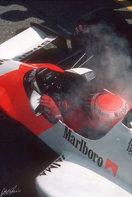
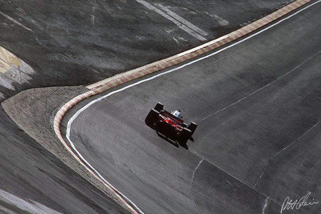
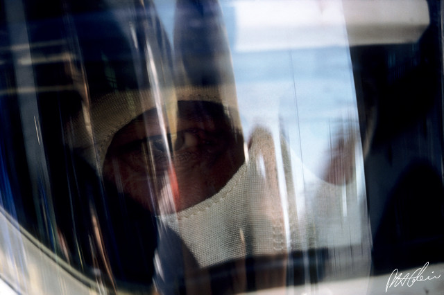
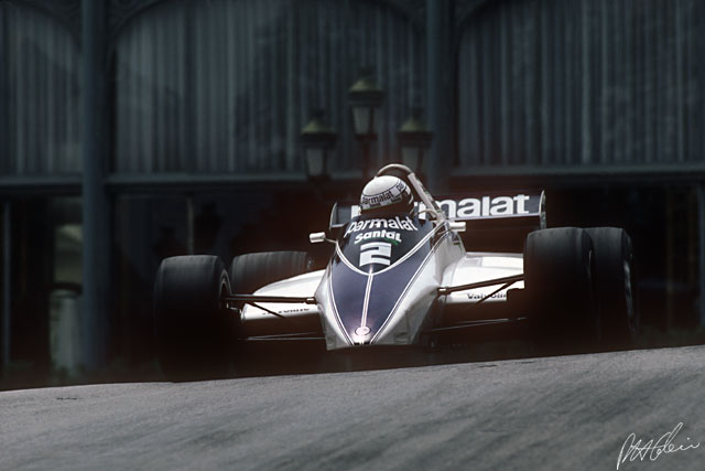
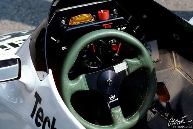
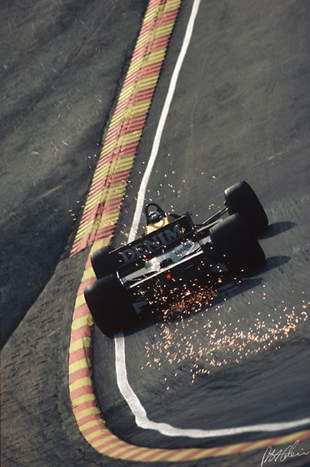
Just watched the documentary on Ayrton Senna (great film) and I’m really digging the whole F1 aesthetic. These images are from The Cahier Archive, a father and son team that has covered the Formula One Championship from the 1950s to the present.
It’s interesting to see how the sport has changed over the years but my favorite decade has to be the 80s. Check out the previous post on the Porsche 917 for more vintage racing goodness.
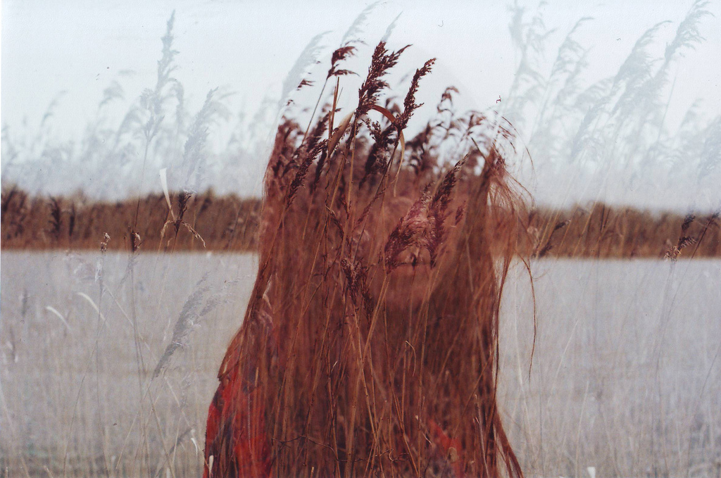
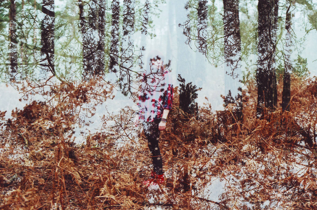
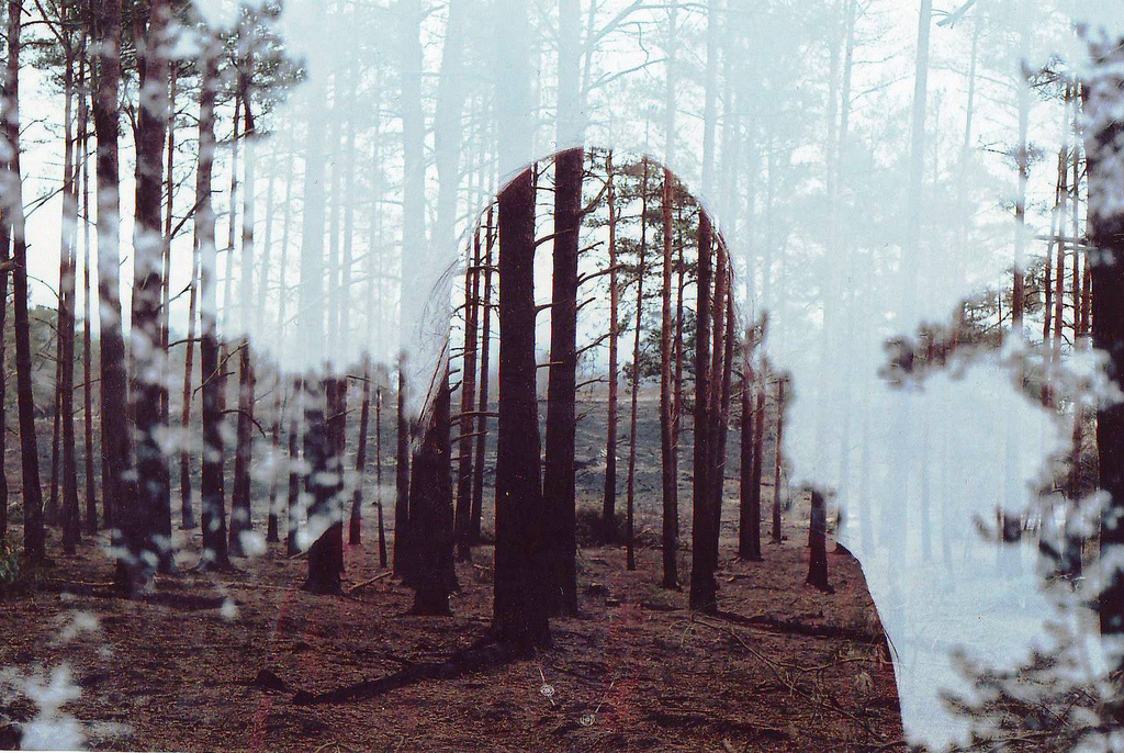
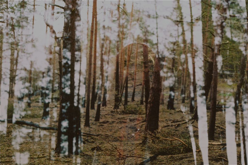
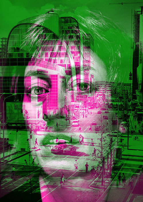
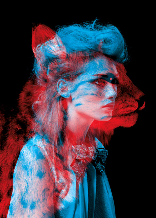
Beautiful, haunting double exposures by Oliver Morris. Even the title of his Flickr stream, “Lullabies to Paralyze” conjures a similar feeling of uneasiness in me.
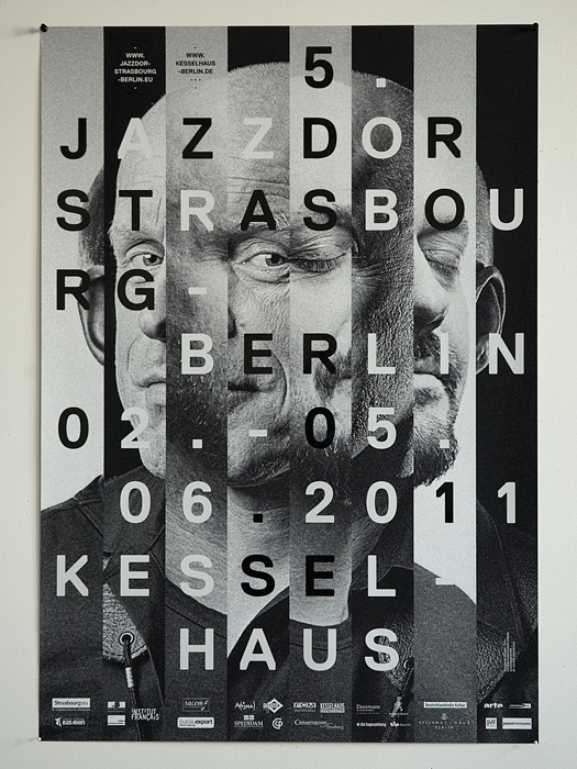
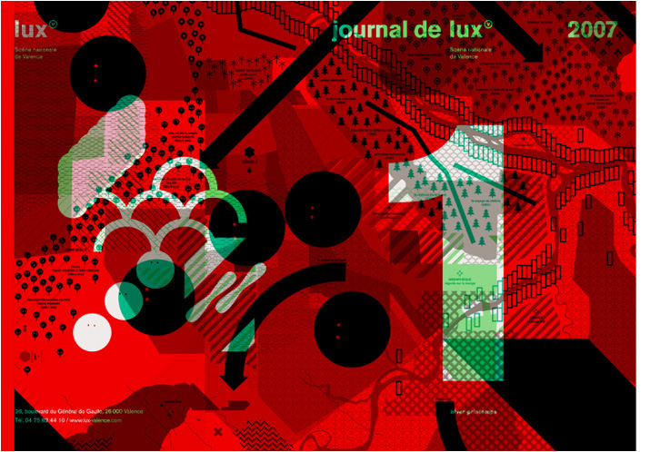
Some great work by Helmo from France. I especially like their Jazzdor 11 and Beast ModeFashion Animals projects. The type and imagery in their work seem to complement one another just right.