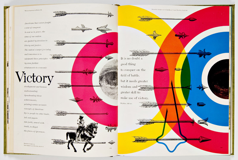
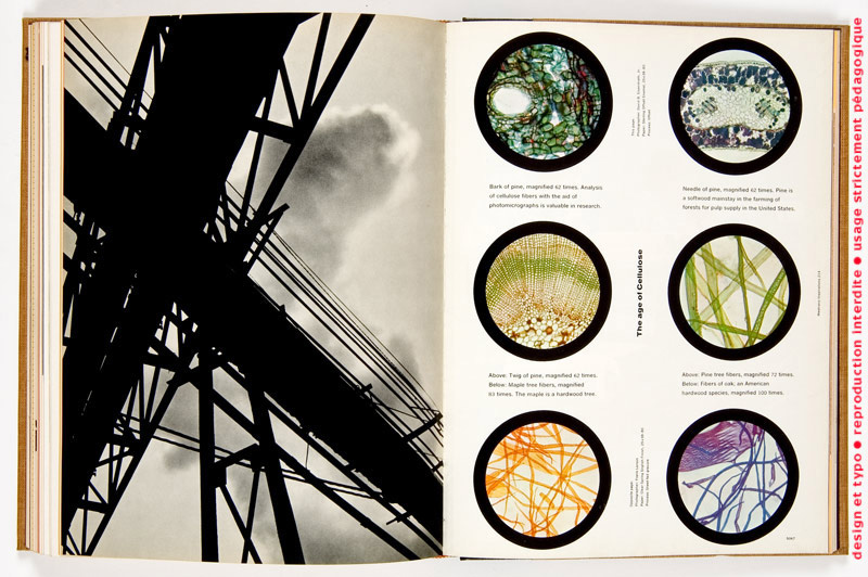
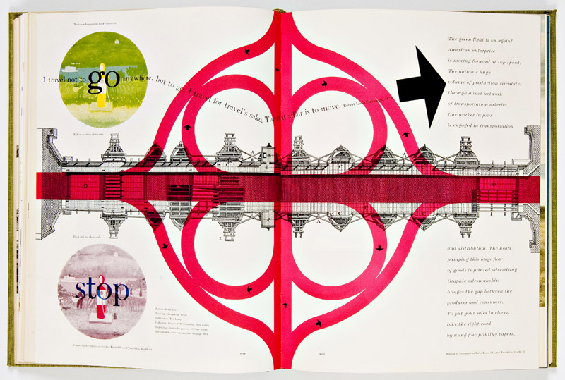
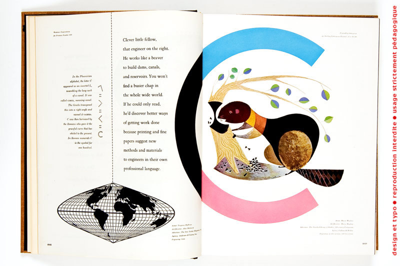
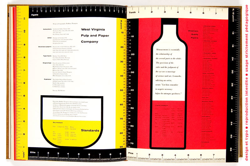
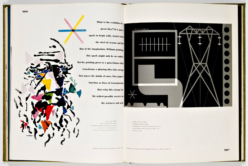
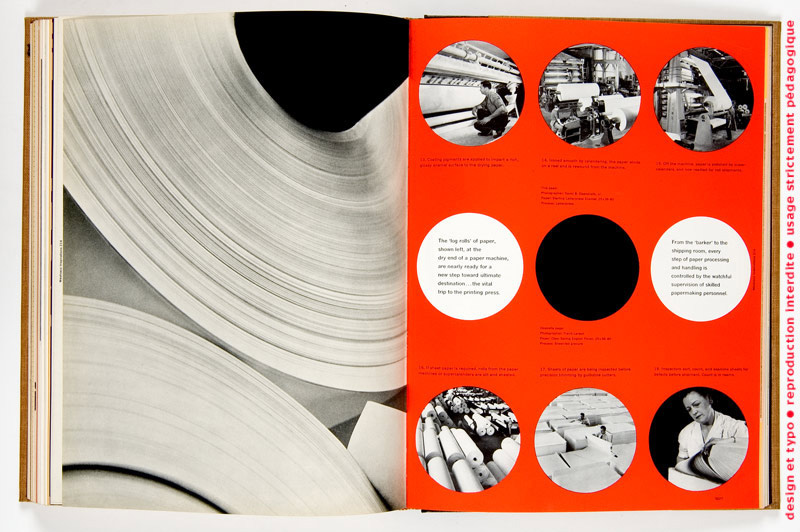
Westvaco Inspirations was a graphic arts publication issued by the Westvaco Corporation, formerly named the West Virginia Pulp and Paper Company, with the objective of showing typography, photography, art work and other graphic inventiveness on papers manufactured at its mills. Because Westvaco Inspirations was intended to demonstrate printing processes and papers, its primary audience consisted of 35,000 designers, printers, teachers and students.
Thompson designed more than sixty issues of the magazine over eighteen years and utilized a variety of printing methods, including letterpress and offset lithography. Tons more great scans at Typogabor.
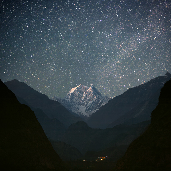
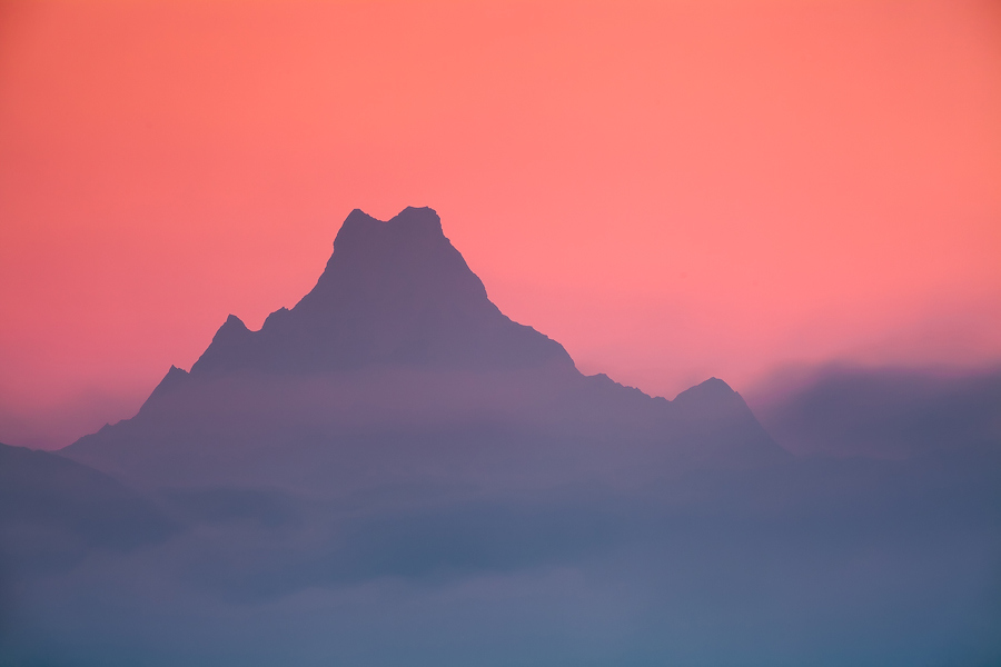
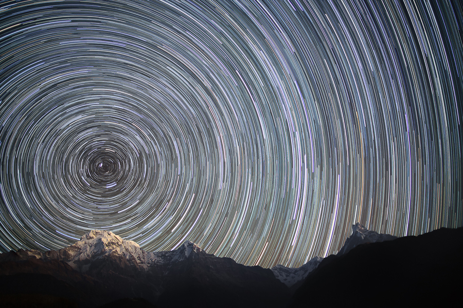
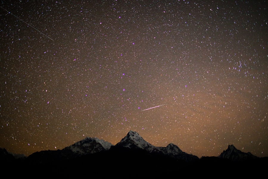
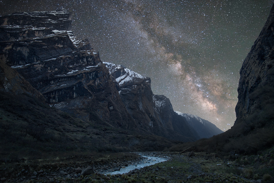
These amazing images were taken by travel photographer Anton Jankovoy. His shots of the night sky above the Himalayas are simply jaw-dropping. If astrophotography is your thing you owe it to yourself to check out his site.
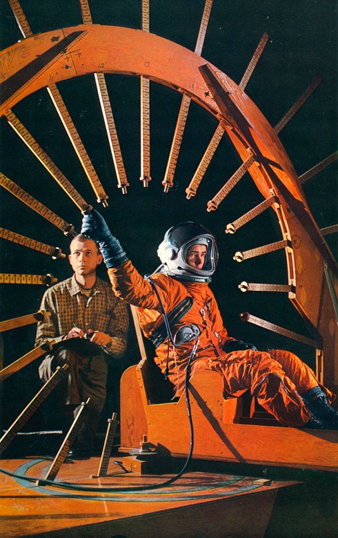
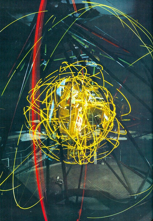
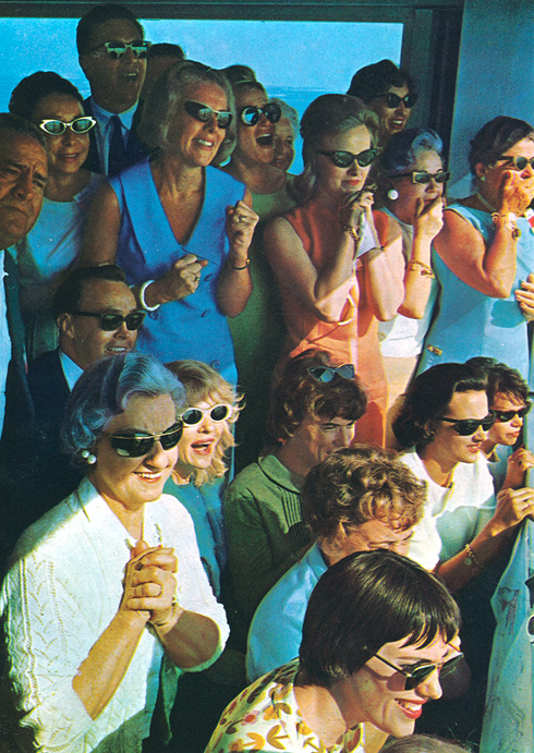
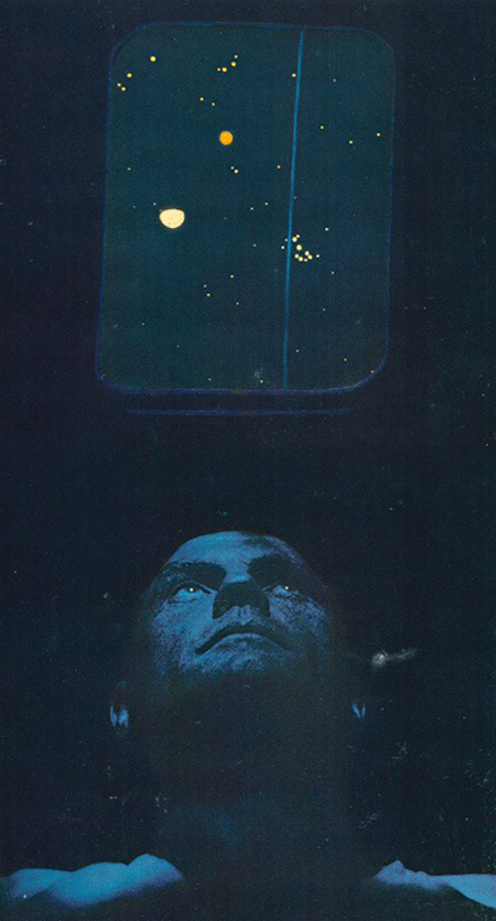
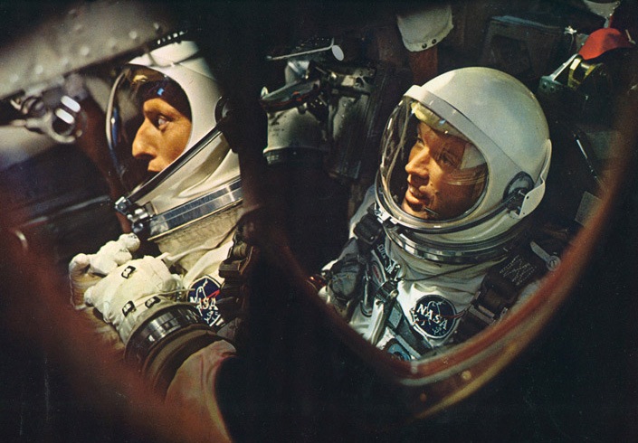
Sci-Fi-O-Rama has some gorgeous scans from Time-Life’s To the Moon, “an audio and visual chronology that documents NASA’s Mercury, Gemini and (of course) Apollo projects.” It includes 6 doubled sided vinyls of interviews and famous radio transmissions as well as a 190 page slip case book, which these scans come from.
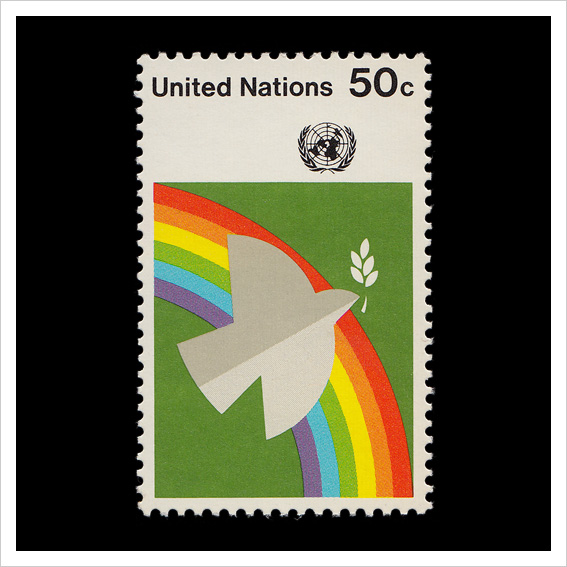
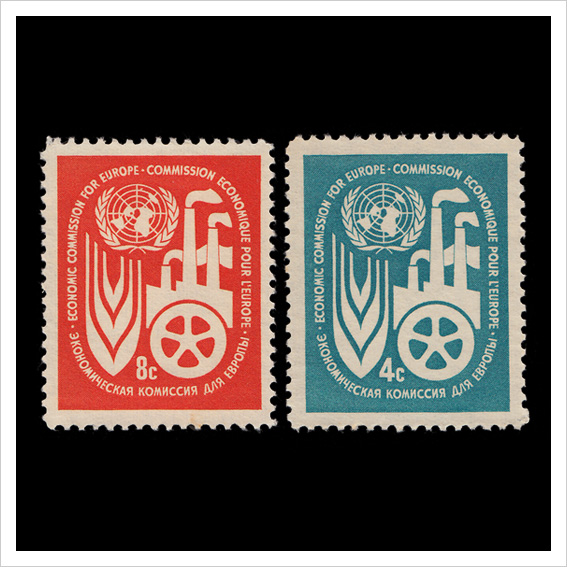
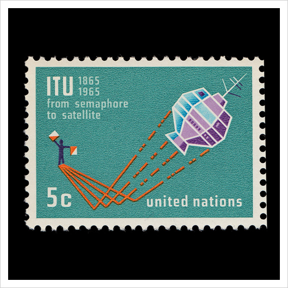
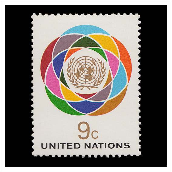
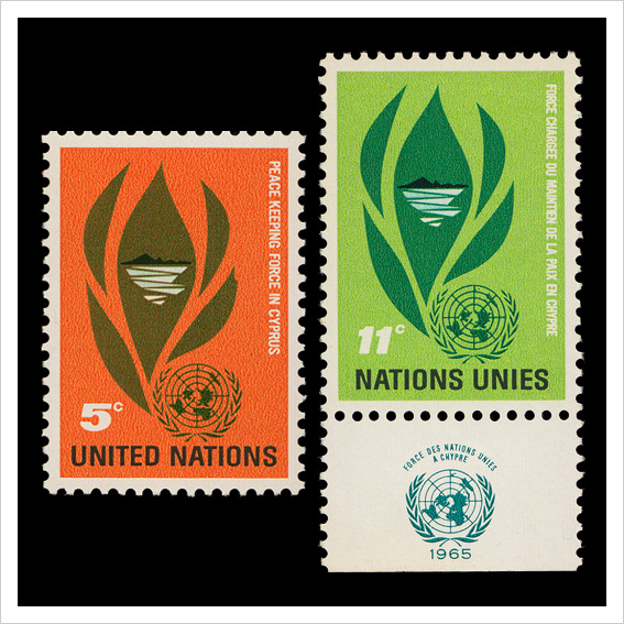
Amy Henderson of AQ-V recently acquired a large collection of old United Nations stamps:
Because the UN is an international organization, its stamp must bear symbols that will be recognized universally. Besides the beauty of the design, the UN Design Committee must consider the political implications of any symbolism used. Naturally none of them can stand for anything contrary to the standards and principles of the United Nations, nor can they represent any one culture, religion, or race.
It was the Design Committee’s suggestion that the official five languages—Chinese, English, French, Russian, and Spanish—should be used on as many of the stamps as possible. This was the origin of the “five-language border” which has become characteristic of UN stamps.
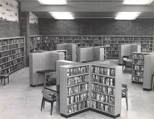
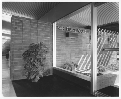
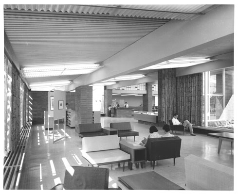
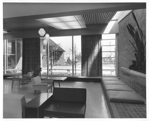
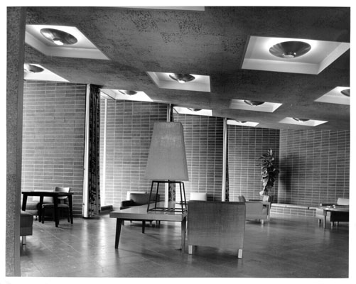
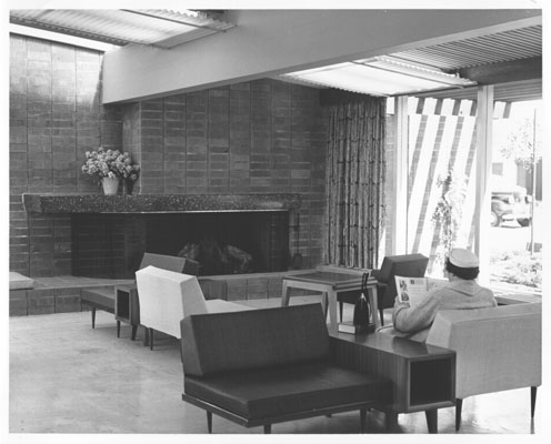
Marina Branch Library was the 23rd branch established in the San Francisco Public Library system and originally opened to the public in 1954. It was designed by the architectural firm of Appleton and Wolfard at a cost of $156,742. Furnishings cost an additional $12,926.
Recently the branch underwent renovations and reopened in 2007 at a cost of $3.9 million. It’s a shame that libraries and offices rarely look like this anymore. Anyone else find any hidden gems on the site and care to share?
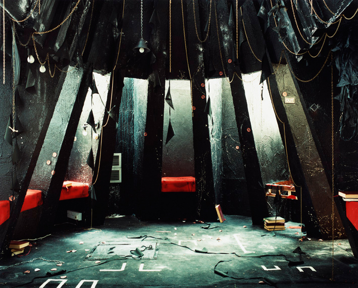
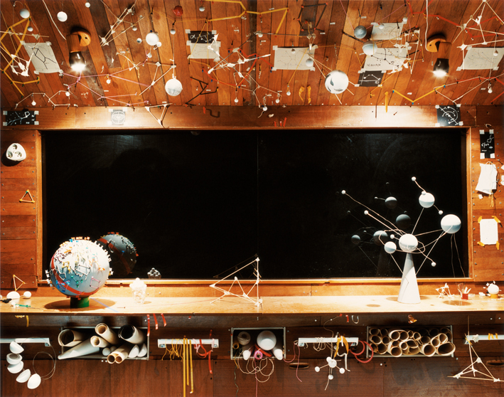
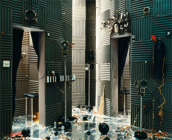
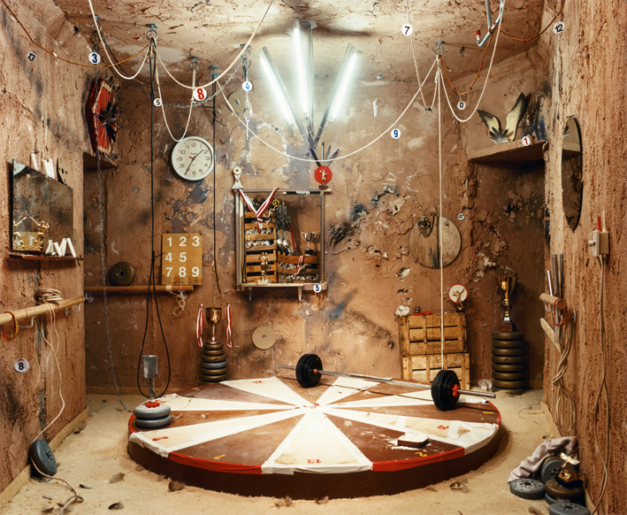
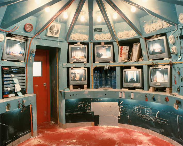
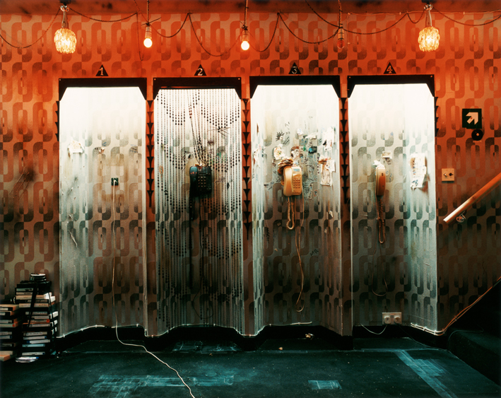
London based Anne Hardy photographs intriguing images of interior spaces. Her scenes are brought to life so convincingly that I thought they were the remnants of abandoned spaces, but they are actually meticulously crafted sets she creates in her studio from scratch.