I am usually reluctant to list my favorites of anything. It’s hard to establish a consistent criteria with which to judge all items fairly, and even if you do, the list changes so frequently that it’s pointless to commit it to writing. My one exception has always been logo design, and Scott’s recent post got me thinking about it again. For as long as I’ve been interested in design I have always maintained the exact same favorite logos. They aren’t necessarily in any particular order, but the three pictured above are far and away my favorite marks of all time. I’ve never been satisfied with logos that gain their strength over time or with gradual brand association; for me, a successful mark works right away.
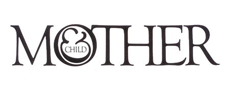
Mother and Child by Herb Lublin
The immediate cleverness of this one is probably what is most attractive to me. I remember staring at it for about five minutes the first time I saw it in the back of Area. I couldn’t believe how at once simple and wonderfully complicated it was. The ampersand has always been my favorite symbol, so to see it employed so unusually was also very exciting.
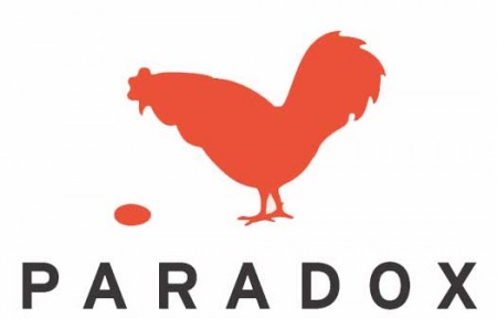
Paradox by Christopher Simmons
Another perfectly clever image. It needs no explanation and the “aha” moment occurs instantly. I’m still impressed how much wit was able to be squeezed into one tiny little mark. Like many great logos, it appears incredibly simple and seemingly obvious, but only after it’s come to fruition at the hand of another designer.
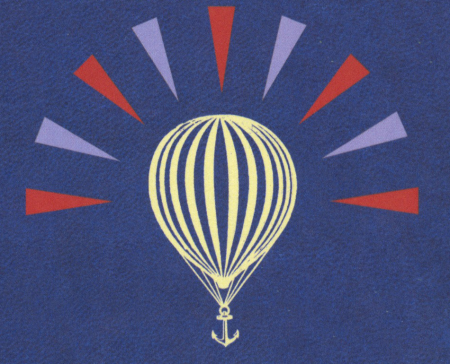
Modest Mouse by The Decoder Ring
What a perfect single image. This is one I can’t look at without feeling incredibly jealous for not thinking of it first. It encapsulates so many different feelings and emotions in one single mark, while still managing to be aesthetically pleasing at the same time (though I can’t stand the colors). The designer sums it up nicely: It’s an idea I came up with because it represents stasis — the balloon will never go up or down. It’s just a general feeling I have about everything: Every time we seem to cure or solve something, another problem pops up.
Of course there are many other wonderful logos out there, but this is a top 3 after all. List yours if you can think of them!
A few beautiful pieces by Buchanan-Smith, a New York City based design firm. I love their type sensibility, especially on the first image, and I find their image style very effective in its simplicity and subtleness. Much more work can be found on their site.
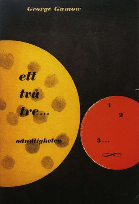
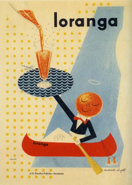
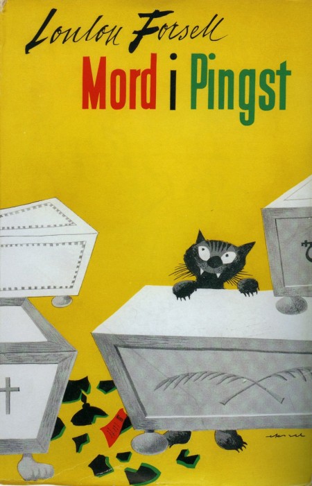
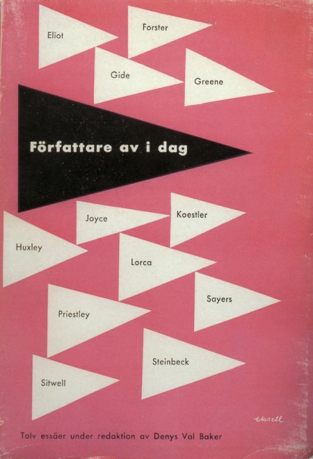
Assorted work by designer Olle Eksell to kick off your Tuesday right. What great typography! (It’s all late 40’s, early 50’s work.) All of the above are scanned from a book I picked up in Tokyo. I thought I had stumbled upon the secret of all secrets when I found it, but you can buy it on Amazon just as well.
Read Between the Leading is a design podcast started by SCAD students Aaron Heth and Matt McInerney. They release just about one show per week and discuss a diverse range of design topics; everything from the Tropicana fiasco to a new name for the @ symbol. They usually have one guest per show, and they’ve already had Mark Simonson, Antonio from AisleOne, and the Grain Edit team on so far. You can listen on their website or subscribe in iTunes.
I never listen to the radio, and have never been able to incorporate podcasts into my routine, but I’ve been trying to keep up with RBTL. I love geeking out over design, and I don’t find many opportunities to do so outside of school. I also continue to be fascinated by differences between design programs across the country, and it’s great to hear the perspectives of students from schools like SCAD. Aaron and Matt do a good job compiling relevant and interesting issues to talk about; their passion for design is definitely contagious. They are still working out some kinks, but I could see the show really blowing up as they hit their stride. Anyone else had a chance to listen? I’d be interested to hear what you all think of the show.
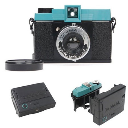
I miss Polaroid! I’ve been stockpiling some old film, but I’m always afraid to use it and run out for good. It looks like the Instant Back attachment for the Diana+ Lomo camera might serve as an able replacement. The Instant Back attaches to the Diana+ and provides you with instant (90sec) print outs, just like Polaroid. It looks like it will do until the Impossible Project begins manufacturing their new film for the old cameras.
Of course, after Scott’s post below, a purchase of any other type of camera besides the 5D seems pointless. I have to start saving now!
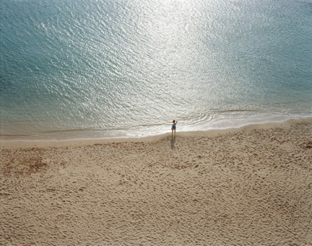
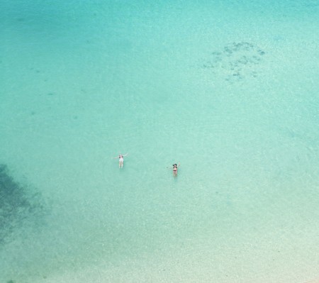
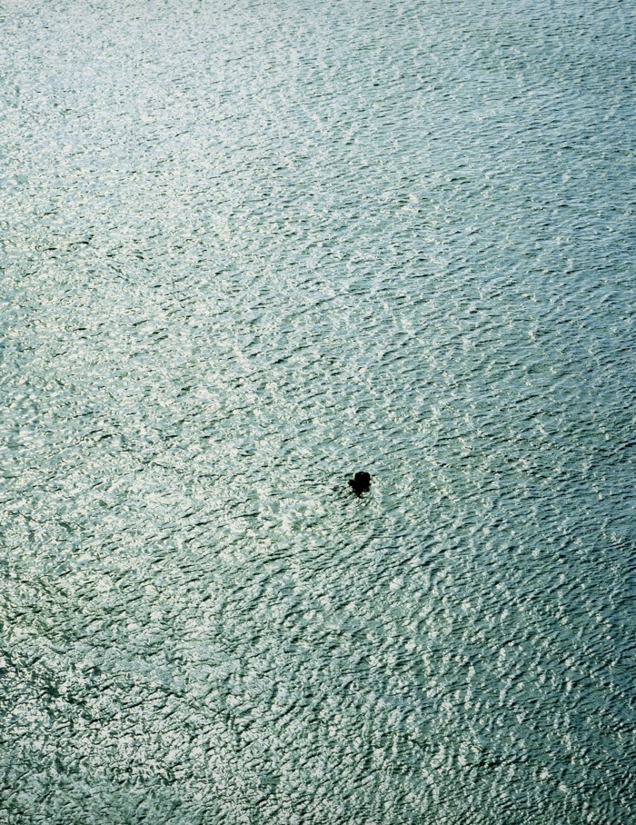
The above are part of Richard Misrach’s On The Beach, a series of large scale (six by ten feet) photographs of swimmers and sunbathers in Hawaii. You can pick still pick up the book (though it looks like it’s become quite expensive), or if you find yourself on the East Coast, you can see the exhibition in person. It was recently on display the National Gallery and is scheduled to be in Atlanta until August of this year. I highly recommend seeing these in person; they are absolutely massive and are truly awe-inspiring viewed full size.
The last image is my favorite photograph of all time. When I first saw it, it affected me like no photograph ever had. I was left speechless, and am still not able to really explain what it is I find so powerful about it. It’s hard to tell on screen, but the little dot in the water is two people embracing. I like that you can’t see the shore; for all we know, they could be floating out in the middle of nowhere. Of course, all of the photographs were taken out of Misrach’s hotel room window, so they can’t be too far out there, but it’s easy to forget when all shoreline indicators are absent. Perhaps it’s this sense of remoteness and potential danger, combined with the serenity of the overall scene, that gets to me. I feel worried and calm at the same time. I would almost fly to Atlanta just to see it again; it’s like a drug.
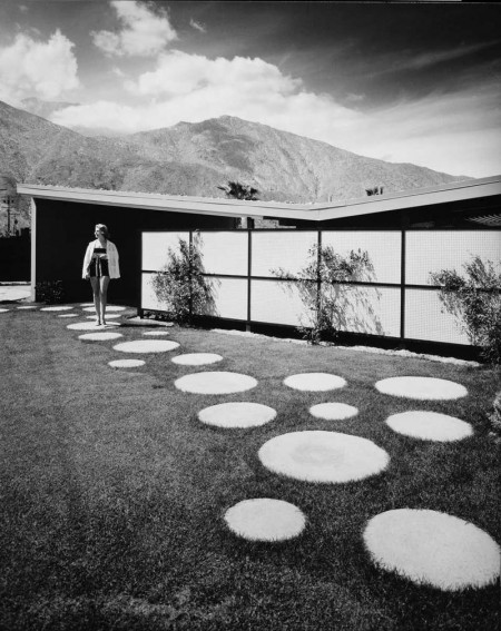
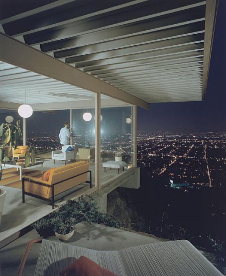
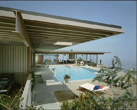
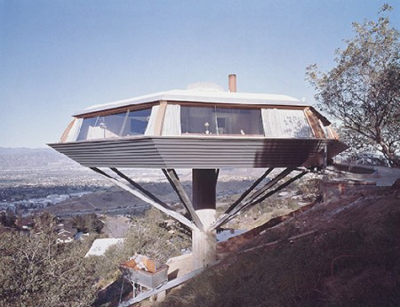
Visual Acoustics is a documentary about architectural photographer Julius Shulman. It’s been touring the country since July of last year, when it premiered in Los Angeles, and just recently won an award for Best Documentary Feature at the Palm Springs International Film Festival. I guess it’s not hard to believe; mix photography, modern architecture, and film together and you have an unbeatable combination! Shulman’s work epitomizes architectural photography, and it would be fascinating to hear him talk about it and get an in-depth look into his world. I just watched the trailer and it really does look amazing. I just wish they would have a screening in San Francisco…
Anyone seen this yet?
Populating his photos with human models and striking landscapes, Shulman combined the organic with the synthetic, melding nature with revolutionary urban design. The resulting images helped to shape the careers of some of the greatest architects of the 20th Century…Through the exploration of both Shulman’s art and uniquely individualistic life, Visual Acoustics offers an unforgettable portrait of Modernism’s most eloquent ambassador. [Link]
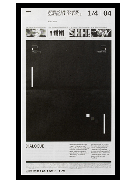
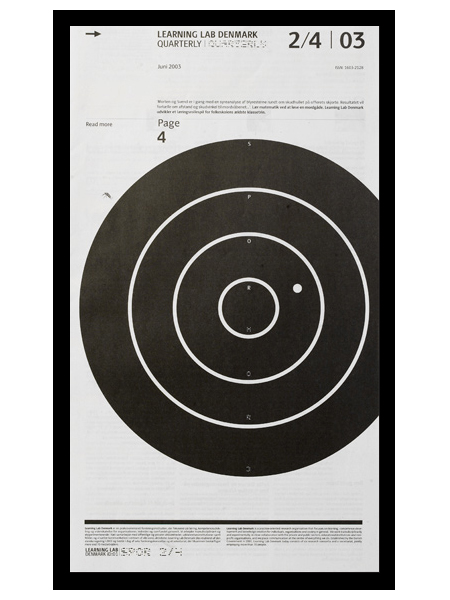
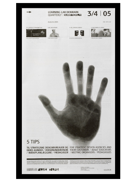
e-Types did this newspaper series for Learning Lab Denmark. I am a big fan of the compositional style at work here. Anything with a strong grid, effective use of scale, and highly refined details will win me over quick. I especially love the second one; the slightly off center target gives it a really refreshing balance. (I should also mention that I’m a sucker for black and white.)
I actually thought (and hoped) these were posters when I first saw them. I prefer posters that take a minute to digest. For me, the more sections, information, and images you can incorporate into a poster, the better. Sure it may not be effective in terms of getting a message across quickly, but I think the end result is usually more visually intriguing and effective, from a design standpoint. (Advertisers would certainly disagree.) Seeing as these aren’t posters, perhaps it’s beside the point, but regardless of their deliverable form, I think this series is very well executed.
When a design doesn’t work – go old school. Forget hype, think craftsmanship. Heavy skills prove over and over to be the best tool to overcome the creative crises we all encounter at least five times a week. Creativity is nourished by structure.