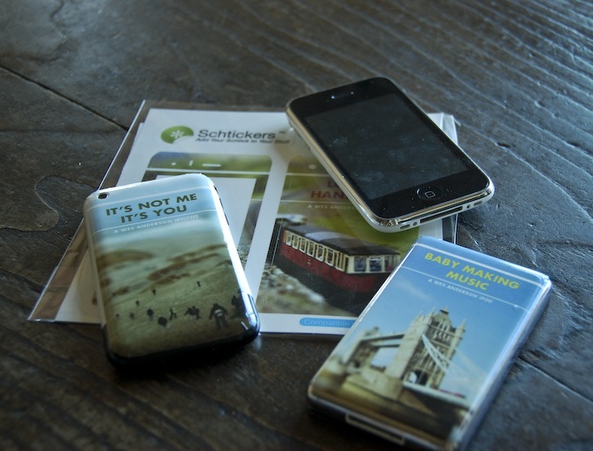
I’m still chipping away at the project I mentioned last week. One of the requirements is the creation of three products to complement the film festival we are creating and branding. The products can be pretty much anything, but one has to tie conceptually to our overall vision for the project. I have no idea what I’m going to do in this regard, and I figured I would knock out the other products first. I decided to try out Schtickers and get a few custom iPhone/iPod skins made. I can’t imagine ever actually wanting to ruin the impeccable design of either device with a sticker, but for a hypothetical film festival mock up, I figured it could at least be interesting. As I am also creating a website for the festival, I thought the iPhone/iPods would look good next to the laptop displaying the page on presentation day. The “electronic” portion of the festival brand fully fleshed out.
Overall, I would recommend Schtickers if you happen to find yourself in the market for some custom skins. I think they are most useful for in-class projects, or perhaps an unusual gift, but are definitely not a serious design option for professionals. Print quality is fairly good, but nothing close to what you’d get on paper. For my image style, it actually ends up looking dead on, but I can’t imagine many people appreciating the softer edges and slight blur you get with the vinyl print. The design/order process was very easy and smooth, and the stickers arrived within two days. Compared to some of the other vendors I am outsourcing to, this was amazing turnaround.
For the above sticker mock ups, two of the images come from agnusleonard and matstace. For the final versions, I will be using my own tilt-shift work like on the record cover. Next up should be the poster, which if all goes according to plan (when does that ever happen?), should be printed tomorrow.
Semi-related, Zweiphone will make your iPhone look like another, out of date phone. (via Subtraction)
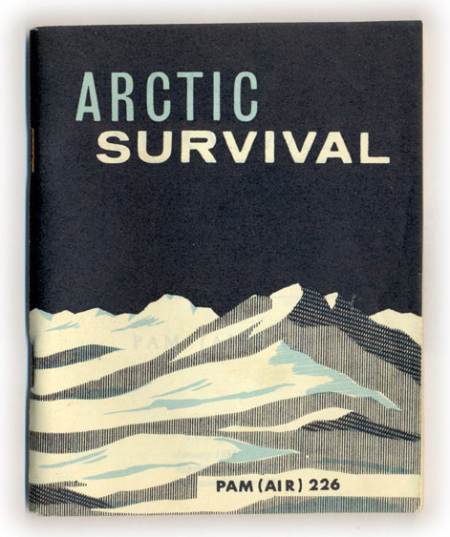
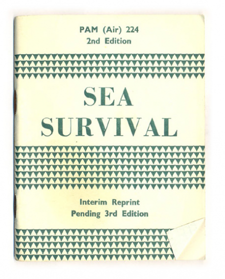
Hopefully won’t be needing either of these anytime soon, but with a cover like that, I’d take the Arctic one around with me regardless. Both survival manuals, along with a desert and jungle version, are up over at things magazine. You can even read the entire book if you think you might find yourself in an ice or sea related predicament.
Conserve your energy. Do not rush around aimlessly. Avoid fatigue. Get plenty of sleep. If you cannot sleep, just lie down and relax your body and mind. You will not freeze to death unless you are utterly exhausted.(link)
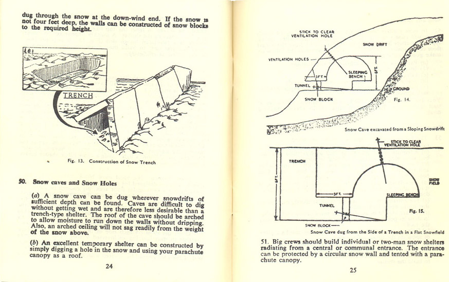
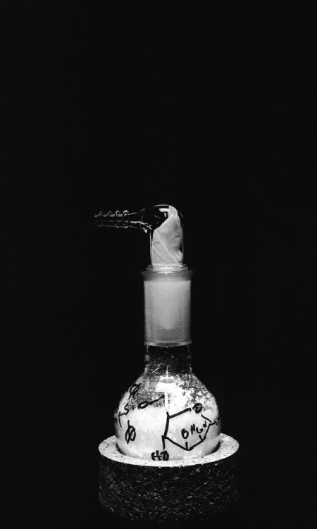
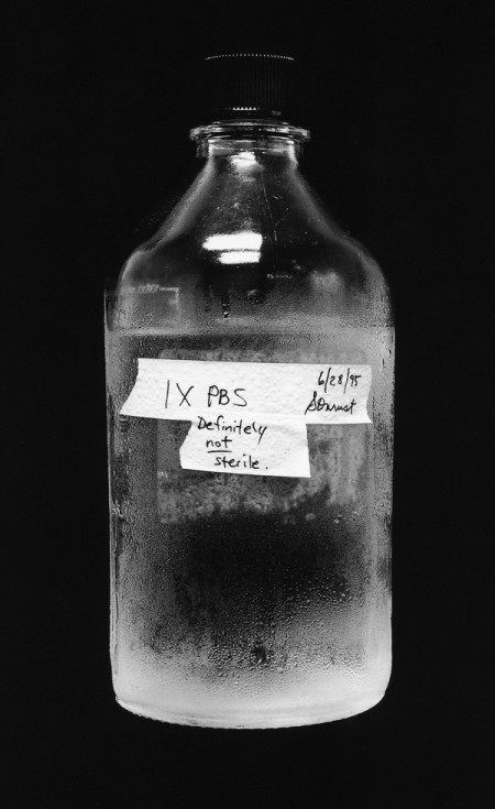
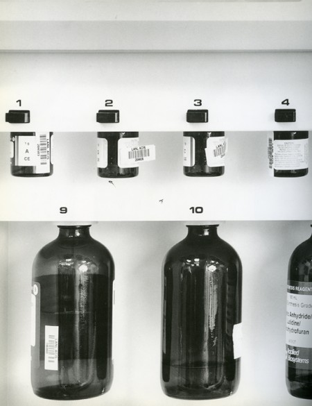
Photographs by Catherine Wagner from her book Art & Science. They are all part of the same project for which she travelled to major laboratories around the US and captured many different elements of the scientific experience; everything from beakers (my favorite) to bone marrow smears. As the intro states: “The resulting images offer the opportunity to encounter science in an innovative and unusual manner, as they bridge the distances between art, science and everyday life.”
Polish designer Jacek Utko on the impending doom of the printed newspaper, and how good design could turn things around. His statistics certainly are convincing, and I hope for the sake of my morning routine that he’s right. I would really hate to see the printed edition become extinct. Watch the TED version here.
He mentions it briefly, but when he says “this is the new role of the designer: to be in the process from the very beginning to the very end”, that is the biggest take away for me. The role of the designer is definitely changing, and our value now has a lot more to do with how we think than what we can do with a blank page.
Khoi Vinh just posted an incredible piece about design criticism for his Subtraction blog entitled “Dear Designers, You Suck”. He calls for a new kind of design criticism, one that separates the designer from their work and attempts to imbue the field with more objective and honest criticism.
…are we really having the kinds of meaningful, constructive, critical discourses that we really should be having? Are we too quick to take offense at the opinions of our peers? Or are we pulling our punches too much when discussing the merits of the work that our peers turn out? To put a finer point on it: are we being honest with one another?
The answer is definitely no, we are not being honest with one another. As a student, I am very familiar with the problem he describes. As our school is critique based, we see this avoidance of real, honest criticism every day. When something truly awful gets laid in front of us, we hedge around what we really think with all sorts of meaningless qualifiers: “Well, um, I think…for me anyway, and maybe it’s just the light but…the colors aren’t working.. but uh.. in the best way possible.” I know I for one have never felt comfortable saying what I really think, and this is the problem. There is no way to really grow if you don’t get the critique you need, and getting past the discomfort of critiquing honestly is what desperately needs to happen, as awkward as it might seem at first.
The harsher teachers at our school tend to get a bad reputation for being blunt–which in my mind translates to a good reputation. I’ve always seen the most improvement with my own work when the first thing the teacher says is “this is really bad, and here’s why.” I want the teacher that makes people cry. I want to hear “this is terrible” when the work actually is. The worst thing someone can do is say they like something just to be polite.
Khoi’s article is a breath of fresh air, and I truly hope his words will be put to practice. I like to imagine what class would be like if everyone truly spoke their mind; how exciting! How much more we would learn! Maybe it won’t happen tomorrow, but it can start with reading this article. Well done Khoi for calling attention to a such a pervasive problem!
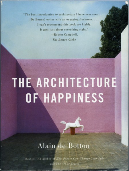
I purchased The Architecture of Happiness by Alain de Botton because I loved the cover. I think it was the colors that first caught my eye. I was also intrigued by the shadow and the shape it created; how it almost touches the statue in the most perfect way. The eye follows the line it creates, and it helps reinforce the hierarchy of the page really effectively. For whatever reason, and as the title indicates the book may elucidate, the whole design makes me happy every time I look at it.
Why this design makes me happy, and to a greater extent, why architecture of a certain aesthetic caliber appeals to us, is largely what this book explores. It is a must read for designers of all disciplines as it pursues the question at the core of what we do: Why make things look beautiful (what does “beautiful” even mean?) and not just purely functional? One of my favorite parts of the book describes the principles of some nineteenth century engineers that felt like they had determined the end-all criteria for evaluating structural design:
The engineers had landed on an apparently impregnable method of evaluating the wisdom of a design: they felt confidently able to declare that a structure was correct and honest in so far as it performed its mechanical functions efficiently; and false and immoral in so far as it was burdened with non-supporting pillars, decorative statures, frescos or carvings. Exchanging discussions of beauty for considerations of function promised to move architecture away from a morass or perplexing, insoluble disputes about aesthetics towards an uncontentious pursuit of technological truth, ensuring that it might henceforth be as peculiar to argue about the appearance of a building as it would be to argue about the answer to a simple algebraic equation.
As the rest of the book unfolds, Botton examines, as eloquently as he does above, the alternative to what these engineers proposed. Why it is that we strive to make things beautiful, and what qualities beautiful work possesses. The parallels between his chosen arena of architecture, and other realms of design, are easily drawn, and make it very worthwhile for interested minds in every field. My favorite paragraph is on page 72, and does a nice job bringing together a lot of what he discusses in the book:
In essence, what works of design and architecture talk to us about is the kind of life that would most appropriately unfold within and around them. They tell us of certain moods that they seek to encourage and sustain in their inhabitants. While keeping us warm and helping us in mechanical ways, they simultaneously hold out an invitation for us to be specific sorts of people. They speak of visions of happiness. [Buy on Amazon]
– – – –
On an unrelated Note: Peter, of Buchanan-Smith, wrote in to clarify the attribution information of a previous post on designer Josef Reyes. The work presented was produced by the studio Buchanan-Smith, where Reyes works as a designer, and the post has been updated to credit the work to the Buchanan-Smith studio. Definitely make sure to check out their site, they have a lot of great work.
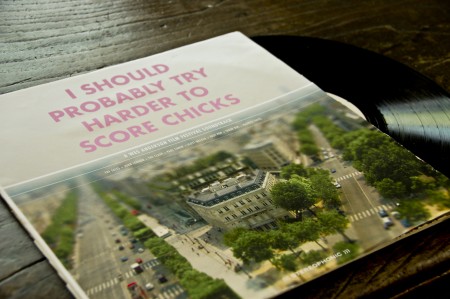
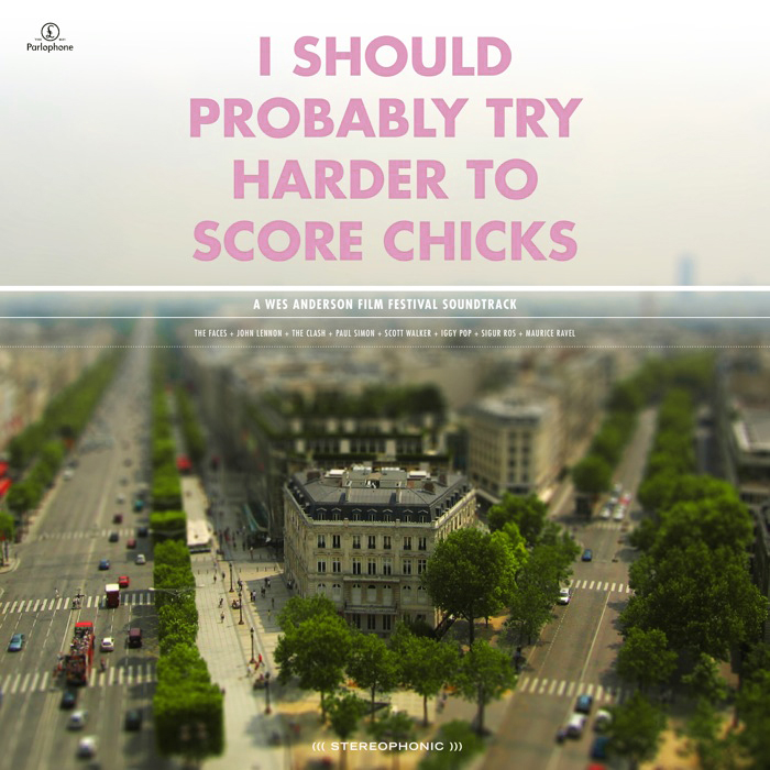
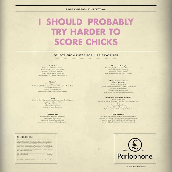
A while ago I mentioned a project I was working on for class regarding a film festival. The project is about halfway done at this point and I thought I’d post a little (tiny) bit of what I’ve been working on. The project is to create a hypothetical film festival centered around a director of our choice. We are to design all of the collateral that would support the festival; posters, catalogs, tickets, schedules, signage, products, a website, trailer, and DVD packaging to name a few. The style is to be reminiscent of the director, but we are not meant to copy the existing visual branding that surround the films.
As Wes Anderson is my favorite director, I decided to create my fictional film festival surrounding his work. His films are packed with beautiful imagery and all adhere to his very distinctive visual tendencies and style. Of all the directors I was considering (Gondry, Allen, Fincher) his work seemed to have the most exciting/appealing visual possibilities. I started out with a much different approach than what you see above, and was mainly just taking pictures of random objects and curiosities and slapping type over the whole thing. My first directions were really bad, fantastically terrible even. I was pretty much just poorly recreating shots from some of the films and not inserting any additional concept to the look and feel. (I’ll post some of these earlier directions in later process posts).
The direction I eventually landed on, and what you see a piece of above, was a combination of tilt-shift photography and Anderson’s typeface of choice. The use of Futura Bold is a direct tip of the hat to his style. I figured I needed to have at least one direct visual link, given that my image style was much more divergent, and Futura Bold would be immediately recognizable to anyone familiar with his work. The concept behind the tilt-shift choice was based on the observation that all of Anderson’s films seem to take place in a parallel social universe where people say what’s on their mind and things unfold in most peculiar ways. Anderson, being the auteur that he is, sort of curates this whole crazy universe. The tilt shift look, in addition to being visually captivating enough to grab attention, is meant to conjure this image of Anderson overseeing this unusual world that exists in his films. I have been tilt-shifting my own photography so far, with fairly successful results, and it’s been a fun technique to learn. I try to use my own photography whenever possible, and find the “Flickr look” (as in people sourcing images on Flickr) that pervades most projects at school exceptionally irritating. It’s hard to generate your own imagery for a project this big, especially if the concept is unusual, but I feel much more proud of the end result when everything is of my own creation.
The centerpiece of the project is meant to be the logo. We spent the first couple weeks coming up with logo treatments and titles for our film festival (Just calling it the “Wes Anderson Film Festival” was not allowed). For my project, I have neither a title or a consistent logo mark. The logo and title unfold throughout my project, and are consistent in their type treatment and ridiculousness of the language. For example, the title of the LP above is “I Should Probably Try Harder to Score Chicks,” a line from Rushmore. The “logo” that appears at the top of the main film poster is “They Were Giving Each Other Handjobs While You Were Taking a Nap by the Pool.” When you see a lot of pieces of the puzzle, the lack one mark is not evident because the consistent type treatment and language tie everything together. It’s also fun to have super random sentences gracing the front of all of the work; makes for a much more humorous project.
Above is just one piece of the massive project that I am attempting to put together. It is a soundtrack of songs that are either in some of the films, or feel like they might be, and is still very much a work in progress. Having landed on a image/type style, with about a month to go, my motivation has trickled to a crawl. The hardest thing for me is conceptualizing what the project will look/feel like, and once I have this locked down (and it’s just a matter of applying it to all the different formats), I lose a lot of interest in what I’m doing. I’ll kick back into gear soon, and hopefully will have more pieces to show in the weeks to come.
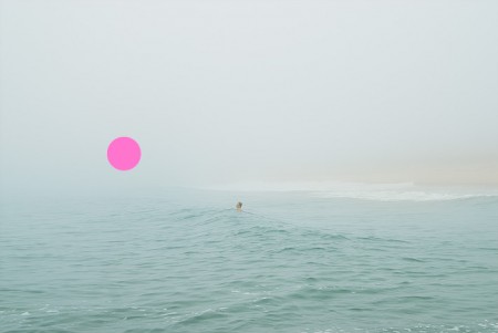
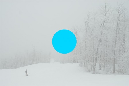
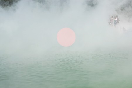
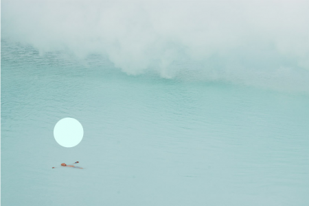
These shots by Carlo Van de Roer look like pure and unfiltered tranquility. I’ve never been to Iceland before, but this series captures what I imagine it would be like. It looks freezing and potentially dangerous, but still somehow soothing and comfortable. Probably the most immediately noticeable aspect of these images is the inclusion of the colorful floating orbs. Personally I love them, and I think they are the reason his work has picked up so much recognition. They are a unique touch that brings a little bit of extra magic to his already stunning photography. I’ve read he screen prints the orbs onto the photographs, but I can’t find any information regarding the concept behind the orbs. Perhaps it’s just an aesthetic choice, but I would imagine (and prefer) that there is some deeper conceptual reason for their placement.