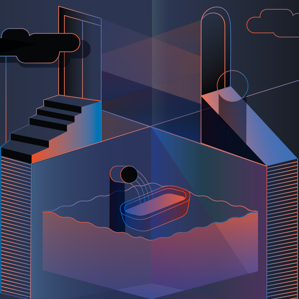
Weekend Inspiration: Pattern Matters
Posted by Jon M

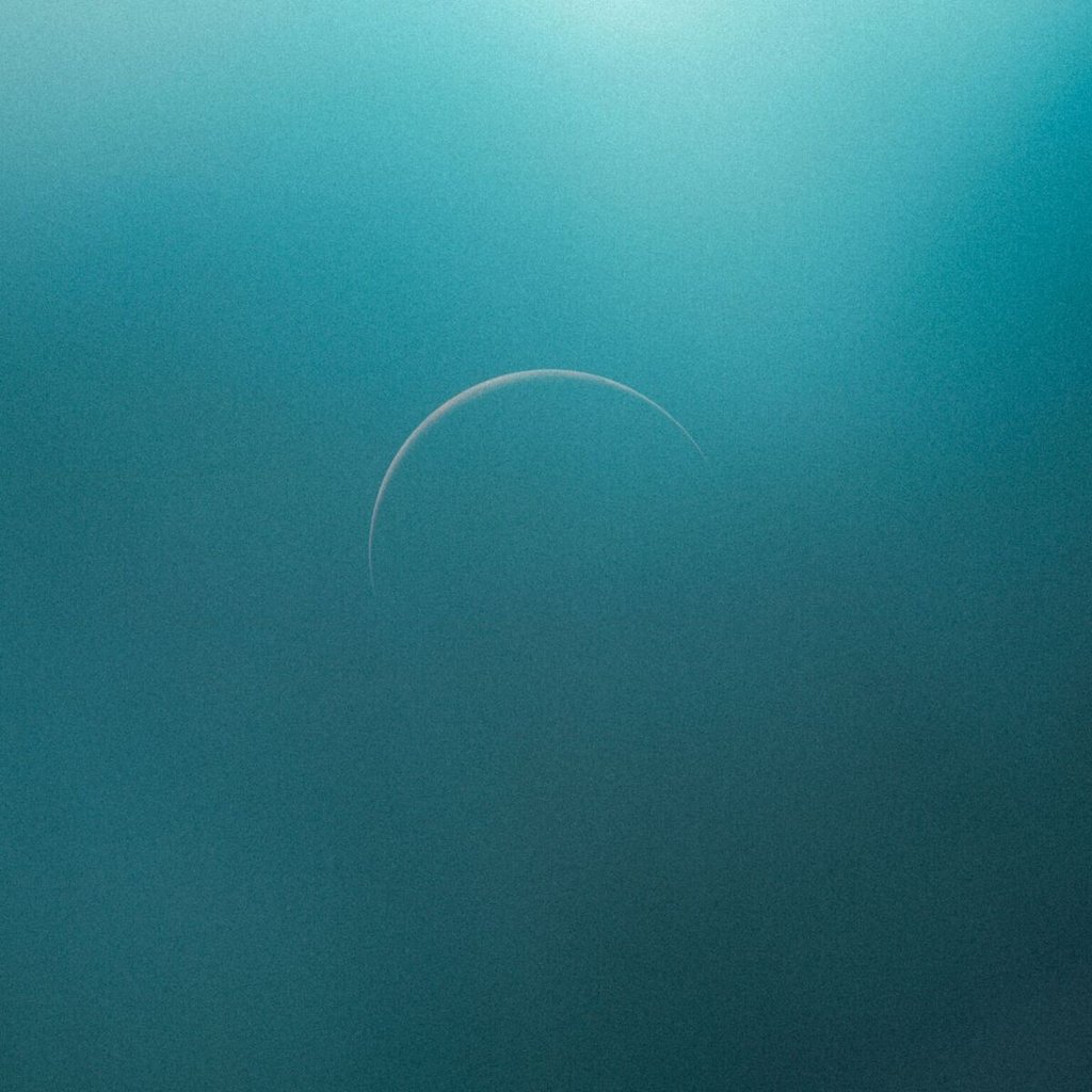
The return of Jon Hopkins and his new album, Singularity, his first since 2013’s breakthrough, Immunity. Singularity is due for release on 4th May 2018. Along with news of Singularity, Hopkins has shared ‘Emerald Rush’ the first track to be released from the album.
Singularity begins and ends on the same note: a universe beginning, expanding, and contracting towards the same infinitesimal point. Where Immunity – his hypnotic breakthrough LP – charted the dark alternative reality of an epic night out, Singularity explores the dissonance between dystopian urbanity and the green forest. It is a journey that returns to where it began – from the opening note of foreboding to the final sound of acceptance.
Shaped by his experiences with meditation and trance states, the album flows seamlessly from rugged techno to transcendent choral music, from solo acoustic piano to psychedelic ambient. Its epic musical palette is visceral and emotionally honest: with a destructive opener full of industrial electronics and sonic claustrophobia and a redemptive, pure end on solo piano.
Exploring the connectivity of the mind, sonics and the natural world, Singularity reflects the different psychological states Hopkins experienced while writing and recording. It is a transformative trip of defiance from his initial sense of frustration at the state of the contemporary world to the ultimate conclusion that a true sense of peace and belonging can only come from nature.
Singularity is intended to be listened to in one sitting, as a complete body of work.
Singularity Tracklist
Singularity
Emerald Rush
Neon Pattern Drum
Everything Connected
Feel First Life
C O S M
Echo Dissolve
Luminous Beings
Recovery
SUPPORT VINYL
A genuine ode to the softer sides of the early 90s indie pop scene, could have been cherished by either coasts back then.
Positive Noise, the debut album by Sam O.B, is not a ‘journey of a record’, but it’s also not Party Time USA. It’s nuance: cloud patterns: like good progressive jazz. Like the refinement of refinement, the elegance of elegance. Sound propelled by its own smoothness. A coolness that isn’t cold. The earnestness of an old friend. Expanse. Experimentation. Actual warmth.
Sam O.B. is (and has always been) a man of classics. When you hear the sax on ‘Salt Water,’ you will understand this ambition with precision. Arpeggiated horn delay and female oohs fall like geodesic rain. The blasting synth leads on ‘Midnight Blue’ and ‘Nearness’ waver and find their way (“Always on time”). The sing-and-play harmonies of ‘Sirens’ refer to the stunning bliss of smooth jazz, which has been in Sam’s arsenal of interests for longer than anyone can remember.
Pre Order Now
Beautiful Limited Vinyl and Digital
Sam O.B – Positive Noise – The Debut Album
Album Out 11th August 2017
© LuckyMe Records 2017

by jasonjko
As co-founder of spatial audio platform Envelop, pioneering producer and electronic musician Christopher Willits navigates the new universe of three dimensional music composition. The technology positions sound around the listener—full spatial orientation—whether inside an Envelop space or at home with ordinary headphones. A logical step for an artist whose output, spanning over 25 releases, has inched increasingly towards rich, immersive audiovisual experiences. His new project, Horizon, culminates a career-long journey for space, physicality, and serenity in music. Fitting, a decade after Willits marked Ghostly International’s first ever exclusively digital full-length, that he brings the label its first spatial audio album.
Willits began to share his diverse vision of ambient music in the early 2000s, releasing a string of critically acclaimed albums on the 12k label. The minimal sound introduced on those recordings remains at the core of his work: warm guitar tones woven into smooth, harmonic surfaces. Willits would expand the spectrum of his catalog next through collaboration, working with Ryuichi Sakamoto, Zach Hill (Death Grips), Taylor Deupree, and, for 2014 LP Opening, the whole band of Tycho.
In the period since Opening, Willits and friends successfully crowdfunded Envelop, allowing further development of its open source software, which integrates with production tools like Ableton Live as well as virtual reality platforms, and its 3D sound space locations for performance, research, workshops, and other non-profit projects. He also composed the original score for documentary The Art of Listening, and continues to lead music production and meditation classes in San Francisco.
Both Willits’ teachings and his mission with Envelop inform the deep ambient terrain of Horizon. Spanning one hour and thirty minutes, the album surrenders to the sentient fabric of time and space, and by design, aligns with sleep patterns, meditation, and other mindful practices. This is slow music, mapped to surround listeners whether in states heightened or muted. Space, literally and figuratively, to reflect in.
The innovative 3D mix is evident within the first sweeping, spherical pan of “Comet” (access to Envelop’s software or spaces not required). As one orbits, on occasion the panoramic view touches down to the surface by way of ambisonic field recordings, like the Peruvian Amazon at night on “Return” and the Hawaiian ocean waves of “Waipio.”
This weightless motion—shifting between gaseous and textural, macro and micro—offers a unique and transcendent proprioceptive experience. Listeners are ushered through atmospheres with indeterminate length, breadth and depth. It is as if we are at once above, below, within, and alongside the skylines of sound.
SUPPORT DIGITAL

The Epoch is a hinge. We tend to follow a linear trajectory until a point at which we realize that through free will the path can be bent and redirected.
I’ve been very busy for the past year or so working on a new album so it’s been a while since I’ve posted. Now that the new Tycho album — Epoch — is out I wanted to write a little about the meaning and origin of the artwork. I worked as a graphic designer for 14 years until I decided to pursue music full time so the visual element of Tycho has always been at the core of the project for me. I think the imagery tells a story that the music can’t fully articulate, and vice versa.

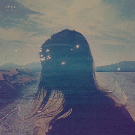
Past is Prologue (2006), Daydream (2007), Dive (2011), Awake (2014)
· The Trilogy Begins
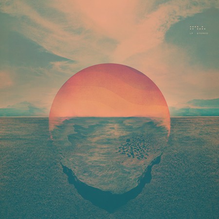
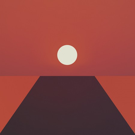
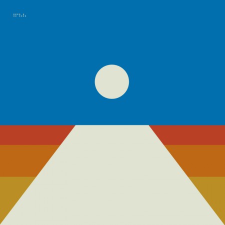
Dive (2011)
The cover for Dive was a foray into maximalism combining photography and design. I wanted to evoke the sense of being on an unavoidable path, one from which deviation was impossible. I wanted the viewer to be pulled into the image and be drawn toward the sun. I think this design speaks to the music in that it felt like the beginning of a journey and the multi-layered composition echoed the sonic aesthetic of the music. I spent quite a bit of the next couple years refining this style and creating various collage type images.
Dive Single (2012) – Another cover in the style of the Dive full length cover
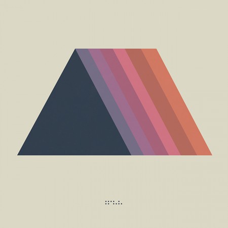
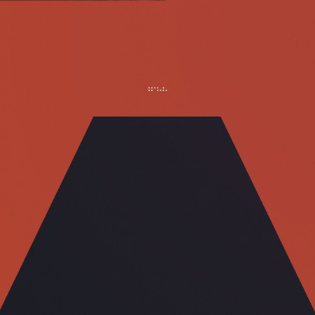
· Enter Minimalism and The Trapezoid
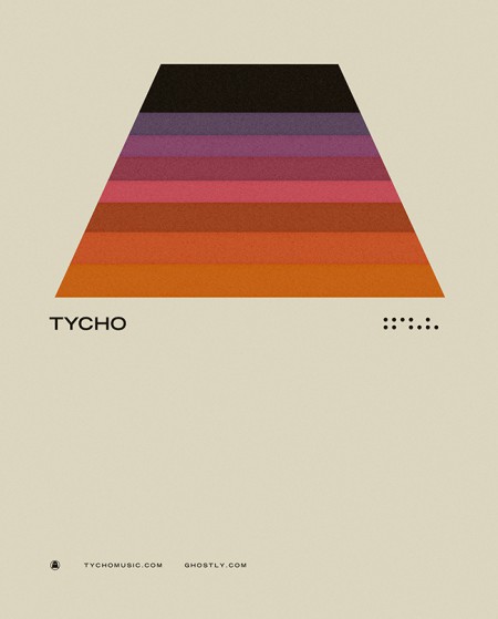
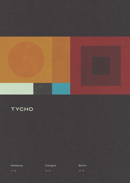
Concert Poster (2012)
· The Awake Era
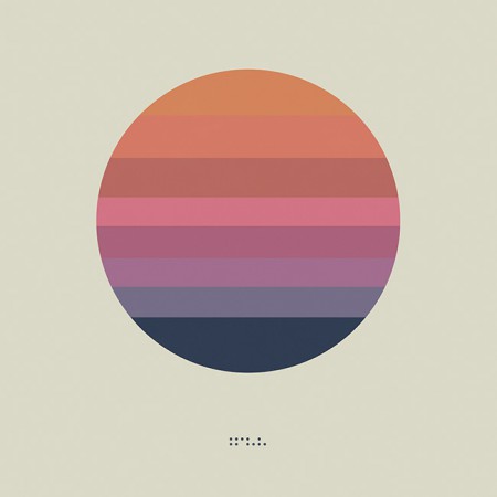
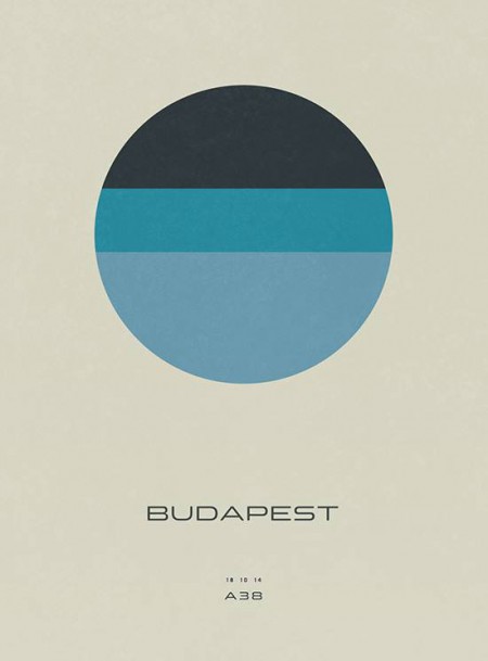
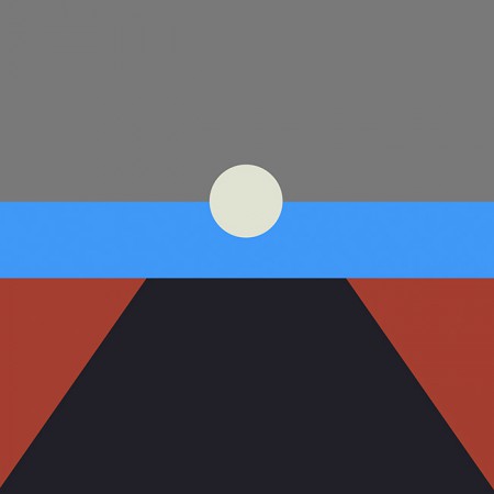
Awake (2014)
Both the circle and the trapezoid symbols featured heavily in the videos and visuals for Tycho during the Awake tours (2014-2015)
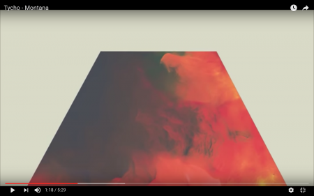
Montana Visuals (2014)
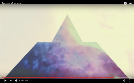
Montana Video (2014)
During the Awake album cycle I continued down this path and lots of imagery followed for show posters and releases.
Concert Poster (2014)
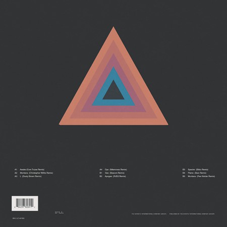
Montana Single (2014) – the trapezoid combined with the triangle
· The Darkness
The overall direction for Awake was very light and halfway through the cycle I started shifting things into a darker space for contrast and to foreshadow the next album.
Awake Deluxe Edition (2014)
Concert Poster (2014)
Awake Remixes (2015)
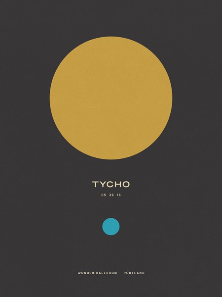
Concert Poster (2016)
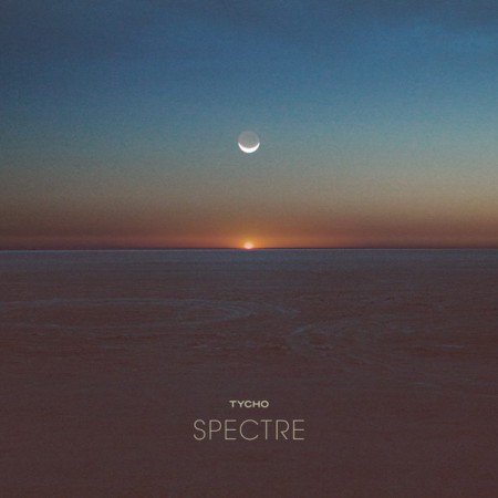
Spectre Single (2014)
Spectre – Bibio Remix (2014)
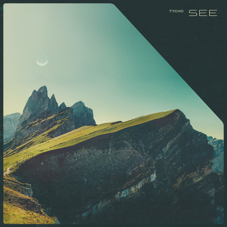
Tycho – See (2014)
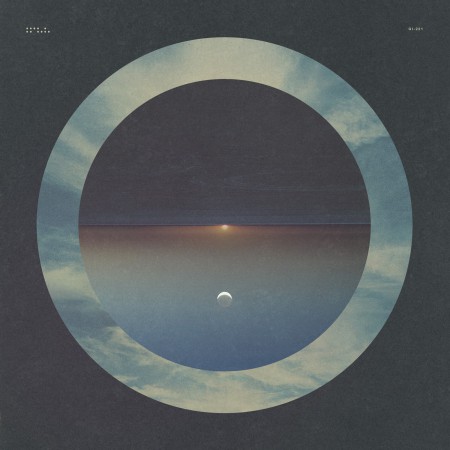
· The Epoch
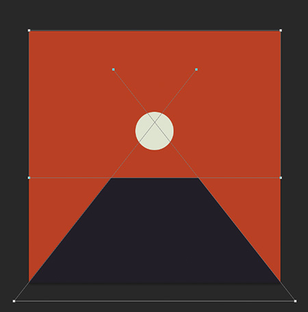
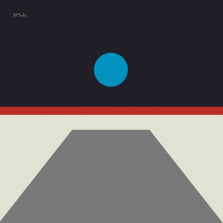
Awake had been out for over two years and it was time to start thinking about the next release. Up until this point, when doing minimal compositions I had been using textures and distressing to give some depth to the images and break up solid fields of color. For the next phase I wanted to further simplify and remove any extraneous elements. I wanted to cut to the core of the message and try to distill things into a language of basic symbols.
Artwork for the first single from Epoch: Division (2016). This was designed after the album artwork and was meant as a transition which would introduce the elements and colors that would follow in the full length release.
Musically, this album was about circling back while maintaining forward motion; revisiting and refining the concepts of earlier albums with a view to the future. My primary goal was to incorporate the color scheme of the very first Tycho release: The Science of Patterns EP (2002). I also wanted to revisit the simplicity of that artwork as Epoch was all about focus and efficiency, chiseling away anything which was not absolutely necessary.
The Science of Patterns EP (2002)
The following are selected iterations of the Epoch cover design which led to the final version.
The initial concept (2015)
An early concept incorporating a more three dimensional look. I ended up leaving this in favor of a more simplified form

The first simplification, the horizon line is still subtly implied
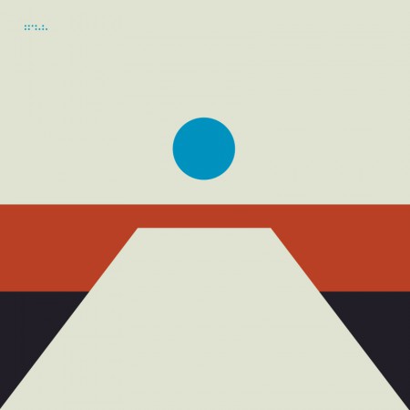
A tangental concept exploring the incorporation of more color. This ended up being the impetus for creating the alternate cover series for the countdown (discussed later)
Another alternate with more color and a defined horizon line

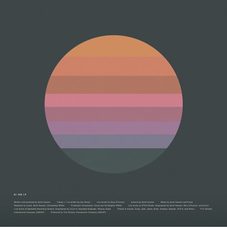
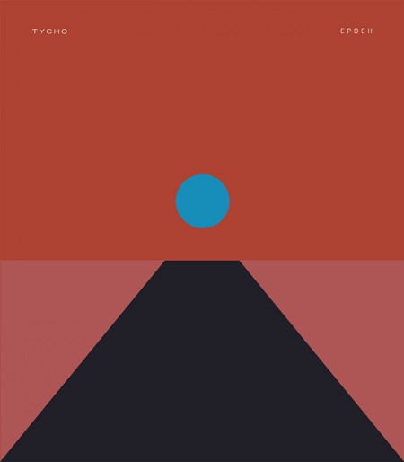
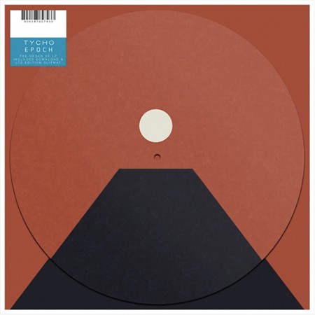
The final form: Tycho – Epoch (2016)
I felt that the power of this image would be in its simplicity and also in its portability. It could adapt to many form factors with ease and felt more like a modular system than a singular image. At this point you have to take into account that the vast majority of people will experience album artwork at a tiny square on a smartphone. At this scale a lot of nuance and detail will be lost. This is not to say that I intended to oversimplify purely for this reason, but it is a consideration.
· Release
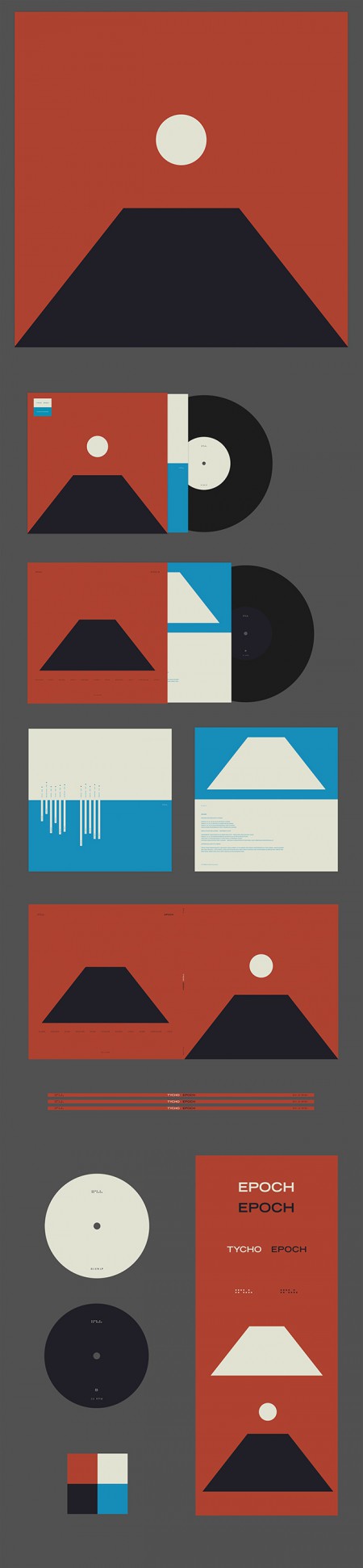
Epoch Vinyl Packaging
Epoch was released 30 days after completion as a surprise, as such there wasn’t enough time to have vinyl and CDs produced; only digital versions were available on release day. As a stopgap until the vinyl arrived, we decided to offer a custom slipmat with pre-order purchase at retail outlets. More about the release strategy in The New York Times piece With Vinyl, the Musician Tycho Establishes a Physical Presence
Epoch Slipmat
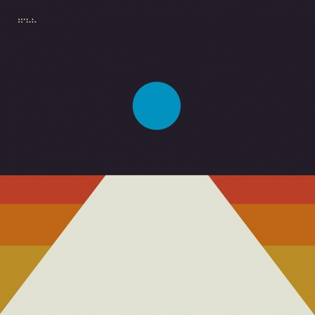
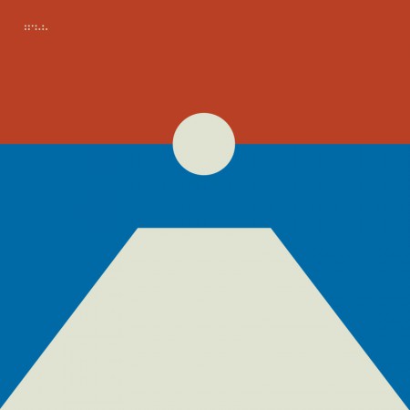
For the Awake release I cut up a print of the cover art into squares and released it as nine panels as a way to count down to the release. For Epoch I wanted to create several alternate versions of the cover art to use for build up. This release was not announced ahead of time so it was fun to slowly release elements of the design without people fully understanding what was coming. Here are a few examples of the alternate versions.
Tycho Descent Burning Man Sunrise Set Cover
06-division
08-local
02-horizon
04-receiver
All in all this was an enjoyable and fulfilling process for me as a designer. I’m looking forward to the next couple years, creating future permutations and working with this design/color system. The first example of this is below, the poster for the show at The Fonda in LA.
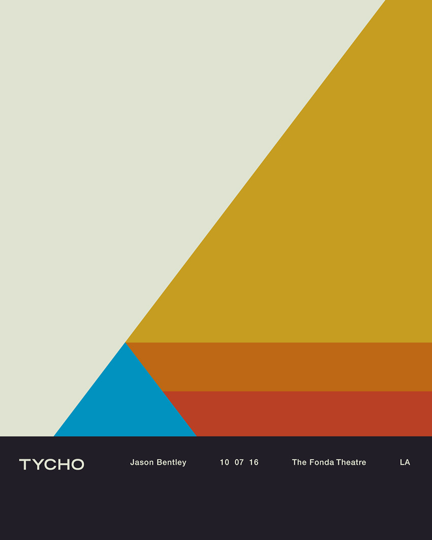
Tycho Fonda LA Concert Poster
Thanks for reading, if you have any questions leave a comment and I’ll do my best to reply.
I’ve been waiting for the full album stream to share this release with you but I got antsy, you need to hear this release. Future lush dance music that opens up and tunnels down through virtual pipes and opens in spaces we’ve never seen, sooo happy to have him on Ghostly.
FULL ALBUM STREAM RIGHT NOW @ Hype Machine
As half of Teengirl Fantasy, Logan Takahashi is best known for making glassy, expansive tracks. On his debut solo album NoGeo, however, he creates an intimate world of fertile, furtive rhythms. Throughout the album, techno-tinged patterns unfurl with zeal and digital melodies slowly rise and fall. If the music of Teengirl evokes widescreen, technicolor club scenes, NoGeo is a zoomed-in study of timbre, rhythm, and melody. “I started a lot of these tracks almost as etudes for myself,” Takahashi explains. “I was trying to draw on my experiences both from the last few years of my life working with TGF and from my musical experiences beforehand.” Takahashi grew up studying classical violin as a child and attended Oberlin Conservatory out of which TGF was born. “There are many things that I still either use or try and consciously reject from my musical upbringing and this was a way for me to explore some of that.”
Much of NoGeo was composed using Elektron’s Monomachine, which contributes to its minimalist aesthetic. There’s a uniformity to the tracks on NoGeo; though each has its own distinct, vibrant shape, all of them are cut from the same cloth—built on a sturdy rhythmic foundation that’s ornamented with buoyant candescent, sounds. “People talk a lot about borderlessness in dance music, and indeed I’ve always been most drawn to music that exists in or a works to create new grey areas,” Takahashi explains. “From the late ‘80s Japanese Neo Geo genre to the early ‘00s Brooklyn tabletop electronics scene, I’ve always been inspired by the notion of being able to create your own vocabulary.
As Takahashi points out, the album’s title is a nod to the musical style that Ryuichi Sakamoto spearheaded, one that fused Japanese and Western influences. Sometimes that influence was direct: the track “Kazoku Ogawa” was inspired by Takahashi uncovering a box of lost letters written by his grandfather containing family secrets from Japan. Others, like the somber, quietly cruising “Rekr,” simply use the idea of obscuring borders as an abstract starting point. “There’s an idea that I’ve been pretty inspired by for the past 5 or 6 years, and it’s the idea of viewing technology and computers as ‘organic,’” he says of the thought-process behind “Rekr.” “We normally think of ‘technology’ and ‘organic’ as two separate things, but computers are made of crystals and metals and magnets from the earth. That idea is interesting to me.”
Binding everything is Takahashi’s steady hand and clear musical voice. While each track has its own distinct, vibrant shape, there’s a oneness to NoGeo; it is the sound of Takahashi standing on his own for the first time.
Support CREAMSICLE COLORED VINYL
 gan Takahashi
You know the drill, this guy is one of our favorites, just dive in.
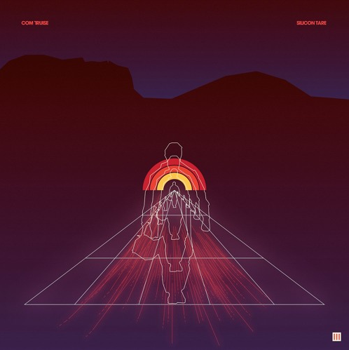
On Silicon Tare, the sci-fi story that Seth Haley, who records as Com Truise, began on the Galactic Melt LP and continued on the Wave 1 EP takes a dark turn. At the conclusion of Wave 1, the protagonist, Earth’s first synthetic astronaut, successfully makes contact with the far-off Wave 1 colony but, once he does, things get fuzzy. He falls in love; there is a war coming. A story that began in hope and dreams of discovery ends on an uncertain note. Change is in the air.
It’s evident Haley’s style has matured since 2010’s Cyanide Sisters. Sisters wonderfully warped sonics could have been the sound of broken VCRs spinning analog tapes, all of them singing in unison. His 2011 full-length Galactic Melt was rich and expansive, full of slowly-coasting synths, melodies that wriggled and popped, and masterfully-controlled rhythms. Since then, Haley’s sound and production techniques have progressed, becoming wider and fuller—high definition 3D madness. His always-cinematic signature sound and 4/4 kick drum patterns are present, of course, but the dynamics and tempos are increasingly more colorful and varied.
Silicon Tare opens with a skating sheet of synthesizer before easing into a steady, walloping beat. It doesn’t stay there for long: halfway through, the lights come up, and synth notes crackle across the sky. “Sunspot” is a departure–its soft-pink tone, synthetic slap bass and quasi-808 percussion recalls the edgier end of ‘80s pop. And he pushes the boundaries even further on “Forgive,” a big, booming number with fat streaks of synth and a gleefully hectic rhythm track that stops, starts and sputters over and over again.
Silicon Tare moves Haley and the fictional Com Truise even deeper into the cosmos, discovering new lands along the way and offering a glimpse of where he may travel in the future. And if the characters at the center of his ongoing story may be in peril, Haley himself is in control.
Tare sets the stage for the final chapter in Haley’s Com Truise saga, which will be the first official follow-up to Galactic Melt. It’s not only the perfect prelude to that finale, but the perfect representation of Haley’s ever-expanding universe of sound.
Support VINYL

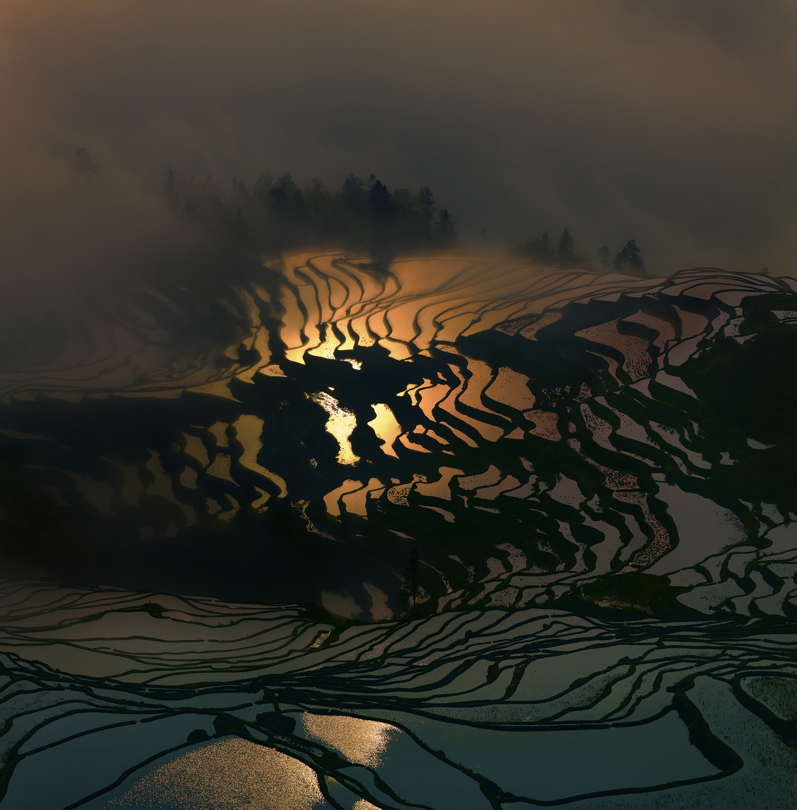
Rural China must be an absolutely amazing place to visit and photograph. A sentiment Thierry Bornier must have said to himself before leaving his job as a Chief Financial Officer at an international fashion company in New York and traveling to China to start a new life.
Thierry states..
…deep down I knew that number crunching could never satisfy my thirst for natural beauty and my love for photography.
And so, I gathered my courage and decided to see what my life would become if I did something I truly loved. I’ve never looked back.

Theirry, a French photographer specializing in capturing the landscapes of China, has been documenting the cascades of rice terraces in Yuanyang every year since permanently moving to China.
The winter temperatures here, although never freezing, are such that the terraces can only support one rice crop a year. After the harvest, from mid-September until mid-November depending on the elevation, the terraces are filled with water until April, when the planting begins.


From elevations as high as 6,500 feet, the terraces undulate down into the valleys, forming intricate patterns that mirror the clouds and the sky. The fusion of man and nature creates awe-inspiring beauty, and I love the patterns and the diversity of colours that can be found at each site.

You can see more of Theirry’s work on his website: thierrybornier.net where he offers week long photography workshops in rural China beginning in February of next year.
Via: Maptia
Posted by: Owen
")
")
")