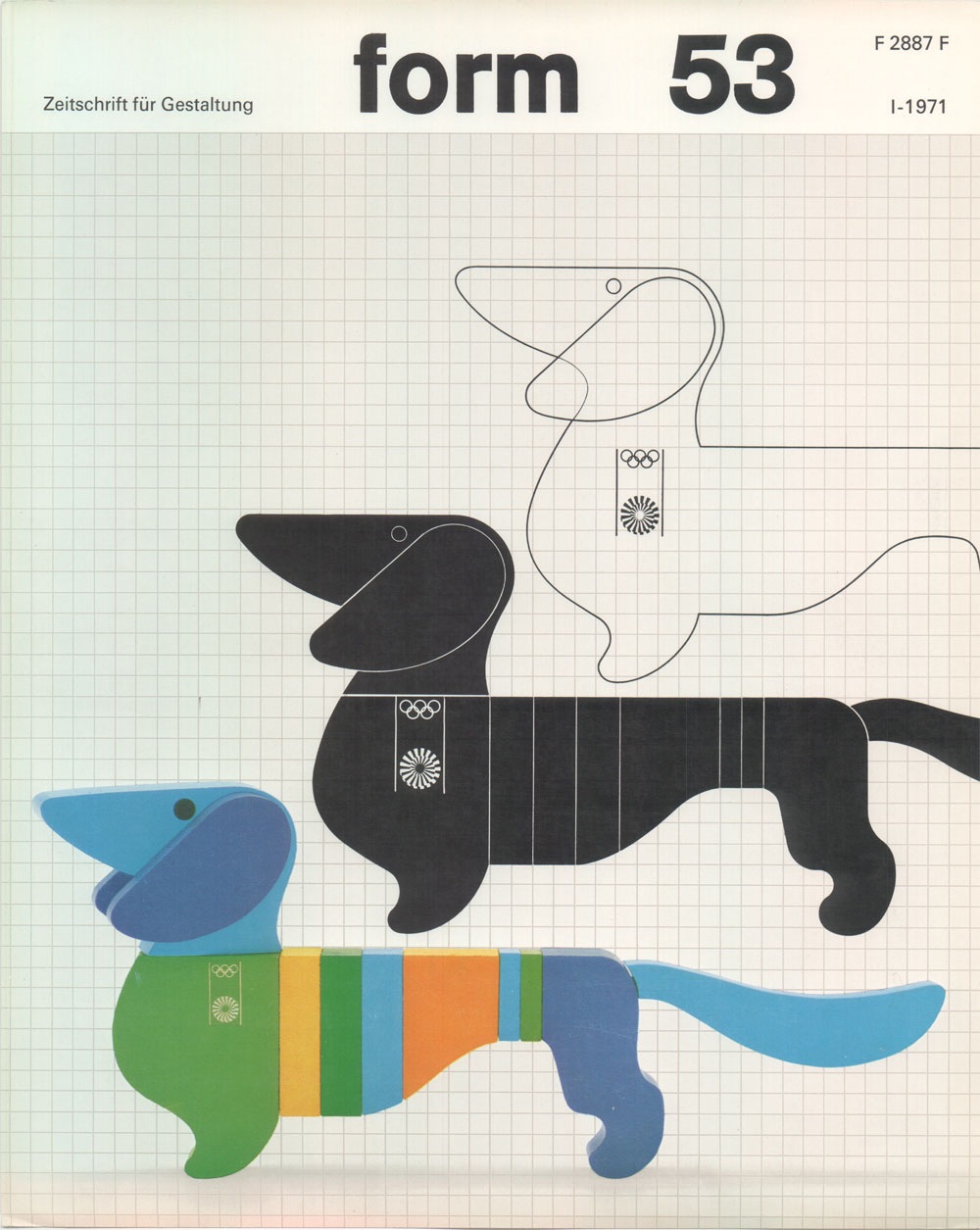
Another image by German Designer Otl Aicher who was responsible for the branding of the ’72 Munich Games. All of this stuff is amazing. I am not a huge fan of the Dachsund mascot, but this is about as good a treatment you could give to such a concept. Simply do a Flickr Search for "Otl Aicher" and your head will explode. Incredible stuff, some really nice shots of the London Aicher exhibition. I just can’t get over how contemporary these colors and forms are. None of it feels dated, could have been from a pitch for 2012, if the people who oversee those sorts of things still had any taste that is. Seems like all the stuff now days is targeted at the lowest common denominator. All of the recent stuff I have seen for 2012 is throw-away, middle of the road with compromise written all over it. Aicher’s campaign is thought provoking and timeless, obviously a good argument against the design by committee ethics I have to imagine produced this sort of output.
Alphanumeric has a great set of Otl Aicher work including these artifacts from the 1972 Munich Olympics. As much as I love the posters from Munich, there’s something about the official stuff (tickets, badges, etc.) that might be even more fun to look at. I love how they combine form with function and you can never go wrong with serial numbers. It’s amazing to think that people defiled that beautiful luggage tag with their names and addresses. I guess that’s what makes these all the more interesting, the fact that most were destroyed by being used for their intended purpose.
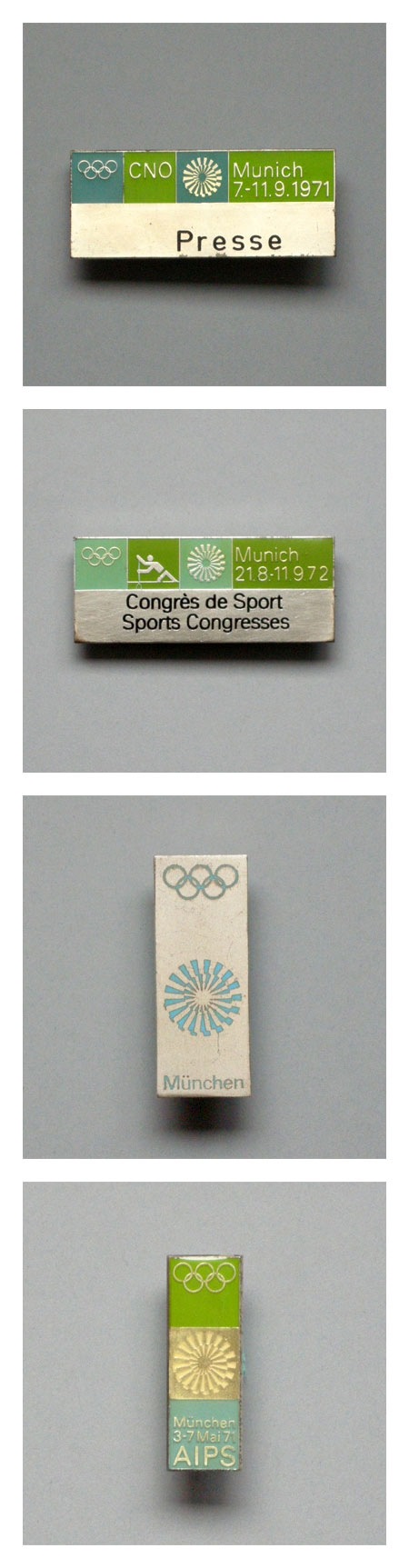
Some Otl Aicher 1972 Munich Olympics pins. There is nothing better than green with that deep aqua-marine (top pin in particular). If I had these I would wear a different one every day on a short sleeved white button up shirt with horn rim glasses. Speaking of the ’72 Olympics, Spitz is still the champ in my book based on stylealone.
Interesting Cretive Review piece about Olympic Logos: "With the enormous barrel of nastines currently being dumped all over the London 2012 logo, we wondered what the reception might have been for some of its predecessors had they been released today. What comments, for example, might the Herr in the strasse have come out with when confronted with design’s holiest of holies, the Munich 1972 logo?" Read the rest of this article >
If you read down to the bottom you’ll find this surprising bit of info: "As we revealed here, the final 72 logo is not solely Otl Aicher’s design. Aicher had wanted to use a radiating sun (which was later put to good use by the German lottery) but it was deemed impossible to copyright. His design was put out to competition, the winning entry, as judged by a panel including Aicher, being Coordt von Mannstein’s (literal) twist on the original."
And on a side note the type is set in Univers, so nice. Image via FFFFOUND!
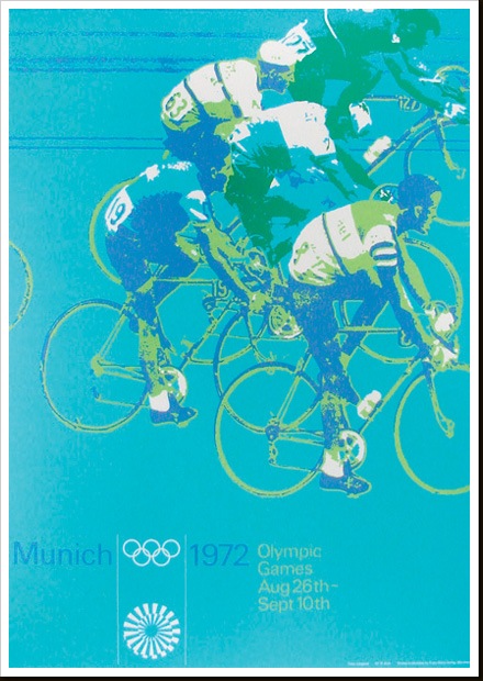
Part of a series of posters from ’72 Munich games by Otl Aicher. I’ll post some more examples in the coming weeks. These must have had a very modern feel when they came out, the colors certainly contrast the prevailing palettes of the time.
With the London 2012 games (along with their controversial branding) in full swing I thought I’d revisit one of my favorite — Olympic or otherwise — branding campaigns ever: that which was created for the 1968 Mexico Olympics. Graphic Ambient has some beautiful images of the work in the real world, some of which I’d never seen before. I definitely have to say that I prefer Otl Aicher’s work for the 72 Munich games; but this has it’s own thing going on and after all it did come first! Related reading: Design Magazine #237 Via Graphic Ambient
I’ve just returned returned from a trip to both Munich and London, where I spent time with colleagues in both locations. Cosmic timing really, considering the London 2012 Olympics are on the horizon, and I’ve had Otl Aicher on the mind recently.
Much has been said in recent years about the shortcomings of the London 2012 graphic identity, but I hadn’t really been paying close attention to all the outrage, and had all but forgotten the design work – so I wasn’t prepared for the onslaught of Olympic schwag that greeted me at the official London 2012 shop at the St. Pancras Station in London. It’s borderline seizure inducing. Having just stepped off the train from Munich, where I spent time in Olympiapark and was exposed to Aichers work throughout the city, this London 2012 noise was especially jarring. And that mascot! Sigh. I took quite a few pictures, and had originally thought I’d post about Waldi vs Wenlock, but I decided I wouldn’t subject you to any of that madness. After all, this blog is here to celebrate beautiful things.
Scott has extensively covered Aicher’s work for Munich ’72 here before (in fact it’s where I was first exposed to it), but I thought the timing was right for us to be reminded just how amazing a coherent Olympic graphic identity and subsequent merchandising campaign can be.
Creative Review recently posted the above scans of the official Munich ’72 merchandise catalogue, and there are a few images of what look to be the official gift shops as well. While Waldi was the only souvenir that was actually designed by Aichlers studio directly, I find it really impressive how cohesive the entire output of the “Olympic Souvenir” department was. This is most likely due to the fact that Aicher dictated a very strict set of rules as to how the logotype and symbols could be used.
It’s easy to pick apart London 2012 when stacked up against the extremely high bar set by Aicher’s work for Munich, but let’s be real here, remember Izzy from Atlanta? NOTHING is as bad as that. What. Is. That. Thing.
I’m not sure if they entered the competition, but if they did I’d be real curious to see what Bibliotheque came up with for the London 2012 graphic identity. After all, they know a thing or two about Aicher’s legacy, having put together an exhibition of his Munich ’72 work over at the Vitsoe shop in 2007, comprised entirely of posters and print from their their own collection. This unofficial Olympic torch poster they did is pretty amazing as well.
Bonus link: While googling around, I found this site that offers up the official Olympic report books as PDFs. The Munich 72′ books span 3 Volumes, upwards of 1200 pages. For the true Munich ’72 geeks.
I’m not sure why, but tickets of all kinds have always piqued my interest and this set may be the best I’ve ever laid eyes on. But forget the tickets, would just love some high-res copies of these photos for framing.