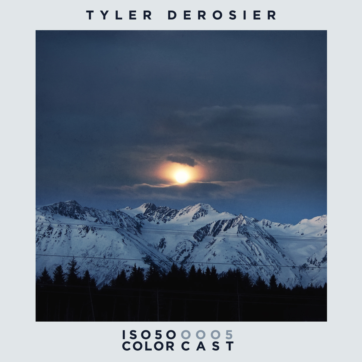
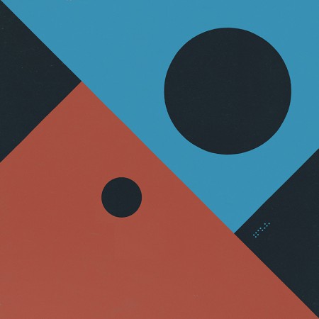
Our 5th installment of the ISO50 Colorcast Mix Series has been carefully put together by a kind northerner by the name of Tyler Derosier. We got a 2 hour boy this time around, just look at the tracklist below:
1. Dresvn – A2
2. Kyle Hall – Mysterious Lake
3. Warren Raww – Ross
4. 2 Bit Crew – Hoop Dreams
5. Terrence Pearce – Stroker
6. SVN & Porn Sword Tobacco – Fresh II
7. Moomin – Time Circle
8. Dorisburg – Irrbloss
9. D. Tiffany – Orange Crush (Plush Managements Mix)
10. Jupiter Jax – Armed for Peace
11. Royer – Window Sun
12. Jonas Palzer – Solid Liquid
13. Alvin Aronson – Mat
14. Royer – Facts
15. Studio OST – Bent Light
16. Chaos in the CBD – Digital Harmony
17. Heathered Pearls – Interior Architecture Software
18. Nas1 – Exit 12, 13
19. Frank & Tony – The Gales
20. Deep88 & Melchior Sultana – Days Go By
21. Jordan Blacksmith – Naja
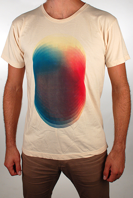
Hi guys, I didn’t want to spread all this info over time so I just made it one compact post for you. Today, we put a limited run(no repressings) of 40x Echo Circle shirts in the ISO50 shop designed by Heathered Pearls. They have a enzyme wash treatment that simulates 40 typical laundry cycles gives this shirt a unique super-soft feel. The print on it is a mini halftone effect, pretty detailed for shirt, pick one up at the ISO50 shop.
This marks the start of Scott and I selecting a few new designers to do a shirt for ISO50, hope you enjoy.
Above is a day time disco mix I did for Ghostly International, feel free to download it within the Soundcloud player, it starts off with a snippet of a rare Boards of Canada track.
Thanks as always for stopping by and reading and more importantly listening to the music from up and coming musicians here on ISO50.
Tracklist
Boards Of Canada – Ithcus Sound Ikons – Honey (Coyote rmx) Woolfy vs. Projections – Isabella Tornado Wallace – Swimmin’ Worst Friends – Ski Hive Clashing Egos – Aminjig Nebere (Joakim’s afrobot mix) Motor City Drum Ensemble – Raw Cuts #6 Studio – Life’s A Beach (Todd Terje beach house mix) Sourya – Anatomy Domine (Prince Language mix) Blackjoy – Moustache (Prins Thomas diskomiks) Tiger & Woods – Deflowered Spoon – Don’t You Evah (Matthew Dear mix) Seth Troxler – Aphrika John Selway – Shake The Snow 18 Carat Affair – I Wanna Love You
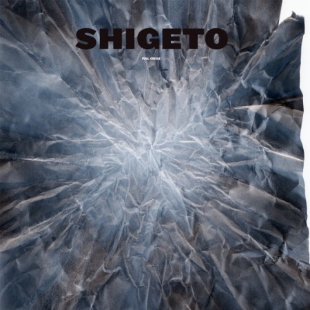
Since i’ve known Zach Saginaw aka Shigeto and saw him play live I had a feeling early on he was one of those guys that was going to give beat producers a run for their money, the man is a performer and can drum with more dynamics than any other producer I know. You can listen to songs like Look At All The Smiling Faces and get the understanding that this isn’t someone thats looking to just produce beats for fun, the man wants to do this as a living because he cares about the sound and was born to take this sound to the next level and not only on a album but more importantly on stage.
If you’re a vinyl head then this is your piece, the vinyl comes with a art sleeve by Mike Cina and the CD slid in there too, you can pick it up at The Ghostly Store.
Below is a quick run thru of the whole LP, just a few seconds of each song that was done by Alex Koplin aka H34dUp and who comments on the blog regularly.
Jan Jelinek does many different styles of minimal electronic music, some under this moniker and also Farben. In 2001 “Loop-Finding-Jazz-Records” came out on Germany’s ~scape label which has artists like Portable, Pole, Deadbeat, etc. The record has so much detail yet sounds like its really small as if you could put it in the palm of your hand, It’s like peeking in and looking at all the gears that run an old expensive pocket watch. You can hear all these thousands of little pieces working away by turning and hissing. If you like “Do Dekor” then the whole album is worth picking up.
Christ. is unbelievable, this song is pretty much a well timed synth solo that is full of character, the synth has this muted oboe sound to it but maybe the reed is cracked, I know that might sound crappy but there’s plenty of charm all the way thru.
Vancouver’s Circlesquare has his own sound because of slow tempo that he makes all his music in and his singing style. This ends up being a great chance for him to get his name dropped when explaining music since I use it all the time when trying to explain a sound that is a little more then just dark, slow and lush. The breakdown at 2:42 and on is remarkable in my opinion, I know its super simple but perfectly written to bring back a song that might of not grabbed you right from the beginning.
*really quick side note: I wish you could all hear how loud the tuba music is downstairs from me while I try to write about Jelinek, Christ., and Circlesquare, its something to experience, I know I play music loud but the guy below me LOOOOVES tubas on a level that I can’t touch as a fellow music lover. Okay, back to this post…
It’s hard to know who’s going to be the next Broken Social Scene, Fleet Foxes, or any big indie folk act since there everywhere. My face sometimes feels so naked during a show since i’m the only one without a beard but i’m there for the music and also lets be honest the kind ladies that make it out to these shows. One band I want to see is Elm From Arm they just sound fun and have that Broken Social Scene build to their songs but with half the band members.
The Epoch is a hinge. We tend to follow a linear trajectory until a point at which we realize that through free will the path can be bent and redirected.
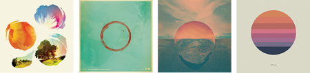
I’ve been very busy for the past year or so working on a new album so it’s been a while since I’ve posted. Now that the new Tycho album — Epoch — is out I wanted to write a little about the meaning and origin of the artwork. I worked as a graphic designer for 14 years until I decided to pursue music full time so the visual element of Tycho has always been at the core of the project for me. I think the imagery tells a story that the music can’t fully articulate, and vice versa.
Past is Prologue (2006), Daydream (2007), Dive (2011), Awake (2014)
The sun disc, both literally and as an icon, has always been at the center of the artwork. From Sunrise Projector and on I’ve used the sun and circle as a metaphor for life; the sun being the life giver and the circle symbolizing the closed loop, the interconnectedness of the human experience with the physical world.
· The Trilogy Begins
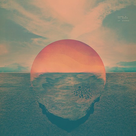
Dive (2011)
While I had explored a lot of these themes previously, I feel that Dive was the beginning of a trilogy of albums and so was the starting point for a narrative and symbology which have become central to the Tycho identity.
The cover for Dive was a foray into maximalism combining photography and design. I wanted to evoke the sense of being on an unavoidable path, one from which deviation was impossible. I wanted the viewer to be pulled into the image and be drawn toward the sun. I think this design speaks to the music in that it felt like the beginning of a journey and the multi-layered composition echoed the sonic aesthetic of the music. I spent quite a bit of the next couple years refining this style and creating various collage type images.
Dive Single (2012) – Another cover in the style of the Dive full length cover
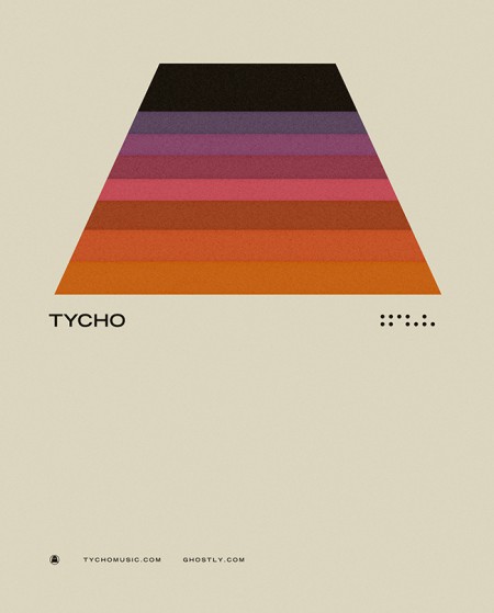
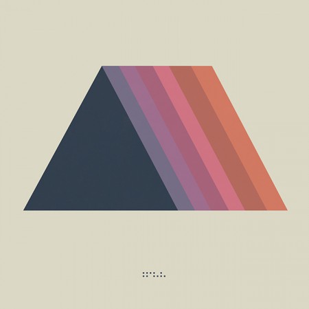
· Enter Minimalism and The Trapezoid
Concert Poster (2012)
As a graphic designer I have always had a deep appreciation for minimalism and the simplified, efficient expression of ideas through form and color. But as a visual artist working within the context of Tycho my output had typically trended toward almost painterly styles, multilayered collages which were anything but minimal. But at some point after the release of Dive I decided that I wanted to get back to my design roots and bring a more simplified, refined style to the project. The beginning of this shift was around 2012 when we played The Independent in San Francisco. This was meant to be a simplification of the same path seen on the cover of Dive, the colors a reflection of the sun into that path. This was also one of my first uses of the trapezoid shape which would become core to the symbology of Tycho.
· The Awake Era
Awake (2014)
Dive was in many ways a breakthrough record for Tycho: it was when I first formed the live band and we began touring extensively. It also marked the period when I was finally able to quit doing freelance design and focus solely on the music and the imagery surrounding Tycho. After a couple years of touring it came time to make a new album and I knew this would be a pivotal release, quite literally a make-or-break record. I wrestled with the art direction for months before finally deciding to go in an entirely new direction from Dive and earlier works and create a minimalist direction for the release. I had always felt strongly about the spectrum and trapezoid from the 2012 poster and so I revisited the concept and incorporated the sun imagery to bring it into storyline.
Both the circle and the trapezoid symbols featured heavily in the videos and visuals for Tycho during the Awake tours (2014-2015)
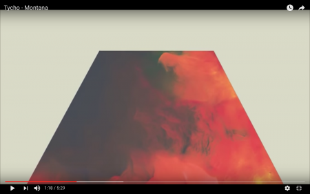
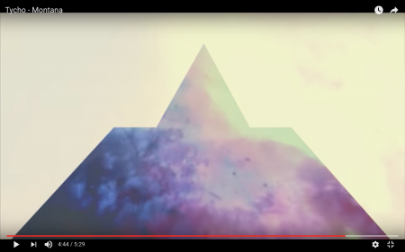
Montana Visuals (2014)
Montana Video (2014)
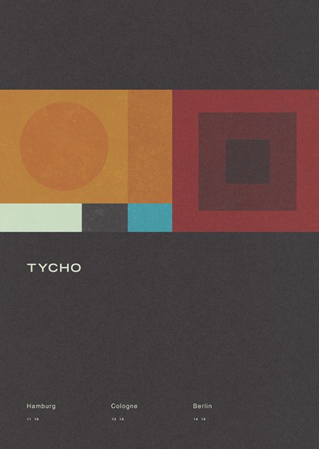
During the Awake album cycle I continued down this path and lots of imagery followed for show posters and releases.
Concert Poster (2014)
Montana Single (2014) – the trapezoid combined with the triangle
· The Darkness
The overall direction for Awake was very light and halfway through the cycle I started shifting things into a darker space for contrast and to foreshadow the next album.
Awake Deluxe Edition (2014)
Concert Poster (2014)
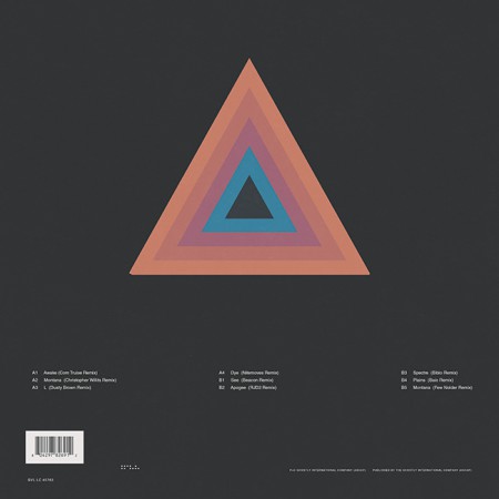
Awake Remixes (2015)
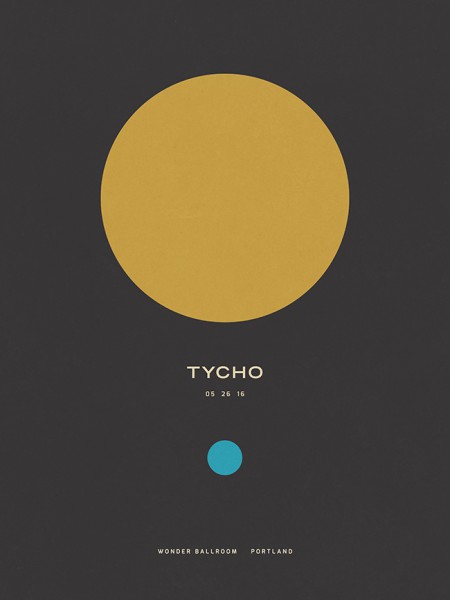
Concert Poster (2016)
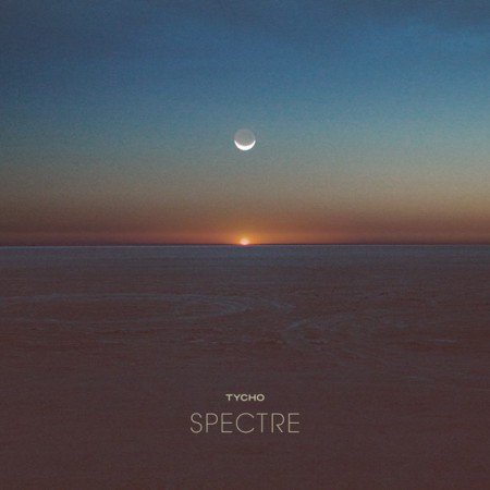
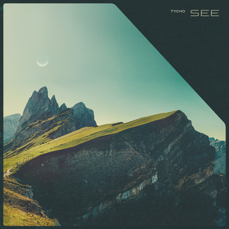
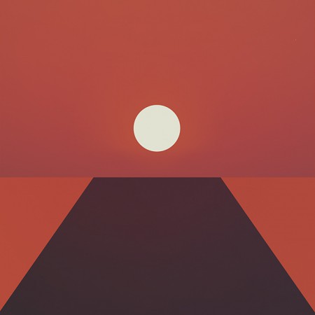
To compliment the darker themes for the Spectre and See singles I introduced the moon as the central element in place of the sun.
Spectre Single (2014)
Spectre – Bibio Remix (2014)
Tycho – See (2014)
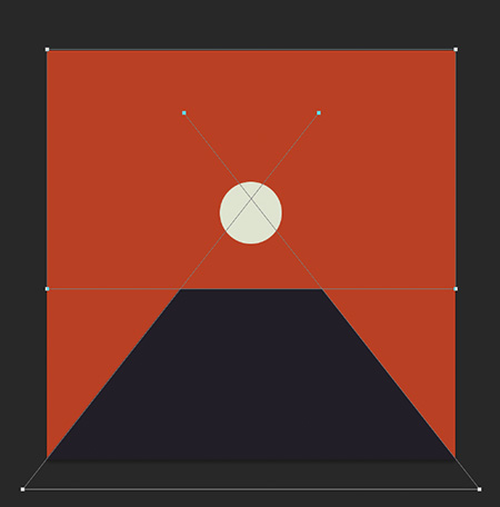
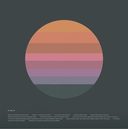
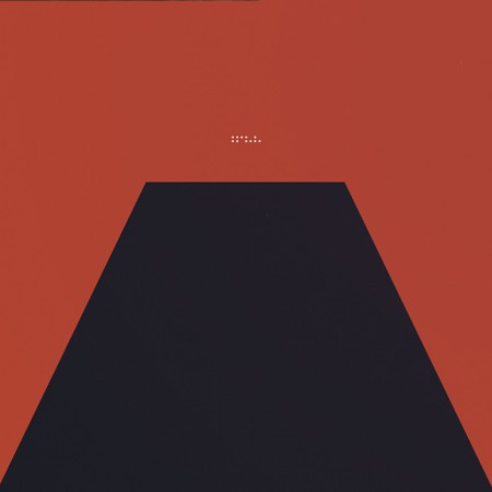
· The Epoch
Awake had been out for over two years and it was time to start thinking about the next release. Up until this point, when doing minimal compositions I had been using textures and distressing to give some depth to the images and break up solid fields of color. For the next phase I wanted to further simplify and remove any extraneous elements. I wanted to cut to the core of the message and try to distill things into a language of basic symbols.
Artwork for the first single from Epoch: Division (2016). This was designed after the album artwork and was meant as a transition which would introduce the elements and colors that would follow in the full length release.
Musically, this album was about circling back while maintaining forward motion; revisiting and refining the concepts of earlier albums with a view to the future. My primary goal was to incorporate the color scheme of the very first Tycho release: The Science of Patterns EP (2002). I also wanted to revisit the simplicity of that artwork as Epoch was all about focus and efficiency, chiseling away anything which was not absolutely necessary.
The Science of Patterns EP (2002)
I also wanted to draw upon the two core symbols of the project: the circle and the trapezoid. But this time I wanted the circle to represent the moon, a body reflecting the light of the sun. In this way it was a metaphor for this album, a reflection of the previous works presented in a new form.
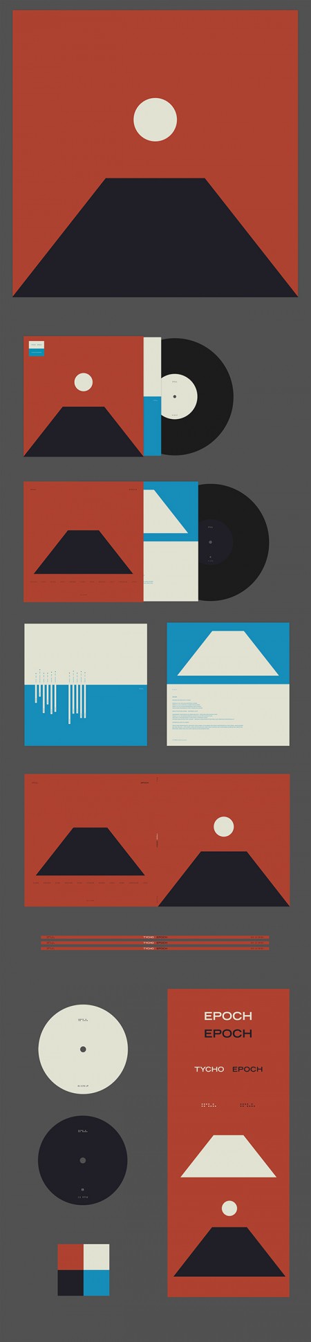
The following are selected iterations of the Epoch cover design which led to the final version.
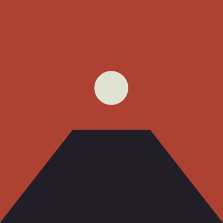
The initial concept (2015)
An early concept incorporating a more three dimensional look. I ended up leaving this in favor of a more simplified form
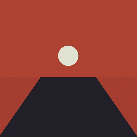
The first simplification, the horizon line is still subtly implied
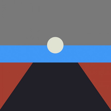
A tangental concept exploring the incorporation of more color. This ended up being the impetus for creating the alternate cover series for the countdown (discussed later)
Another alternate with more color and a defined horizon line
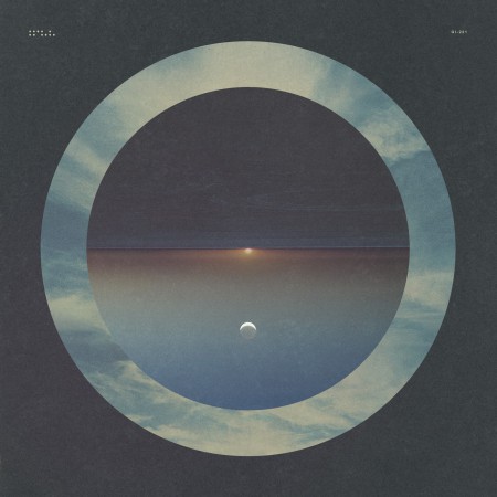
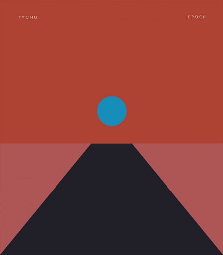
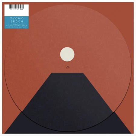
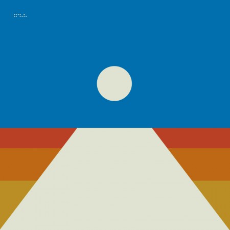
The final form: Tycho – Epoch (2016)
In the end I decided to keep the image ambiguous, the viewer should decide exactly what it was they were looking at and ascribe their own meaning to it. This meant stripping the image down to the essential elements, leaving a simple icon.
I felt that the power of this image would be in its simplicity and also in its portability. It could adapt to many form factors with ease and felt more like a modular system than a singular image. At this point you have to take into account that the vast majority of people will experience album artwork at a tiny square on a smartphone. At this scale a lot of nuance and detail will be lost. This is not to say that I intended to oversimplify purely for this reason, but it is a consideration.
· Release
Epoch Vinyl Packaging
Epoch was released 30 days after completion as a surprise, as such there wasn’t enough time to have vinyl and CDs produced; only digital versions were available on release day. As a stopgap until the vinyl arrived, we decided to offer a custom slipmat with pre-order purchase at retail outlets. More about the release strategy in The New York Times piece With Vinyl, the Musician Tycho Establishes a Physical Presence
Epoch Slipmat
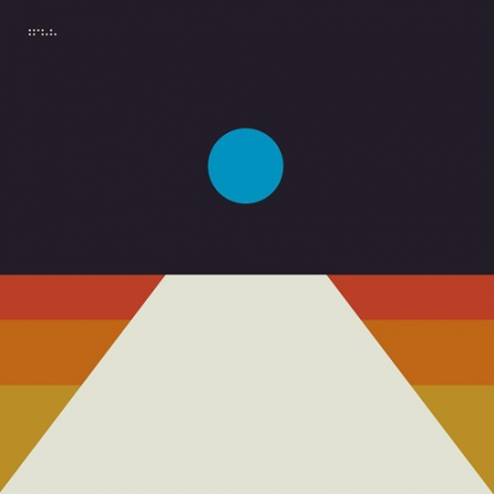
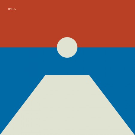
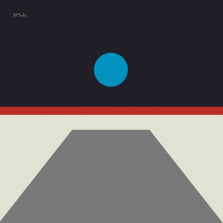
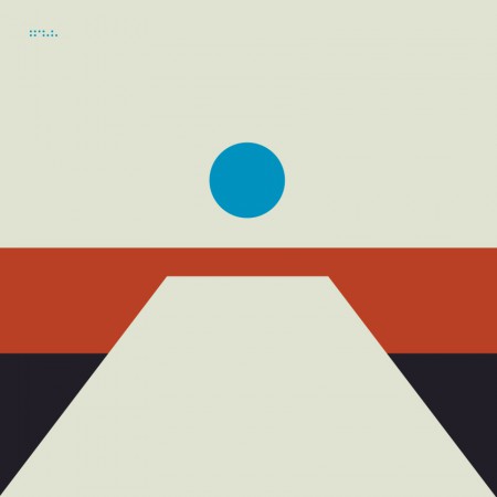
For the Awake release I cut up a print of the cover art into squares and released it as nine panels as a way to count down to the release. For Epoch I wanted to create several alternate versions of the cover art to use for build up. This release was not announced ahead of time so it was fun to slowly release elements of the design without people fully understanding what was coming. Here are a few examples of the alternate versions.
Tycho Descent Burning Man Sunrise Set Cover
06-division
08-local
02-horizon
04-receiver
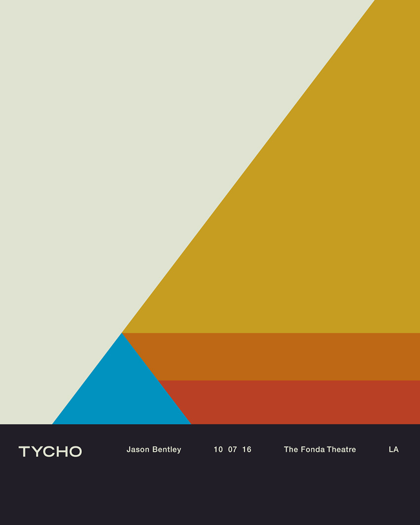
All in all this was an enjoyable and fulfilling process for me as a designer. I’m looking forward to the next couple years, creating future permutations and working with this design/color system. The first example of this is below, the poster for the show at The Fonda in LA.
Tycho Fonda LA Concert Poster
Thanks for reading, if you have any questions leave a comment and I’ll do my best to reply.
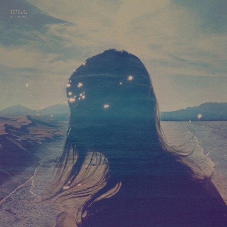
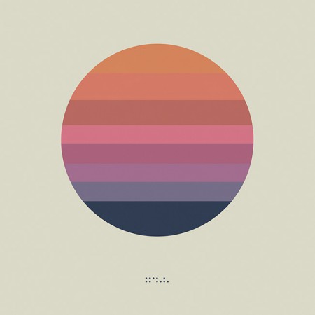
As you may have noticed I haven’t been very active on the blog over the past year. This is because I had decided to focus solely on my music project, Tycho for a while. I spent the last 9 months or so working with the band on a new record which is now complete. Of course, Tycho is very much an audio / visual project so I’m still working consistently on design whether it be album covers, show posters, or online assets. I was working on the cover art and developing the packaging in parallel with the recording process this time around. We recently shared the final artwork for this LP, entitled Awake (listen to the title track here). I’ll go more into the reasoning behind and making of the artwork later, but for now here is a quote from this Reddit discussion of the cover art that I commented on:
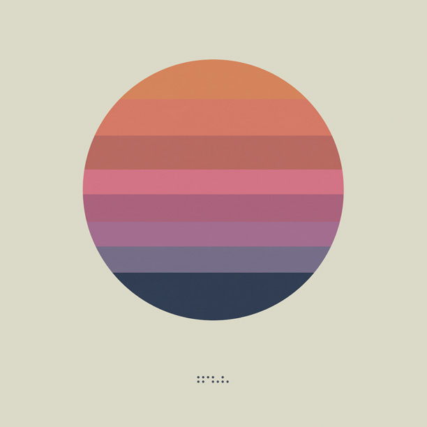
This design was mean to be a flag; more of a symbol than what I would think of as traditional album art. I felt that, with physical mediums disappearing, album art didn’t necessarily have to fit a given format and I wanted something that could be readily transported.
If you look at earlier artwork you’ll see that I was pursuing a more maximalist / photographic direction for Tycho (e.g. http://imgur.com/a/kk93f ). But this album has a more stripped down, visceral thing going on and I wanted that reflected in the artwork. Really this is meant to be an inconized form of the sun / circle motif present in a lot of the Tycho cover art to date. Kind of like a unifying symbol for all the output that preceded this release. I see this, for various reasons, as the first true Tycho album and so wanted to focus everything into a simple form that encapsulated that idea. On a side note, there are eight color bands in the circle, each one representing a track.
The beauty of creating the artwork for the music over all these years is that I am free to develop a cohesive lineage with the imagery. From what I have seen of my peers over these past 13 or so years as a designer, we generally tend towards simplification as we go along and I think that is an important part of design: efficiency of communication. Whether this particular design is effective in that respect obviously isn’t something I have the objectivity to comment on, but that was the goal at least.
The album will be released on March 18th, 2014. Here is the track listing:
Tycho – Awake (2014)
1. Awake
2. Montana
3. L
4. Dye
5. See
6. Apogee
7. Spectre
8. Plains
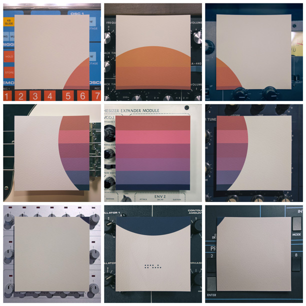
And those who were following along on Instagram, Facebook, or Twitter know that we released the artwork first via a 9×9 grid. I printed the artwork, cut it up, and photographed it using various pieces of musical equipment as backdrops. Here’s the grid in one image:
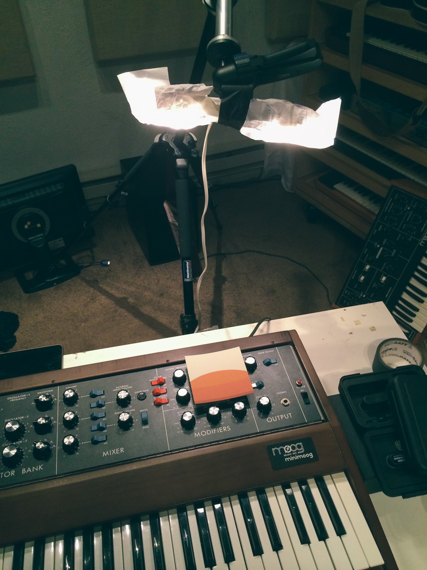
Makeshift lighting setup. All my camera gear was stolen recently so limping along with a point and shoot setup for now.
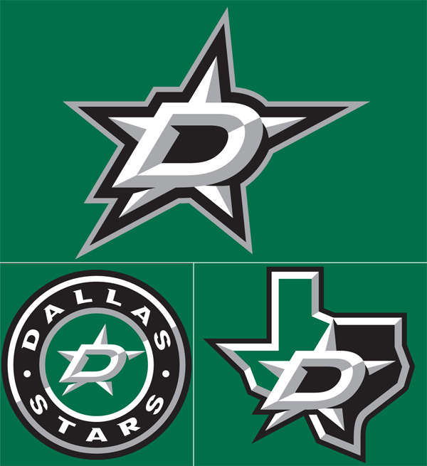
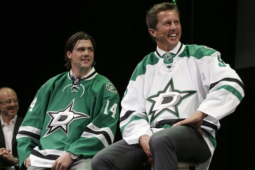
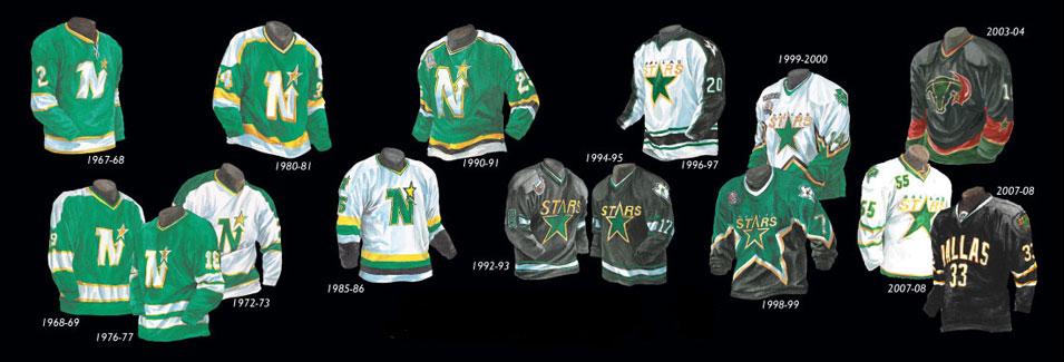
I love talking to you guys about sports logos and jerseys, so lets get to it on these Dallas ones for 2014. Let’s start with the state shaped logo- not bad, it’s about as literal as you can get, right? They went the minimal route; the shading is a bit over overkill along with the outlining and italic D. The circle one is junk, it looks like it was following some sort of 3 color rule in the center and the designer gave up.
Now to the main logo, the D over the star… cooooome oooonn mannnnnnn. First off, let’s get some ideas going about why they even kept the Stars’ name when they moved from Minnesota to Dallas? I’m guessing a sheriff badge sort of thing right? Well, now it’s just losing soo much character, at least go with that literal over shaded state shaped logo. Also, the outline of the bottom left hand corner of the D and the whole bottom of the D looks screwy because of the use of italic. The black outline has all sorts of jacked up crap going on. This is a multi-million dollar professional team that just approved a hack job, who approved this? Could you imagine pitching an italic star to the Dallas Cowboys fans? Cows would be let loose into the streets.
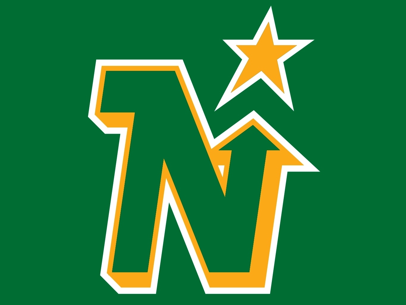
Look… for the people that think I just want retro back, that’s not the case. I’ve seen beautiful and horrid line work from the 50s to the 80s, I’ve seen over worked and garbage through the 90s to now. I don’t even like the North Stars logo that much when you compare it to others during that time (i.e. Calgary, Hartford, Edmonton, etc. all gorgeous), but I do appreciate the creative effort. I understand the need of a redesign when your old logo is just the word and a star, but the reason it was maybe bothering the higher ups was because it probably wasn’t selling and because it was too plain for fans. This new logo is one whole level worse than a Heineken bottle cap and also with less colors.
Going to end this on a positive note, if I had to wear the green jersey with a different logo on it, I’d proudly do it- it’s laid out nicely and riffing off classic jersey layouts that work with some nice class worked into it.
One last mix for the year, this one is for Montreal boutique SSENSE, I tried to go a bit moody yet still build to some sort of drive. The mix contains a track from one of my favorites from Circlesquare and this years Shed LP, hope you enjoy.
POLISH-BORN BROOKLYN-BASED PRODUCER JAKUB ALEXANDER, BETTER KNOWN BY HIS STAGE NAME, HEATHERED PEARLS’ AMBIENT MIX OF PROGRESSIVE, STEADY RHYTHMS AND HYPNOTIC BASSLINES OPENS WITH A SYNTH-DRIVEN OFFERING FROM THE HYPERDUB-SIGNED NEW WAVE PROJECT, DARKSTAR, BEFORE ARTICULATING SMOOTHER SOUNDSCAPES, KICKLESS BEATS AND ETHEREAL VOCALS FROM THE LIKES OF CIRCLESQUARE, TROPIC OF CANCER AND PLANETARY ASSAULT SYSTEMS. SWEDISH PRODUCER MOKIRA’S EXPERIMENTAL SINGLE, TIME TRACK REMIXED BY SILENT SERVANT FILTERS IN A CONTEMPORARY TAKE ON AMBIENT ELECTRONIC FILLED WITH HAZY STATIC FOLLOWED BY TRACKS FROM FELLOW GHOSTLY INTERNATIONAL-SIGNED DUO LUSINE + WINGO.