Serious Business
Posted by Scott
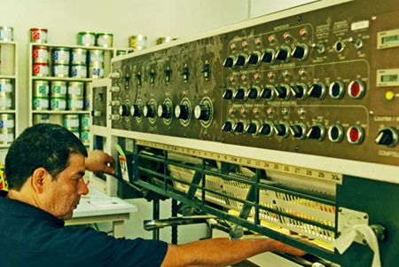
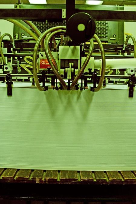
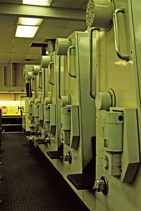
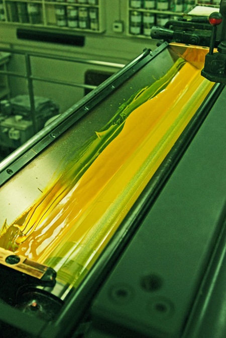
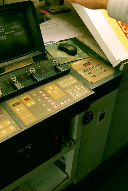
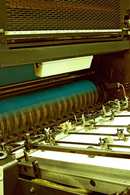
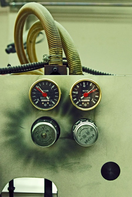
I’m at Continental Colorcraft in LA for the Obama printing. The proofing is complete and the presses are running at full tilt. As the title suggests, they aren’t playing around at this place, the press is the size of a small house. Some really cool 80’s era industrial design going on, great knobs and dials (the first shot looks like a Moog Modular, can’t go wrong with that). Not trying to be a tease (as some of you commented on the last post) but you can catch a couple small glimpses of the print up above.

25 Comments Leave A Comment
DE says:
May 15, 2008 at 2:08 pmOh man I LOVE this stuff.
Jeremy says:
May 15, 2008 at 2:15 pmQuestion…when you finish a file of that size and get it ready for print, what file type does it end up in? BTW – sooo stoked about seeing the final product!!!
ferdinand says:
May 15, 2008 at 2:17 pmI can’t wait to see the finished design. I love the colours and composition with the large Obama logo in the middle. Looking forward to seeing the details! Needless to say that the photos are great.
mike says:
May 15, 2008 at 2:23 pmis that what I think it is in picture 5?
ps: even with an idea of how those presses work, I still have a lot of respect for the people that operate them. it looks confusing as all hell.
Matt says:
May 15, 2008 at 2:24 pmit looks like it says ‘progress’ along the bottom in #5.
faber. says:
May 15, 2008 at 2:32 pmAny idea on when they will be available – looks awesome. Can’t wait to see it up close (instead of zooming in on my screen :)
Jug says:
May 15, 2008 at 2:37 pmYou guys remember that game show “Classic Concentration” (hosted by Alex Trebek)? Where bits and pieces of the final puzzle were revealed one at a time? This is *so* Classic Concentration…
Chris Hahn says:
May 15, 2008 at 2:39 pmWow. It all comes down to the printer, huh? I mean, you can calibrate your expensive monitor all day if you want, but printing gives that digital process life. Its a physical object at that point. Man, what a cool job.
Eric W says:
May 15, 2008 at 2:59 pmlove how you make every photo look old and authentic to your graphical styles. nothing is out of place, ever.
Jess says:
May 15, 2008 at 3:20 pmI thought it was amazing to walk through a still-functioning 60s print shop in my hometown, but this is just amazing. Love the images!
Joaquim Marquès Nielsen says:
May 15, 2008 at 4:56 pm…as if the sun is rising over the great sea, shooting up into the sky like a divine hand grasping the clouds.
It’s funny what you can make of tiny pixels ;)
aaron says:
May 15, 2008 at 10:27 pmlooks like scott hansen has been taking tips from the writes of LOST. slowly telling what the hell is going on on the island. or in this case at the print shop
Daniel Carvalho says:
May 16, 2008 at 1:05 amOld 80’s industrial design machinery, how coincidental heh, it’s like you morph the physical realm around you into pre-2000 era. Your universe is tearing the fabric of the real one.
Do you ever feel intimidated / insecure while attending a proof session, especially high profile one like this? I ask because I know you, like a lot of us out there, have no “qualification” and we taught ourselves. Do you ever feel unqualified or uneducated?
Hey Scott, another question, any good sources or tips gained from experience regarding monitor calibration?
– Daniel
marshall says:
May 16, 2008 at 5:31 ami had a dream last night that Billary won. D:
ed@dupe says:
May 16, 2008 at 6:26 amI must say, this is all very exciting.
Proofing is usually a pretty dull affair for me, but no doubt this is something special to you, Scott – and your army of followers
Ssa Trams says:
May 16, 2008 at 7:23 amYou might want to get your camera lens checked out. Its making everything green and some how putting Photoshop grain over all of your photos.
Utah says:
May 16, 2008 at 8:11 amSsa Trams – you might want to get your eyes “checked out” because I’m not sure you know what you’re talking about. Scott is obviously not using a flash in these photos, which means he is shooting at a super high iso to keep from blurring in a dark press room. High iso’s result in a little grain. If he were actually applying the grain in photoshop the white areas would also be loaded with the same grain as the darks. As far as the green tint goes, it could either be a result of the funky fluorescent lights used in the shop or some post production color adjustment. No matter though, Scott can do whatever he wants to his photos without condescending quips, and so can any other artist for that matter. Nice photos Scott – love the intentional retro style!
Jay says:
May 16, 2008 at 8:21 amFrom what I can see of the poster in photo #3, it looks quite good, and very much the ISO50 style.
You can get a better view of the poster here:
http://img221.imageshack.us/img221/5204/obamaposterwf8.jpg
(cropped/enlarged version of photo #3)
joshua says:
May 16, 2008 at 9:33 amOh snap! Good eye Jay. Does this remind anyone else of the “monster splash” in Cloverfield?
:)
Scott says:
May 16, 2008 at 10:08 amDaniel-
good question, I will do a piece on monitor color calibration very soon. I am getting a new monitor today, finally, after talking with the people down at that print shop and checking out what they use.
SSA Trams & Utah-
I am using a pretty run of the mill lens, a tamron 18-70 at 2.8 aperture and a moderate ISO (640 for most of those). definitely no flash. I am doing a fair bit of color color correction and curves to bring out the already existing natural grain but none is being added. synthetic grain never looks very good. I know, I am sometimes shameless with my vintage-izing of things, but that’s how I like it!
Daniel Carvalho says:
May 16, 2008 at 10:30 amSweet, very keen read that piece Scott. I’ve been delaying buying a new monitor for a long time as well. My old ViewSonic CRT packed up recently and I’ve wanting to switch finally to LCD. I’ve been pretty hard pressed in my quest to find a decent quality LCD monitor though.
What I find often, the colours change from the top to the bottom of the screen. And that is… just pure evil. The only LCD that I’ve seen recently that doesn’t do that is the Apple Cinema Display in our office. Unfortunately, I’m not the one using it.
– Daniel
Leggoz says:
May 16, 2008 at 11:11 amawesome vibe going on man! great shots.
EJ says:
May 16, 2008 at 12:47 pmUTAH – I think you might need to chill out. It was obviously a joke.