Stereogum – Drive XV
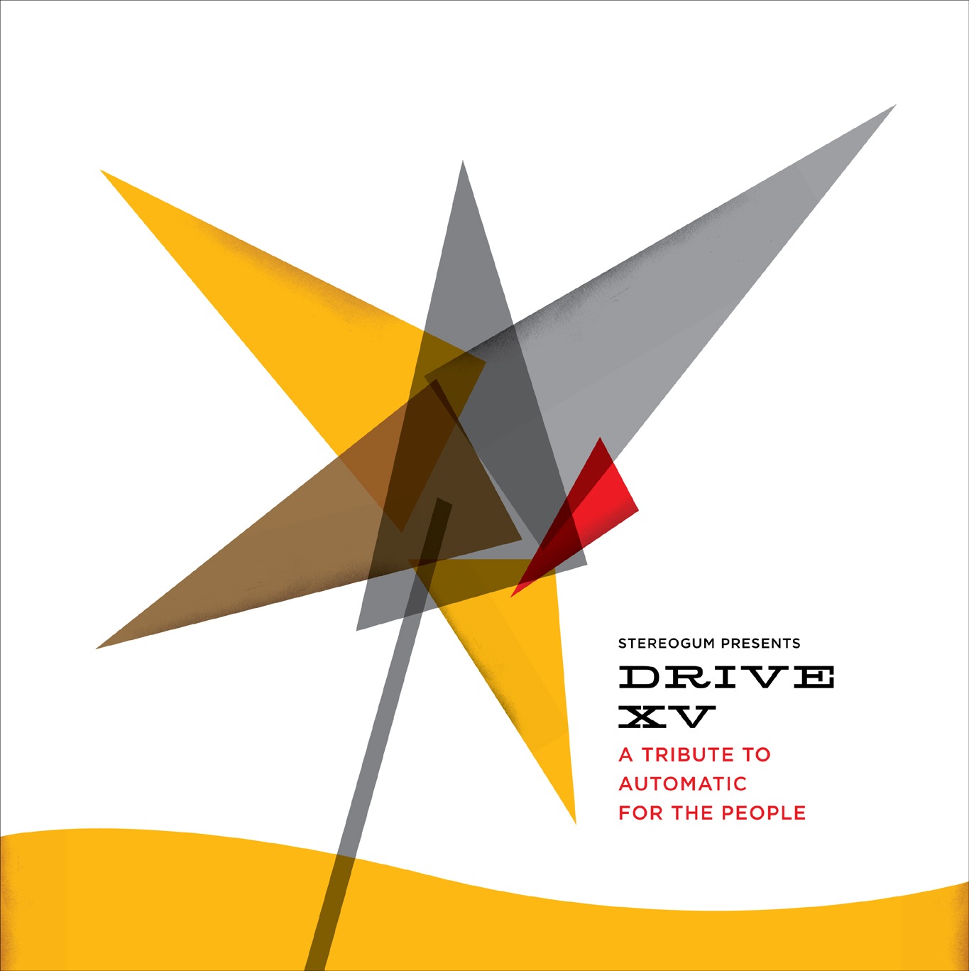
Was talking to the guys from Stereogum today about a design project and they sent me a link to Drive XV, the 15 year Tribute to REM’s Automatic For The People. I remember when Automatic For The People originally came out, it was really something unique at the time, one of my favorites. So apparently Stereogum has designers sort of re-imagine the cover art for the tribute albums and I thought this one came out quite well. Really like the type treatment and minimal approach. You’ll notice that it vaguely follows the form of the original. Bonus: name those fonts
Design aside, the Shout Out Louds’ tribute to Man On The Moon is superb, have a listen below. I hear some Paul Simon Graceland in that chorus, anyone else?
Shout Out Louds – Man On The Moon
[audio:remmoon.mp3]
13 Comments Leave A Comment
john says:
February 6, 2008 at 10:13 pmis it Hellenic wide and Avenir?
Greg Formager says:
February 6, 2008 at 10:53 pmNot liking that design very much at all. Nor the type in this context. Anyway, that’s my $.02
Damo says:
February 6, 2008 at 11:15 pmI find the type not bad – yet a little off putting (maybe the serifs)
Also i feel the blocks of colour could possibly have more texture of a faded screen print or something similar! they seem rather flat and boring combined with that type….my 2c – a little kitty is building up :)
Clayton Perryman says:
February 7, 2008 at 1:06 amI just wanted to say your an amazing person. You’re more inspirational to people than you may know. I’m sorry, I know some people don’t like to hear that. Your music, your prints, your photography, and just your nice, down-to-earth, kind way of helping people out; its truly something rare in today’s world.
Just wanted to say thanks.
Clayton
Brad Blackman says:
February 7, 2008 at 7:23 amThe serif font, maybe Lonestar or Hellenic. The sans, probably Gotham. (I like Gotham a lot myself, but I feel like it’s a bit overused.) On the original REM cover? Looks like DIN or Trade Gothic Condensed 20, hard to tell from the size.
I like the overall aesthetic of the new piece, but I think the original is more iconic. Maybe that’s just time and nostalgia doing that to me.
Shud says:
February 7, 2008 at 9:15 ami looooooovvvvvve gotham. such a nice font. and i llllooooooovvve DIN mittelschrift as well.
i like the design, but it doesn’t blow me away or anything.
Scott says:
February 7, 2008 at 9:31 amyeah, those fonts sound about right. I think juxtaposing serifs and gothics can be very effective if applied correctly. overall, you’re all right, this design could go either way, but personally something about the lines, type, and color all come together for me, so still have to say I’m a fan.
Gareth says:
February 7, 2008 at 10:42 amAbout the cover, I understand it’s a “re-imagine” so I’ll give it some leeway, but 1950’s sputnik-style doesn’t fit my mental model of what REM was about back then. I enjoyed the track tho :)
Greg Formager says:
February 7, 2008 at 3:40 pmIf I block out the yellow wave at the bottom with my finger the design looks better to me.
Rogga says:
February 11, 2008 at 1:38 amThis is just a test. Nice blog by the way!
Florian says:
February 22, 2008 at 5:36 pmFound the “DRIVE XV” type: 58 Rodeo by Nathan Williams. You can find it at fontshop. :)
unknown says:
September 23, 2008 at 7:22 pmawww you go alright i think