What Goes Around…
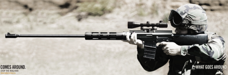
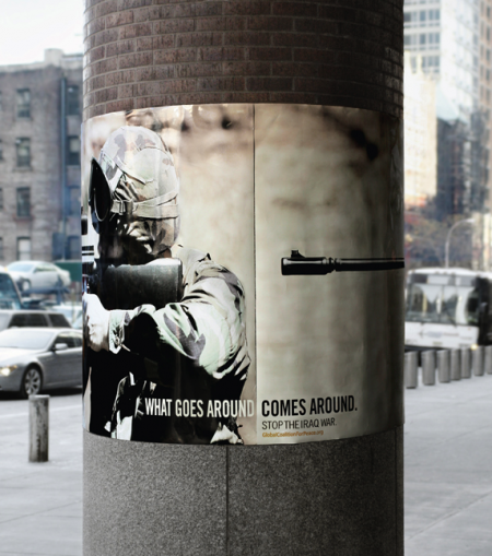
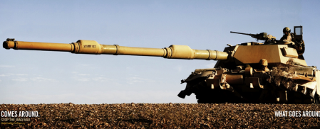
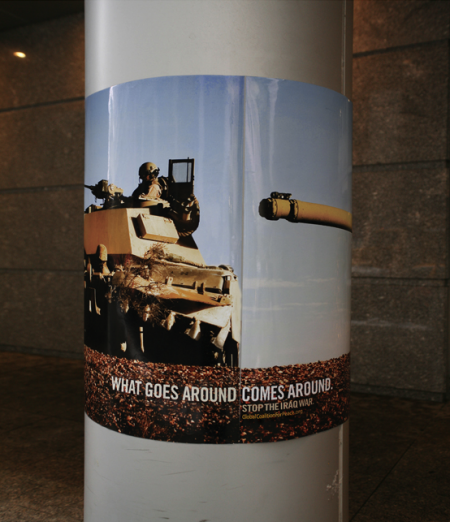
Big Ant International created these posters for the Global Coalition for Peace. The series has garnered significant recognition of late, including a Silver Pencil at the One Show Awards, and nominations for both the D&AD and CLIO Awards 2009. The posters are wrapped around street poles and achieve that ever so illusive “aha” moment when viewed in this circular manner.
I would imagine a poster series depicting soldiers essentially pointing guns at themselves is bound to be met with some controversy, but it seems clear to me that the “target” of the campaign is the US foreign policy and not the soldiers themselves. The metaphor is clear. Hopefully as the work competes for further acclaim, opinions about the message won’t get in the way of recognizing the work as a successful piece of graphic design. The series is a great example of a simple and brilliant concept executed very effectively.
See the rest of the campaign here.

18 Comments Leave A Comment
Brennan says:
May 18, 2009 at 6:35 pmOh man, this is brilliant!
I love clever ads that make you think and, as you say “Aha! moment”.
*Goes off to photoshop to think of clever pillar ads.*
Great find.
Jakub says:
May 18, 2009 at 8:01 pmStrong ad indeed, nice find Alex!
Rent says:
May 18, 2009 at 8:16 pmsaw this the other day…very clever and indeed very provoking. I like it.
frank says:
May 18, 2009 at 10:48 pmAwesome! For some reason it reminds me of this old Soviet movie poster I saw where the left half of a horizontal image was printed on the top half of a vertically oriented poster and the right half on the bottom. When the posters were pasted up side by side in an offset, bricklike pattern, you would see the full horizontal image and a whole wall full of them created a big repeating pattern. I’m not sure if I explained that right but anyway, this is much more clever.
tobias says:
May 19, 2009 at 12:58 amwhat a great idea
Matthew says:
May 19, 2009 at 2:48 amVery Strong idea, Does it extend into other media? If is would dig to check out the other executions.
Ashely Adams : Sticker Printing says:
May 19, 2009 at 3:15 amShort… powerful… and very clever. The rifle effect is the strongest. The weakest one was probably the one with the grenade (see the Big Ant website for the entire set). But a good, memorable campaign on the whole. Thanks for the post.
greg says:
May 19, 2009 at 7:11 amVery smart.
Daniel.D says:
May 19, 2009 at 8:52 amVery attractive design. It would be interesting to see it from all angles and not just the barrel of the gun/tank to the back of the head/tank. Does anybody know if it creates a sense of direction to make you want to look around the whole design? Im curious to see if it attracts the viewer enough to look at the whole composition. Overall its a very bare-bones design with a massive impact. Awesome!
Tek says:
May 19, 2009 at 9:53 amGreat example of how less is so much more. Work is genius and I’m fully on bored. We the people need to take back America and not let our g.o.v be g.o.d over our beliefs of what is right and wrong. Advertising is an effective way to speak FOR the people not just sell to the people.
Nick says:
May 19, 2009 at 10:20 amWhat an amazing idea… Great find!
Marcos says:
May 19, 2009 at 4:28 pmHilarious dan!
Do you know whats also “clever” and “provoking”?
The documentary “Brothers at War”. However, I do not think it falls under the “Liberal” arts category.
http://www.brothersatwarmovie.com/
It’s the soldier, not the reporter who has given us
Freedom of the Press.
It’s the soldier, not the poet, who has given us
Freedom of Speech.
It’s the soldier, not the campus organizer, who has given us the
Freedom to Demonstrate.
It’s the soldier, not the lawyer, who has given us the
Right to a Fair Trial.
It’s the soldier who salutes the flag, serves under the flag and
whose coffin is draped by the flag,
Who gives the protestor the right to burn the flag.
~Father Dennis Edward O’Brien, USMC
Ichabod says:
May 19, 2009 at 8:44 pmthis is absolutely disgusting
Scott says:
May 19, 2009 at 9:28 pmI deleted “dan’s” comment. Dan- no need to take it there, if you have a point you think is worth considering, try to make it in a more intelligent manner.
Daniel.D says:
May 20, 2009 at 8:08 amscott
Its not that im trying to disrupt a vibe, I apologize, not my intention. Just curious to seeing more angles of the picture on pillar. Probally could have worded it better.
Brad says:
May 20, 2009 at 8:34 amWow. Very powerful piece of design. The application is brilliant.
I don’t know how I feel about the message. But this isn’t a political blog… so I’ll keep it to myself. :)
The Kingmaker says:
May 31, 2009 at 1:07 amImmanently cool. Has a striking pathos to it. Nonetheless, panders to some obsolete sentiments. America’s military actions abroad certainly increase the likelihood of America becoming a target, but this paints soldiers as the target… which they actually are… which is a tad whack presuming the designer of this piece is in American civilian. Adbusters kitsch circa 2004. Neat design, nuanced presentation, but definitely neither artistic nor original [in b4 “make something better”, “art is relative”, etc.]. Certainly won’t effect the war itself or people’s opinions of it hitherto, hence not a very effective design — unless of course the ‘effect’ is some contrived bull such as ‘raising awareness.’ Obama is president, we’ve got plenty of bright folks in this country and on this planet to counteract the morons — lets empower them in our subways rather than witty, restless, activipsters. Overall: interesting, but way too late.
Daniel Farrell says:
September 17, 2009 at 1:41 pmSeeing that actually made me laugh out loud haha! ;)