Montreal ’76
Posted by Scott
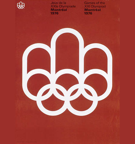
Had this laying around for a while, classic Olympic poster. This is a perfect example of how much the core ethics of design have changed. Take this one in, then have a look at these olympic logos…. what happened to design?

23 Comments Leave A Comment
steven good says:
September 17, 2007 at 4:39 amIt’s a great classic design, as is the logo from the ’80 Moscow games.
cujto says:
September 17, 2007 at 12:25 pmWhen you are allready taliking about the Olympics logo what do you think about the London 2012 logo? I to agree that the 60’s design did had a certan vibe to it.
Scott says:
September 17, 2007 at 12:51 pmI am actually not as averse to the proposed London games logo as a lot of people. I think it is at least interesting and thought provoking. It’s definitely not my style, but I could see how it could be worked into a lot of promotional things, and that’s what it’s all about at the end of the day I guess, promoting awareness. But I definitely would love to see them go back to the simpler forms/colors of the past logos. Perhaps the younger generations just don’t appreciate the same simplicity and minimalism many of us were raised to recognize as “good design”.
Pablo says:
September 18, 2007 at 5:55 amDesigners now take synthetic drugs.
Jayden says:
September 18, 2007 at 6:30 amYeah the London one is whacked . Love that old moscow poster. Although being Australian I’ve gotta put a word in about the Aussie one… it contains icons of Australia that probably aren’t too obvious. The legs and arms are boomerangs, the body looks to be of an Aboriginal style, and the streak of blue traces the Sydney Opera House… it’s pretty well done. But still doesn’t carry the same poise as the solid moscow version…
drew kora says:
September 18, 2007 at 2:48 pmThat montreal logo is gorgeous…looks like something of yours, Scott.
As far as the recent stream of olympics logos, I’m fond of the Chicago one with the sears tower being the top of the torch.
Scott says:
September 19, 2007 at 2:46 amYeah, I have always loved Olympic branding. I will definitely be posting more in the future, have a bunch of cool examples lying about.
Drew says:
September 19, 2007 at 6:41 amVery good point – although I’m sure you could have linked to a slightly less right wing and warmongering site to make it…
Scott says:
September 19, 2007 at 2:34 pmDrew-
Even better point! Sorry, in my haste to find a site featuring those 3 particular logos I didn’t stop to check the overall content of the site. I posted my own mirror of the images and switched the link.
Phil Crissman says:
September 21, 2007 at 8:28 amGood point. I’m not a huge fan of the Vancouver 2010 logo, either…
Or are we just being nostalgic for a design style we don’t see so much anymore? I suppose in the end of the 60s/70s, people might have been sick and tired of these sorts of designs, and we’ve just been away from those styles for so long that it seems fresh again?
That being said… I still like the old one better, too.
Stephen says:
September 21, 2007 at 9:23 amThe proposed Chicago 2016 logo was very nice, until Chicago decided to change it:
Orig:
http://www.typophile.com/files/Chicago_2016_6227.jpg
New:
http://www.chicago2016.org/
Jakub says:
September 22, 2007 at 1:01 amStephen, that original logo is amazing for Chicago 2016, i can’t believe their not going with that one. That second one reminds me of a bank logo or something.
like: North Fork Bank
http://www.strategicagency.com/big_brands/nfb1101a.gif
: / disappointing
Michael Erdmann says:
October 12, 2007 at 1:51 pmPhil, I completely agree about the Vancouver logo. Not only did they misappropriate a First Nation’s symbol, the inukshuk (giving it a happy face!), but the symbol has nothing to do with Vancouver (the Inuit people who traditionally make inukshuk live thousands of miles away in the arctic). Sure, I know it’s about showcasing the whole country not just the host city, but Vancouver and the province of British Columbia has plenty of culture (including local aboriginal people) they could have drawn from… this one is just embarrassing.
Anonymous says:
April 15, 2009 at 3:11 amwhere is the picture
Ted Burrett says:
April 24, 2009 at 3:04 amHey, cool tips. Perhaps I’ll buy a glass of beer to that man from that forum who told me to visit your site :)
Simon Pauslachner says:
October 22, 2009 at 10:22 pmReally good, go ahead
david says:
February 5, 2010 at 6:09 amI think it’s symptomatic of a lot of mainstream design. Loss of confidence in a simple solution. From design companies as well clients.
If this (the Montreal logo) was submitted to certain person of my acquaintance, the reaction would be “the background is boring and undifferentiating, can’t we make it a gradient? The symbol needs to be more impactful (read fatter). Can we get it rendered in 3D, to bring it to life? And a drop shadow.”
I won’t blame computers, they’re just a tool. It’s the tools sat in front of the computers and the even bigger tools standing in front of the clients.
Jeremy says:
February 24, 2010 at 8:28 pmRe: the Chicago logo; the Chicago team did not have a choice but to change their logo; prospective cities are not allowed to use the Olympic torch as part of their logo. Chicago violated that very basic rule with their first logo, and were forced to change it. They chose a star reminiscent of the 4 stars on their city flag, with colors representing the Great Chicago Fire at the top, and Lake Michigan at the bottom.
Jonny says:
June 10, 2010 at 8:59 amGreat post. I know I’m three years late noticing this, but it’s so true!