Student Project: Set In Stone
Note: I wrote this process post a while ago about a project I completed last November. There has been so much going on these days that I forgot about it in the depths of my terribly cluttered hard drive. As I have transitioned to thesis mode now, there are less of these sorts of projects in the pipeline. This is one of my favorites I have completed at the Academy thus far and it was interesting to revisit. This is the article in its original form, as I wrote it last December.
Assignment
This semester we were asked to immerse ourselves in one topic and research it through a series of week long projects. The content of each project would be the result of our extensive research, and we were expected to pick a topic robust enough to be worthy of 15 weeks of study. Each project encouraged us to explore different design solutions and helped us hone in on a visual style that we could use for the final project, which would synthesize all of our work into one deliverable.
For the last month of the semester, we were tasked with compiling all of our research into a book that we would write, design, and bind ourselves. It was to have a minimum of 48 pages (6″ x 9″), a hardcover, and provide some meaningful insights about our topic which we uncovered during our semester of research. In addition to providing a worthy and refreshing commentary, it was to be a covetable piece of graphic design that felt visually appropriate for our topic.
The topic I chose for the semester was Mega Cities (urban areas with a population over 10 million people). The original focus of the project was an examination of what makes a city successful — what it is about a massive city that makes it unique. It eventually dovetailed into an exploration of the ways these cities are confronting the problems they face and how increasing populations make solving these problems more complicated and time sensitive. These problems are becoming increasingly relevant as the world’s urban population continues to grow at an unprecedented rate. I flirted with numerous other topics, some of which I thought were quite interesting, but I found that Mega Cities would provide me with the most interesting and engaging material.
Early Stages
On most of the early assignments (two of which are below), I explored different visual directions in hopes of finding something exciting that I could use for the book. I discovered little things here and there that I knew I wanted to incorporate somehow, and the early assignments were very valuable in this regard. I felt good about some of the design I was doing, but I didn’t really feel like it was good enough to work across an entire book. Each assignment was only a week long, and frequently I found myself disinterested with my project a few days after it was completed. I tend to judge my work based on how long it takes me to become tired of it, and I was worried that these initial projects only had a week long expiration date. I find that as I improve as a designer, this period of time becomes longer and longer.
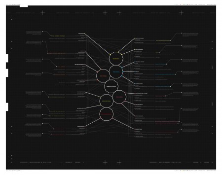
I was also doing a lot of research on existing formats for books about cities. I’ve lived in the city for a year now, and I still can’t believe it took me until now to visit William Stout Books in the Financial District. They have a wonderful selection of design related books, with an entire floor devoted to architecture. I spent a lot of time in their Urban Planning section trying to get a sense of what books about urban areas usually feel like — what sorts of design conventions are normally at work. I noticed that most books about cities use photography to tell their story, and that many of them feel very much the same. I was attracted to a number of Japanese books that took a much more diagrammatical approach. I thought this aesthetic might be a good way for me to distinguish my book.
Concept
One thing I kept coming back to was the way cities were so often portrayed in the existing literature. They were always static, and you never got the sense that they could change. I wanted my book to feel much more urgent, frenetic even, in an effort to change the perspective of cities being set in stone. The idea would be to convey the sense that cities were much more flexible, ever-changing entities, and that despite the financial and time related costs, drastic changes could still be made to the urban environment. Conceptually, I considered getting this across my primary goal. I decided the best way to accomplish this would be through illustration.
To create the conceptual juxtaposition I was hoping for, I decided to make most of the book to feel very structured, and then place the illustrations within this tight and technical layout. The idea being that the book is basically the “completed” city with the sketches and drawings augmenting its landscape and conveying the sense of urgency and change. This idea for a dual aesthetic passed judgement before we went on Thanksgiving break, and I used my time off to write and illustrate the book. I was nervous about completing the content for the book over break without direction, but I knew I had to finish before returning if I was going to have enough time to bind the book the way I wanted to.
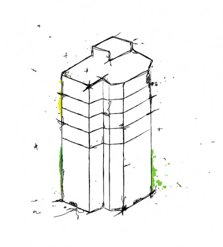
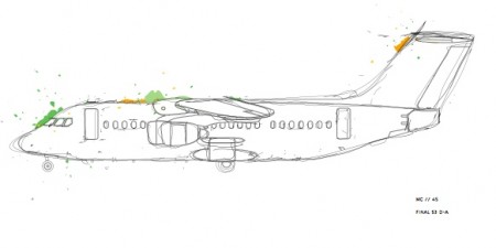
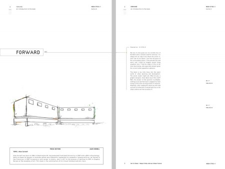
Above you can see examples of the illustrations. You’ll notice that there is very little color employed, with just a touch leaking out on the sides. This was done mainly to reduce their visual weight on the page; to avoid drawing your eye away from the written content. They were all done using a Wacom Tablet, something I started using while completing this project. I was very impressed with how the tablet performed and am excited to incorporate it into my workflow. I could never use it as a mouse replacement, but it’s perfect for illustration work.
One other idea, that didn’t make the final version, was to have someone other than myself “correct” the book with red pen. The corrections would be done after the book was already printed and bound, and it would be taking this idea of city/book “under construction/evaluation” one step farther. It was deemed a little too risky, and I didn’t want to have to be there to explain that the marked up version was the final version. It would have been confusing since that the book would eventually be presented in a classroom environment, and given this context, people would have assumed that I just hadn’t finished in time. If the book was found in a bookstore, this assumption would not have been a problem because people would think, again given the context, that however it was presented was how it was meant to be.
Content
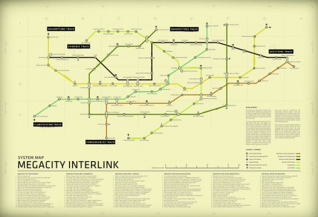
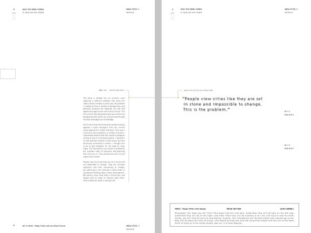
Below you see a couple example spreads of the book. The content was divided into five major sections, each devoted to a different type of urban conundrum. (things like waste disposal, the environment, or public transportation) I tried to explore some of the most interesting problems facing Mega Cities, as well as present some of the most innovative solutions at work around the world. At the end of each section, different graphic design solutions were presented to help ameliorate the problem presented. This was a requirement for the book and the hope was that one of these opportunity gaps might turn into an eventual thesis project.
The content unfolds in the small paragraphs that are either connected to the title of the page, or the call-out quotation. The content does not take up much real estate, space-wise, and I liked the overall look this created. Obviously, for a book about massive, sprawling cities, this spacious layout might not sound like the best choice conceptually, but there were certain concessions I had to make. During my brainstorming process, I was working with a few different concepts, and my professors encouraged me to pick a visual direction and stick to it. As much as I would have liked to entertain every visual direction I found conceptually relevant, it became clear that I had to choose only one. I decided to go with what we deemed the “sketchy” look, as I thought this would be the most fun and also the most interesting.
Once all of the content was written and the sketches illustrated, I could lay out all of the pages and get a sense of what the entire book would feel like. When my professors saw the book in this form, they were quick to point out that it felt very monotone, and that there was no visual relief provided. One of the criteria they enforced for these books was that it be engaging on three levels: It had to be interesting for someone to flip through briefly, skim over in a couple of minutes, and also read completely. The issue was that my book, despite the illustrations, felt the same everywhere.
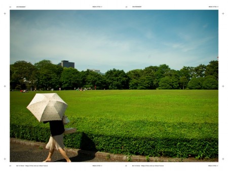
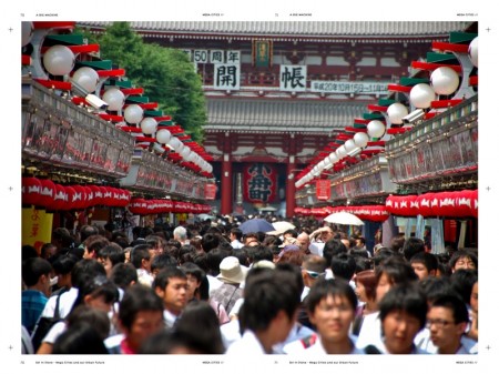
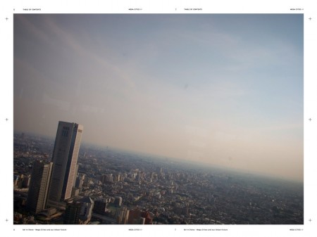
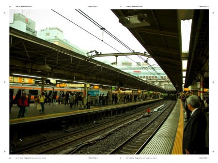
I tried a number of things to try and provide the visual interest we thought the book lacked. Eventually, the tactic which worked best was also the tactic I was initially trying to avoid most: photography. I knew I had a number of pictures that I had taken while in Tokyo this summer that I thought might be appropriate for the book. Since Tokyo is the biggest city in the world, it would fit right in with the content. At first I thought it would go against what I was trying to say over the course of the book, but once I plugged a few pictures in, it seemed this would not be the case. The photography did what it was meant to and provided some visual relief to my colorless content pages, and also made the book more engaging on a “skim” level. You can see examples of these spreads below.
(note: The third image is the original photograph I eventually used for this project)
Binding
Once the content for the book was completed it was time to start binding it. We were allowed to use outside vendors to complete the binding, but given their two week minimum turn around time, it was suggested that we bind the books ourselves and have more time to tweak the content. I am deathly afraid of craft and I usually try to outsource anything involving glue, cutting, chopping etc. I always give it a shot, but craft is definitely one of my weaknesses as a designer. Given this, I decided to have one version of my book bound professionally to use as a backup, in case I ended up glueing my version to the ceiling or something.
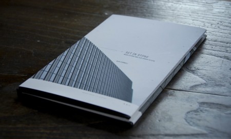
The content for this backup version was prepared two weeks before the deadline, to be bound in time, and it didn’t include photography or any of my final changes. I used a dust jacket to give it some more personality, which you can see in above. I really liked the way it looked overall, and it basically represented the version I had originally conceived, before the addition of the photography spreads. It was nice to have the project essentially “done” two weeks before it was due, and this allowed me to experiment with the subsequent bindings.
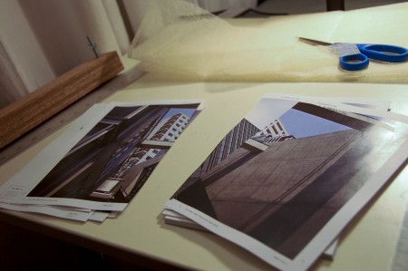
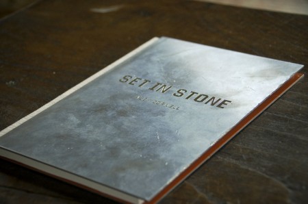
To start the process of binding a version myself, I had to have the pages for the book printed professionally. (My Epson decided long ago that it would refuse any requests to accurately print double sided.) Above you can see the loose pages after I got them back from the printer, as well as some of the other binding tools used in the process. As I mentioned, craft is not my speciality, so my binding method was sort of a combination between what I remembered from our in-class tutorial, and what seemed like it might work. What complicated my process was that I was using two engraved zinc plates as the hardcovers, which I chose because I wanted the book to feel urban. I also wanted to represent the aging perspective about cities (that the book aims to change) with a cover that was about as “set in stone” as you could get.
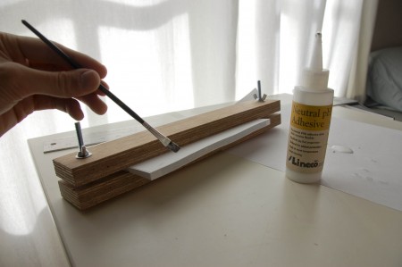
The entire process of binding the book, once you have the loose printed pages, actually only takes an hour or so (aside from drying time). My first step was to glue the block of loose pages together, at the spine, and prepare it for connection to the metal. Above you see the pages secured between two wooden blocks to ensure they stay lined up during the gluing. Using PVA glue, I painted on about 8 layers, and left the block to dry over night. (With each layer of glue, I waited about 5 minutes before applying the next layer) I also attached a small piece of mull cloth at the spine to reenforce the construction and provide a textured feel in hand. The next day, with the pages dry, I had to figure out a way to adhere the metal hardcovers to the page block.
After they had been engraved, the zinc covers felt too pristine and unrealistic, and I wanted them instead to feel like they had been ripped off the side of a building, and really represent the “old” way of thinking. They felt like office trophies when I got them back from the engraver, and I was worried the “lame” factor might get in the way if I didn’t dirty them up. You can see the plates mid-destruction in below. I used a giant serrated knife to scratch up the front, threw them down a set of concrete steps, and also put them (briefly) in a fire. Once they were sufficiently obliterated, I got out my E-6000 metal cement and got ready to adhere them to the block.
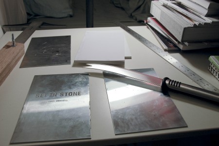
Above the knife is the glued block of pages, ready to be attached to the zinc. This step was the one I was worried about the most, because if something went wrong, I would lose pretty much everything and have to start over. The method of attaching the hardcovers to the page block is called “applied hardcover” and you basically just adhere the hardcovers to the glued pages any way possible. It works much better if you have had the pages bound with a cover paper, but really it can work either way. Using my E-6000, I painted a thin layer onto both the backside of the zinc, and the front of my block. In the most unscientific way possible, I lined up the two and pressed them together, making sure that the edges were flush on each side. I did the same thing on the reverse side and left it to dry for the next three days. E-6000, like other crazy cements, can take quite a long time to dry, so I left the book alone for three days and didn’t touch it again until the final class.
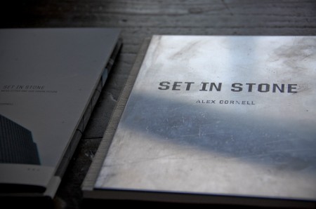
When I returned to the book after its drying period, it looked like everything had been successful. The covers were attached sufficiently and everything appeared to be in working order. What I didn’t realize, and still don’t fully understand, is that some adhesives are capable of binding with just fumes, and some of my pages had been cemented together just by being in close proximity to the hardcovers drying. Luckily, it was only about four spreads that got ruined, but it was still very frustrating to have to deal with such an unexpected problem. I definitely learned what I needed to watch out for if I ever found myself binding with metal again.
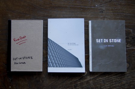
Above you can see all three of my final books together. In the middle is the official “backup” version, on the right is the experimental metal version, and on the far left is the”rough draft” I bound with sandpaper (ha) and davy board using my extra set of pages. I was able to present all of them on the final day of class, and it was fun to have a diverse set of books which represented different conceptual choices I had made along the way. My favorite is probably the one with the dust jacket, because I like the design, but I felt like they all brought something to the table.
Conclusion
This semester had us spending an equal amount of time designing and researching, a combination unique to the graduate school. This approach allowed us to really know our topics and we were able to produce design solutions that were that much more successful because of our deeper understanding. I had a lot of fun exploring different ways to visually and conceptually approach my topic, and I am very satisfied with the way it all turned out.

13 Comments Leave A Comment
Andrew Witherspoon says:
August 3, 2009 at 12:16 amIt’s good to see some of your classes allow for an equal focus on research and design. It was awesome to get to see your process, particularly your struggles with the binding, that looks unbelievability frustrating. Solid end product, definitely worth displaying proudly on the shelf.
Shelby White says:
August 3, 2009 at 1:21 amI also sometimes feel the same way about some of my work having an “expiration date”.
I agree with Andrew in saying that its awesome to get to see your process and binding issues.
RA_OUL says:
August 3, 2009 at 1:54 amWow…what a great post on your process for the Mega City project. I had seen some of the work up on Behance a while back and was really amazed. It’s nice to see the process and struggles you went through to get to the end result. I am a current graphic design student at CSUS and the last two semesters I learned first hand how important research is to every project. At first it seems tedious but in the end the most successful designs are from those who have done thorough research. Great post Alex, I truly admire your work and really appreciate you putting the time to explain the process. It is really great to have young inspiring designers like you.
_Thanks for the binding tutorial too!
Jb says:
August 3, 2009 at 1:58 amCould you please tell me what school you attend/attended?
Thanks,
jb
Joe Snodgrass says:
August 3, 2009 at 7:51 amScott,
For great reading on the subjects of cities, I highly recommend stuff by Stewart Brand. He’s also given quite a few talks on the matter that you can find on the TED website (www.ted.com) or the Long Now Foundation website (www.longnow.org). His focus over the years has been a lot on cities and systems that grow like cities (his book How Buildings Learn was the same application of these systems; also his book “Clock of the Long Now” is recommended). The last few years in particular have been focused on Squatter Cities and how they are, essentially, the cities of the future. It’s incredibly interesting to see the process of how they grow from being poorly formed shanty towns to actual functioning super organisms.
Feel free to email me for more information.
Take care,
long time fan Joe Snodgrass (www.loungingsound.com) (sndtrks.wordpress.com)
koneyn says:
August 3, 2009 at 10:46 am^ Scott’s on vacation, that was Alex :)
Hmmm, how come you didn’t use the oversewn binding method before applying glue? It is very easy to learn and do it on your own and there’s no chance of pages falling off any time soon. Maybe next time, he? ;)
What I like about your book is that I can sense how it can provide a significant tactile experience. First the cold, scratched metal surface, then the dust jacket… that makes it so special, imho.
Alex N says:
August 3, 2009 at 8:18 pmOh man, I love how you posted the process work. The final result definitely shows how much time, blood, and sweat you put into this.
I have one little nit-picky comment though: about fig4.jpg page 9, under the content section of this post; did you choose NOT to hang your quotation mark of that quote text? It’s irrelevant but I just finished a type 3 class and I used to get burned for not “hanging punctuation.”
Beautiful work.
alex says:
August 3, 2009 at 10:13 pmJb – I go to the Academy of Art in San Francisco. MFA Graphic Design program. Currently a little more than halfway done.
Joe – Thanks for the tip, I’ll check out some of those TED videos. Love that site, everything is amazing.
Alex N – I did not do that on purpose haha. Non-hanging punctuation is a huge pet peeve of mine actually. Or maybe it was a conceptual choice…
Joe Snodgrass says:
August 3, 2009 at 10:45 pmAlex in RE Alex N.
>> Oblique Strategies: Honor thy error as a hidden intention
(Brian Eno – …. also a board member of the Long Now Foundation) :)
Jonathan Sterkenburg says:
August 5, 2009 at 2:18 amHey, Alex, just wanted to let you know that you’re probably the most inspiring graphical designer I know. You really make it art. I’ll keep following your work.
Greetings from Holland,
julia says:
August 5, 2009 at 12:54 pmalex,
if you are interested in megacities, check out the documentary lagos/koolhaas. while koolhaas’ voyeuristic nature can be frustrating, it offers a perspective on what he believes is the future of cities– sprawling, informal megacities that use asian cities as the exemplar, rather than european cities.
i really enjoyed this post!
julia
Jeff says:
August 6, 2009 at 2:57 pmbeing close to water is what makes big cities.
Genevieve says:
September 22, 2009 at 12:23 pmWhat a great project! Seems like it was really challenging (in a good way). I wish I would see more design based books dealing with complex topics and ideas. I think this is such an excellent way to present challenging subject matter to people who may not be able to get the same understanding from a purely text based book. It really reminds me of some of those awesome Bruce Mau books out there.