Imaginative/Creative Design Fail
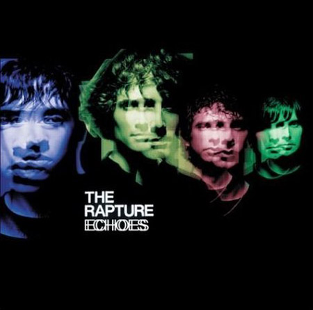
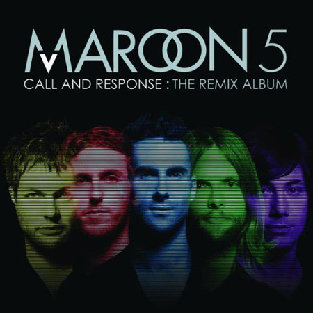
There is absolutely no excuse for this, I mean I see designers rip off other designers every day – we even get emails weekly about this sort of thing – but when you do an album cover in 2008 and you know everyone is going to see it, why go this route? I don’t do album cover design but even I can see there is no sense in this. Aren’t there plenty of obvious solutions for the Maroon 5 designer to choose from that aren’t completely forgeries? One of these three things would of sufficed, and i’m going easy: 1. A different color background 2. Not using band member photos that weren’t just from the shoulder and up floating around in the background 3. Don’t use the same colors, its as simple as that, why not natural colors? I could also throw in “don’t use any stupid effect over their faces”, I mean at least the echo effect made sense. I’m no expert but I just see pure laziness, and you know this designer got seriously paid.

42 Comments Leave A Comment
Kenny Villacorta says:
December 19, 2008 at 11:31 pmI like the Rapture Echoes cd cover better. You might as well contact the person who designed the “original”. It’s either laziness or pure incompetence.
James says:
December 20, 2008 at 12:58 amI called this as soon as the Maroon 5 album came into my college radio station. Blatant and disgraceful.
Scott says:
December 20, 2008 at 2:08 amwhat’s even more amazingly pathetic about this is that the maroon designer(s) had the luxury of hindsight when designing theirs. they didn’t have to bother with that whole, “coming up with an original concept” phase….they could just focus all their energy on the execution. but of course, they did a terrible job in the execution and managed to make this look like a first year design student mocking the original. is that the TV scan lines filter? I am betting though that this was some design by committee major label in-house nightmare that none of the designers involved were in any way emotionally invested in. if not, and this was some rogue plagiarist, somebody’s losing their job. but of course, if that were the case, a few other people should be losing their jobs for not catching this before they printed it on 5 billion CD jackets.
what’s completely insane about these sorts of things is that they could have gave this job to any number of talented designers who probably would have done it for 1/100th of whatever they paid for this crap. the result would have been better and they wouldn’t have every designer on the internet calling them out.
Luan says:
December 20, 2008 at 3:02 amI was just going to make the point that they didn’t even do a good job stealing the design. Even if giving them the benefit of the doubt and never even seeing The Rapture cover, it’s still a horrible design. It’s so dated to early 2000 (to me at least when i found the TV filter in the EyeCandy filter set). I hope they get some major backlash from it and learn their lesson.
Keffer says:
December 20, 2008 at 4:35 amI think it’s the price of the “fame”. Trevor Jackson is very good, the rapture cover he has made too, and it’s always the same with Art Direction. A small junior art director in nowhere get “inspired” and so, do a great bad work with no sens and really bad execution, and he hope no one will make the connection, because the rapture cover, that’s old.
It’s my theory :)
Noran says:
December 20, 2008 at 5:48 amThat Rapture’s cover really kills. The album title message “Echoes” is simply delivered by its design.
While Maroon5, I don’t want to be harsh, despite of the (stolen) idea that we don’t need to go through, 8-year-old kid can do Photoshop execution better than that. Seriously. You should see by 8-yo babysister’s design, haha
I wonder, does Maroon5 ever notice The Rapture’s Echoes cover?
Luke says:
December 20, 2008 at 6:36 amIt’s bad, but it’s a coincidence. Maroon 5’s last album cover was pretty fantastic I thought, and certainly their budget would allow for something impressive. Fail, but I think the Rapture connection is weak.
Jakub says:
December 20, 2008 at 6:47 amLuke –
How is the Rapture connection weak at all? I mean come on both covers have red, green and blue faced musicians and thats just skimming the surface
Tardlovski says:
December 20, 2008 at 9:11 amall i can say is it’s obvious side by side, but the world is so saturated with ‘design’ these days that even the toilet bowl brush cannot escape the market demand for it. so….if it’s a bite, then that’s lame, however i wouldn’t say it’s out of the realm of possibility that the designers actually came up with that without ever seeing the other. i know it seems very obvious though…
whatever the case they are both ugly concepts and executions…in my humble opinion.
Tardlovski says:
December 20, 2008 at 9:14 amoh, and just to drive my point home a little more, i do cover design, and although i’ve never come up with something like these, i’ve also never heard of either of these bands, nor have i ever seen their covers. using a bands faces and tweaking them out isn’t too original for a cover..and i’d say it’s almost a no brainer depending on the brief and/or if you’re feeling lazy.
Tardlovski says:
December 20, 2008 at 9:16 amand more to the point….are these bands even any good? cuz if they’re not, then why do we even care?
jefta says:
December 20, 2008 at 10:00 amGood point Tardlovski. Why even care?
The way of the world, people. We’ve got failblogs for this kinda stuff. Now let’s talk about James White or other talented designers.
chris says:
December 20, 2008 at 11:04 amI’ve never really been a fan of having the band on the cover anyways.
We should also talk about the overuse of ITC Avant Garde. It’s a great looking typeface, but so many designers are just turning to it immediately as a quick type solution.
Oak says:
December 20, 2008 at 11:34 amI agree with luke. I think the connection is tenuous at best. The colors used on the Maroon 5 cover are pretty basic, the composition is completely different also. Big copy at the top of the cover versus tiny copy on the “original,” for a start. The head shots are very informally balanced on the Rapture album and play with the depth of the design a lot more. All that before I mention that the concept of the Rapture album is obviously the echo treatment on the images which makes the whole cover look like it was struck like a tuning fork. It’s really just the colors that are similar and the fact that both designers used shoulders-up head shots.
Similarity is sometimes no more or less than it appears. It looks to me far more likely that someone sat down in front of Photoshop with a bunch of band head shots and a logo and was asked to execute something roughly like the result. I think the Maroon 5 cover is pretty poorly executed, but I’m just not seeing anything but coincidence here.
Timothy Long says:
December 20, 2008 at 1:56 pmThe original concept isn’t that great anyway, so…
david says:
December 20, 2008 at 1:56 pmfunny how everyone immediately jumps all over the designer and doesnt consider the client…I could easily see a situation where the designer came in with some concept/sketches and the label came back and said make it look like this, cuz some marketing genius came across it in one of his “cool” friend’s music collection.
not saying thats what happened here, and the designer probably could have pushed back or made the #1,2,or3 changes that could have pushed this further, but without being established i could easily see a suit railroading a young designer and art directing this forgery, rather than someone trying to pull a fast one on the band with a quick knock-off (it isnt like they are making a cover for their cousins band and are just gonna do whatever…maroon 5 might not be all that great to listen to, but chicks like them and they are a well known band, i would think any designer would be bringing their best for that kind of opportunity).
Grant says:
December 20, 2008 at 5:01 pmTotally douche move on somebody’s part. My only comment is on payment:
This isn’t a defense at all, but record labels sometimes have in-house, salaried designers too, and they’re busy, and don’t necessarily get compensated well by the project/client.
Again, not a defense, and I’m not suggesting this happened, but it’s possible that this project was just one more for an overworked in-house designer to check off their list and not only did he/she not have the time/energy to push back at the client, it may not have mattered.
Jeremy Pettis says:
December 20, 2008 at 5:26 pmRight on Grant, not to mention it’s maroon 5 so who the fuck cares anyway. Rapture art is seriously sick, especially with the whole echoes concept. Being so visually literal never looked sexier.
frank says:
December 20, 2008 at 7:54 pmThat “designer got seriously paid” comment is pretty LOL funny. I suppose there’s a remote possibility that it might be true but I SERIOUSLY doubt it.
Scott says:
December 20, 2008 at 8:52 pm@*
I guess I see the point that it was perhaps some in house designer that was told to do this…. but how far can you go with the excuse “I was just doing as told”. that’s a pretty weak one; although in this economy, I guess you gotta do what you gotta do.
I don’t buy the idea that this is a coincidence. I do agree that it could be some sort of simulacra type situation, but I think you can trace a line from the original rapture cover to the maroon 5 cover, however many turns that line may have taken on the way between, I don’t know, but I think they are connected.
@jefta-
james white is great! I talk about him and other great designers all the time. but there is a sordid underbelly of design that needs to be exposed once in a while. we have to discuss the good along with the bad. It’s not merely negativity, and it’s not posting pictures of people falling off bicycles in the rain, it’s just trying to dissect and learn from other’s design missteps.
@frank-
you’re right, you really never know. I used to design a fair amount of covers and in my experience, there wasn’t a whole lot of money in it. but then again, I never designed a cover for a band as big as maroon 5. so yeah, if they didn’t get paid, it means they were a) in house and just doing their job, B) desperate to make a name for themselves by taking on projects for little or no money. or C) a terrible negotiator. whatever the case may be, there’s still no excuse for this.
finally, yes, no one gives a fuck about maroon 5, and I’ve honestly never heard of the rapture until I read this post by Jakub. but design is design, sometimes the hardest clients to do good design for are those you are not really into for artistic reasons. I had to do a website for ruben studdard once. I don’t like his music, but I worked hard at it and produced what I thought was a good design. so that’s what we’re discussing here, not the artistic integrity of the bands in question, but the integrity of the designer working for the bands.
David says:
December 20, 2008 at 8:54 pmWow…………everyone here has got it right.
Jake says:
December 20, 2008 at 8:58 pmWe should turn this into a competition and make the cover they should’ve made, while ALSO biting the original.
Tardlovski says:
December 20, 2008 at 9:34 pmi don’t think this is an issue of integrity until we know the full story…if anything it’s laziness. you guys are acting like this is the ultimate blasphemy. i hate to say it, but sometimes you just don’t give a rats ass about a job. and you know, if this guy/girl knew the shitstorm this created here, perhaps they’d have done things differently. i think if you work for yourself, then you HAVE to give a shit. i think that’s a different animal. but if you work full time at this stuff for somebody else, and the wages for designers being what they are (mostly pathetic), and depending on the circumstances, i’m sorry, but there are just those days where something lands on your desk and the brief is what it is….lame and completely devoid of creative vision. and once you start settling into what they are really after, maybe listen to the cd, or visit the website, or whatever, you decide, yup, who gives a fuck, let me smash this one out in 2hrs and get at that new tantalizing project with the wide open brief. i think it really depends on what the situation is…
Tardlovski says:
December 20, 2008 at 9:37 pmbtw, that’s not really an argument to make excuses, it just is what it is. if you look around in anytown usa, you’ll see design work that is so bad it’s beyond comprehension.
Scott says:
December 20, 2008 at 10:45 pm@tardlovski-
100% agreed. anyone who’s worked in design for a while has found themselves in the situation you describe more than a few times. I am not trying to lay everything on the designers (I got big money on this being design by committee) . I guess what amazes me is the systemic laziness, as in a long line of managers, label execs, band members, designers, art directors, etc. seeing this and stamping the big OK on it. but I guess the real tragedy is just that this is straight up lame, which is hard to see for a simple fact: no matter how you feel about maroon 5, there are a ton of eager young designers who would give their right leg to get a job like this, to have their work seen by this many people. so I guess to see it come out this way, lame and (questionably) plagiaristic , I guess it’s just sad. But I agree, you can’t condemn anybody for this, it’s just a bad situation and I think jakub was just pointing that out.
also, I don’t think a bunch of design geeks like us duking it out in the comments of a marginalized design blog qualifies as a shitstorm. I can bet whoever did this could care less what we all think and will never see this. But I have seen a couple other articles around the net about this… so yeah, I guess the best thing ever would be to hear it straight from the source. so anyways, I know it’s a long shot, but here’s an open invitation! if you had something to do with this or know the story behind it, hit us up and we’ll post your story, full anonymity if you want! would make a great “making of” post for sure.
off topic, but Legowelt and Beat Broker are playing @ Paradise SF tonight… see you out there!
jefta says:
December 20, 2008 at 11:34 pmTardlovski: good point about the integrity
Scott: good point about the good, the bad and to add the ugly: http://failblog.org/2008/12/20/postcard-fail/
John says:
December 21, 2008 at 8:19 amwell…
I’m not going to judge someone here, but I want to say something that I always say when I see something like this:
I believe that in our world (nowadays) there are sooo much designs, and so much designers that it “just happens” that things get similar (to say not ripped).
You can’t always have new ideas that nobody ever used before =/
zacislost says:
December 21, 2008 at 9:39 amHey Scott,
I know you dabble with Visuals (in a VJing sense), this post reminds me of the way I felt in relation to this recent fiasco:
http://vjforums.com/showthread.php?t=26397
I feel it’s incredibly similar to this issue you’ve raised here.. artists being ripped off..
Sans. says:
December 21, 2008 at 12:35 pmsure and about that inspiration comes from way back at least on mtv
http://www.youtube.com/watch?v=QCbpwd6EoRg
here are some other cases iv’e seen here in mexico
…we’ve all seen the weapon of choice video with christopher walken
heres region 4. and its just as i said, were in 2008 and this is just an insult to…just mankind.
http://www.youtube.com/watch?v=uIM5e6nD54A&feature=related
heres a blog about this kind of stuff
http://youthoughtwewouldntnotice.com/
Enoch Adams says:
December 21, 2008 at 4:22 pmBoth of these designs came after the 2001 release of the self-titled CD ‘Outlander.’ The different colors assigned to differtent band members’ shadowed faces appeared on the panel opposing the cover, which also featured the luminous and colored band members. Links below.
http://www.myspace.com/officialoutlander
http://images.google.com/imgres?imgurl=http://cdbaby.name/o/u/outlander.jpg&imgrefurl=http://cdbaby.com/cd/outlander&usg=__LyhQm0ycb3jQRisQBX19muudPw0=&h=200&w=200&sz=18&hl=en&start=2&tbnid=lg0mlTjdfEf1AM:&tbnh=104&tbnw=104&prev=/images%3Fq%3Doutlander%2Bwalczak%26gbv%3D2%26hl%3Den
Marc says:
December 21, 2008 at 5:19 pmIt’s ionic that the title is “Call and Response.” I say shame on you, Maroon5, for approving this. And if you didn’t have the power to approve your album’s artwork… then double-shame on you!
It’s sad when things are overtly derivative — and worse. It’s one to thing to take a good idea and make it better, but making bad ideas lamer is a total disaster.
It’s also (mildly) interesting that the type in is so similar, too. The “echoes” has a double effect, whereas the “OO” in Maroon picks up on that, too.
nicholas says:
December 21, 2008 at 10:06 pma post to restore some balance:
i wish i had the kind of time to dig for designs that ‘look’ similar and then rant about it and drag the designer through the dirt via blog posts. that in itself is should be taken into account – jakub either has an incredible memory, a coincidental moment that linked the two covers, or way too much time on his hands. my assumption, since so many people posting on this thread are so good at that, is the latter.
here is the deal – i do think that this is a sad coincidence – chances are that the maroon 5 designs eyes had at one time seen the rapture cover. i do think there are a lot of factors that need to be considered including the aforementioned client control.
bottom line is that every designer at some point in their careers will encounter this issue on some level. michael beirut has openly spoke of this subject and [gasp!] has had solutions that looked similar to another designer … oh the horror! –
http://www.designobserver.com/archives/entry.html?id=14444
furthermore – anybody could look at any famous designers work and find some similarity with another designers work and fight jakub’s battle. when i first came across scott hansen’s work, some of his stuff reminded me of something before … specifically his russian workers party designs. did i dig deep to expose it? fuck no! i don’t know the whole story, i don’t know the facts. some people in this world are just pathetic enough to do this kind of thing and jakub is no better … myself? i think logically and give a good designer the benefit of the doubt.
http://youthoughtwewouldntnotice.com/blog3/?p=1288
link courtesy of Sans. and his/hers above post [i had never seen this site before today]
on a parting note – i just want to say that this type of situation is a huge waste of time and energy because for every instance of suspected unoriginality, there are several more impressive, original, and thought provoking solutions out there, lets celebrate those works.
jorn says:
December 21, 2008 at 11:14 pmi’d be more sympathetic if your “forum snowboard” didn’t look like a giant maxi-pad. pretty sure that got designed a long ass time ago.
Heather says:
December 22, 2008 at 12:48 amfortunately maroon 5 are terrible, and no one will buy this CD anyway.
Christopher says:
December 22, 2008 at 11:47 pmI’ve gotta say, its not a great cover, there is no disputing that. However, one of my closest friends is a designer at atlantic records and he has given me a bit of insight into the process of the package design process over there. For something like this, a remix album, there was probably little to no budget, a very fast turnaround and a load of non-creatives turning down every original idea presented. My friend has shown me some of the things he’s pitched, and then the designs that were put into production and at times there is a huge discrepancy. I wouldn’t say he’s a bad designer, actually I think he’s pretty damn good, but he has been forced to make bad designs.
magda says:
December 26, 2008 at 6:31 pmThere is nothing like being forced to do bad design. I have had to for work, and as easy it is to say that you would never fall into that, sometimes you really have no choice (unless you are willing to outright quit).
ryan says:
December 28, 2008 at 4:58 pm:p
http://www.facebook.com/album.php?profile&id=564530811#/photo.php?pid=1224038&id=564530811
devolute says:
January 6, 2009 at 2:46 amThe album cover is still much better than the album.
Eddie Danger says:
January 6, 2009 at 3:38 amDamn, that’s a great example of crap designers making way too much money. It’s sad to know there are so many talented designers out there struggling… and then seeing something like this.
Steve says:
January 6, 2009 at 8:50 amI agree its a shame when people lift others ideas without much thought – however, the rather prosaic irony is, Mr Tycho, that this discussion is taking place on a page where, to the right, is a small version of your Soviet style poster with the arc of the man swinging his hammer echoing the curve of the Russian sickle. This, I’ve always felt is a very, very close approximation (dare I say almost exact copy) of an icon that ZTT used on Frankie Goes To Hollywood sleeves in the 80s.
There are only so many ideas, and whilst I think you’re a seriously talented chap, and would gladly stand behind you if things kicked off with Maroon 5, perhaps you just need to accept that there are only so many ideas… and imitation, as they say, is the highest form of flattery.
Oscar says:
October 19, 2009 at 8:24 pmMan! talking about plagiarism (last year but anyway) who the fuck is this dude and why is his work a bad copy of Scott’s work!
http://us.twentyonesquares.com/
Kadeem says:
July 8, 2010 at 2:36 pmthanks for sharing,Fahad