Designing The Xbox One
Posted by Scott
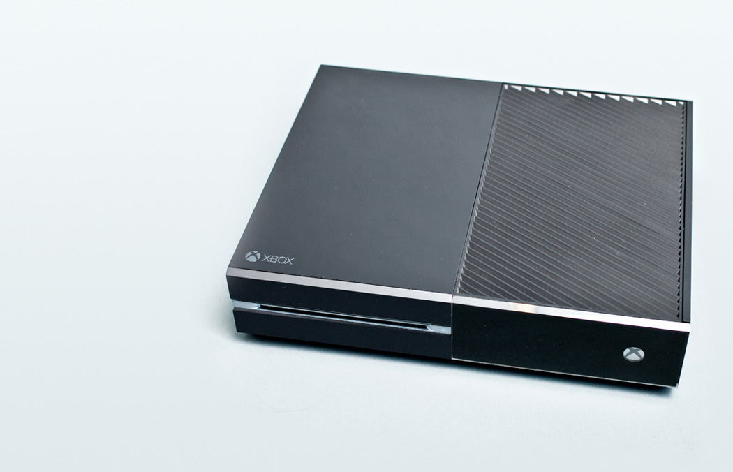
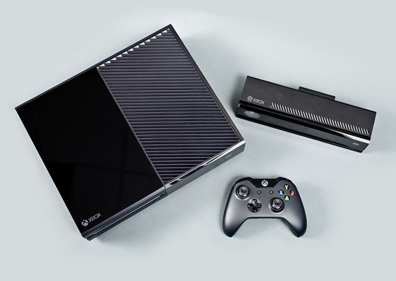

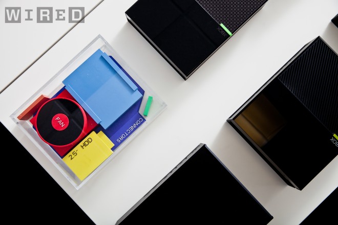
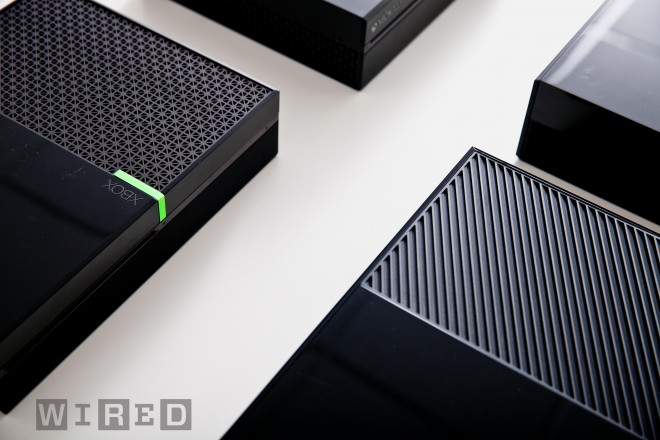
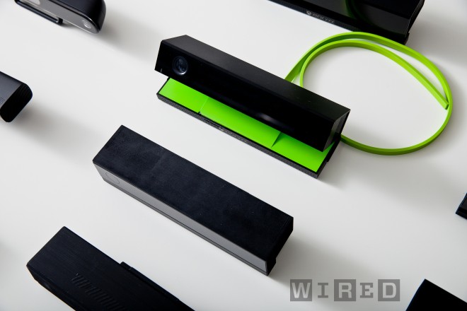


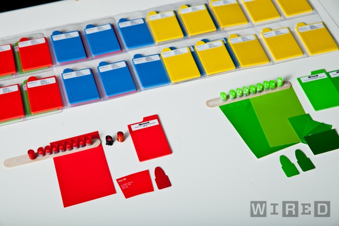


Pleasantly surprised by the striking good looks of the newly revealed Xbox console. Wired has a piece detailing the new unit and the design process that formed it.
I’ve read a lot of people bashing the design after the reveal. I’m not sure what they’re comparing it to, this or this or even this, but in my book it’s the best looking console thus far. Of course it’s all relative considering the gaming industry consistently produces some of the worst product design imaginable given their budgets and resources. I’ve seen a lot of people online comparing it to an 80’s VCR. I love 80’s VCRs, I love stackable media components, and I’ve always loved Xbox, so I suppose I’m somewhat biased.

24 Comments Leave A Comment
nitrofurano says:
May 21, 2013 at 2:00 pmtoo sad is Xbox is #defectivebydesign – unless we can install Linux in it somehow… – btw, about the product design, who did that? :)
Michael says:
May 21, 2013 at 3:43 pmGood looking? Looks like cheap & fat 80’s VCR.
Scott says:
May 21, 2013 at 4:08 pm@michael-
A) I think a lot of 80’s VCRs were really well designed. But then again I have a thing for ID from that era. I like boxy designs like this.
B) “Good looking” is an extremely relative idea in the gaming world. Look around http://photos.pcpro.co.uk/blogs/wp-content/uploads/2008/11/xbox-360.jpg
http://icdn3.digitaltrends.com/image/playstation-3-530×365-c.jpg (why the Spiderman Font? why can’t I stack things on it? It’s a media component, they have to be stackable.)
C) I’ve always loved XBox so I’m biased and personally thought the 360 was pretty ugly so this, to me, is a huge improvement. I wouldn’t mind this showing in my living room. The old one was hidden at all costs.
Joey Bergeron says:
May 21, 2013 at 4:28 pmI agree! I like the design and the specs. However there is something very major that seems to crush it.
Xbox One Games
– Not backwards compatible
– Must be installed onto the console to connect to Xbox Live Account
– If you choose to play the game on another Xbox Live Account you must pay a fee
Don’t forget on top of the $60+ cost of the games there is also the cost of the yearly membership to Xbox Live.
This is really standard Microsoft (shoot self in foot) behavior. Just not sure how many people will stay on when PS4 has the same specs without all the red tape.
In all from a design point it does look well done hardware wise though. About time I think.
Scott says:
May 21, 2013 at 4:29 pm@joey
This post was just about the product design. I don’t care about the functionality as, for various reasons, not the least of which that I quit gaming a couple years ago, I’d never again buy a console gaming system.
Brandon says:
May 21, 2013 at 4:32 pm@Scott – what I’ve read is that it’s big…really big…and in the age of miniaturization I guess people take issue. Personally, I think the front is nice and that’s all anyone will ever see of it in my media center. But the xbox 360 redesign was a big improvement over the original 360 (http://static.giantbomb.com/uploads/original/2/26636/2352651-xbox_360_busca_descontos.jpg).
But they are trying to make a set top box here, and it’s definitely a lot better than the hideous, boring things I’ve had to deal with over the years (see any directv box ever).
Steven says:
May 21, 2013 at 4:34 pm@scott
I loved reading through your comment defenses. Just sayin.
Richard says:
May 21, 2013 at 4:39 pmLooks good. My only gripe is that it would be great if there was a new logo to match this new design though. The old one looks a little out of place here.
Joey Bergeron says:
May 21, 2013 at 4:39 pm@Scott
Yeah, as life goes on I don’t game like I used to. I’m just frustrated at the money hungry monopoly way they take.
I like the detail put into the design. Whoever they got to do this console, they chose right. I can’t quit place it but it’s like I have seen this style before. It’s classic/modern like an old hand held transistor radio.
Spencer Colaco says:
May 21, 2013 at 4:57 pm“For 30 minutes, the two executives have been talking about the future of Xbox—about the need to ‘re-architect the living room for the 21st century,’”
This is a pretty big step for a company like Microsoft, especially for this product imo. Historically their attention to design is pretty poor right down to their system tray icons. I remember Dieter Rams saying that Apple is the only company in the world that pays as much attention to industrial design and even icon design as they should.
Maybe Microsoft is finally starting to realize this?
Scott says:
May 21, 2013 at 6:11 pm@spencer-
Of course Apple is pretty much on top as far as massive, soulless corporations go, but you’re right, this is at least a step in the right direction as far as MS is concerned.
As for MS’ past, I agree fully. I use Windows 7 every day of my life (Win is my main desktop for music / design / video. Macs are my laptops for shows / web browsing / entertainment). I don’t even see the icons and ugliness anymore, just look past it to what is, in my opinion, the most responsive and flexible OS between Windows and OS X. Of course I’m a lifetime MS user from DOS to 95 to now so I’m hardwired to their UI and interaction model at this point.
dag says:
May 21, 2013 at 6:50 pm“Also, I wonder how it’s being received by its core demographic of 14-year-olds who’ve had sex with people’s moms? ”
…what???
Scott says:
May 21, 2013 at 7:08 pm@dag-
haha, I’m assuming you’ve never been on Xbox Live? That place is full of pre-teens screaming insults at you, most of which involve some form of intercourse with your relatives.
dag says:
May 21, 2013 at 7:19 pm@scott –
Ohhh… yes it’s been ages… Well I think this console would be better with paper tape reader
Spencer Colaco says:
May 21, 2013 at 9:12 pm@Scott
Its too bad we have to categorize Apple as soulless. I mean they would never consider making a ridiculously aesthetically pleasing blender like Braun would. But ya, imagine MS with the same vision.
Btw, does a company come to mind besides what we’re talking about that have that nice balance of form and funcion?
Pat Zimmer says:
May 21, 2013 at 10:50 pmhttp://www.youtube.com/watch?v=KbWgUO-Rqcw
You can watch TV on it.
nitrofurano says:
May 22, 2013 at 1:59 ami think the only part of this game that smells like rotten is the fact it comes from Microsoft (like everything else coming from them) – i think that old VCR look (i think is missing some parts with that fake wood) is not that bad…
Surrey Web Design says:
May 22, 2013 at 2:51 amNice design, maybe it looks like 80’s VCR, but you cannot reject it or criticize it due to this single fact. From my point of view if it resembles the 80’s VCR, then it should be appreciateable, because its designers give a revival to old design.
KYLE says:
May 22, 2013 at 5:31 amI think it looks nothing like a VCR, as I have many VCRs still and only wish they looked that good. Of course, my VCRs are from the late 90s, so that’s that.
In my house we have NES to PS3 all stored in the same area. The amount of space all of the old systems combined take up is not that much compared to the PS3, only because they are boxy, stackable. Boxy might have a bad rap, but that’s just cause we have seen some really bad examples. There are just as many shitty round pieces of work in my mind.
And yea, spiderman font? I can’t call a machine that reminds me of Toby Macguire a sleek, sexy, or even matured product.
I’d get that XBOX.
KYLE says:
May 22, 2013 at 5:36 amNo offence Toby, that was 11 years ago.
Jerry says:
May 22, 2013 at 8:31 amUnderwhelmed.
It seems a massive waist of potential. This product designed like that in the year 2013, something is terribly wrong.
Kevin says:
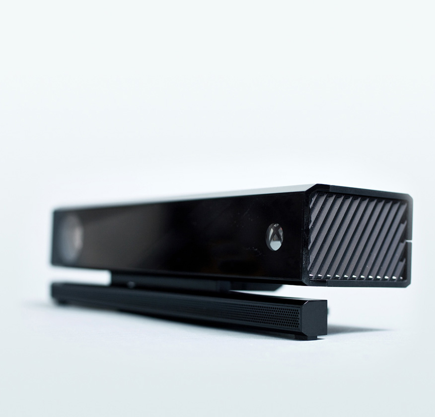
May 22, 2013 at 3:38 pmI love the design, love it. The way they integrated the venting instead of trying to hide it is beautiful… but then again I’m an engineer.
Taylor says:
May 22, 2013 at 6:31 pmIt would be cool to see analog buttons and switches make a come-back, but it will probably take some time for the nostalgia to kick in.
fishtanks says:
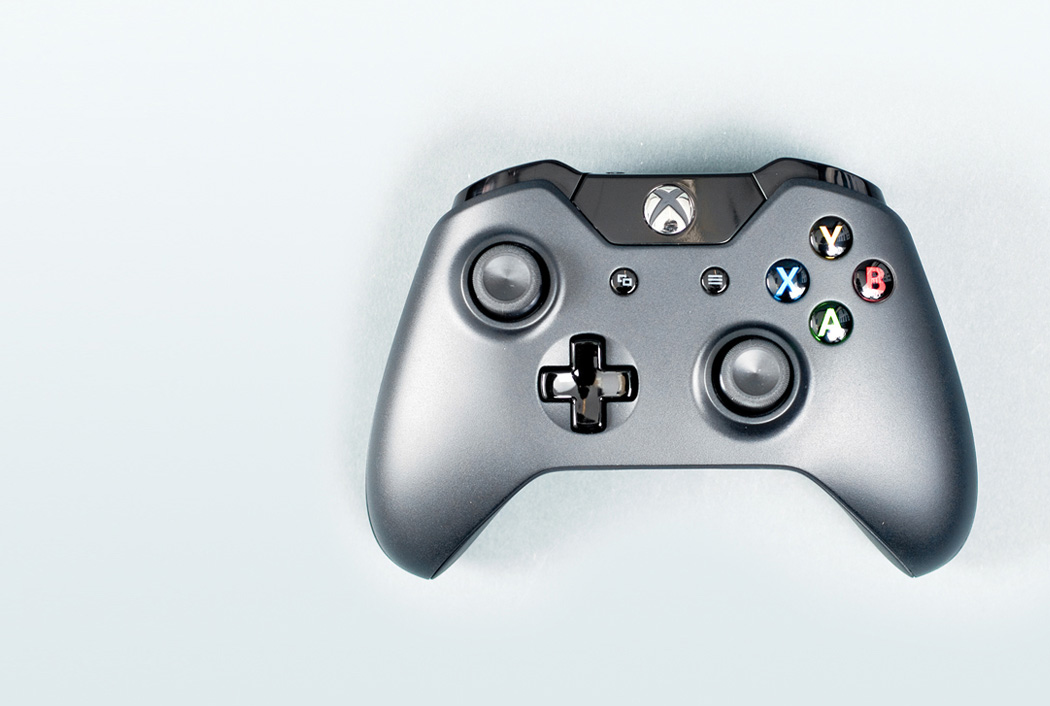
June 19, 2013 at 9:01 amI’d say both XBOne and PS4 are butt-ugly in terms of product design. Only good looking part is the XBOne controller.