Das Neue Schulhaus
I’m pretty sure it doesn’t get any better than this. By Swiss Designer Carlo Vivarelli who also did the "Flums" Poster.
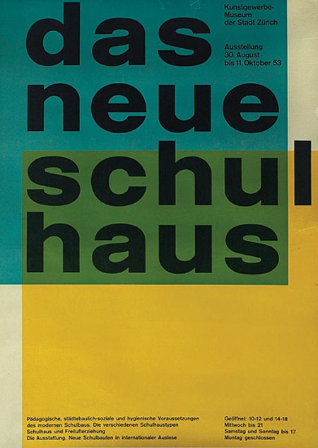
"997. 1953 poster, advertisement for The New School House, C.L. Vivarelli, Zurich Art Business Museum, marked Vivarelli, printed by Bollmann, dated 1953, linen backed, 36"x 50", 500-700"
Via the Treadway/Toomey Gallery
Seeing great design like this, by designers who are no longer with us, always makes me wonder what our generation’s legacy will be. in 60 years I wonder what artifacts young designers will look back on in awe. The pessimist in me wonders if we are doing anything quite as groundbreaking and forward thinking as this in the print medium. Print seems to have been relegated to a sort of suspended animation while mediums like video and interactive jump leaps and bounds every year. I don’t know if this is a function of the age of the print medium, i.e. everything new and innovative has been done, of if there just aren’t enough people pursuing print design as an art form anymore. Or perhaps I’m just stuck in the past and for some reason only design like this affects me in any meaningful way. Either way, there is no denying the greatness of this image.
Can any of you design scholars out there name the style or period that informed this design? I want to say Bauhaus, but I am sure someone can explain why that is wrong.
UPDATE: Via Eric in the comments:
"This design is definitely a product of the international typographic style developed in Basel switzerland, during the 1950s…This style is is clearly influenced by the bauhaus, but they took it to the next level. beautiful example."
Carsten also wrote a great comment explaining the "Reformed-School" in Germany and how it relates to this poster.

5 Comments Leave A Comment
Damo says:
November 16, 2007 at 4:24 amGot to love that overprint…sheer brilliance
A devastating simplicity that echoes beyond generations indeed!
By the way Scott while I leave a post – I have to mention that I am a huge fan of you and your works. I have been monitoring constantly the progress you have been making, for example the transformation of your web site into a more personal blog style…a great interaction, and your article in Computer Arts Magazine.
I love seeing the new found images by others and yourself of the uniquely odd designs of the past that have predicted a possible future along with the dialog that comes with them
As a printmaker, designer and past musician myself I admire your style and enthusiasm – the colours you choose, the forms and compositions, the sounds you create are all great works
a truly inspiring individual! I congratulate you on all your hard work and truly thank you for visiting your site always inspires me to be constant in producing works of my own
cheers!
.Carsten says:
November 16, 2007 at 5:28 amBauhaus is right and wrong in the same way. It is influenced by the bauhaus style. First of all bauhaus had no comercial or advertising products. Craftmanship joining art was the the main idea of bauhaus. So the printing wasn’t one of the main subjects, bauhaus dealt with. There were some posters advertising the theater group of bauhaus or some exhibitions. But they were more typographical than illustrative. After all they weren’t colorful 2-dimensional like this one here coming from switzerland.
It ist not directly bauhaus but it is influenced by the modern movement in Germany between 1910 and 1930. At last it is the typical style of the 50s in Europe. The spirit of bauhaus came up again after 1945 and was transported by movements like “new bauhaus” in Chicago, foundet in 1937.
What is important to the swiss poster shown here is he ralation in typography to the german reformed-school movement of the eraly 20s. In this movement architects and teachers wanted to get rid of the traditional schoolbuildings and instructions. Until then they were affected by the old Kaiser Reich of Wilhelm II that endet after World War I in 1918. The buildings looked like medieval or renaissance houses, they had very view and small windows and the typography of the books were old german style
looked something like this
or this . The buildings looked like this.
Reformed schools looked something like this one.
The Reformers wanted to find a way out of the pre-WWI society by reforming everything that reminded them to that society. They wanted to get away from complicated forms and the dark colors of those past years and declared the sans-serif typography as their ideal. It is clear and has an industrial and academic background like the architectural style of the reformers. Everything had to be clear, lightful and positiv.
The style of the refoming movement never disapeared during the Hitler regime. It survived in some niches and was in some very special parts adopted somehow (i.e. industrial architecture and typography).
After 1945 everything changed and artists remembered the refoming movement – not so much the bauhaus because it was too avantgardistic and not as well accepted as the a little more conservative – or less avantgardistic – reform movement. The swiss artists were very open for this kind of style as they were even before 1933. In 1957 swiss graficdesigner Max Miedinger developed the “Helvetica” Type.
The type that is used here in the poster is the same as the one the german school roformers (as all the whole refoming movement) used in their publications. So the swiss whanted to tie in with the german reform movement before 1930 as they did much longer than the germans themselves ;-) – concerning the building styles. But this is another story
What could be intersting for you is the work of Walter Allner. He was a graphic designer who learned at the bauhaus and died just some weeks ago. Here is one typical 50s magazine cover designed by him
Here is a collection of the fortune magazine’s-covers styled by him (50’s)
Hope tha gives you a thought of bauahaus and it’s adoption in the 50s.
willzager says:
November 16, 2007 at 11:04 amIts good to know that others in the younger generation also appreciate the more static forms of design. Computers have been great and being a self-professed geek I love them but there is no easier way to ruin good design than through the thoughtless use of new technology.
Eric says:
November 16, 2007 at 12:27 pmThis design is definitely a product of the international typographic style developed in Basel switzerland, during the 1950s. I have been studying compositions like these in my type 1 class for the past few weeks and Im really starting to fall in love with them. This style is is clearly influenced by the bauhaus, but they took it to the next level. beautiful example.