Mexico 68 Revisited
Posted by Scott
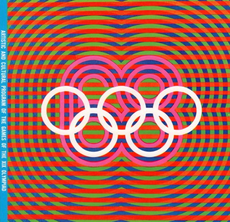
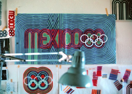
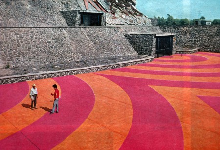
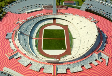
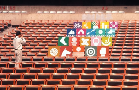

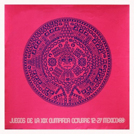
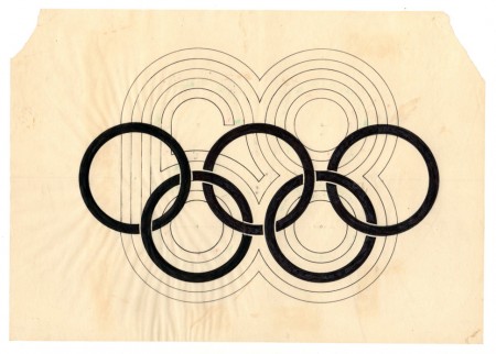
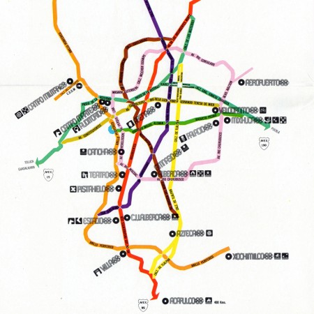
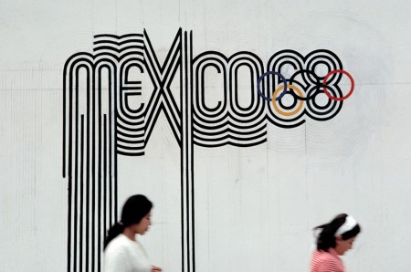 With the London 2012 games (along with their controversial branding) in full swing I thought I’d revisit one of my favorite — Olympic or otherwise — branding campaigns ever: that which was created for the 1968 Mexico Olympics. Graphic Ambient has some beautiful images of the work in the real world, some of which I’d never seen before. I definitely have to say that I prefer Otl Aicher’s work for the 72 Munich games; but this has it’s own thing going on and after all it did come first! Related reading: Design Magazine #237 Via Graphic Ambient

7 Comments Leave A Comment
Felipe says:
August 2, 2012 at 10:12 amDamn that period was so cool!, in my opinion way better than this olympic pictograms and logo, (specially logo). Psychodelic mexicans!! :D very nice!
Scott says:
August 2, 2012 at 10:15 amYeah it was an amazing time. I will say though, something like this would never fly today, nor would I think it would be very successful.
As offbeat as the London banding is, I’ve grown to accept it, and almost enjoy it when taken in as a whole. The swimming area, for example, was really well done. With the lights in that blue wall and everything, thought it looked great.
bluish-ilona says:
August 2, 2012 at 5:08 pmI just had a grand ol’ time listening to the washed out/my morning jacket remix whilst browsing the archives of your heavenly blog! Delving into the vast “space” of the ISO50 blog is quite a treat! I dodged many asteroids, aliens and stars along the way! Scott, I can’t wait for you to sign my army jacket at the fyf fest! Cheers!
Reno says:
August 4, 2012 at 9:33 amLove it! Still a big inspiration for me :)
Ricardo says:
August 5, 2012 at 9:21 pmBRING TYCHO TO MEXICO.!!!
little people says:
August 21, 2012 at 1:22 pmI’ve always loved that artwork. My mum was an athlete that competed at the Olympics in 64, 68 and 72. Sadly my mum never got a poster of the Mexico games… but i do have this gem from Tokyo. So simple.
https://dl.dropbox.com/u/2498047/tokyo.JPG
John says:
September 2, 2012 at 10:43 amwhat do people think of the Rio logo?
http://www.wimp.com/riologo/