yeah, first glance i was like “whaaa” and skipped it, but i just looked at it again today and actually took the time to read it. veryyyy nice. so simple.
because otherwise it wouldn’t complete the “C” in canada. I think it’s more about the message than the overall aesthetics on this one…. it’s like quebec and canada are linked and shouldn’t be torn apart. as you may know there is a movement to declare sovereignty quebec.
That’s right. Its beautiful not only because of its typographic aesthetic but because of its historical symbolic connection.
Quebec tried to become an independent nation of Canada in 1980 and 1995. Both times, the Canadian House of Commons passed a symbolic motion recognizing the “Québécois as a nation within Canada.”
“While the most apparent reason for separatism is Quebec having a Francophone or predominantly French-speaking (French-Canadian or Québécois) majority, as compared to the rest of Canada which consists of all but two English-dominant provinces (New Brunswick often is considered as essentially having a bilingual population), the origins and evolution of the movement are actually fairly complex.” (wikipedia)

9 Comments Leave A Comment
Sam Mallett says:
July 8, 2008 at 3:19 amAll I can say is… WOW!!!
Jayden says:
July 8, 2008 at 3:44 amvery cool
nataJane says:
July 8, 2008 at 12:14 pmthis is great.
joshua says:
July 8, 2008 at 12:38 pmIt’s like the perforated tab on a to-go coffee cup: It just works.
But did anyone else find it a little hard to read on first viewing?
Lance says:
July 8, 2008 at 4:26 pmyeah, first glance i was like “whaaa” and skipped it, but i just looked at it again today and actually took the time to read it. veryyyy nice. so simple.
Pollock says:
July 8, 2008 at 11:31 pmIts a great great job, This kind f graphic design is always amazing
Kim says:
July 9, 2008 at 7:53 pmSorry but I dont like it.
The font is terrible!
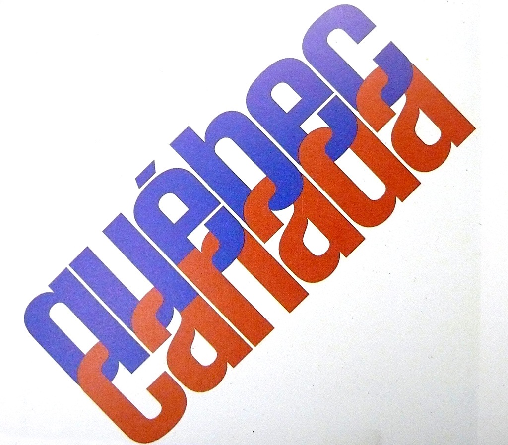
And why is the Q of Quebec not in capital when it should be?
Scott says:
July 9, 2008 at 9:23 pmbecause otherwise it wouldn’t complete the “C” in canada. I think it’s more about the message than the overall aesthetics on this one…. it’s like quebec and canada are linked and shouldn’t be torn apart. as you may know there is a movement to declare sovereignty quebec.
Greg C says:
July 11, 2008 at 7:42 amThat’s right. Its beautiful not only because of its typographic aesthetic but because of its historical symbolic connection.
Quebec tried to become an independent nation of Canada in 1980 and 1995. Both times, the Canadian House of Commons passed a symbolic motion recognizing the “Québécois as a nation within Canada.”
“While the most apparent reason for separatism is Quebec having a Francophone or predominantly French-speaking (French-Canadian or Québécois) majority, as compared to the rest of Canada which consists of all but two English-dominant provinces (New Brunswick often is considered as essentially having a bilingual population), the origins and evolution of the movement are actually fairly complex.” (wikipedia)