SF Chronicle Redesign: Archer
The San Francisco Chronicle just unveiled a redesign of their print edition this past Sunday. According to them, the new look is “brighter and more modern” and retains “its distinctive, classic character.” I’ve never felt like the Chronicle was fantastically designed, but this most recent incarnation is definitely a step down for me. The colors give it a USA Today-esque vibe, and I don’t feel like I can take it seriously at all.
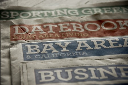
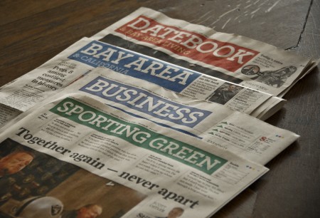
Central to the new look is the incorporation of Archer, the “colorful slab serif” by H&FJ, as their principal headline typeface. I like Archer, always have. I really like the ball terminals on some of the uppercase letterforms, and I think they did a great job crafting a distinctive and more exciting slab serif. I’ve found it very useful for clients that want to look reliable, safe and friendly, and still seem unique and exciting. Given my general fondness for the face, I was surprised to feel such disgust when I saw Archer staring back at me on Sunday morning.
I think it’s a combination of things that ruined Archer for me. First, it’s played out. As much as I love it, I see it everywhere these days (assignments at school, adverts for just about every paper company, home and garden magazine, etc). That sort of typeface proliferation is fine for something like Helvetica, but Archer is too distinctive to work in so many different scenarios effectively, let alone a national newspaper. It reminds me slightly of what happened to Papyrus over the years. It was distinctive font that was rendered completely useless by millions of people browsing through their font list and picking the most “unique” looking. Of course, Archer is not included on your computer when you buy it, or as specialized as Papyrus, but a similar thing seems to be happening at least to some degree. Either way, I was sad to see two things ruined for me on Sunday morning: Archer and the SF Chronicle.
What do you all think? Is Archer the next Papyrus? Any Bay Area readers still receive the print edition of the Chronicle and like the redesign? Let us know in the comments.

13 Comments Leave A Comment
Daniel Carvalho says:
February 6, 2009 at 1:22 amPlease don’t ever say Pap$&us ever again. It’s offensive.
I didn’t realize Archer was so heavily used over there. It’s really beautiful. H&FJ are a really talented bunch.
Joaquim Marquès Nielsen says:
February 6, 2009 at 3:34 amInteresting point on how certain very distinct typefaces can be “over used” and thereby loose it’s original charm. I wonder why that doesn’t apply to Helvetica? Like you mention, the reason could be that Helvetica doesn’t really have any distinctive characteristics – it’s just there in it’s purest form. A font like Papyrus (sorry Daniel, hehe) is full of fuzzy details, and seeing a font like that being used on pretty much everything from menu cards to posters is just… wrong!
The Danish design bureau e-Types make their own fonts for each project. Now that we’re talking about news papers, I’d like to bring up a design that they did for the Danish paper “DAGEN”. Take a look: http://www.e-types.com/visUKProjekt.asp?artikelID=163 (browse by clicking the image)
Jeremy Pettis says:
February 6, 2009 at 7:06 amSame fate as cooper black? I’m pretty sure papyrus was always ugly, atleast cooper and archer are solid fonts. What about avant garde?
Brad Blackman says:
February 6, 2009 at 7:35 amPapyrus is overused, but I don’t think it’s for the same reason as Helvetica or Archer. (I haven’t seen it all that much here in the Southeast, maybe it is overused in the Bay Area.) I’d say Gotham is getting close to being overused, but I haven’t gotten tired of it yet.
And don’t forget that in the 1980s Helvetica’s popularity waned considerably. Designers were sick of it after the 1960s and 1970s. Seems like it’s only experienced a comeback the past 5 years or so. It’s a good workhorse face, but too much is too much. Garamond is a good face, too, but I’ve seen a lot less of it lately than 10 years ago when I first got into design.
Trenton Elkins says:
February 6, 2009 at 7:37 amI personally fell in love with Archer and have used it in numerous projects in the last year, however, I’ve come to realize that it has already become (borderline) default for a lot of designers. Hopefully this is a passing trend, and Archer won’t suffer the same fate as other trendy fonts.
Alex works the days / HeadUp works the nights says:
February 6, 2009 at 7:42 amThis is such an interesting coincidence. I’m designing a logotype for a friend who is a pro photographer, and like other clients I’ve done work for, she is continually attracted to Papyrus-like fonts, which I quickly cautioned her against using for the exact reason you stated above– it’s one of those fonts that has been waaaaaaay overused, yet it wasn’t really worthy of such use in the first place.
Even more interesting, while we aren’t using Archer, we went with a similar one– Lapland bold, which I am very happy with. It’s got slight differences like square terminals (is that the proper term?), but the mix of contemporary and classic worked well.
As for whether Archer will turn into Papyrus, I definitely don’t think so for one simple reason– it’s not included in MS Office…I think a huge reason Papyrus got to be so overused is that it’s one of the few fonts of that style, and it tends to catch peoples’ eyes. From an aesthetic standpoint, I think it’s bearably pleasant, but I would never use it myself.
As for fonts that get overused, Jeremy is getting at it I think– they say the only man who was ever truly able to use Avant Garde properly was Lubalin.
Brian says:
February 6, 2009 at 11:11 amArcher and Papyrus have no comparison what so ever…Papyrus is just ew and Archer is rendered beautifully. If this were ancient Egypt when papyrus was one of the only available paper sources and they had some way of printing on it and they used the Papyrus typeface I would still have to say ew.
Rent says:
February 6, 2009 at 11:20 ama definite downgrade for sure…why couldn’t they just keep it classic with their gothic typeface. lame!
Joel Nealy says:
February 6, 2009 at 7:15 pmYour assessment was detailed and direct. Yet. I feel your disdain sounds personal…well, thats how it sounds.
If this is a critique, I would say the typeface choice makes it more accessible. A lot of people who read the paper have no preference for design. They want accessibility.
Reasons may include:
1. “Is this the paper for me?”
2. “Do they report the news from a perspective I can identify with?”
3. “Is this newspaper legitimate?”
The design of the paper, most definitely, influences a consumer when they are faced with deciding on those issues in addition to those core questions.
With all that said, I think your assessment of the paper is a little harsh and overkill.
In my assessment, the font chosen to headline belongs. The synergy between color and print is balanced. The design is good.
Is it magnificent, groundbreaking, earth shattering?
No. Of course not!
Is it necessary for it be such?
No! Of course not!
The design is well executed and the layout and column system seemed professional and standard issue. These observations lead me to believe that the potential reader of this periodical will appreciate, if not enjoy the layout.
No knock on you, or your feelings about it. I just think beauty is in the eye of the beholder sometimes…
I behold typical, standard and trusted design sense.
Trust is good.
sincerely,
Joel Nealy
Chris Robinson says:
February 9, 2009 at 11:33 amI don’t think Archer will go the way of Papyrus, another typeface that’s used a lot these days is Gotham but however much I see it, it never grows old. Simply stated—some typefaces are timeless, some are not.
Berthold says:
March 31, 2010 at 12:01 amI think it is important to take into account what a typeface is supposed to do in a given context. In my opinion, a font that commands attention in itself reduces the impact of the content. Most times when we complain about font abuse (for instance of the-font-that-shall-not-be-named) it is because there is a dissonance between what the font says (Hi kids!) and what the content says (trespassers will be shot).
As designers with a deeper understanding of fonts, we often come across our “favourites” and see them in contexts we would or have not used them in. Paying more attention to certain fonts can lead us to the conclusion that they get overused when in fact they may be used rather sparingly. We also infuse the fonts with our own meaning which may conflict with other people’s vision of how the font should be used. In a way, we are predisposed toward and distracted by the typeface, which is almost always a bad thing.
Average Joe Roman will probably not pay attention to these details, and rightfully so. Fonts aren’t the story, they just tell it.
On topic, I think a slab serif suits a newspaper rather well. But it really depends on what you expect.
Trevor Jahner says:
April 19, 2010 at 9:42 amJust have to mention the irony:
After I read this article the ad below caught my eye with something called “MagCloud” set in Archer.