Pepsi redesign
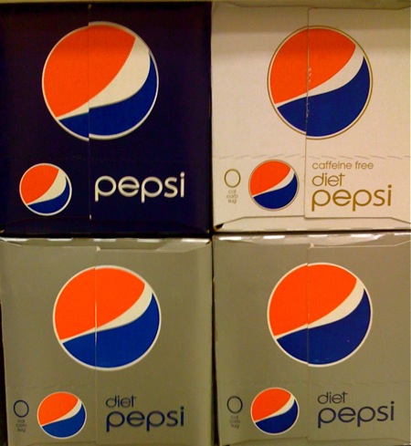
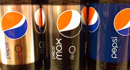
Pepsi stepped up it’s game in my opinon and simplified their brand really nicely (Please excuse the iPhone camera photos but I didn’t bring my camera to the grocery store like usual). Not only did they change the logo, but they’ve changed the swoosh slightly a bit for each variety of (i.e. Diet, Caffeine-Free, and Max). I was pretty impressed mainly because they had the new logos sitting next to the old ones which has these blue pixel explosions in the background and so much unwanted text. Stepping back and seeing a wall of the simple new blue pepsi 2 liters all aligned was pretty beautiful even though i’m a Coca-Cola fan. One other good layout addition was the abbreviation of the 0 calorie, carbohydrates, and sugar text aligned nicely under the logo. Don’t get me wrong though, i’m not a complete fan of the Microsoft gamer X in the font. Do you think this means Mountain Dew will get a new logo? Oh my there is a graphic design god and he cares.
In celebration lets listen to Aphex Twin:
[audio:polynomial.mp3]
57 Comments Leave A Comment
Thomas says:
December 26, 2008 at 5:55 amFollowing The Dieline, Mountain Dew also has a redesign.
http://www.thedieline.com/blog/2008/11/mtn-dew-cleans.html
Jay says:
December 26, 2008 at 7:23 amThe blog, “Brand New” has been posting about this for a while:
http://www.underconsideration.com/brandnew/archives/pepsi_revealed_sort_of.php
Chris says:
December 26, 2008 at 8:06 amI’m not a huge fan of the “e” or the “x,” but otherwise, I think this is a vast improvement on their logo.
Jakub says:
December 26, 2008 at 8:35 amThomas & Jay –
Gentleman, you have to ask yourself do they have the high quality on scene photography that Jakub offers? ;)
liz mclean knight says:
December 26, 2008 at 8:38 amHahah! I wish more people would toss up Aphex Twin songs in celebration. :-) Yes, the new Pepsi identity is chicer than I think its demographic will appreciate. :-D
jefta says:
December 26, 2008 at 8:45 ami judge a book by its cover, and soda aint no exception. Looks like i’m gonna get myself some sugarwater!
Joshua says:
December 26, 2008 at 8:55 amLooks like Sierra Mist also got a re-design. I do like the forest image in the background, but I’m not sure about the blurred “mist”, though it is quite fitting.
Jakub says:
December 26, 2008 at 9:18 amJoshua –
Do you have link to the Sierra Mist your looking at?
micael says:
December 26, 2008 at 9:25 amFunny, I personally think all of these redesigns are absolutely awful.
You can see the Sierra Mist can here:
http://www.underconsideration.com/brandnew/archives/pepsi_new_bottles.php
The pepsi logo also won the top spot for Worst of 2008 at Brand New, as seen here:
http://www.underconsideration.com/brandnew/archives/brand_new_best_worst_2008.php#comments
And I think this post sums up my feelings as to why its so awful pretty well:
http://web.mac.com/steffan/Blue_Ember/EmberBlog/Entries/2008/11/8_The_terrible_new_Pepsi_Logo.html
ejectorset says:
December 26, 2008 at 9:27 amSo it is a whole re-brand? Awesome! I saw an empty pepsi can in the recycle bin at work Tuesday, but I figured it was just a limited edition can or something. I with you though, I am all about coke.
Joshua says:
December 26, 2008 at 9:38 amWow, sorry Jakub. I copied the link, but somehow forgot to post it. Looks like someone already beat me to it.
Jeremy Pettis says:
December 26, 2008 at 9:54 amget mexican coke in glass bottles, you wont be disappointed!
They still use cane sugar and it’s just as cheap as normal coke.
http://sfist.com/attachments/Jim%20Herd/GO8F1963a.jpg
chris says:
December 26, 2008 at 10:00 amI know they are trying to create a connection with the swoosh and the “e”, but I can’t stand the little bump in the e. it makes me think there was a mistake in printing or something.
solid choice on the celebration song.
Jakub says:
December 26, 2008 at 10:11 amJeremy –
Is it really cheaper though? I think Mexican coke by my place like $2
chris –
hah you ruined the “e” forever for me ;) it almost looks like the old logo
As for the music, gotta find a way to plug in more Aphex Twin songs on the site
Eric says:
December 26, 2008 at 10:52 amI have to concur with Micael (and the Brand New blog, which called it the worst logo of the year in their roundup) — awful. It’s an interesting concept, but the execution is just off-the-charts bad, particularly in light of all the years of consistency in branding they just squandered.
Joel says:
December 26, 2008 at 11:31 amIm not a fan. I think its awfully dormant and average. I personally feel that the logo doesnt have a nostalgic quality at all. I think its painfully boring.
There is overdoing it and under doing it. This is underdoing it.
I cant say Im a fan, I need some insight as to why this design was chosen. it doesnt say pepsi generation at all.
Cole says:
December 26, 2008 at 11:33 amNice post Jakub. I dig the new stuff for its simplicity but the asymmetry of the new logo is making my eyes want to go places they’re not used to going.
AAa aa a ap h hhh ee hhh eeeee e e ex e x xx xxxx
Luke says:
December 26, 2008 at 11:34 amI totally agree with Eric. I’m surprised people would actually like this new branding. I almost feel inclined to like it because I know a team of well-paid people designed it, so it must be good, right? I think especially the standard pepsi “swoosh” is just terrible. The shape feel incomplete. The curves should have been executed differently. I’m sure it looks more elegant on the shelf perhaps, but I think the minimalist approach went too far. It’s too “bandwagony.” I think that current trend in packaging is not really creating better design. It’s all over, and I feel like brands are being cheapened in a way. Maybe it’s temporary, and once every brand has transitioned over to a minimal look, it will no longer feel that way. Right now, the new pepsi looks like an off-brand. Trendy typeface, interesting logo concept gone boring…
I recently saw a prototype branding for a new pepsi bottle with the old logo on it. That thing was fantastic looking, and was was some kind of minimal white and blue. Scott – you would have liked it more than this. Haha
coma says:
December 26, 2008 at 11:40 amshepard fairy did the old mtn dew logo.. his commercial work is so bad IMHO… happy to see pepsi got with it and changed that 94 style out with another style from 96.. still is not amazing .. but its a step in the right direction..
David says:
December 26, 2008 at 11:54 amThis is the first thread I have read on any blog that people actually liked this fail of a redesign. To me, it looks like a high school student did it 10 minutes before class, but to each his own.
I’m a coke man from here on out.
Keffer says:
December 26, 2008 at 12:06 pmThe worst redesign ever.
texas says:
December 26, 2008 at 12:19 pmat least theres some sort of design sense involved that sets it apart from the typical american junk food packaging. i mean even the sugar packets at the european esspresso bars blow most of our stuff out of the water. i like it.
ill find links later..
Scott says:
December 26, 2008 at 12:31 pmbeen seeing the new pepsi around for a while and at this point I really don’t know how I feel about these. at first I was into them just based on some visceral, nostalgic level. they’ve obviously taken some big cues from the old diet pepsi. But something about this new brand falls a little flat for me, it isn’t as strong. I think it’s more pleasing to the eye from the strictly visual design perspective, but it doesn’t reinforce the brand in my opinion. It just feels too soft. I do, however, really like the new logomark system, I guess it’s just that type that’s throwing me off.
Jeremy Pettis says:
December 26, 2008 at 12:35 pmjakub, i think it depends on were you buy it. There is a mexican grocery store near my work that sell it for about a dollar a bottle.
As for the redesign: I really didn’t like the execution of the smile swoosh, to me it looks sort of like a messed up path of some sort. The Max’s swoosh is the best of them all. If you took that swoosh and put it on the blue can I’d be cool with it. I do have to admit that now seeing it in the flesh at the grocery store / gas station, that it does hold it’s own and look way sexier than other soft drink packaging. Not as sexy as vitamin water though. The Idea of the swooshy “e” is cool but it’s just not being harnessed well. our kids will look back on this design and probably think it’s dope, but we’ll see.
As for the mtn Dew:
Seeing the original mtn dew redesign I had a flash back of an old annual I had scanned. Check out the “new man” logo in the bottom left corner of this scan…
http://www.flickr.com/photos/jeremypettis/2344038891/in/set-72157603993823647/
Now look at the original mtn dew redesign…
http://www.thedieline.com/blog/images/2008/11/24/pepsi2.jpg
probably just a coincidence, how ever the newman logo is way more slick considering it is the one type execution that works for both words of the company name(it’s just new flipped).
Wayne D. says:
December 26, 2008 at 1:25 pmI don’t like the redesign. Pepsi is one of the worlds most recognized brands, and this iteration appears like a redesign done by a student in a community college and posted it on deviantArt. I’m sorry but I don’t see the direction they are going with the modified globe/swirl element, and the thin sans-serif text is great for some logos but not for a soda giant like Pepsi. It is too airy and does not convey the element of thirst or the desire to have a drink. It looks more like a mark for a hip body spray or men’s shampoo.
I saw this too, on theDieLine.com, as well as UnderConsideration’s BrandNew. There is a reason why this earned the top spot in the worst brand disaster of 2008. Those guys know logo design. Saw the new Pepsi logo image on this post and thought this was another installment of ‘Logo Design Fail’ and was surprised to find words of praise in the article.
I still hold out hope of reading an article in the near future saying PepsiCo has abandoned this concept after reviewing consumer and marketing responses. But seeing the branding on already printed packaging bums me out.
* Pepsi please hire an agency with just a ounce of passion for nostalgia. This rebranding will only dilute and ‘water-down’ their position against Coca-Cola.
WH says:
December 26, 2008 at 1:49 pmI got a can of Pepsi and I was like “This looks like it should be featured on the ISO50 blog”…lol
Hasia says:
December 26, 2008 at 2:13 pmНовый логотип похож на лыбящегося уебана, такого хамоватого
Anonymous says:
December 26, 2008 at 2:16 pmI just think it looks like a copy or knockoff of Pepsi from China or created by WalMart. Basically a crappy water-downed version.
Greg Formager says:
December 26, 2008 at 3:43 pmBad typography.
Scott Lowe says:
December 26, 2008 at 8:19 pmI like it. The “e” is a little weird but maybe not terrible. i dont like that it is diet PEPSI and pepsi MAX, as in i think pepsi should always be the bigger word and the modifier word for it should be smaller and maybe in the same position. The logo redesign is great but the differences for each brand are arbitrary when there could be a bit more meaning behind it.
Overall the simplification is great and i think that recognizable color and layout speak way louder than an explosion of swooshes and fake water drops printed all over a bottle.
Pants says:
December 26, 2008 at 9:12 pmTypography = F
Logo = F
Terrible “design”. Looks like a 5th grader played with Adobe Illustrator for ten minutes. The alternating thickness of the white ‘stroke’ is awful. Looks hastily done and has absolutely no lasting power. A post 2000 fad logo.
vlad says:
December 26, 2008 at 9:52 pmReally, it is a plus on layout and text, but the logo. I think logo is not anything new or fresh. It looks like a mistake to me. The swoosh is so abstract now. Maybe its just me, but few other graphic design gurus were also shocked by Pepsi’s choice.
Dillon says:
December 26, 2008 at 11:00 pmDoes this remind anyone of the ‘O’bama campaign marketing?
http://ichkalliope.typepad.com/photos/uncategorized/2008/05/02/obama08button.jpg
Jeremy Pettis says:
December 27, 2008 at 9:35 amno
CJ says:
December 27, 2008 at 9:38 amJakub, with all due respect, you have better taste in music than you do in re-branding. ;)
Joen says:
December 27, 2008 at 12:11 pmI like the colors, and despte the font being a bit thin which may be a bad idea if seen from afar or at an angle printed on a truck, I generally like the font.
The logo shape, however, shouldn’t have been changed the slightest. It’s still a circle, it’s still the same colors. It’s curves have just been irked and offset. Why destroy the beautiful curve? That curve is clearly still part of the E — removing it from the circle destroys any echo effect that could’ve been.
Incredibly bad redesign, on other words.
Martyn says:
December 27, 2008 at 5:56 pmDeparting from the subject a little but i’ve noticed how you keep apologizing for your iphone pictures. Come on, remember who your talking to. We all love that lo-fi style that the iphone kicks out and if you don’t you should check out the toy camera or camera bag apps to really get your on the move pics looking more like the cover art on half your favorite albums!
try http://appshopper.com/photography/camerabag
bicycleman says:
December 28, 2008 at 1:20 amI love it! Super clean logo! Why is it not on the shelf at my store :(
Sebas van den Brink says:
December 28, 2008 at 5:05 amI don’t like it. The packaging somehow – to me – doesn’t feel together at all. Too much whitespace. It doesn’t strike me as a nice soft, sweetened, coke kind of drink that’s what inside the bottle. It’s too much design, too much thought, not enough “drink!” I love the really old Pepsi logo’s and designs. Especially the one from 80’s, actually. This is just… no. Web 2.0 being applied to a bottle.
Though I hardly ever drink cola anyway. Dr. Pepper!
Panasit Ch says:
December 28, 2008 at 6:02 amI didn’t like the new redesign but I must say: the Max one grew on me. But I think I like the aesthetic of the abstract shapes more than the idea of it.
Bas says:
December 28, 2008 at 7:57 amCome on, it’s not awful! Coca Cola’s Zero promotion is awful.
It’s definitely not perfect, though.
Likes:
– It’s more contemporary then the old version (compare: http://blog.indigio.com/wp-content/uploads/2008/03/pepsi.jpg)
– It’s stands out against many other products because of it’s simplicity (no crappy 3d effect and splashes in the background).
– The different swooshes are a magnificent idea.
– The most characters of the type are good, imho.
Dislikes:
– The Layout
– The curve of the swoosh isn’t completely right (though way more interesting than the older one)
– Some characters.
I think many are overreacting.
Rob McDougall says:
December 28, 2008 at 11:12 amI quite like this redesign. I think it is possibly a little too radical, especially with the swoosh – but like Bas said, the different swooshes are magnificent! Perhaps they could’ve done a bridge-design with the old logo – made a thinner one for the Diet Pepsi etc…
Joshua says:
December 28, 2008 at 11:50 amI was eating lunch with my dad when I noticed he had a can of diet Pepsi with the new design, so I asked him what he thought of it. He had no idea what I was talking about. I had to point out to him that it was a whole different can, all he noticed was that the color had changed.
I’m only sharing this because my dad is pretty much the average american consumer, and he didn’t even notice that anything had changed. “It’s not gonna make me buy or not buy it”. He had no opinion on it at all.
Clearly this new design isn’t going to hurt Pepsi at all if people don’t realize anything has changed.
Nick Wade says:
December 28, 2008 at 2:55 pmYou’re the first person I’ve come across who’s written any praise for the redesign. I’m hoping the Aphex is a sign that you must be high
Brian says:
December 28, 2008 at 4:21 pmall i see is a fat man wearing blue pants and a too small red shirt bending over showing his plumber’s crack…
jefta says:
December 28, 2008 at 5:26 pmthe old pepsi logo had 90’s written all over them. Awesome redesign. Good Job Pepsi.
Stuf says:
December 29, 2008 at 7:38 amHoly Crap that’s one of the crappiest logo redesigns ever! It looks like some fake China knockoff. It doesn’t even make sense as to what it is. I like the simplicity and typography is ok, but the ‘swoosh’ logo is pure shiz! It amazes me that you like it!? I file this one under ‘Fail’.
Kevin Crawford says:
December 29, 2008 at 1:26 pmI had trouble figuring out if this was normal Pepsi or not, which kind of pissed me off. I think they went a little too far in simplifying…
fourplay says:
December 29, 2008 at 3:27 pmBAD BAD BAD. They lost it.
Jakub says:
December 29, 2008 at 6:45 pmI hope everyone realized that when it comes down to the logo its not a favorite of mine at all its not even my style but i do like element a few elements of it especially the abbreviations. The more I look at it I want the font to be bolder
Jake says:
December 29, 2008 at 7:07 pmI totally agree that the simplicity is a step in the right direction. Something about the proportion of the logo to the type is a little disturbing, and I’m not sure about the type being vertical. The “max” seems to be the most effective to me.
I think the slight variation in the original logo is a “good idea,” but for the coin whoever is designing this is getting, I’d like to see better execution.
Anybody else think it was a dumb idea to put the logo (twice) on the can carton door and over the flap where it will never line up in a million years, and will be totally destroyed as soon as its opened? They also flip the type here which is a little schizophrenic compared to the bottle, but not a huge deal.
Jeff says:
December 30, 2008 at 10:42 amThey could have definetly kept the mark and easily just rebranded the packaging with a new typeface.
There is nothing special about the tornado mark other than it feels unbalanced unlike the ocean wave.
[Another] Chris says:
January 6, 2009 at 8:52 pmI’m torn.
The new type is definitely nice. But as far as the logo what I dislike is that it forgets the pepsi of our youth. It just feels a little awkward. Brands as established as pepsi shouldn’t change logos ALL THE WAY. It makes me feel the way I might if my mom were to get plastic surgery. it’s kinda like…’mmkay mom I know you want to look ‘hot’ but you really don’t need to impress anyone anymore; the fact that your eyebrows reach for your bangs just makes me feel awkward.’
And ‘why are you getting plastic surgery? Is it because Dad died or what?’
The fact that pepsi got a makeover makes me feel like they feel the need to get back on the prowl; like an old cougar or something. If my dad likes my mom (and is still alive) she dosen’t need to get surgery…. so the fact that my ‘mom’ is getting plastic surgery in the metaphorical sense here makes me feel like pepsi feels like it’s lost value in the sight of consumers. And thus it diminishes the longstanding reputation that I think WE all assume a brand like pepsi holds, wether we buy it off the shelf that day or not.
besides i wanna see more of this http://farm1.static.flickr.com/145/357073406_36f16b3b46.jpg
Pilar Osbourn says:
January 10, 2011 at 12:30 pmI am not in a position to view this website correctly on saffari I think there’s a problem