Rebrand Success Vol. 1

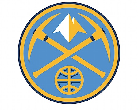
![]() After all the talk lately about logo redesign failures I thought I’d post something about a potential success. I happened across Aaron Draplin’s post on the new Denver Nuggets logo and thought it came out pretty good. At first glance the pick axes seem a bit over the top (we get it, people mined for gold in ye olde times Colorado), but it grew on me. As Draplin pointed out in his post, the mountains are the best part of the whole deal. Below the new logo are the two preceding versions. The most recent was pretty much gross in every possible way. The old school one is of course awesome in that nostalgic way, very cool for throwback jerseys and all that (or if you really, really like Tetris), but it just wouldn’t cut it in today’s game. The typo is heavy-handed and the logo is too busy and detailed to be useful in small formats.
After all the talk lately about logo redesign failures I thought I’d post something about a potential success. I happened across Aaron Draplin’s post on the new Denver Nuggets logo and thought it came out pretty good. At first glance the pick axes seem a bit over the top (we get it, people mined for gold in ye olde times Colorado), but it grew on me. As Draplin pointed out in his post, the mountains are the best part of the whole deal. Below the new logo are the two preceding versions. The most recent was pretty much gross in every possible way. The old school one is of course awesome in that nostalgic way, very cool for throwback jerseys and all that (or if you really, really like Tetris), but it just wouldn’t cut it in today’s game. The typo is heavy-handed and the logo is too busy and detailed to be useful in small formats.
This new version is clean and strong; even if you don’t really like it you’d have to give them points for steering clear of, as Jakub puts it, the “Mountain Dew logo style”. I’d have to imagine fans are going to be pretty happy with the new look, can you imagine wearing that last one on a shirt? It looks like the logo for a pizza place up in the hills somewhere, I half expect it to say “Uncle Mike’s Pizza” or whatever. So what do you think, did they nail it?
P.S. While the logo may be nice, I’m not sure how I feel about the typography for the new jerseys. Something about it reminds me of an off the strip South Lake casino.

26 Comments Leave A Comment
Daniel Carvalho says:
December 3, 2008 at 5:09 amI think it’s decent logo that is a fresh brake from the typical sport styling team logos that are flying around at the moment. However, as previously mentioned, I think the mountains are my favorite element and would prefer them on their own. I can see the possible need to add the extra fluff, as those mountains alone can be a little abstract. Especially to common folk.
It’s strange though because, although there is obvious mining symbolism in there, every time I look at the logo I think, nautical. I don’t know if that could be a failed aspect of the re-design or just personal interpretation.
HectorO says:
December 3, 2008 at 6:38 amis it just me, or the second one just look like the buffalo sabres logo??
Andrew S. says:
December 3, 2008 at 7:24 amIts all about those mountains, for sure.
David says:
December 3, 2008 at 7:33 am@HectorO Yes – the Sabers logo was my first thought.
I dig the mountains by themselves, but how are they going to do the type?
Ryan Whynott says:
December 3, 2008 at 7:44 amThe new logo has moved in a refreshing direction. The image which is supposed to be a basketball does not scream ‘a basketball’ to me though. I am not a logo designer and so I’m reluctant to say, “it could be done better”, however that’s the way I feel at the same time. It seems like it could perhaps appear with a tiny bit more clarity. I’d like to see the accompanying type as well.
Scott says:
December 3, 2008 at 8:21 amRyan-
yeah, I am having trouble with the basketball as well, almost looks like a globe.
The accompanying type is here:
http://www.fansedge.com/Images/Product/41-53/41-53511-F.jpg
jesse says:
December 3, 2008 at 8:41 amI love the new logo. I am so tired of everything looking like it’s from the XFL.
Ryan Whynott says:
December 3, 2008 at 9:37 amAh k, I should’ve seen that link for the text at the bottom of the original post. I guess I was also wondering though if there is a version of the new logo which includes / incorporates the text (aside from just being placed on the jersey) to the extent that the older versions of the logo do (especially the second one from the bottom).
Craig says:
December 3, 2008 at 9:41 amThe top two logos are actually secondary logos, and the primary is the third one down. This was originally introduced in 1993 in a navy/gold/red scheme to replace the ‘tetris’ logo at the bottom. The logo was given a new color scheme in 2003 with Carolina blue/yellow, before reintroducing navy as an accent color for this season. Likewise the uniforms are alternate uniforms, with the main jerseys displaying the typeface from the primary logo. For a full history of the Nuggets identity/uniform go here:
http://sportslogos.net/team.php?id=229
While I agree that the current primary logo is cookie cutter, and the tetris uniforms are a classic, I have to admit that I do like the current identity. I remember when the logo was introduced in the early 90’s during the Mutombo/Pack era, and it seemed on the money. Likewise I approved of the new colors that were introduced to signal the Carmelo Anthony era as somewhat refreshing. I can understand both points of view. As a sports fan I see that the logos are hitting the mark with their target audiences. But as a designer I understand how sports logos fail most of the criteria of what makes a ‘good’ design.
I think there is a lot of room for improvement in sports identity design. We’re seeing a total lack of thought and repetition in modern sports design. The best example of a ‘great’ design is the New York Yankees. Their identity consists of 2 simple interlocking letters, one color, and pinstripes. They’ve never changed it in their 100+ year history, and its no coincidence that the Yankees have the most recognized sports brand in the world.
frank says:
December 3, 2008 at 11:52 amThese Nuggets, they’re a mountain climbing team I take it?
chris says:
December 3, 2008 at 12:30 pmI actually have a throwback Alex English jersey that has the rainbow skyline. It’s arranged differently, so there is no “tetris” look to it.
http://i4.ebayimg.com/02/i/001/19/16/0c47_1.JPG
Pablo says:
December 3, 2008 at 1:09 pmI agree with Craig’s point of view. There is alot of room for improvement in sports logo and in the last few decades its apparent that the basics of logo design in this arena have gone out the window. it seems like the design culture for sports branding is a “more is more” which goes against Craig’s other point about the Yankee’s logo. perhaps the designers working on these logo identities nowadays take into consideration the sensationalism that exists in sports today. it definitely isn’t a simple entertainment choice like it used to be back when logo’s where cleaner and more simplistic. today you have ESPN talking heads all day, fantasy teams and sports drinks (like mentioned many times, the mountain dew phenomenon). Perhaps simple, sophisticated logos in this setting don’t seem as aggressive when your competition has a scowling bird shaped like a knife or a drooling, snarling bulldog on their jerseys. i don’t embrace it, but maybe the change has to happen culturally in order for us to see more sophisticated logos.
Something else i wanted to point out was my disappointment of the Golden State Warriors branding. i think its the worse one in the league:
http://www.warriorsteamstore.com/gswar11380802.html
i don’t like the introduction of the orange. i don’t think its necessary. instead why not go with a “gold” yellow to better represent “Golden State”? I really dislike the type also.
Ryan Doran says:
December 3, 2008 at 2:15 pmNot sure about the nautical reference? Why?, because the ice/ore-picks cross each other like an anchor? They do it in crew logos, swords on coat of arms and pretty much any vocation that utilizes a shaft longer than a no. 2 pencil. And I for one like it.
I completely agree with the loathing of extreme/mountain-dew’esk logos. I have a suspicion that they’re all made by the washed up designers of Starter jackets, Jncos and pogs. The Warriors fell into this trap as evidence of Pablo’s link, and it’s sad because their old logo was classic and they changed just as the team started to gain some momentum.
I’m a big premiership soccer fan and it seems like the hierarchy of those teams representation goes colors, crest and then sometimes but rarely mascots. Names like red-men are more common and if there are names they have some kind of local or historical significance.
The strong sports brands here have that too; the Yankees and Notre Dame are both cases in point. People bleed blue and white and blue and gold.
These designers had to bring something together for the Golden State Warriors, that’s Native Americans local to Cali and drips of identity. One of the colors they had to work with was even in the name.
What did they come out with in 97?, the silver surfer with a bolt of lightning in his head and now it’s just a W with the lightning. The gold was also replaced by two shaped of orange.
I see a laundry list of parallels with Dogma’s ‘Buddy-Jesus.’ One big cheesy thumbs up fellas.
(As for the Nuggets typography, italics belong in Pisa.)
Matt says:
December 3, 2008 at 5:41 pmI like the logo, but the new nuggets type is too goofy. The letter forms don’t complement each other as well as they should. I think a Minneapolis school bold uppercase sans serif would work well or something similar like CSA, Draplin Design Co., the Decoder Ring orAesthetic Apparatus.
Andrew J. says:
December 3, 2008 at 6:25 pmhas anyone seen pepsi’s new logo redesigns? They’re TERRIBLE
Scott says:
December 3, 2008 at 8:11 pmcraig-
what?! the pizza time logo is current?? I just assumed that was some outdated junk. that’s really too bad….
james says:
December 3, 2008 at 10:43 pmhttp://pomo.cca.edu/~jprovenza/new_web/untitled-1.html
frank says:
December 4, 2008 at 1:51 amhttp://www.beloblog.com/KGW_Blogs/pdxscene/nuggets.jpg
Bernat says:
December 4, 2008 at 12:04 pmLove It!
Tyler says:
December 5, 2008 at 10:49 amI know this was a post about good design, but I am shocked no one brought up the Oklahoma City Thunder logo (http://sportslogos.net/team.php?id=2687). It’s just godawful. Some OKC Thunder executive must have had their son or daughter design that thing. It’s just hideous. As a designer and a lifelong NBA fan, I find it disturbing that the Thunder are using this logo when they were formerly known as the Sonics, who in my opinion, had one of the most recognizable brands in the sport (http://sportslogos.net/team.php?id=241). I know that legally they can’t use the Sonics name or designs, but you’ve gotta step up your game when you come from a tradition like that.
Pablo says:
December 5, 2008 at 11:12 amHey guys. don’t despair. here is something refreshing. some alternative hockey jerseys. some of these aren’t too bad:
http://sportsillustrated.cnn.com/multimedia/photo_gallery/0812/nhl.third.jerseys.rating/content.1.html
katie says:
December 5, 2008 at 7:16 pmtoo dated. will need to be redesigned again soon.
jdAvis says:
December 5, 2008 at 9:37 pmI saw Aaron’s post the other day and was really impressed with the mountains.
Tyler is dead on. The Oklahoma City Thunder OKC’s logo is terrible. I hope this is a year one temporary brand and will be redone soon.
Brandon says:
December 6, 2008 at 7:01 amSidenote: I’m a devout Cavs fan, and I watch every game religiously. While their new uniforms are way better then their previous Orange/Lt.Blue look, they are a tad typical of today’s logos.
http://sportslogos.net/team.php?id=222
But, I thought it was clever for the designer to go all the way back to the birth of the team, in which their colors were Wine and Gold. Wine being a Maroon color, and Gold being a rich yellow. The new colors are dubbed “Wine & Gold” once again, but using an actual Tan type of Gold, and adding Navy as an accent.
The new branding came out with the acquisition of LeBron James. The city was able to take all this new pride in the team, having a premier player, a new look, and being able to root for the “WINE & GOLD”, like many did when the team first came out.
Anyway, I just thought it was clever for the designer to go back to the very start, ignoring any other branding attempts that followed the original. It’s a way for them to be nostalgic, but also to breathe something totally new into the franchise.
kyle steed says:
December 11, 2008 at 2:06 pmnot much for basketball but that logo is sick.
Sean Berger says:
December 15, 2008 at 9:30 amI love this logo redesign — they quickly won me over as one of my new favorite teams to watch, not only b/c they started acquiring better basketball talent but also because of the new look. it’s very hip — and i hope it transcends itself of trendiness.