Logo upgrade design fail Vol. 1
Posted by Jakub
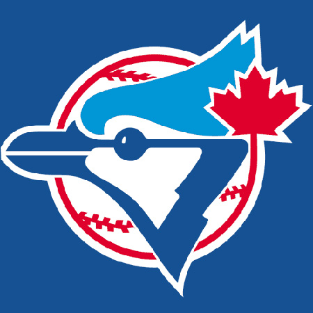
![]()
I hope you don’t mind if I go on a tangent here? I know the baseball season is over but enough is enough on these redesigns that look like the Mountain Dew logo. Who are the graphic designers that are doing these? The new logo looks like its going 80 miles per hour. The old classic Toronto logo had such strong pieces holding it together especially the color scheme, separated shapes and the leaf. The new one strips away the only Canadian element about it the maple leaf and even the color red, what on earth was the designer thinking?

62 Comments Leave A Comment
Dunlap Studios says:
November 13, 2008 at 4:10 pmA lot of companies are throwing out style and uniqueness for what is popular. I don’t think that the re-design is so much a failure, it’s not a bad logo, it just definitely lacks the personality that the original logo had. I’m looking forward to more of these!
Jesse says:
November 13, 2008 at 4:15 pmhe was thinking $$$. And what a good portfolio piece it was. To many new designers are about their own progress. They feel like they are not a good designer unless people have heard of them. More people ought to care about life and what an honor and responsibility designing is, and less about $$$ and fame. but hey we all have bills to pay.
Corby says:
November 13, 2008 at 4:20 pmIt’s worth noting that when the original Blue Jays logo was designed, that style was probably as cliche as this new logo is now. It’s definitely not my taste. But maybe in a few decades someone will think it’s amazing and wonder why logos don’t look that good anymore.
Jakub says:
November 13, 2008 at 4:29 pmDunlap Studios & Jesse –
I understand its not a failure and that you have bills to pay but to strip away any character or pride from a country that just years before lost another team(The Montreal Expos). For a designer not thinking at all about “Hey maybe i should figure out a way to keep the leaf in there some way since we have a special icon in this logo going that works or just at the very least keep the color red” and just be culturally blind to the subject he is working kind of makes it a big failure. I just think a design project like this needs to be supported with a lot more thought, i’m not even Canadian and I don’t understand how that designer felt okay turning that logo in. On a side note: I do own this baseball cap by the way :) just because i love the old logo on white and the rest of the cap in that royal blue, its ace!
Jacob says:
November 13, 2008 at 4:49 pmThis is my favorite Blue Jays logo:
http://www.canadiandesignresource.ca/officialgallery/?p=2130
Not official or anything — but a hell of a lot better than the new one.
drew kora says:
November 13, 2008 at 4:54 pmI think the old logo is cool in context…definitely nostalgic and I’d rock that white baseball cap any day. But I have to say the old logo isn’t really that great. I’ve seen better logos from that era, sports or otherwise. It’s sort of meh for me all around.
The new one is also meh for me, but hardly garbage. It’s just falling in line with current style But I’ve seen way worse modern sports logos than that.
Nick says:
November 13, 2008 at 5:02 pmIt’s very possible the designer in question didn’t even make the decision on whether or not the leaf stays. Designers now-a-days gotta eat it when it comes to the client’s whims, even if they dilute the spirit of a piece. Don’t like it? We’ll hire someone else who does.
As far as the new logo I think it’s hands down more aesthetically pleasing: it’s a lot simpler, more streamlined, and more cohesive. One flowing shape as opposed to separate elements. Though I don’t understand the absence of red… without it the logo seems to lose it’s connection to the teams past.
It seems clear they wanted a more aggressive, modern image, at the expense of their legacy. Whether or not thats a good idea… I guess it depends on who you are. If you own the blue jays, that’ll depend on your ticket sales. If you’re a fan, well chances are you’re pretty pissed.
Jerry says:
November 13, 2008 at 5:02 pmI grew up with that logo in the 80s when I was still living in Toronto, so when I saw this redesign lately I was pretty shocked. While I admit that my nostalgia probably compromises my objectivity, I do think that the old logo was much more characteristic and memorable. I also think that, looking back now, the old logo was in need of a refresh, but this… thing… is not a direction I agree with. You’re absolutely right about the missing leaf, it was an integral element. I don’t mind the more aerodynamic bird but they could have respected its old look a little more. I wouldn’t mind something right in between these two logos.
Hey, I guess we can be glad they didn’t add gloss to it…
chris says:
November 13, 2008 at 6:46 pmbefore the current logo, there was this horrendous piece:
http://www.sportslogos.net/images/logos/53/78/full/1413.gif
short-lived, thankfully. but yes, its sad they remove all of the Canadian heritage from the new logo.
David says:
November 13, 2008 at 6:58 pmI personally think the updated logo is by far more attractive (and I will probably be the only one within this post that thinks so.) It is rather sleek, sporty (no pun intended), and uses the elements of design very well, and for the most part it looks rather modern, instead of a logo that screams 1990 from the 56k modem era.
On the other hand, the retro logo in which everyone seems to praise is rather stale in my opinion. There is a lot of line work that I think the logo tries to imply so much information that doesn’t really need to be there. I personally think the negative and positive space doesn’t work as well as the updated version either. Although I don’t see the big fuss about leaving out the Canadian leaf. After all baseball arel apart of one of two leagues and everyone knows where Toronto is located…
But it isn’t a surprise as to why that logo would be favored over the other, especially within the context of this blog, because the old blue jay logo itself resembles the design principles used by Scott. Not a bad thing, but something that doesn’t come as a surprise.
michaelmanasseh says:
November 13, 2008 at 7:02 pmEWW!! That is repulsive!
Jer. says:
November 13, 2008 at 7:19 pmAs a Canadian graphic designer living in Toronto and a Toronto Blue Jays fan I couldn’t agree more with this fail. I’m glad they started sporting the retro uni’s some games this year. New Era starting selling the original full backs as well.
Luke says:
November 13, 2008 at 7:34 pmLets face it. This site is all about vintage design. I’m with Corby. Years from now people will eat up current design clichés. A balance of appreciation for both is definitely necessary I believe. I love the posts on this blog, but like David says, this post isn’t suprising, because the old logo is iso50. Just like Otl Aicher and Italian car designs. It’s an aesthetic preference, not aesthetic law.
So that being said, I like both. The first logo is so far from perfect, and the second lost the Canadian element — sure. I think the composition of the elements is much more elegantly done in the second. I also enjoy the typography of the same vein that came with the new logo. All in all, I don’t think it’s a huge loss. Somebody should really do something about the Cubs logo though. And the Phillies. Haha.
jules says:
November 13, 2008 at 7:38 pmwhy does it matter? we all know the only good baseball logo that counts for anything is the yankees. that being said, how do you know the creative brief didnt say to take out the maple leaf?
Mike Greenberg says:
November 13, 2008 at 8:08 pmI actually think the logo works well. I agree that the designer most likely had very little say in the piece, and possibly even an art director bent to the wishes of the client. That said there’s a multitude of reasons why they may have ditched the Maple– perhaps not wanting to be known as the only Canadian MLB team? Splitting the difference between modern and the dated logo would have worked better…. It’s not nearly as bad as the new Pepsi logo!
Joey Sichol says:
November 13, 2008 at 8:14 pmThe Milwaukee Brewers old logo and the Hartford Whalers logo are much better examples of cool logos from this period…
Jakub says:
November 13, 2008 at 8:58 pmI can agree that elements of the old logo mainly the baseball stitching aren’t something that i would of kept in a redesign and the beak. I can say though the new logo does nothing for me, the overall outline shape could of been better. Also, I have to write the letter J down every day and I think that J is awful, the italic aspect and the curve at the bottom is a bit of a nightmare.
I’m only critiquing it this harder maybe because I think of this project as a dream job mostly, to be able to design sports logos, I mean I probably dreamt about that job over and over 10 years ago.
I do like Corby’s point too but man what I would do to go back in time enjoy those walking around in a world of those logos instead the Monster Energy Drink logo, Boost Mobile, etc ones that are plastered all down my street.
frank says:
November 13, 2008 at 9:07 pmThat is one BADASS blue jay! He’s got some serious ‘tude! Welcome to the ’90s!
Craig says:
November 13, 2008 at 10:01 pmI agree 100%. The old logo was one of my favorite designs in all of sports. Its interesting that they actually brought it back this year on a powder blue alternate jersey.
I actually do some design work in professional sports and write about this exact thing in my blog (brandball.blogspot.com).
Reuben Whitehouse says:
November 14, 2008 at 12:26 amAaahhh no there goes one of my favorite all time logos, dang it.
sean patrick says:
November 14, 2008 at 4:52 ami think the comment about making it look mountain dew is great. these designers love their vectors and dont seem to cling to any kind of historicity. its kind of like mexico city urban planning dept (build on top of ancient sites). this new logo is insane. it is gross and appeals to those who dont care about design. these designers are analogous to that band nickelback. they give us all bad names.
Scott says:
November 14, 2008 at 4:57 amThere’s definitely some truth to what Corby and Luke are saying, but I don’t think it’s always entirely the truth. Of course we look back to the design aesthetic of earlier generations; it’s inspiring to see the creative output of people who lived in and who’s work was shaped by what was essentially a different world than we live in today. But we look back to the highlights of past design, only the top 10% of what was produced during those periods. The rest is discarded as camp and kitsch. Will we remember this new Blue Jays logo in 20 years? I doubt it just like I doubt many designers are very fond of the Braves logo from the 70’s. The reason the original Jays logo was successful and remembered fondly by so many is because it’s good, not simply because of it’s age.
Today design is driven by different imperatives. The corporate landscape is a much different place and the business of branding it reflects this fact. I think design in the past was left more to the designers while today it is all about design by committee and focus groups.
True, popular culture will always latch on to the sort of lowest common denominator end of things when brining back a style or trend, but I think we as designers are equipped to recognize good design and not merely be swayed by the nostalgic aspects of a vintage design.
I guess my point is that not all things vintage are appreciated for that fact alone. The reason we look back in awe at something like Mexico ’68 Olympic branding, for example, is because it was incredible design. Not just incredible design for it’s time, but incredible design period.
When I was a kid I, of course, collected baseball cards. Every team’s branding was very unique; the overall aesthetic vibe of each team was very distinguishable. It seems like so many identities for sports teams today are swirling into a homogenous middle ground of mediocrity, the ability to differentiate between them on a stylistic level is becoming more and more difficult.
Daniel Carvalho says:
November 14, 2008 at 5:16 amMy opinion is not too different from those already expressed by some.
I don’t really like the first logo, it has some core vintage elements that make it somewhat at a glance appealing, but they are joined together with weird forms and lines that don’t match quite right. The whole composition is feels stale. Regardless of the context of time, I think these points are still valid. Like Scott has even mentioned before, and it’s something I agree with, good design can be timeless.
I think the new logo suffers from the opposite problem, excellent execution but the style can be debatable. I don’t think there is necessarily a right or wrong regarding their obvious reason style choice, it definitely feels like a sports brand. The implementation of the “J” is nice.
Not assuming that Jakub is just merely questioning the logo based on designer’s choice, which is not the final say, I would have liked to have seen some red in there. Clients’ influence or not, we’re talking about the complete end product.
Andrew J. says:
November 14, 2008 at 7:37 amsearch the phoenix coyotes, they did the same thing, the logo used to have a more native american theme(looked kind of like heiroglyphics) but they changed it too a “Fierce Coyote” howling. I grew up with the old logo, but it was anythign but cool. I’m glad they changed the logo because it helps keep up with the times. I’m sure coyotes fans didnt want to look lame in this day and age. The new design is still stupid but at least its up to par with other teams new designs. It looks exactly like that blue jays design acually haha
Alex / HeadUp says:
November 14, 2008 at 9:02 amHAHA yeah Andrew I remember the old coyotes logo was pretty wack. I maintain that the worst logo “update” was my alma mater, University of Pittsburgh’s panther. It went from being a distinct cursive “Pitt” with a yellow and blue panther, to a stylized navy and gold panther with 3-D block lettering for Pitt, to the current design, which looks like a sea otter…aerodynamic to the point of looking hopelessly stupid.
Jakub makes a good observation about the trend in logo design for many sports teams becoming less memorable and more cliche and visually unappealing, leaving behind certain proven design principles, and I guess you have to look at the tools used to create it as well– no doubt the original and the current were made using two different techniques by two different designers schooled in two different eras of design.
But Scott makes an excellent point as well about designs being memorable because quite simply, they are just good, they are based upon age-old conventions of what is aesthetically pleasing to the human eye, whereas the less memorable stuff is not. The context of time doesn’t have as much to do with one design being more memorable than the other, although I sometimes have trouble separating the technique from the context when assessing whether or not I consider a design to be pleasing to my eye.
Dave Krstin says:
November 14, 2008 at 9:25 amDon’t know if this is just retro fever or not, but kids here in Toronto are busting out the old logo all the time. Mostly on newer garments.
Even if you can argue that the new one is successful, I highly doubt the “extreme jay” will be kickin’ it old skool in 20 years…
Jakub says:
November 14, 2008 at 10:36 amDave Kristin –
exactly! that “extreme jay” won’t have a following in 20 years and I think part of it and this is getting off the subject a bit is because the kids these days won’t be cherishing all the gimmicks that are put in front of their faces and this new logo is a gimmick in many ways.
Daniel Carvalho –
But those “weird forms” are pretty simple and what I think is appealing about that time of design is taking a few forms and constructing an object in this case a Blue Jay. Usually this works if your a good designer unless you we’re the one that made the new Olympic logo for London UGH!
motor9 says:
November 14, 2008 at 10:44 am…but if they don’t *update* their logos, how will they ever make gazillions on RETRO merch? juss sayin’
peace [m]
anon says:
November 14, 2008 at 10:50 amdavid kinsey designed the mountain dew logo.
while i agree with your stylistic preference on this one, i also see the validity of appealing to the types of people that drink mountain dew and watch sports… they’re not the artistic bunch for the most part
Corby says:
“It’s worth noting that when the original Blue Jays logo was designed, that style was probably as cliche as this new logo is now. It’s definitely not my taste. But maybe in a few decades someone will think it’s amazing and wonder why logos don’t look that good anymore.”
I says:
“word, good point.”
Andy W. says:
November 14, 2008 at 10:51 amThis is a marketing decision, pure and simple.
This logo is all about growing their base. In this case, their target is 6-year old boys, the next generation of Blue Jay fan. Their existing base won’t be swayed by a new logo, but parents could be dragged to more games by and purchase more merch for their enthusiastic kids.
Brian says:
November 14, 2008 at 10:53 amI agree with what Nick mentioned earlier. I guarantee it probably isn’t what the designer wanted either. I’m sure a lot of the direction was “given” to the designer.
Jakub says:
November 14, 2008 at 11:02 amAndy W.
I guess i’m not having kids then unless I record abunch of 80’s PBS onto VHS, play them Boards Of Canada, and deck them out in vintage Pittsburgh Pirates uniforms when they play baseball instead of what they have now Dora the Explorer, Hanna Montana MP3’s, and letting them buy Arizona Diamondbacks merch? yikes!
http://en.wikipedia.org/wiki/Arizona_Diamondbacks
Just kidding, definitely not that controlling haha but how do parents deal with their kids these days with all these gimmicks.
Luke says:
November 14, 2008 at 11:26 amHow do you think the new logo could have been executed in such a way as to make it last? I’ll be honest – i would totally wear a tshirt with the old logo on it. Or a hat. But only because of the feeling associated with the logo.
It makes me wonder what actually causes that.
I think I agree that this new logo won’t have the same effect – or will it?
Is that actually predictable? And if so, what logos created today will last?
I think my favorite sports team branding right now is the Seattle Seahawks. Great color palette and the logo is very cultural and should probably never be changed. It is very stylistically universal. Whereas the blue jays old logo had many issues i think.
Interesting issues for sure! Will our postmodern aesthetic philosophies ever sort themselves out?
Jonathan says:
November 14, 2008 at 12:59 pmLuke, you bring up an interesting point… What is it about vintage/retro/etc. that we are attracted too?
Why is it that we would be more drawn to wearing a shirt with the old logo rather than the new? I think we should really start a whole new debate on that question… And I wonder if in 20 more years, will we feel the same way about the current logo?
Matt says:
November 14, 2008 at 1:06 pmI agree with David. The old logo was weak and not well balanced. I don’t think it’s necessary for sports teams to have logos that last for 10 years. I think it’s exciting to see the brand of a team change the way players change.
But its funny how tuff the bluejay looks now. He’s got a case of the bird flu and is out for blood.
BetterThanHuman says:
November 14, 2008 at 1:15 pmNo opinion here. I’d rather avoid that part of the conversation.
However, Nick is right. You can’t necessarily give the artist all the credit.
Most artists with the qualifications to do this caliber of identity will be working at an agency under an art director.
Also, these days, clients don’t often come in and say “Just as long as it looks cool…”
The reality is that many clients are taking the role of art director.
Op says:
November 14, 2008 at 4:35 pmLooks more like an eagle or a hawk than a blue jay…
Ryan says:
November 14, 2008 at 8:17 pmI don’t see a strong resemblance to either a bird, or the letter J. Considering the name of the team is the Blue J’s I would hope to be able to get that association without looking at the original logo. But I agree with Scott in that there is a certain style that all sports teams seem to be trying to emulate, it seems counter productive in a branding sense if all teams attempt to look like each other. There needs to be a modern look and feel to these rebrands, but it seems that the graphic qualities of “most” of these rebrands have very little lasting power. As dated as the original may look now, I bet most of us remember its uniqueness compared to other teams.
Matt says:
November 17, 2008 at 8:23 amI have to say I love the old logo, I was heartbroken when they started making changes to that god-awful reworking with the big red maple leaf and then this “extreme jay”.
Now it’s not so much that I dislike the new logo, it’s not bad. But it isn’t the old logo. And most of that is in all likelihood more because I grew up watching and loving the Jays and not because of it’s design.
I still remember like it was yesterday watching Otis Nixon try to pull off his bunt in extra innings of the 92 series. And just the same with Joe Carter’s walk of home run in 93. The feeling I get thinking about those days is the same feeling I attribute to the old Jays logo. A sense of pride and joy in the team I love going back to back to win the world series in 92 and 93.
So from a design standpoint is the old logo great? I don’t logo design is definitely a weak area for me. Do I love it? Yes! More than any other logo I can think of.
So I think that is why people hate the new logo it isn’t the quality of the design for either of them, it is all in the memories.
Jim MacLeod says:
November 17, 2008 at 9:00 amI think that both of these logos are good representations of their era. Very few clubs can have a timeless logo. The Yankees pull it off (much to my Boston dismay.) The original Jays logo is retro. The Yankees’ “NY” or the Tigers’ “D” are timeless.
In a few years, the Jays can once again rebrand themselves and sell a ton of new caps and jerseys.
At least neither of these are as bad as the bird-tossing-the-ball logo that they had for the 2003 season.
spacerock joe says:
November 17, 2008 at 10:59 amMy favorite example of a sports logo redesign FAIL is definitely the current Buffalo Sabres logo. They went from this brilliant pictogram, http://upload.wikimedia.org/wikipedia/en/0/06/BuffaloSabres1980s.png
to this flying toupet slug thing:
http://upload.wikimedia.org/wikipedia/en/c/ce/Sabres.PNG
What’s that have to do with a sabre?
chris says:
November 17, 2008 at 6:45 pmOne other thing I just realized, I’m pretty sure the majority, if not ALL teams in the MLB have the emblem on their hat to represent WHERE they are from, not the mascot.
And with this “J”, they mock that whole system. Shame.
http://mlb.imageg.net/graphics/product_images/pMLB2-1316831dt.jpg
And what’s wrong with the Diamondbacks??? Besides the fact they totally choked in the final month.
Will says:
November 19, 2008 at 1:01 pmDon’t forget that design work is not completely up to the designer, the end product ultimately lies with the client. If the client wants trash, the client will get trash and the designer is out of a portfolio piece.
Margot says:
November 19, 2008 at 5:51 pmAs a Torontonian, I just have to note that the new logo is a lot more fierce looking than the past one. Since the Jays suck, Torontonians in general don’t feel too enthusiastic about baseball or bother going to Jays games much any more, so maybe the designer as trying to make the team look tougher, and possibly better, than it really is. I will agree though that it’s a cliche logo and looks like any other team logo out there, and I’m not a big fan.
XYFloyd says:
November 20, 2008 at 4:32 pmhey man i love your site.. your friend michael told me you were looking for a new way to earn some extra income online.
i own an awesome website where you can make money online..most our users are making like 20-50 bucks a day.. with minimal work.. its pretty simple to do.. its actually so easy to do you won’t believe ill actually pay you to do it.. and its 100% free to sign up and try.
another positive about my site unlike all the other sites.. i will pay you out daily.. so you earn 5 bucks in the first 5 minutes you work on my site.. request a payout and i will pay you out right then.. i guarantee no other sites like mine will pay out daily multiple times..
i’d be glad to help you.. if you sign up..
http://tinyurl.com/6255qv
Brian says:
November 24, 2008 at 9:01 amThe old logo is much more timeless. REALLY good design reflects it time, but also stands the test of time and keeps its quality longer. The new logo is going to look dated much quicker. The classic logo does an amazing job of nicely tying together a lot of elements, AND the bird looks like a Blue Jay. The new logo is pissed-off “generic bird”. Sorry, tough logos don’t make for better baseball. The leaf was probably omitted by the owners so that they can move the team to the highest-bidding city.
ALPHA THEORY says:
November 24, 2008 at 10:54 amFAIL! And anyone else who likes the “new” version, YOU FAIL!
Mike D says:
November 24, 2008 at 1:58 pm“Sorry, tough logos don’t make for better baseball.” -Brian
Exactly. A baseball logo can look bad ass and imposing without having to look like it’s going “80 mph.” If the Blue Jays were a football team with similar standings in the league, this would be a change for the better, but they’re not.
I like Luke and Corby’s points about contemporary cliches being praised down the road. That’s such a great insight to keep in mind. Unfortunately, this is not the best example of that. This new logo is trendy.
The best designs are timeless, but even some of the most effective designs in their initial contexts are not ultimately timeless. I love the old logo, but it does strike me as more vintage than timeless. A rebranding was a good challenge to attempt for the Jays. Too bad they failed.
Arron Lock says:
December 3, 2008 at 11:05 amThis logo certainly doesn’t capture the Canadian spirit like the old one but I don’t feel that it is a fail by any means. It is a decent logo that is following suit in style with many of the other sports teams, MLB included. I think if the designer could work the maple leaf or at least some red into it, it would be great.
vuxes says:
December 5, 2008 at 12:12 pmI’m not a designer, but being Canadian, I hope you’ll all allow me to express the contrarian view.
How many American teams sport the American flag? Why MUST a Canadian team sport the maple leaf?
“Good Design” used to mean the necessity to include elements that mean something, such as baseball stitching, maple leaf, the right colors, etc.
I absolutely love the new logo, the Blue Jay with an attitude, and the stylish “J”.
Thanks for reading.
Weston says:
December 6, 2008 at 4:59 pmI personally hate the old logo… The maple leaf just seems like an afterthought.
“Make it feel more Canadian”
“Ok, I’ll add a maple leaf.”
I’m indifferent towards the new one. It certainly isn’t original, but I don’t think it’s terrible.
craig says:
December 7, 2008 at 8:29 amIt seems I am really out on a limb here because I really like the new logo. The beveled edge on the letter “J” stands out. It has clean feel to me. The color scheme is really sharp the blue definitely stand outs to me.
Jim says:
December 14, 2008 at 6:11 amThe redesign is fantastic, in my opinion. The old one was gaudy, flat, and very “clip-art-ish.” Why was the stupid Maple Leaf so great? Do all the other teams put a USA flag, or a star in them? The old logo wasn’t unique, it was pathetic.
I also think some of you designers are getting to be a little full of yourselves. As a designer, your job is to communicate with the client’s desired audience, not win awards, not feel good about your “work” and certainly not judge other people’s work without having a clue of the facts.
Jakub says:
December 14, 2008 at 6:22 amJim –
Looking at your site though, it bores me half to death. Its just stock graphics at their blandest and safest levels like some boring iphone app art. If we cared that little like these examples then there would be nothing to look forward visually in graphic design when it comes to something simple, iconic and beautiful. Go thru some Rand and Bauhaus layouts and logos and give them a good twice over for a few hours and come back and chime with something that hasnt been said before.
Panasit Ch says:
December 28, 2008 at 5:58 amI like the new design. I think people are upset over the direction that they decided to go with (in this case the popular or so-called “cliched” direction) but I think there’s nothing wrong with the design itself. It looks fast modern and very balanced. Gathering from what I read, you guys hate the idea of changing it more than the actual design. I mean if a design student hand this in to you what score would you give? If you think something less than 75 something is obviously not right and you have some bias thing going on that you are not disclosing. Me, I see this as a 95 out of 100 work easily.
At least this looks better than the new UPS logo.
Melkyman says:
February 22, 2009 at 8:37 pmIt seems like the Red Sox’s logo is eveywhere these days because Boston finally won the Series in 04 so people are getting on the bandwagon. If you really hate the Yankees, you’re probably inclined to buy a Sox hat.
lzkim says:
November 13, 2010 at 7:02 amGood collection of logos.. I agree to that Melkyman.. :-)