Logos by Paul Rand
Posted by Scott
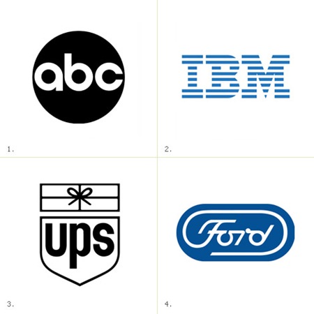
James White has posted a follow up to his excellent feature on Saul Bass’s branding work, this time focusing on logos by mid-century corporate logo extraordinaire Paul Rand. Very nice stuff, thanks for posting James! Link

10 Comments Leave A Comment
Jake G says:
September 23, 2008 at 1:16 amright on, my teacher showed us this exact sheet last week in my “history & appreciation” class. We talked about how balanced most of his work was, then debated about the IBM logo and why he chose to use the horizontal lines. Many say it resembles interlace scanning of screens (or printers), or the fact the M is so hard to balance placed beside a B, he had to use the lines to tie everything together nicely. What’s your take on it?
Mirwen72 says:
September 23, 2008 at 2:15 amIBM is really good logo.
Also your United States Postal Services has great logo. This morning a parcel came with this logo on it and 12 of your t-shirts Scott in it (I got only 3, the rest wanted my friends). Greeeat! :). You are about to became quite popular in this god forsaken land :).
Jakub says:
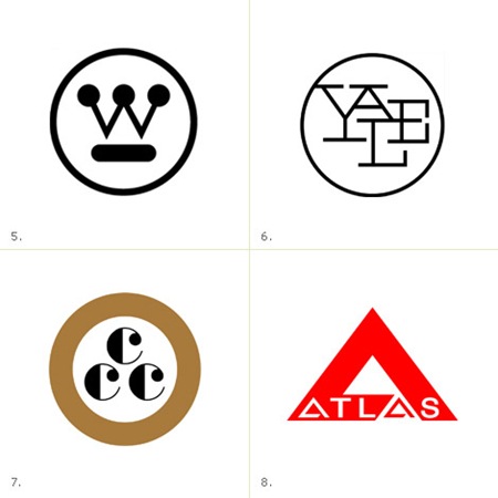
September 23, 2008 at 10:08 amthat YALE one is kickin my ass, its spot on, i think people the UPS one for granted, just a great way to tie in the company product into the logo
frank says:
September 23, 2008 at 10:30 amThat version of the Ford logo is cool. Was it ever used?
Jonathan says:
September 23, 2008 at 2:24 pmGood question Frank, I was wondering the same thing… Not sure if it was ever used, but I’m will to bet the Ford logo we are all familiar with today was an imitation, birthed straight from Rand’s mark.
Anyone who knows more about that mark, definitely post it.
frank says:
September 23, 2008 at 2:46 pmNah, Rand was definitely riffing off of an existing logo. Looks like the current logo basically existed as early as 1927. Rand’s design must have been a proposed redesign that got rejected.
http://www.cartype.com/pics/3155/small/ford_logo-group.jpg
frank says:
September 23, 2008 at 2:48 pmHaha, and if I would have actually clicked on the link I would have seen that is says “Ford Motor Company (unused): 1966”
oops.
danny says:
September 24, 2008 at 2:02 amhas anyone heard about the supposed reason for the rejection of his Ford logo? notice any sexual undertones in there? imagine the “F” and the “d” as two people and the “or” as the “handicapped” symbol. i don’t know if that’s official, but i’ve heard about it from multiple people.
Jonathan says:
September 24, 2008 at 6:21 amwow… That’s all I can see now. Yesterday I thought this logo was awesome, now it just looks like a handicapped orgy.. ouch!
Scott says:
September 24, 2008 at 4:27 pmoh god….why!