Terrabyte 3: Tycho / ISO50 Live in L.A.
Update: Tickets & info are here
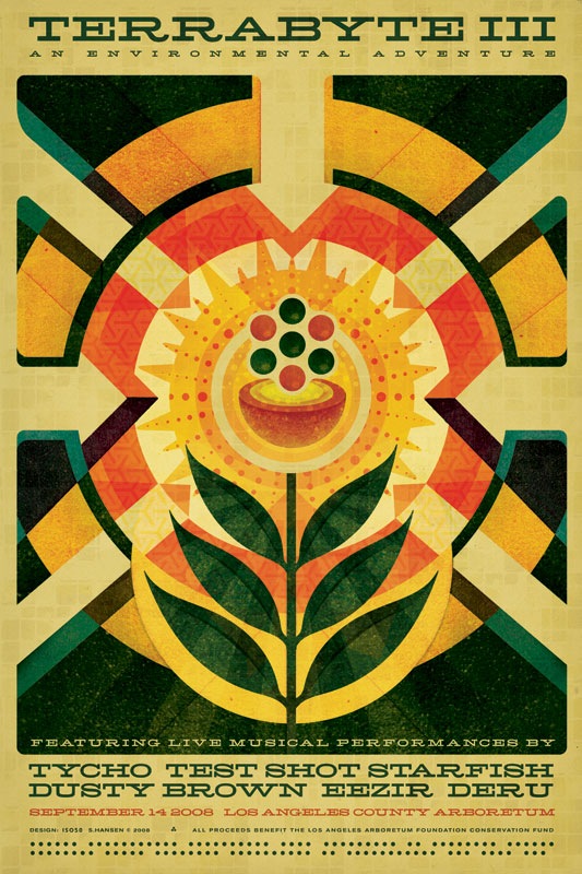
Update: Poster Image updated (see above) and back posted here
I just finished up the poster / flyer design for the third annual Terrabyte event (click the above image for a large version). This is the first work I’ve done since the Obama poster and it was a nice chance to get the wheels turning again. The spec was pretty open, just had to include the themes of Nature / Technology / Art. I went for a sort of 60’s modernist infographic approach, like a page from an old physics textbook maybe. This was also the first chance I got to use one of my favorite new fonts: Hellenic Wide. The face was really a pleasure to work with, it cuts a nice line and sort of acts as it’s own divider so there wasn’t much need for all sorts of lines and spacing. Time permitting, I’ll post a small "making of" on this in the coming months. The poster will be available for purchase online in the next couple months and I am hoping to have some early copies available at the show itself.
For those of you into nuclear physics, the imagery is supposed to represent a critical mass, as in everyone coming together and then and explosion (of the aural/visual kind, not atomic). Poster design aside, try to make it out to this event if you’re in the Southern California area, it’s sure to be a great evening of music and visuals, I’ll be playing a set as Tycho and doing some live video / visuals as well.
Terrabyte is officially described as a "unique celebration of nature, technology, and art". Translation: A great evening in the Los Angeles Arboretum out on the green listening to live electronic music and viewing visuals on huge screens. All ages are welcome; it’s a $10 donation to get in and all proceeds go to the Arboretum preservation fund. There’s a bar for those 21 and up and a lot of exhibits to check out. An architecture school builds this massive array of projection surfaces that stand about 30 ft. tall to fire the visuals on to; it’s a pretty amazing sight. Needless to say, it’s a great time and well worth the ticket price. If you missed the past 2 years, now’s the time to make it out, this will be the best one yet.
Here’s this year’s live lineup:
Tycho (+ISO50 Visuals)
Test Shot Starfish
Dusty Brown
Eezir
Deru
More info at the Arboretum’s site
Date: September 14, 2008
Location: L.A. County Arboretum & Botanical Gardens
Time: 5:30-9:30PM
Entry: $10 Donation
ALL AGES SHOW
See you out there!
Comment on this post

60 Comments Leave A Comment
skapiso says:
August 21, 2008 at 1:52 amvery nice Poster.
Rae Davis says:
August 21, 2008 at 2:25 amAre the “R’s” modified?
Or do they just curl up a lil like that?
Once again Scott you never cease to amaze me buddy.
r
bobbygrotesk says:
August 21, 2008 at 3:09 amHELLLLLLLENIC WIDE, Awesome.
Paddy says:
August 21, 2008 at 3:51 amBeautiful. Just wonderful.
I’d love to get an insight into your ideas process when you are designing a poster. I’m always impressed by your tremendous creativity and range of styles.
If I lived anywhere near Los Angeles I would most definitely attend. Unfortunately it’s rather a long flight from Ireland.
Helvetiac says:
August 21, 2008 at 5:04 amLove it. Awesome. I think this might be your best work yet. I like the combination of clean vectors and gritty textures, and that you’ve steered away from from the over-used distressed edges!
Mark Weaver says:
August 21, 2008 at 6:26 amlove hellenic wide. keep up the great work.
Brad Blackman says:
August 21, 2008 at 6:47 amThis is awesome. Nice work. The only thing I don’t like about it is the names kind of run together at the bottom. Very nice colors, type, texture, and overall composition. Do you plan on selling these in your store? I’d love to see a step-by-step process post similar to the one you did for the Obama poster.
Glenford says:
August 21, 2008 at 6:57 amis that braille at the bottom? that’s not actually functional is it?
criticism aside, i really dig that halved ball/neutron/nuclei or whatever in the middle.
Jeremy Stereo says:
August 21, 2008 at 8:25 ammario bros. on the work!
hell yeah.
Horacio says:
August 21, 2008 at 8:26 amgreat work!
is that purple side of the left arrow out of place?, I just wonder
Nice typo :)
Brian says:
August 21, 2008 at 8:30 amVery cool. Definitely looks like it could be a retro-futuristic corn flakes box cover.
As Paddy said, I would be there too, but I have to stay here in Arkansas.
There’s just not enough of those kinds of venues and events around here.
Brian says:
August 21, 2008 at 8:35 amColors! Very nice poster design. I especially like the typeface as well. Do you plan on updating your portfolio here with any of your new work? Great work as always!
Brandon Meier says:
August 21, 2008 at 8:41 amLove it, I just saw it posted yesterday on Dusty’s myspace.
Looks Hella-nic tight. haha.
mike says:
August 21, 2008 at 9:03 amvery interesting. this is the kind of thing that i would actually stop in my tracks while on the street to take a look at.
Ben says:
August 21, 2008 at 9:17 amI am now using this phrase for the first time in my life with sincerity: This poster blew my mind.
It is beautiful. You, sir, just reignited my passion for drawing.
Damian says:
August 21, 2008 at 9:17 amwow… beautiful
frank says:
August 21, 2008 at 9:54 amThat’s brilliant! I think this is probably your best work yet.
frank says:
August 21, 2008 at 9:56 amUh oh, here comes the nitpicky OCD asshole in me :)
Why do the orange and brown pieces of the left hand arrow tip not meet? Aaargh, ignore me :) I can’t help it.
Dante says:
August 21, 2008 at 10:26 amThat is beautiful. Hope it comes out for purchase!
Tanner Moehle says:
August 21, 2008 at 10:53 amWow ISO using Serif fonts? This is a big deal. Love the illustration, very well done and a venture from your usual work.
David Cole says:
August 21, 2008 at 11:36 amThis is gorgeous. Do you have any good sources for original 60’s modernist infographics? I know exactly what you’re talking about and would love to fawn over some.
Phil says:
August 21, 2008 at 11:56 amc’est tres magnifique! :)
Jakub says:
August 21, 2008 at 12:32 pmi love the hints of older project patterns slightly showing up in bits of some of the ISO50 work, it feels like its sitting nicely under stacks and stacks ideas, like you could peel away at this poster. I think some designers wouldnt want to use past pieces but its a unique angle and great way for a designers in this time to show that their are other ways to show you know its that designer work and not someone else, its kind of like a trademark stamp to some of the ISO50 work in my opinion.
Jelle says:
August 21, 2008 at 1:51 pmgreat stuff man.. as always. I’m not a big fan of the font though..
Jayden says:
August 21, 2008 at 3:32 pmLove it. To me it feels like technology (hard lines, patterns) all focusing in on the environment (sunflower, food bowl). Great stuff.
Steve says:
August 21, 2008 at 3:42 pmMan, great call on the hellenic wide. I’ve never seen it before, but I love it.
Jenn says:
August 21, 2008 at 3:53 pmwow. i want one.
Max Weir says:
August 21, 2008 at 4:21 pmAwesome work! The font works perfectly with this design, once again a lovely piece from you and its so well done. What does the dots at the base represent?
Scott says:
August 21, 2008 at 5:55 pmThanks everyone for the comments, much appreciated!
I’ll do my best to answer all the questions here:
Rae-
The R’s are standard, you can see them here: https://blog.iso50.com/?p=1918
Brad-
good call, that’s something I meant to address but it slipped by at the end, I am going to tweak the titles tonight.
Glenford & Max-
The dots are meant to evoke the idea of an old computer programming punch card, they had all these cool patterns like that (although most were rectangular punches). It sort of reinforces that 60’s industrial modern vibe.
Horacio & Frank-
nice catch, I totally missed that. I looked at this thing for so long I started to block out things. I always make a detail pass at the end but some things make it by. I’ll fix tonight.
Brian-
I usually just make a whole new portfolio then release all the new work at once, instead of incrementally updating the existing one.
Tanner-
very observant, yes, this is my first foray into the world of serifs.
David-
search for “graphis inforgraphics” on flickr.
Rent says:
August 21, 2008 at 6:52 pmmight have to take a journey down south for this!
Jake Graydon says:
August 21, 2008 at 8:56 pmScott, great layout man.
I am in serious need to see you live and Terrabyte sounds very cool, my style for sure, but I live in Vancouver BC. I just went to an electronic music festival near Nelson BC called “Shambhala”. It has 6 massive stages, out in the middle of a dense beautiful forest, they have a downtempo stage located on a river’s beach and I think you would be perfect for it. Similar style of projection surfaces at every stage, so your visuals would be accepted and appreciated I imagine.
Take care
Frederico Phillips says:
August 22, 2008 at 7:25 amHey tycho, i think you should post the old logo of mac, with isac newton.
take care
Jason Fletcher says:
August 22, 2008 at 2:16 pmJust moved to LA recently and almost browsed over this event. Been listening to Tycho for a long time and loving every bit of it. I’m very excited to hear your music in this incredible environment!
Bob says:
August 22, 2008 at 2:27 pmNice poster!
Forrest says:
August 22, 2008 at 7:33 pmYes! Great poster, and I am soooo psyched for the show, I am really gonna try and get up to this one!
Sticboy says:
August 23, 2008 at 9:37 ami’ll see you there! will you have swag for sale?
gwdesign says:
August 23, 2008 at 3:55 pmAwesome poster! I’ll be there at Terrabyte with my wife and kids again :-)
last time my wife sat down in Peacock poop, I think she learned her lesson. Oh, and I hope that Reggae ice cream truck doesn’t drown out your set this time :-D
Chow says:
August 25, 2008 at 1:24 amLast year’s decorations were kinda weak. I hope they do it this year.
Looking forward to it.
PKayne says:
August 25, 2008 at 2:20 pmGreat poster Scott. I saw it on grainedit.com so a instantly popped over to see it it was indeed on sale. Can’t wait until it is. I would love to place that one my wall
michael j. says:
August 25, 2008 at 7:47 pmGreat Scott! And not the kind Doc Brown exclaims upon inventing the flux capacitor…hmmmm, maybe a Delorian post is in your future!? Anyway, I noticed that somehow the old version of the poster with the slight mis-alignment was posted on the MySpace bulletins. Not a big deal but thought you’d like to know. I plan on catching your set and the whole event, looking forward to it :)
celie says:
August 26, 2008 at 1:08 amI love this! I’d love to read more about your design process, too.
j.son says:
August 27, 2008 at 3:17 amYay, a performance in Los Angeles! Finally! Can’t wait.
the masses says:
September 5, 2008 at 8:48 amYes, please make available to buy. Loving this poster.
Jose Espinoza says:
September 7, 2008 at 9:51 pmI’m soooooo there and yes I’d like that poster tooooo.
Russell Reeves says:
September 15, 2008 at 9:34 amWow! What a great show last night at Terrabyte III! I went with my 15 year old daughter and she was just as blown away as I was. Her comment to me after the show: “I loved how they intermingled the astronaut and scientific images with their music, it really made me feel something great inside!”
Thanks for a very special evening!
Desserts says:
September 19, 2008 at 9:46 amNeat design. I’m glad to have stumbled across this site.
Pregnancy says:
October 4, 2008 at 4:12 pmExcellent! Great Style
Thanksgiving Recipes says:
October 8, 2008 at 9:15 amlove the attention to detail, very nicely done
Min Kim says:
October 20, 2008 at 8:52 amYeah! Finally they are doing it again.
I went on last year and met Scott and bought few of his art pieces.
Looking forward to seeing you again!
Calgary Graphic Design says:
July 19, 2009 at 10:18 pmLove the poster! Yup, I’d put that on my wall!