PDP11 Handbook
![11_02[1]](https://blog.iso50.com/wp-content/uploads/2008/07/windowslivewriterpdp11handbook-1c7d11-021-2.jpg)
![11_03[1]](https://blog.iso50.com/wp-content/uploads/2008/07/windowslivewriterpdp11handbook-1c7d11-031-2.jpg)
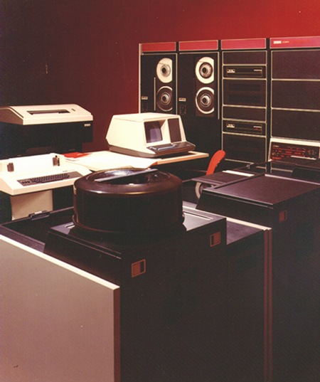 Up top is the original handbook for the Digital PDP11 Microcomputer (front and back). This was a successor of the PDP8 line I covered earlier. This time around we’ve got a liberal shift into the magenta range for the interface. The lower image depicts the machine in use; funny how they’ve dubbed it a "microcomputer" yet it’s peripherals fill an entire room. Makes me realize that for all the ills of the modern world, we as digital artists certainly live in a fortunate time for our chosen profession. The great irony here (considering the proliferation of computer based desktop publishing) is that these brochures for computers were all set photographically, by hand. I’m not sure what typeface that is, it looks rather custom so perhaps it never made the leap to the digital realm as a font. Let us all know if you have any ideas about it’s identity.
Really liking the cream border on the handbook and it looks to be intentional in this case as opposed to being an effect of aging like we saw in the Blue Note covers. Also, here’s an interesting example of a programming card from the PDP, unfortunately it’s a bit cut off.

8 Comments Leave A Comment
uriah says:
July 29, 2008 at 2:09 amGreat colors, those pink tones with the cream. Nice find.
PT says:
July 29, 2008 at 4:18 amI love the composition of the last image. Brilliant!
—PT
Josh Mast says:
July 29, 2008 at 6:31 amSlightly related, here is some info about the old DEC logo.
Igor says:
July 30, 2008 at 2:49 pmHi Scott! I’ve found some nice soviet-era book covers about the space exploration: http://epizodsspace.testpilot.ru/bibl/oblojki/1957.html
(click on the word “далее…” at the bottom to go to the next page)
tadoma says:
August 4, 2008 at 9:39 amThis is beautiful, but have you seen the video on Audio Conferencing?
http://www.veoh.com/videos/v373473Ha3kGKSa
Really pretty music in there too. Sounds a little like if Bibio used synths.
lost in space says:
August 4, 2008 at 9:51 ambrilliant! so this is the orginal handbook cover or your version of it?
love this stuff. been collecting scans myself with a view to doing something with them..
Dane Henas says:
August 10, 2008 at 12:11 pmThe font looks a lot like Avant Garde with a custom lower case k–easy to do with letraset! I worked in graphic arts back then (too high falootin’ to call it graphic design back then!) and used to love to set headlines on a Typositor, which was a pretty cool machine for setting high res type. I wish I would have kept all the old catalogs and brochures for Photon and Compugraphic!