Orquesta Sinfónica de Puerto Rico
Posted by Scott
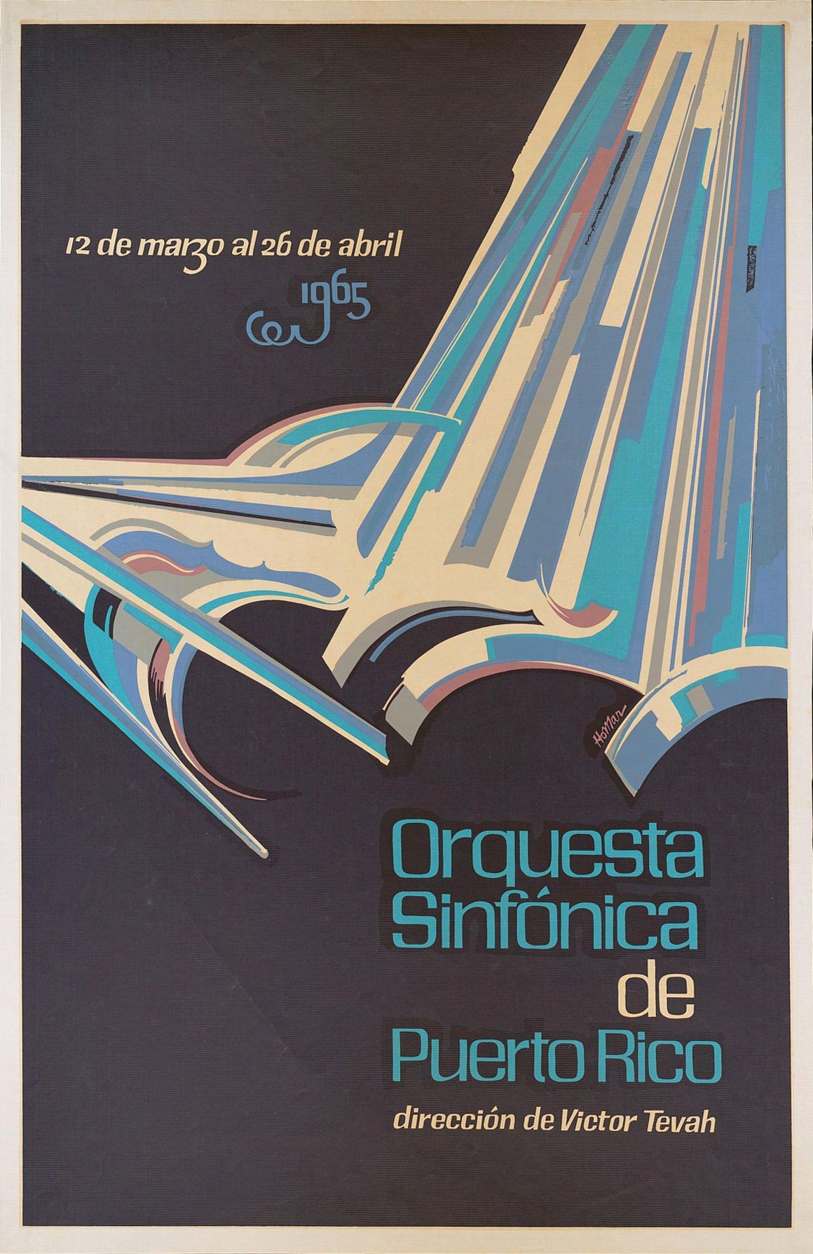
Some awesome typo going on in here, found it over at The Ministry of Type. It’s apparently by Puerto Rican artist Lorenzo Homar, there’s a full bio on him at the bottom of the page. Really very nice hand lettered style, The Ministry briefly discusses the possibilities of creating a digital typeface based on the top font up there, let’s hope that happens at some point. The bottom one, although obviously hand lettered, looks familiar…But I can’t put my finger on it. Any ideas?

5 Comments Leave A Comment
Laura says:
July 18, 2008 at 4:46 amGasoline Sans?
Jp says:
July 18, 2008 at 9:44 amBeautiful. Homar is well known in PR, where print making really flourished for a time. Anyone interested should check out “El Cartel en Puerto Rico.” Sadly, it’s hard to get reprints of any of these nowadays.
Scott says:
July 18, 2008 at 12:41 pmlaura-
close but gasoline is more chiseled and angular. and a lot of the characters are way off (check out the lowercase “r” for example)
bill gatse says:
July 18, 2008 at 8:52 pmlooks like Amplitude/Rotis
… or comic sans…
:P
Manuel Rivera says:
July 21, 2008 at 6:37 pmI’m from PR. Lorenzo Homar is amazing. All of his stuff is breathtaking, specially his type, linocuts & poster works. Nice find..