Shepard Fairey: Orwell Redux
Posted by Scott
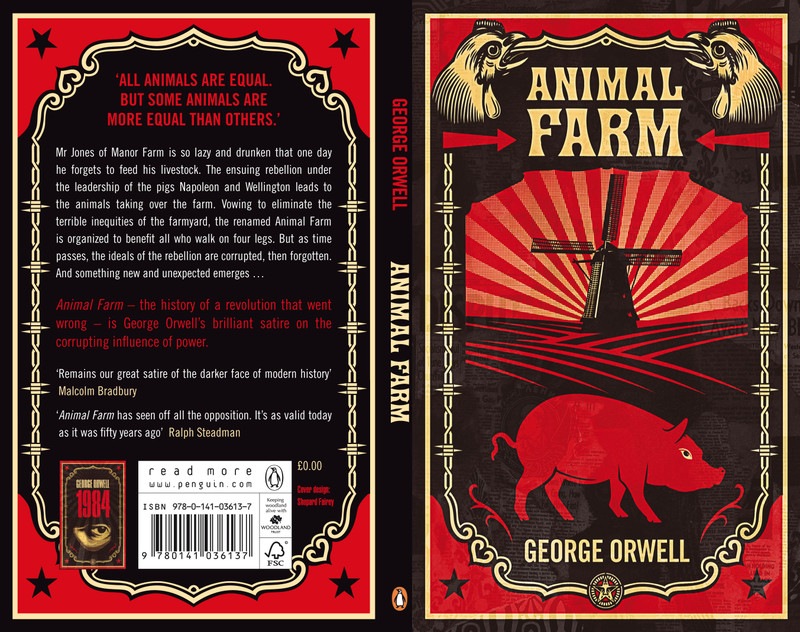
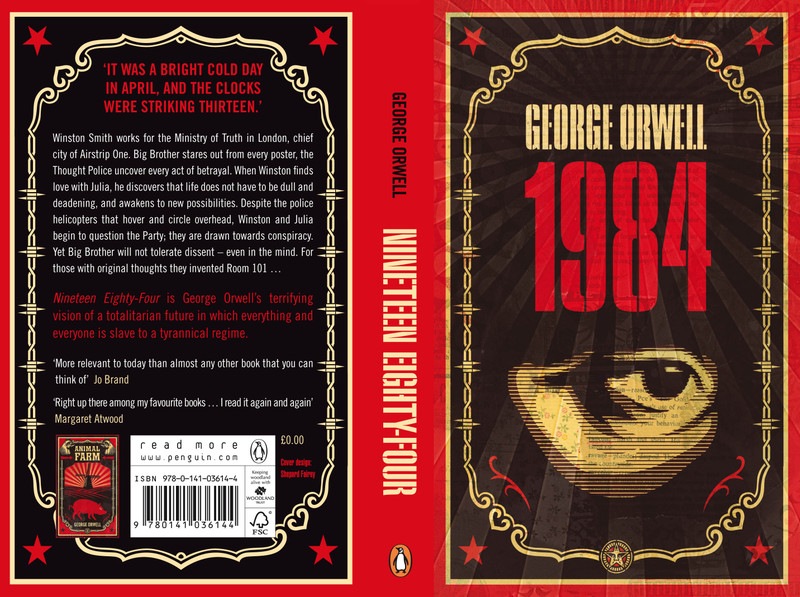
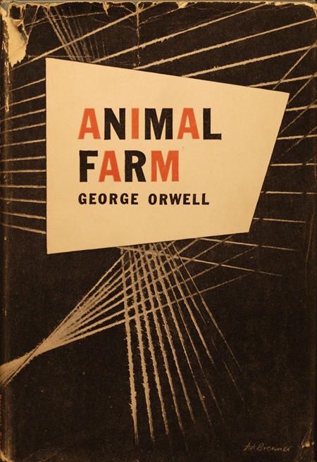 Shepard Fairey has re-designed the covers for two of George Orwell’s classic novels: his dystopian masterpiece, 1984 and his totalitarian allegory, Animal Farm. I can’t think of a better artist to tap for such a task, these two concepts fit nicely with the decidedly cynical slant of Shepard’s work. I really like his take on the covers, but must admit that the minimalist / modernist in me is still partial to Art Brenner’s original for Animal Farm (above).

10 Comments Leave A Comment
NAVIS says:
May 9, 2008 at 3:24 amI knew it was Fairey’s work right off the bat. Curse Fairey and his super distinctive style. I went to one of his shows here in LA last year and his screen printing pieces are nuts.
Although I was driving with my friend through Hollywood the other night and EVERYWHERE are these HEEL posters with chihuahuas on them:
http://farm3.static.flickr.com/2019/2473013663_a076c5ec4b.jpg?v=0
Apparently it’s some Disney movie. Hmm… jackin’ Fairey’s style much? HEEL. OBEY. Way to go Disney.
Scott says:
May 9, 2008 at 3:40 amnavis-
yeah, I’ve seen those around San Francisco too… They struck me as sort of poorly executed. It’s like they were trying to capture that whole DIY aesthetic but instead they ended up just coming off a bit cheap. But maybe that was the idea? Because honestly, I guessed they were just some random street art, not something with disney money behind it. So perhaps they’ve accomplished their goal?
drew kora says:
May 9, 2008 at 4:55 amBeautiful covers. I prefer the classic, too.
A few years ago “1984” was released in a special hard cover edition with these really stellar collage paintings/screen prints illustrating the story throughout the book. Awesome minimalist stuff, muted colors…really beautiful.
The typography was whacky, too…squares and shapes and odd columns, some pages with all caps and red text. A really interesting, cool design overall that captured the feeling of the book. The name of the designer and illustrator escape me at the moment and I can’t find it online…I’ll have to check when I get home.
drew kora says:
May 9, 2008 at 5:03 amAh! Found it. Here’s a pic of the cover.
Alex Williamson is the illustrator. More pics from 1984 on his Web site.
NAVIS says:
May 9, 2008 at 11:28 amIf that’s the case… and giant corporations are infiltrating the street art scene… we are doomed.
And I agree with it looking cheap. I couldn’t imagine more than three minutes went into the whole process. They probably couldn’t decide whether to use Impact or Arial as a font.
clint says:
May 9, 2008 at 1:28 pmThat’s cool to see those covers, what a good fit to have Shepard do them.. 2 of my favorite books for sure.
Portia says:
May 10, 2008 at 5:43 amI’m an avid book collector. Can anyone tell me how I could possibly get my hands on the 2 books in question? My sincere thanks!
pete says:
May 10, 2008 at 12:37 pmreleased later this year worldwide so i guess your local bookstore eventually
discussed on http://www.obeygiant.com
moha says:
June 11, 2008 at 10:01 amThose covers definitely give you that feeling of deception that each book contains. They fit the stories well. Oh, Shepard Fairey is actually bieng featured in an upcoming film called Beautiful Losers. Its set to premiere this summer in August. Im really excited to see his artwork bieng featured in a film!
http://www.beautifullosers.com