The Bank Job
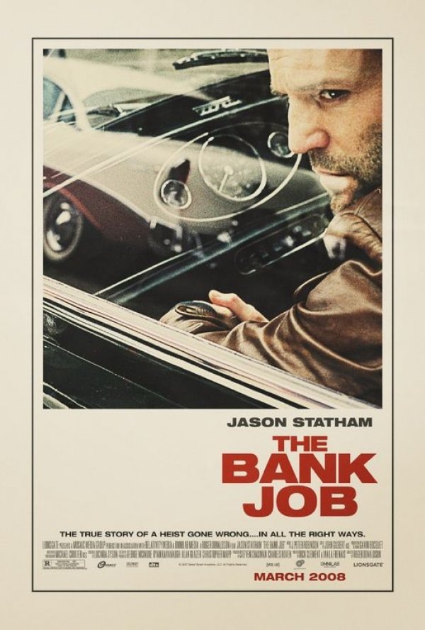
I saw this poster plastered all over a construction site by my house a while back and was really struck by how well executed it was for a modern movie poster. I had been meaning to post it but had totally forgotten until Joris commented on it in the 100 Greatest Movie Posters post. You really don’t see design of this caliber and style in the movie industry anymore. I am assuming this was an early version of the poster. I read somewhere that the big studios will commission an early, more subdued / subversive version of movie posters far in advance of the release and then they come with the tried and true (and boring as hell) final version replete with giant heads and random quasi-illustrative open space backdrops. It’s so formulaic, but I suppose they’ve done their homework and that’s what moves the masses. Sad. Thanks Joris for the reminder on this one!
Extra Credit: This seems to be a similar still to the one used for the poster, give you an idea of the sort of photo manipulation that went into the poster version, very nice. Also, here’s another, infinitely worse, version of the poster.

20 Comments Leave A Comment
Chris says:
June 20, 2008 at 3:39 pmI couldn’t agree with you more Scott. I saw that list of posters a couple days ago and saw some pretty interesting ones. I didn’t think the persons write up of each poster was entirely correct, but that’s besides the point. If you ask me one of the best on the list is/was Metropolis. So amazing for 1927.
Alex / HeadUp says:
June 20, 2008 at 3:44 pmHoly shit…thats an amazing poster, so refreshing to see that style actually being used nowadays, as we mostly only get designs like that orange nightmare you also posted. Whoever took the original photo and turned it into that poster did a wonderful job!
lerin. says:
June 20, 2008 at 3:46 pmLooks to be influenced by The French Connection poster back in 1971.
NAVIS says:
June 20, 2008 at 6:15 pmI would see that movie just based on that poster design.
And like Alex said, it’s very refreshing.
But who’s brilliant idea was it to put gray text on an orange background? That’s not annoying or anything…
Jesse says:
June 20, 2008 at 8:24 pmHot damn hot poster!
Rob McDougall says:
June 21, 2008 at 3:57 amGreat poster, I guess they’re trying to invoke some sort of nostalgia for The Italian Job, and other great 60’s/70’s heist films…
Now, is the film any good?!
Vijay says:
June 21, 2008 at 6:53 amDamn good job with the poster, especially when contrasted with the still image. Just compare the colors of the jacket from the poster and from the still; awesome edits.
Matt says:
June 21, 2008 at 12:39 pmYeah thats a sweet poster. I’m a big fan of the Grindhouse posters- Death Proof and Planet Terror. As far as awesome recent movie posters go.
thomas says:
June 21, 2008 at 4:30 pmthis is the most beautiful movie poster i’ve seen in a very long time!
until now i wasn’t really interested in the movie, maybe i should check out some trailers
Joris says:
June 22, 2008 at 7:31 amThanks for the kind words, I’m glad I somehow brought it back to your attention as it is in my opinion indeed one of the nicest posters I’ve seen in a very long time. So I can only be happy more people get to see it.
Keep up the good work ’cause reading your posts is always been a pleasure for me.
Kind regards Joris
Andrew S. says:
June 22, 2008 at 8:00 amFor some reason I didn’t really like the poster at first. I’ve since come back to look at it about 7 times. It’s pretty fantastic. I’m kind of sad they didn’t go with the orange one though.
Just kidding.
Jan says:
June 22, 2008 at 11:25 amI like the overall style, the grainy/retro photograph and it’s colors, the chosen fonts – but for the most part it’s a typographic catastrophy.
A center-aligned title forced into some virtual right aligned box. How dumb.
They should have consequently aligned all elements to the right or all elements to the centre, but this is some messed up combination.
It feels poorly executed, or like compromise.
Yeah, but still (especially in comparison to most movie posters) a great movie poster. Makes me want to watch the movie.
snoox says:
June 22, 2008 at 1:11 pmI can’t see what’s so great about this poster? I don’t think the grainy looking picture meets the movie(-plot) at all. And just like Jan said, the poorly executed typography is just bad. They defintely need to do a final version here.
Scott says:
June 22, 2008 at 4:02 pmsnoox-
it’s all about relativity. Look at this: http://www.movieposter.com/poster/MPW-31623/Dark_Knight.html
then come back and look the bank job poster. If it were for anything other than a major motion picture, I would have to agree with some of what you and jan said. At any rate, I still think overall it’s a great poster, it might not get a frame, but I would at least pin it up somewhere in the studio.
Gareth says:
June 23, 2008 at 12:33 amgreat poster, shame the film is terrible.
joshua says:
June 23, 2008 at 3:06 pmI can’t remember if anyone ever told me that center aligned text moved to one side was a design don’t.
But for some reason it’s really eye catching. The entire piece feels well thought out to me.
aaron says:
June 26, 2008 at 9:22 pmlooks likes the designer was using the golden rectangle/spiral as a layout reference
greg says:
June 30, 2008 at 8:26 amI saw these posters all over NYC a few months back & thought they were great. Beautiful, classic design.
PKayne says:
July 2, 2008 at 12:03 pmI know someone posted a link to a Dark Knight Poster already but I came across a much better one (on Perez Hilton’s site of all places) that I think will be a real classic. I was so impressed by the composition. I think I may just order it and put it on ice. I would feel like a dork hanging it in my place right now as the movie is about to come out.
http://img.perezhilton.com/wp-content/uploads/2008/07/batman.jpg