Vintage Ski Ads Pt.2: Skis
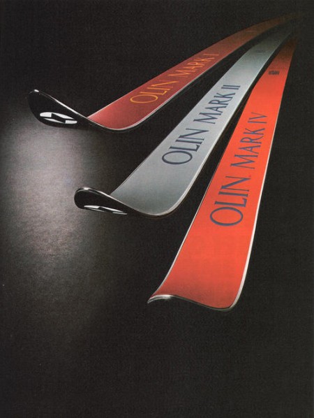
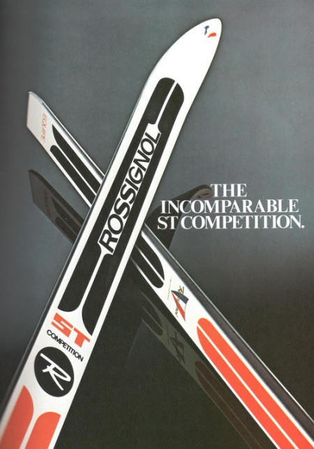
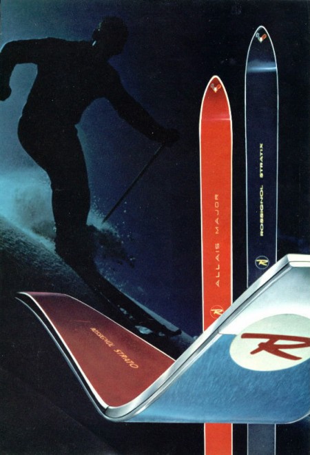
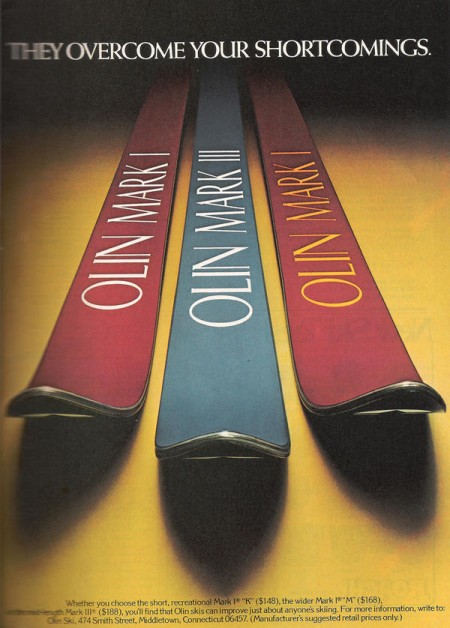
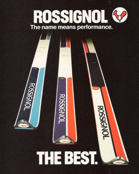
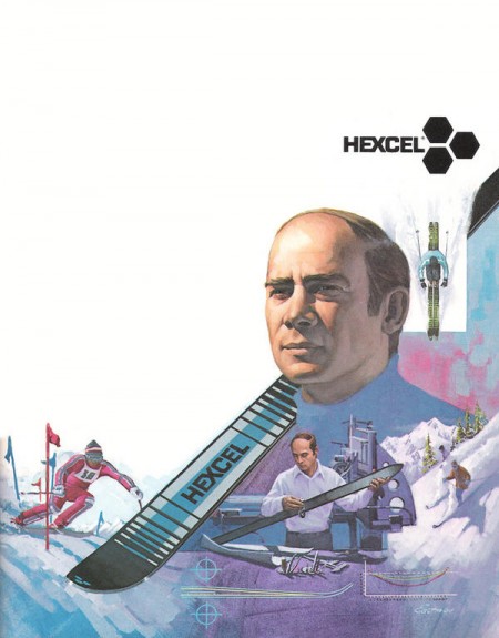
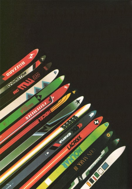
In part 2 of the Vintage Ski Ads Series I chose some that focused in on the skis themselves. When I see skis these days they either look like pop culture threw up all over them or they were designed by the same guy who makes the info graphics at the bottom of the ESPN screen. Looking at the examples above it’s plain to see they had a little more appreciation for subtlety and a sense for classic design back in the day. Either that or the printing methods were such that they were limited to simple shapes and colors and the designer in me is just picking up on that.
When I think about it, this could be the case with a lot of older stuff. I think we as designers often appreciate unintended aesthetic elements; things that were a function of necessity or limitation rather than deliberate design decisions. A good example would be vintage audio equipment. I think the Neve Sidecar is one of the most beautiful inanimate objects ever created. But when you really look at it you realize it was designed by engineers; pretty much every design decision was dictated by necessity and function. So I must be reinterpreting that as physical beauty creating a connection between the idea of an object’s functionality and it’s aesthetic beauty. In other words, maybe I only like how it looks because I appreciate how it works (or in this case, sounds). Then again, I have some gear around the studio that I love the sound and functionality of but is just downright ugly to look at.
Anyways, all those Rossi’s are incredible. This whole style needs to make a comeback, but it seems these days people need to be beaten over the head with design instead of left to appreciate its finer points on their own. I’m not saying there’s not a place for busy, crazy graphics on skis — I myself have designed several busy, crazy skis — I just wish there were more like these to choose from. I guess it’s a different industry, no longer do guys in mock turtlenecks with comb-overs get all scientific and wear collared dress shirts while developing new skis in the lab, now it’s just this guy and a Nintendo DS in a dark room.

22 Comments Leave A Comment
Eric O says:
January 12, 2010 at 2:10 amthat one says “Hexcell” kills me. hah! and who’s that dude with the mean combover? he looks important, and very wise…even beyond his years.
drew kora says:
January 12, 2010 at 4:36 amAh man, all of the Rosignal Skis up there are blowing my mind, especially the Stratix (3rd pic down). Wow, so simple and clean. Thanks for the sweetness.
Kyle says:
January 12, 2010 at 9:56 amI linked to Kneissl’s website in your first ‘vintage ski ads’ post but I figure why not post again. They’re the only company who still has it IMO.
http://www.kneisslnorthamerica.com/alpine.htm
NAVIS says:
January 12, 2010 at 9:59 amWhat’s funny is that two skis from this era now equal one ski from today. Skis are so fat/wide but in the best way possible. I should bust out my dad’s old, rusted out Hexcel skis. Complete with straps on the bindings that wrap around your ankles because binding brakes didn’t exist yet.
georges says:
January 12, 2010 at 10:07 amBasic rule of mechanical engineering : something to be good has to look good. the sense of this got lost with electronics and electrotechnics… but our sense of beauty has often a good sense of the physics supporting it.
Guess the market evolved from sportsmen serious about their sport to an approach to the snow-activities which have become more immediately spectacular, appropriate for television.
Dave says:
January 12, 2010 at 10:36 amBeauty. I have been on the same kick for a while.
The ads you’ve shown are good examples of when skiing was very gucci. Back in the early 70’s-80’s skiing was still being marketed as a niche sport for the jetset but has since become more affordable. Skiing has basically caught up to skate/snow in the sense that in order to grow the brand they now market their products by selling the sport and its athletes in a 60/40 split of lifestyle/product.
Nonetheless very rad. Love the simple ski designs. There are a bunch of companies who have tried doing the simple approach, Nordica for one. They used single colours with minimal branding in their first year of ski production. The colours were unique and quite striking tones of Red, Yellow and even the greyscale top sheets were nice. I liked them as a minimalist but the overwhelming response from the public was that they looked cheap. It also coincided with ski brands hiring contemporary artists to graf-up their boards and it’s been on that tip ever since. I personally like the simple stuff but what the hell do I know.
PS Makela’s stuff for Rossi in the early 90’s was a turning point for my own approach to sport. Love the big type and the slightly off imagery.
http://www.deepseat.net/sluff/sport/ad-psmakela-rossi.jpg
jon says:
January 12, 2010 at 11:08 amWhat about Downhill Racer? The opening credits for that movie are amazing. I can’t seem to find them online anywhere, but here’s the trailer.
http://www.youtube.com/watch?v=U-OU7xHYF_Y
frank says:
January 12, 2010 at 11:34 amMy dad had some of those Olin’s. I can’t remember which mark.
You make an interesting point about design limitations and stuff designed by engineers. I’ve often thought about that with regard to something like the minimoog with it’s classic clean use of Futura. Or compare the front panel of a Pro-One or Prophet 5 to the garish stuff Dave Smith is designing today.
I suppose when you had to get stuff professionally typeset there was always a somewhat knowledgeable gatekeeper that clueless customers had to go through first. Once people had direct access to playing around with fonts and colors themselves things went all to hell.
Kevin says:
January 12, 2010 at 12:22 pmOh man. The 3rd one down is a winner. Such beautiful ads. Shame they’re not like this anymore.
Daniel Carvalho says:
January 12, 2010 at 12:33 pmSome very cool designs indeed. Images 3, 5 and 7 really appeal to me, thanks for the inspiration.
Heh, you’re right, bring in the docs and toss out the dudes.
Eric W says:
January 12, 2010 at 1:34 pmI totally agree with the Ski graphics thought. I can’t handle most of the graphics on snowboards these days and always wait until something clean and well designed pops up. Sure there are great boards, but I can’t handle the hand drawn crap my Northwest companies put out. I always follow Burton for this reason and have purchased products from their Custom line over the years.
blackabee says:
January 12, 2010 at 5:17 pmbeauty
yo says:
January 12, 2010 at 8:35 pmThose Lacroix were like the Moet and Chandon of skiing. When I see the Elans and the K2, all I can think about is the Mahr brothers going after Ingmar Steinmark in Lake Placid ! Dynastar had introduced a lead weight on the spatual and Blizzard had some kind of thermo ski… Ha the marketing of skiing. No a days, it’s real sking, I go uphill, non of that crapy stand in line and sit on my ass 80% of the day…
Damien says:
January 12, 2010 at 10:08 pmHey Scott, havent visited or contributed in any comments for a while now – hope you had a great xmas and new years eve…
i stumbled across this site recently and thought to be concerned as i believe it crosses the possibilties of copyright infrigement perhaps? here is the link;
http://www.jp33.com/blog/index.php/category/print/
i have seen designs that look very comparitive to your deisgns and wondering if they are actually yours!
cheers
Damo
Brett says:
January 13, 2010 at 8:47 amGreat post Scott. I grew up in Utah skiing @ Alta since I was 2, (26 now) and have witnessed first-hand the descent from truly great, simple & clean eye-appealing designs, to the abundant mass of horrible graphics that seem to STILL pop up every year… For example, check this mess, (prepare to puke in mouth).
http://www.freeride.co.uk/img/review/original/5899_pic1c.jpg
There is a relatively new company, Surface Skis, based here in Utah that is doing a decent job with their graphics, but still it feels like an attempt…
http://www.uboutdoors.com/wp-content/uploads/2009/09/surface-skis-watch-life.jpg
& Then there is this one, which I hope EVERYBODY will take a look at, a true classic gem of vintage ski art. I wish I could find a larger image, but this might be as good as it gets. Design at its finest, haha. Please take a look, and remember the basics of skiing: “Keep Those Tips Up!”.
http://www.insyt.biz/Galleries/Dynastar/170.jpg
Daniel Carvalho says:
January 15, 2010 at 5:58 amDamien, it’s just a guys designs that are heavily inspired by Scotts.
Nick Kohut says:
January 21, 2010 at 7:43 amI love these. I’ve been skiing all my life and when I was really little in the early ’90s I used to see all the K2 and Rossignol ads when my parents would take me skiing or to get skis, but these are even better. I love the atmosphere advertisement used to radiate back then, even commercials and movie trailers had a completely different feel. It all makes me wish things were more like they were back then today.
Ian Clazie says:
February 2, 2010 at 4:40 pmJon, Downhill Racer… Epic movie. Epic poster…
http://au.movieposter.com/posters/archive/main/36/MPW-18233
David Meador says:
March 15, 2010 at 11:56 pmCool post! I reminds me of a ski/music video re-edit I made a while back – http://bit.ly/cNWuUA. A lot of ski graphics now are garbage. It seems like they are always trying to one up each other.
This is my first time on this blog, it’s awesome!!
Travis says:
April 21, 2010 at 1:52 pmAs a beyond avid skier and designer. I have been trying to get into the ski design game for years, but no one is interested in anything beyond status quo which means either yuppy techno puff or left-overs from what was cool 3-5 years ago in the Snowboarding industry. One day you will once again see substance in a ski design and aesthetics and they will be mine.
As for a brand that is somewhat on the right path. http://1.bp.blogspot.com/_OcjttbDF1QE/S89jcxdkg5I/AAAAAAAAA7Q/Z9hNkNI_UYE/s1600/surfaceclose.jpg
(these are actually my skis)
Ian Houghton says:
April 27, 2010 at 6:05 pmPersonally I think there’s a place for both aesthetics in ski design, especially as the industry gets bigger. Ski designs are geared towards the ADD side of things because that’s what’s getting the most exposure, i.e. the X Games, innumerable super park competitions etc. It’s also because bright clothing is back in fashion – those who want bright clothing also want bright skis. Companies like Surface, as they get bigger, will no doubt have an influence on the industry, and we should see more variety in topsheets. I like to think of it as similar to the skinny vs. baggy snowpants argument :)
Vintage fan says:
August 27, 2010 at 9:00 amWow, all those skis are so vintage! Loving the designs and the posters, thanks for sharing, this really made my day!