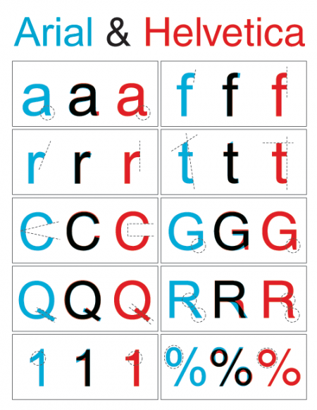
Helvetica vs. Arial
Posted by Scott

Nothing too involved here, just a simple diagram outlining the key differences between Arial and Helvetica. You can find the full alphabet overlayed here. Just in case you’re unfamiliar with the unique history these typefaces share, here’s an in-depth analysis. And here’s the battle mode.
Via Swissmiss, who’s workspace is way cleaner and more Helvetica-ish than mine:


19 Comments Leave A Comment
LV says:
September 27, 2009 at 6:52 pmHelvetica is still better. :)
leon says:
September 27, 2009 at 7:05 pmhelvetica is overused
myriad says:
September 27, 2009 at 7:59 pmmyriad…
GO PRO!
andrew says:
September 27, 2009 at 8:16 pmEh, Trajan is where it’s at.
Jay Williams says:
September 27, 2009 at 8:57 pmHelvetica may be simple, but its usefulness is undeniable.
woodrow says:
September 27, 2009 at 10:30 pmnever noticed all the differences before.. insightful. i have a new disgust for arial and appreciation for helvy!
Tardlovski says:
September 27, 2009 at 10:34 pmat the risk of sounding like a douchebag, helvetica destroys arial. as you can see above, it is inferior in every example. why use arial when you can use the real mccoy?
john says:
September 28, 2009 at 7:35 ampapyrus kills them both…
Adrian says:
September 28, 2009 at 8:49 amI prefer Akzidenz Grotesk over Helvetica. Akzidenz Grotesk has a certain little edge that the clear and appealing Letterforms of Helvetica don’t have.
see here:
http://www.flickr.com/photos/jencinar/1799787135/
frank says:
September 28, 2009 at 9:47 amShe certainly looks cool but she’s going to have a bad back if she sits on that chair every day ;)
Jakub says:
September 28, 2009 at 11:30 amI like the simple adjustment made in the capital C, makes me like Helvetica more
Schlafende says:
September 28, 2009 at 11:38 pmArial’s capital “R” is responsible for the deaths of many brave men and women.
Karen says:
September 30, 2009 at 7:26 pmGreat post. But my question is what is that big enormous clock on the second computer? Is it a screensaver? I so want it right now.
I love the fact that she has red luggage to decorate and match the chairs. Awesome office.
Adrian says:
October 1, 2009 at 7:27 am@ Karen:
here you go:
http://www.9031.com/downloads/screensavers.html